I'm just a photographer, OK? I want to shoot, process, print and store and I want to do it quickly and reliably.
Trouble is, I'm addicted to high MP cameras and large files and so, increasingly, are an awful lot of the people I know. We need a lot of storage - and if Lightroom is not to be slowed down by treacle-speed disk access, that means fast drives.
In the past, I've merely added more internal SATA drives to my old-style Mac Pros and then done a bit of backup here and there. So as you can see, I'm no Lloyd Chambers - I have no really thoroughly structured, analysed approach to storage and backup. To me, it is the washing up after a meal - necessary but of no interest in itself.
Last month my hand was forced. I purchased a "late 2103 Mac Pro" and, because it was in stock and therefore allowed me to skip the several week custom build queue, I took the one with the small internal SSD, planning to use it merely for system files and applications.
All was good until I noticed how slooow Lightroom was compared to my Macbook Pro. I quickly realised that my external Thunderbolt hard drive was the source of the problem and I set about looking for alternatives.
First, analyse the requirements:
- I wanted to be able to have ALL my images in ONE LR catalog, instantly accessible. I test a lot of gear and that means a lot of comparisons - so not only do I want to be able to find any image very quickly and without switching catalogs, I also want to be able to do both A:B "Compare" and to switch from one full screen image to another instantly.
- I needed at least 3TB of external storage but realistically it has to be able to grow to 5TB fairly soon, maybe more.
- I needed that storage to be very, very reliable and very fast
- I needed a backup solution
External SSDs were out of the question: too small or, if the right size, astonishingly expensive. So I had to take the plunge and learn more about RAID. Ouch.
The new MacPro has Thunderbolt 2 and so I blundered into thinking that I therefore needed a Thunderbolt 2 drive when in fact I probably don't. My bad but like I said, I'm just a photographer. Off I went to the online Apple Store and discovered that there are very few Thunderbolt 2 options yet available. So I ordered what seemed sensible - the Promise Pegasus2 R6 12 TB. It promised extreme speed and the usual benefits of RAID.
Let me explain, for those who aren't RAID savvy, what that means: most external hard drives spin at about 7200 rpm - and that means, even over Thunderbolt, a data transfer speed for a single drive of 100MB/s or thereabouts, which seems not fast enough for what I need. By comparison my Macbook Pro's SSD speed tests are read speeds of between 300 and 400MB/s and the one in my Mac Pro goes far over 1,000 MB/s.
RAID allows you to create a 'logical drive' by combining several physical drives into one virtual drive. It then splits the data between several physical disks, all spinning at once, by a process known as 'striping'. So when you access a file, it starts spinning off all your disks a once, effectively giving you speeds that can (over the right connection such as Thunderbolt) pretty much match the speeds of the internal SSD. Cool. It's like having six two litre water pistols instead of one twelve litre water pistol. RAID 0 does just this: it turns, in the case of this Pegasus drive, six 2TB drives into one 12TB drive with astonishing speed.
But RAID 0 has a major problem: if just one of your physical drives fail, then all your data is gone. So there are options to help you avoid this.
RAID 1 mirrors data from one physical drive to another in a two disk array. It slows things down but it backs things up.
A good compromise is RAID 5, which does clever stuff across all the drives so that file data is striped across the drives, but so is parity data. I am no expert (as you can tell) but this level gives you very fast read speeds and a degree of protection: you need at least three physical drives but if one of them fails, you can 'rebuild' your data using a spare. SO you get speed AND redundancy. As long as just one physical disk fails.
The Pegasus ships preconfigured with RAID 5 and that's how I intended to use it at first. I planned to consider a later migration to RAID 10, which may under some circumstances allow two disks to fail while keeping your data recoverable, albeit at the cost of halving the capacity of the array.
So I unpacked The Beast and read the Quick Start guide. No fun yet: when you plug it in, you have to allow it to run a Synchronization routine, which takes many hours.
That done, I fiddled with some setting in the superficially wonderful Promise GUI (turning on the event alarm buzzer, for example) dragged my main LR catalog folder onto the new drive and went to bed, allowing the files to copy over while I dreamed of mythical white horses. Next morning, Bingo! The transfer was complete and so I gathered a bunch of other files and folders from another drive and dropped them all onto the Pegasus.
Buzz. Buzz buzz buzz. Red lights flashing all over the drive. Panic. The thing has frozen and worse, when I look at the GUI I am told that for two of the six physical drives, "Physical Disk is marked as DEAD due to forced offline state". Wow. RAID 5 allows one disk to die without risking your data, not two.
But hang on, this thing is less than 24 hours out of the box. I have only once in my life had a drive failure and now it looks like there are two of them in a brand new product.
Now I really don't want to bore you with what happened next but a précis might be useful.
I discovered that Promise support isn't as good as I might have hoped (understatement). Their online Knowledge Base seems very thin and so I opened a support case and then waited. In a mild panic I googled the problem and found a Terminal Command that could force both the drives back online, which worked but which I was later told by support I shouldn't have done because it might have risked my data. Never mind, I still had my original drive, the one from which I had copied all the files in the first place, and a backup.
Nonetheless I was curious to proceed, to see if the fault had lost me any data (I never found out) and to see what had caused the problem (I never found out) and to see if I needed any physical replacements (after two or three days I discovered that I did, drive 2 needed replacement and I was told to raise an RMA).
Aside from the often extremely slow responses from support, the level of English used by some of the tech staff seemed to me to not be up to the job. Often questions I asked were not answered in the response, and at what was up to 24 hours per ping that became very irritating. The frequent use of opaque acronyms drove me bonkers too.
"Below is the Promise KB link to attach files in CRM"
"if the drive that your forcing online contains any errors that DDF information might corrupt the whole array"
Mind you, it's not just the support staff that love acronym soup: the case-raising process throws it at you with gusto too. I had no idea what a "TLA number was" - but I do now.
But the support staff do love to use tech speak, to show how clever they are, never mind how confusing it might be:
Them: "open disk utility from finder in your mac, select your disk and run a check filesystem"
Me: "I don't see an option for that. I did a Verify and then a repair with this result..."
Them: "Sorry, for the delay in answer yes verify and repair disk is what I meant"
And so on... it's almost farcical reading some of it back now (I was not always completely polite..) especially when a bit of internet research showed me the amusing stories people have of their Pegasus drives issues, including needing to rebuild the RAID within the first few days of ownership and arrays which unmount spontaneously when an iPhone receives a call near the cable...
So I packaged the whole thing up and initiated a return to the Apple Store. Phew?
Pegasus was a horse, right? And horses have tails. This one had a sting: before repacking for shipping I decided to boot the drive up and initialise it so that none of my data remained on it. It turned it on and it gave me a fan warning. I tried again several times and eventually got rid of this so I tried a Mac Disk Utilities secure erase, which failed. In fact at one stage the buzzer sounded and the red lights went on again, forcing another reboot. Finally I succeeded, by using the Promise GUI, to securely erase the drive.
I have rarely if ever had a more annoying tech experience: the product failed quickly and the documentation and support are unsatisfactory, to me at least. The high data transfer speeds may peak at well over 1,000 KB/s but the average, including downtime, was downright tardy.
I have replaced the unit with two 8TB G-tech units, each with Thunderbolt One and two drives in a RAID 0 array. One will be the main drive, the other will be cloned and an old drive will do Time Machine backups for the safe while yet another will be kept offsite. And sure, the maximum data rate of the G-Tech will be around a third of the Pegasus but judging by my previous experience with the brand, it will keep it up for far more than the first 24 hours. It's a tortoise and hare thing, and the tortoise will actually be pretty quick.
Carl Jung, the famous psychiatrist, saw the Pegasus myth as (to partly quote Wickipedia) a profound symbolic esoteric in relation to the spiritual energy that allows access to the realm of the gods on Mount Olympus.
Sod accessing the Gods of Mount Olympus: I'm just a photographer and all I wanted to do was access my data.
Maybe if you're a videographer working with 4K or multiple streams, and you have bullet proof live backup strategies, this astonishingly fast unit is the answer to your prayers. But for me? I don't think so. I will miss the extreme speed but actually, I think I need a Volvo and not a racehorse.
This site is not for profit but I do support the charity Photovoice. I wrote about it in depth a while back and that article is here. If you have found this article useful and are feeling generous, I would hugely appreciate a donation to the charity, even just a pound or a dollar: every little helps. You can donate here and the Virgin Giving site is secure and takes cards and PayPal. The Gods of Great Photography will smile on you if you donate. I promise.
]]>
Such complexity relates to the trend for lens designers to work very closely with camera manufacturers to 'share the load' of overall image quality between the optics and the way in which their output is processed. Aberrations, distortion, even diffraction and peripheral sharpness are, these days, all 'fair game' for a little helping hand from the signal processing part of the imaging chain.
This is made all the more necessary when one considers the design and marketing constraints: for example, a 24-70 Zeiss lens for Sony's new FE range had to be not only a strong performer, but also small, light and correctly priced. Oh, and it has to 'do' video, too - though I will not be commenting on that aspect of its performance.
All this has to be achieved in the context of the fact that a lot of people (me included) simply will not commit to a system unless there's a good mid range zoom. And Sony is building a system here.
In order to get the entire quart into the requisite pint pot, a lot of smart stuff has to go into the design - not just of the lens itself, but of the entire system for which it is designed. An example: this lens has almost epic levels of distortion. So much so, that for JPEG shooting you cannot even turn distortion correction 'Off' - the option is not available in the menu system at all. A low-distortion design such as the 55mm F1.8 triggers the camera to allow the user the choice of 'Off' for distortion but Sony plainly don't want to frighten the less experienced shooter with what would happen should they be allowed to select this option for their flagship mid-range FE zoom.
The short version is, this is a great lens, probably overall the best mid-range zoom I've used and certainly the single most useful lens I own. And Yes, it does let you get great results from the 36mp, AA-free sensor of the magnificent A7R.
But the long version is - complicated. There's a lot to cover. So for those who want to read about the complications in their quest to extract the last drop of performance, read on. For those who want to skip to the fun part, just buy one* and enjoy it: it really is great.
Let's look at the less good stuff first: distortion, color shading, nervy bokeh, astigmatism, field curvature, focus shift, sample variation and the odd and inconsistent behaviours that can occur when you combine these characteristics:
Distortion.
Wow. Here are frames shot at each major focal length (24, 35, 50, 70mm) and developed in LR from RAW (the camera does not apply the corrections to the RAW files).
Like I said, the distortion is close to epic. But the good news is twofold: for an awful lot of shots it simply doesn't matter - the distortion gets lost in the shape of the subject. And should you need to correct it, there's a profile in ACR's current release candidate that does a good job, though I prefer to correct distortion only, leaving some vignetting in place. Furthermore, though there is always a small hit to detail and micro contrast when lens corrections do their 'push and pull' thing on a file, there is plenty of detail to go around and the post-corrected results are still pretty damned good provided you shot optimally to start with.
Tip #1: if you're shooting a landscape or similar and the image has a strong horizontal line in it, composing (if it suits the subject) with the line close to the mid-height of the frame will mean you probably won't need to correct.
Tip# 2: if the you have the camera set to Live View Display: Setting Effect On (Cog symbol:2:item 5) you won't see the distortion in the finder and you will capture a slightly wider FOV than the finder displays, such that a RAW file corrected in post will have about the same FOV as the finder showed. So you have a little wiggle room built in - and I think, but cannot prove, that the camera is always shooting slightly wider than the focal length you have selected, such that a corrected file has a FOV appropriate to the selected focal length.
Color Shading and vignetting
Don't forget that the in-camera, menu-selectable lens shading corrections only correct for vignetting and NOT for color shifts. So, though shading corrections ARE applied to RAW files if ON in the menu, they help only with luminance issues and not color shifts. This is a pity because there are some color shifts. They effectively become 'not a problem' from about 35mm F5.6 or 8 but at wider focal lengths and all apertures, they might cause problems with some scenes, though luckily, because you will always have accurate EXIF information, you can always shoot a Lens Cast Reference Frame later, and use it with Adobe's Flat Field Plugin to get rid of the issue. Here follows an example of an uncorrected file at 24mm and F4 and if you click here you can see files at all major focal lengths and apertures:
Tip #3: shoot with lens shading corrections OFF and deal with both colour and luminance shading later if needed. And buy a Universal Lens Calibrator Sheet for peanuts, it will save your rear end one day
Nervy Bokeh
You're never going to get gorgeous bokeh from a mid-range zoom, especially one that is trying to do as much as this one. And in truth, the bokeh isn't actively bad: in fact sometimes it's just dandy - and for this class of lens, it's very reasonable. But I sometimes find it a little jarring. Here is a series of examples with fore and aft bokeh and different types of subject. It is worst with aft OFF subjects that have sharp lines.
That last one shows the danger zone: it can get close to ugly with too many OOF lines in the background - but 'softer' subjects mask the effect enough, most of the time. In any event, this, for my use at least, isn't meant to be a lens used for extensive OOF work. If I want that, I'll choose the appropriate prime.
These are the three most obvious problem areas. But there are others that are less immediately evident and more difficult to pin down and work around - and I can't claim to have fully cracked this yet, however much I like the results I am getting.
This is what I think - and I might be wrong. I think the lens has a cocktail of quite mild hidden effects that can make it feel a little inconsistent. For example I think it might have a tendency to forward focus shift. My tests aren't quite conclusive but they seem to show this unusual phenomenon at 70mm and less so at 50mm, though it is hard to tell whether it is there at shorter focal lengths, masked by the extra DOF.
I think this combines with some field curvature and my feeling at this stage is that this tends to be forward curvature at shorter focal lengths, possibly switching to a gentle rear curvature at the long end. The trouble is, these things seem to come at go at different apertures, focal lengths and subject distances and shapes. One minute, the lens is sharp from edge to edge and the next, with the same focal length and aperture but a different subject distance, less so.
Usually the MTF is a good place to start when trying to understand these things but it is my understanding that Sony's graphs are generated from calculations rather than bench tests and they are, in any event, pretty incomplete and poorly annotated. They show only the extremes of the zoom, at F4 and F8. This seems like a daft policy given that the best performance is from about 40mm thru 60mm. I'd like to see the MTF for 50mm for example, because the lens is really very good at that length.
All that said, what MTF data there is, screams "astigmatism and field curvature." The higher frequency sagittal and tangential lines look like they're trying to avoid each other and the general appearance is of a lens that has plenty of low frequency detail to the edges but less high frequency detail, and, what high frequency detail there is, is quite strongly astigmatic.
The results of this in the final images is that if you pixel peep at 100% you'll see an odd mixture of detail and blur in the far peripheries - and the characteristic sense that there's more detail in some orientations than in others. The overall effect can be less of a blur (though that is there, somewhat, at the afflicted focal lengths) than of reduced contrast. But in any event, and I really want to stress this point, these effects are common to other lenses of this type and, when it comes to the final result on your screen at 50% zoom (to emulate a 200dpi print) they are rarely troublesome and, at some focal lengths and apertures, not even noticeable.
Regular readers will be familiar with my usual harbour side aperture series and sure enough I have shot it (many times now!) and links to the files are here (all downloadable at 100% size). But I have to say that no one series gives anything like a full picture of the overall performance of this lens. I have shot many, many series at different focal lengths and subject distances and overall been very pleased with the results - they are nearly always at least useable and very often really satisfying BUT the areas that are less strong are very hard to pin down. An example: some frames shot at F5.6 and 35mm seem to have less sharp edges than F4 frames. In other shots with the exact same settings but different subject distances, the effect disappears. To me this suggests that the shape of the field curvature 'tightens' as you stop down at some focal lengths, meaning that planar subject edges can fall behind the field of focus at F5.6 but within it at F4.
I'm still working this out. For now, my rules are based on an analysis of a lot of frames shot of a lot of scenes, often using different placement of focus point within those scenes. Add some educated guesswork and these rules are as follows:
- Best results are in the area between 40mm and 60, maybe 63mm. In this range, you have a very high chance of getting a 36" print that is sharp to the sides.
- At nearly all focal lengths and subject distances bracket F5.6 and F8 frames to be reasonably sure of getting the best results but if you have time, chuck in an F4 when shooting at the wide end.
- At 24mm you risk slightly soft edges and you'll be hard pushed to get sharp corners on a planar subject. Best shot at F5.6 or 8. Top tip: for 'deep' scenes, shoot at F5.6 and focus on one of the furthest elements of the scene. This tends to sharpen up the edges in the nearer parts of the frame, an effect I ascribe to a suspected combination of field curvature and forward focus shift.
- At 28 thru 35mm, it's wise to bracket F4 thru F8 if you have time - sometimes the edges are better at F4 but if you follow the italicised 'Top Tip' in the above bullet point, you'll probably get the best results available.
- At 70mm, avoid F4 - it is usually a bit soft, whereas f5.6 and F8 are very good on centre and fairly good at the edges.
- F11 is noticeably (but not horribly) diffracted at all focal lengths and oddly seems not to offer much gain in DOF. I don't bother with F11 for these reasons.
You could go crazy working this all out and I also suspect that sample variation between individual copies of the lens (I'm on my third) might mean that no one set of rules will work for everyone. So if there is one golden rule it is this: if the shot really really matters, if you want the best chance of sharpness to the edges and corners, zoom with your feet and shoot at 50mm and F8. It works for me.
In fact it works so well for me that I recently posted two mystery frames on a GetDPI forum thread. One was the 24-70 shot at F8 and 50mm and the other was the 55mm F1.8 shot at F5.6 and only one person of many was able to identify the prime lens as 'better'. Really. If you want to play, here are the shots. Clicking them will load them in a gallery from where a 50% of original size version can be downloaded. I'm not saying which is which - they're both excellent, and that's what matters.
For another example, this time at closer range, of how good the lens is in the middle parts of its range, take a look at this one shot at 63mm and F8. Clicking the in-line image will take you to a gallery from which you can load a 100% frame into your browser.
The file is sharp from edge to edge and corner to corner. I'd be happy with this from an very good prime - from a zoom, I am pretty much bowled over.
Looking at some of these files, you might notice the lovely Zeiss micro contrast that so many of us crave. Here's an example at 33mm and F4, which shows the very subtle, articulate way the lens handles transitions of focus, tone and colour. Again, click for a gallery with the full version but, as with all of these, try to drop the image from your browser into a viewer that lets you look at the file at 50% zoom so as to emulate a print.
Landscape Use
This is of particular interest to me and I have shot quite a lot of landscapes with the lens already. Honestly, if I want a huge print of a particular scene I will at least use a prime, and probably a tripod. Most likely I'll use an IQ180 on a technical camera. But for casual, travel and walkaround landscape use I have been surprised at how good the 24-70 is. In fact most shots I've made with it could be used to make my standard fine art print size of around 22" and to the standard I require - near as dammit as good as the FE 35mm F2.8, for example. I have made a gallery to show this - they're not great shots, they're intended to show how, at a variety of focal lengths and apertures, the lens performs for this sort of work. Click on the below image to visit that gallery.
A word now on sample variation. I am now on my third copy of this lens. The first one had a tendency to be noticeably softer on the left side at the wide end, neutral in the middle of the zoom range and softer on the right at the 70mm setting. The second copy was almost the opposite of this. The third copy is better than either, still not perfect but I am certainly keeping it because in my experience, mid range zooms are hard to design and hard to build with perfect consistency. This applies to all manufacturers whose lenses I have tried to some degree. So if you purchase the lens and have the skill and knowledge to test it, do be prepared to keep a copy that seems a little less than perfect because you might have to run through a LOT of copies to get a truly excellent one. I also beg people not to run this 'test/return/repeat' cycle unless they know how to test properly. Manufacturers might deserve to get 'clunkers' returned but it's a real problem for some retailers. If you want to know more about how to test, this article from the excellent Lens Rentals blog will help. I will soon be writing up a simplified method that can be used by anyone with a rectangular room, a 12' cloth tape measure, a tripod and a piece of string. Watch this space!
Flare and aberrations
I did have a small number of instances of LOCAs and purples and so on, but I honestly haven't been bothered by them and now can't seem even to find them. A couple of clicks and they were gone, with only one brutal exception at 24mm and F4, fully against the light and right in the corners.
Flare is even better controlled. I have tried to provoke it again and again and this is the very worst I can do. Treat the T* coatings as one of the lens's strengths - they are very effective.
Focus and OSS
One area where the lens has to bow to the inevitable compromises of its design brief is that it is a little slower than its pro-grade competition. A maximum aperture of F4 might be mitigated by OSS but the fact is that darker lenses make harder work for an AF system. Not only is there less light to work with, but the extra DOF makes for more ambiguity. The A7R does pretty well with this lens most of the time but I personally would not use it for dimly lit events - not even outdoors at dusk. Wedding and event photographers won't enjoy it. In fact, I tried to shoot (very casually) an outdoor hunt meet in very overcast conditions and I missed focus quite a lot. So this is not a 'run and gun' lens in anything other than pretty good light.
The OSS seems effective and non-temperamental. I mainly like it because it helps keep things steady for magnified live view manual focus but it really does help you to shoot at shutter speeds of around 1/FL (so I estimate about a two stop helping hand) and I have had a number of shots at much lower shutter speeds that imply up to four stops of help if you get lucky. I have also sometimes forgotten to turn off OSS when on a tripod and though this is bad practice, it seems not to matter. Similarly, diligent shooters usually turn off OSS if there's enough light not to need it. I haven't bothered and I haven't suffered as a result.
There are two issues that I haven't been able to bottom out, though: firstly, I think the OSS is best when given a moment to 'settle' - again, not ideal for run and gun shooters. Secondly, I have a suspicion that sometimes the OSS doesn't 'park' the lens elements perfectly. This is very common with lens-based stabilisation in zooms and can manifest as a mild softness on one side or the other which seems to come and go. It's hard to separate this out from other effects so I really can't be certain. In any event, with my current copy it is 'no biggie'.
EDIT: added 9th Feb 2014 After much handheld testing with the lens at 70mm I have been able to confirm, to my own satisfaction at least, that the infamous "A7R Shutter Vibration" issue is a challenge for the OSS. This is what I mildly suspected from my experience of the lens so far, and is also to be expected given the data that others have managed to amass on the subject. Handheld testing is by its very nature not exactly repeatable and not amenable to a proper scientific method.
My method was to test my hypothesis, garnered from much shooting experience with the lens that shutter speeds of less than 1/250th might be problematic. So I set up a very well lit test target outside and shot innumerable frames at 1/60th, 1/125th and 1/250th. All the shots at 1/250th were very sharp. About 50% of the shots at 1/125th were acceptably sharp. None of the shots at 1/60th were acceptable. YMMV - and I haven't applied this test yet to the other focal lengths, nor to very slow shutter speeds (where the vibration apparently dies down for 'enough' of the exposure) but my feeling is that though the OSS is doing a good job with the hand held component of motion blur, it isn't able fully to deal with the shutter shock.
Takeway? Go practice with your own copy but don't count on getting the shot critically right at less than about 2-2.5/FL even with OSS on, at 70mm and quite possibly at other focal lengths. It might work, but it might not! In real world shooting this has rarely been an issue for me - I have had a few slightly blurry 70mm frames at 1/125th but nearly all at 1/160th seem fine. At shorter focal lengths I have seen no more of an issue than I would expect from any system.
Summary and Conclusions
Regular readers will know that I repeatedly, in anticipation of the arrival of this lens, stated that it was going to be a 'make or break' lens for the new FE system. I had already noted that the Olympus 12-40 F2.8 lens on an E-M1 could effortlessly get sharper edges on a 20" print than my copy of the famous 'Trinity' Nikkor 24-70 F2.8 on a D800E especially at the wide end. For that reason I was keen to shoot that lens, despite the less good sensor of the MTF system, rather than the Nikkor. It is a very good lens. So what I wanted from the FE 24-70 F4 OSS was a similar performance. If it proved capable of this, it would become my 'go to' lens, making the A7R my 'go to' system.
Does it achieve this? Not quite. When you shoot it absolutely optimally, and re-size the images to match the resolution of the E-M1 (or make a 20" print), there is a tiny, tiny smidge more detail at the far peripheries of the Oly wide images. However, the margin is so slim that when I discount it against the other abilities of the lens (stellar performance in the middle of its range, gorgeous Zeiss micro contrast, nicer and larger files from the A7R) I find radically in favour of the Sony as a system. I will happily give up the small advantage the Oly has at the far edges in favour of a greatly better system performance overall.
I am also convinced that overall, the 24-70 F4 is a better and more useful lens than the Nikkor - I have looked at every aperture and every focal length and winning features of the Sony are better performance at the far wide end. In fact, on my subjective evaluation, the Sony system beat the Nikon system at the majority of focal lengths and apertures and, in the few instances where the Nikon system won, it was by a small margin and the Sony was in any event better than good enough. Sure, the Sony lens isn't for purists (what zoom is?) because it has more distortion. But for my use, it is just better, not to mention smaller, lighter and cheaper.
It is important to note though, that for some users, the Nikon or Olympus systems might be better. They both have faster AF, and IMHO the AF is more reliable in low light. I also have a sense that the Oly and Nikon lenses might be a bit tougher, and a bit more weather proof though I am not about to test this! So if I were a photojournalist I would likely choose one of those systems instead, probably the Oly because of its size and weight advantage and the fact that PJs don't generally need to make vast prints.
But I am primarily a fine art and landscape photographer, with sidelines in travel and portraits. For all these uses, I prefer the Sony system.
* so simple to say 'just buy one' - firstly, they're rare as hen's teeth at the moment and secondly, I had to go through three to get a good one. That's not so unusual, it can happen with any manufacturer and complex zooms are hard to make.
This site is not for profit but I do support the charity Photovoice. I wrote about it in depth a while back and that article is here. If you have found this article useful and are feeling generous, I would hugely appreciate a donation to the charity, even just a pound or a dollar: every little helps. You can donate here and the Virgin Giving site is secure and takes cards and PayPal. The Gods of Great Photography will smile on you if you donate. I promise.
Also I would like to note that on March 26th in London, Photovoice will be holding "PV10" - a very high-end auction of just ten amazing images by world-class photographers. Please visit the website for more information and do consider attending or bidding remotely: not only does it help fund the charity, it is also often a source of bargains prices for big-name work!
]]>Camera of the Year
First prize goes to…
...the Sony A7R*. What a fascinating and infuriating beast this is. Capable of wonderful image quality, often close to Medium Format but in a tiny package, this camera is the first to break through what I considered the most significant barrier facing the industry: a full frame, high resolution sensor in a compact body with an excellent built-in EVF and a versatile interchangeable lens mount. It has not only broken that barrier: it has smashed it, and left the debris of other manufacturers' aspirations spinning in its wake.
There is a lot not to like of course:
- colour casts across the frame with some lenses
- a shutter that sounds quite loud and in the opinion of many people vibrates too much
- an apparently compromised image processing pipeline that hides what it is doing from the user and produces results slightly less good than the same (or at least very similar) sensor in the Nikon D800E ("orange peel" and "jaggie" effect in RAW files when developed in Lightroom, less clean shadows, less impressive higher ISO performance)
- a piece of proprietary software to develop RAW files in (Image Data Converter) which I, and many people it seems, find infuriating and opaque
- poor (but not disastrous) implementation of Auto ISO - no setting for focal length or desired focal length "multiplier"
- no IBIS (a shame on a camera so well-suited to third party lenses via adaptors)
- a menu system that has utterly confounded some users and confused and irritated a lot more
- a manual that reads as if written by a fourteen year old for a ten year old
But this camera breaks serious ground, however much of the larger construction project remains incomplete.
Critically, the way in which it focusses is a huge step forward: in manual focus mode, magnified live view, it gives a clear, clean and precise ability to see where focus is best achieved in a way that D800/E users can only dream of. Combining this with a 36mp sensor is the 'killer app' for the camera. It lets those who want to use it with extreme precision, do so in a way that wrings the last drop from their lenses. In AF mode, it may be slower and less good at tracking than some of its DSLR peers but I, for one, find that for the first time ever, I can use peripheral AF points on a hi-res sensor with a very good chance of success. Nikon has remained silent on the subject of D800 peripheral focus (especially the infamous 'left side' issue) but in the final analysis I trust my eyes: and my eyes say, trust the A7R more.
So here we have a camera which seems to have a less satisfactory imaging pipeline than the D800/E but which I and many other users seem able to make better initial captures with - with the net result of, dare I say it, an average end-result win for the Sony. On top of that, it'll take a huge variety of lenses. I duly award it my much-coveted Camera of the Year Award, however much it also deserves a Could Do Better.
Oh, and a lot of people are having tremendous, creative juice stimulating FUN with it and seem very largely un-bothered by the bullet point list of woe above. They know an IQ bargain when they see one, and they love, love, love the form factor and accuracy of manual focus.
Second prize goes to
The Leica M240. It is damned good, and whatever they did to the rangefinder makes a huge difference. In fact the RF focusses as well as does the A7R using magnified live view (with wide to moderate telephoto lenses at least) and it does a better job (as you might expect) of dealing with colour shading issues with M glass. But after shooting the A7R, the 240 feels portly, vulnerably expensive, and makes one think that its ticket price is an awful lot to sink into a fast-moving market. And its EVF comes close to sucking in comparison.
Third prize goes to
The Olympus E-M1. What a lovely camera. What absolutely stunning IBIS. What a wonderful extraction of IQ from a too-small sensor. Ignoring (I can't forgive) it's pathetic Auto ISO system, which undermines the achievement of the IBIS at every turn, I'd say that this piece of kit will be all the camera most people will ever need, most of the time. But for me, a landscape-obsessed big print guy, MFT doesn't cut quite cut it well enough - especially when the full-frame A7R is about the same size and weight and has more than twice the pixels - and larger pixels at that.
However, if, as I think will eventually happen, an MFT sensor can one day deliver IQ similar to that currently obtainable from an A7R or D800E, even at higher ISO, then a camera like the E-M1 will trump an A7R because it is easier to make great lenses for smaller sensors. This is where I think the action will be in the long run and so, though I might sell my E-M1, I will be keeping the better lenses.
Lens of the Year
First prize goes to
The Olympus 12-40mm F2.8 Pro M.Zuiko. I very rarely use a lens that immediately lets me know that it is excellent and doesn't later disappoint in some less obvious manner. This lens is the best mid-range zoom I have ever used on any system, if your criteria is that it should be at least good and often peaking at excellent across the entire frame at all focal lengths and apertures. I wrote in my review of it that it is so good that if my aim were a 20" print, I would prefer to use this lens on an E-M1 than a Nikon 24-70 F2.8 'Trinity' zoom on a D800E. I stand by that judgement. The Oly lens has no focal length at which it fails to satisfy and, on the basis that one should never sell a good lens, I will hold on to this even during periods when I have no MFT camera. Frankly, in my Camera of the Year section, any of the three candidates could have been the winner but in this Lens of the Year section, there is no question in my mind as to which lens most impresses.
Second prize goes to
The Nikkor 70-200 F4 VRIII. This lens is an extremely viable alternative to its F2.8 sibling. Smaller, lighter, with better stabilisation, a much better travel and hiking choice, the F4 gives about the same IQ and at a lower cost too. I switched.
Third prize goes to
The Sigma 35mm F1.4 DG HSM. Like many manufacturers, Sigma seems to have a bit of a QC problem: I had to go through several to find a copy that wasn't asymmetrically sharp and even now, with the best one I could find, there is some ambiguity. The lens also needs at least F5.6 and preferably F8 to get sharp edges. But it is great value, it feels lovely, and it has the most lovely rendering. If you want to shoot at F1.4 and get something really quite like the Leica Look on a more restricted budget and on a 36mp camera, this lens on a D800/E will tick your boxes. Great, if you're prepared to work at it.
Accessory of the Year
First prize goes to
The CaptureOne Complete Lens Cast Calibration sheet. It costs £49 and is almost indispensible for owners of any system with colour shading issues - this includes the Sony A7R and RX-1, the Leica M240 and many Medium Format backs when used with field or technical cameras. I am going to write more in future about how best to use this in conjunction with the Lightroom Flat Field DNG Plugin but in short, for a small outlay and a little extra effort, you can radically improve the fidelity of your colour when shooting any of these systems with certain otherwise wonderful lenses.
Second prize goes to
The Leica Disto D510. This is a recherché choice but fans of medium format backs on technical cameras would love to find that Santa had stuffed their stocking with one of these: with a lens suitably equipped with a High Precision Focussing ring, one can finally get over the fact that Medium Format live view in the field is generally somewhere between hard and impossible as a means of accurate focussing. Just point the Disto, press the button and get the distance readout to enter onto your HPF ring. It works and it has greatly improved the quality of my MF photography.
Third prize goes to
… a product that isn't even available yet. The Foldio. I joined the Kickstarter crowd fund for this the second I saw it and I can't wait for it to arrive. A miniature studio (think background AND lighting!) that folds flat and slips into an envelope. How cool is that? So hopefully, next year when I blog I will be able to include product shots that I am normally too lazy to set up and light, and too scrupulous to steal.
Best Photo of the Year
Over the years I have learned that the best way to finally snag an amazing shot is to buy one that someone else made. I have an insatiable appetite for the work of others and most of the stuff that hangs on my wall is either not photography at all, or is by other people. This year, I saw one image that I absolutely had to have. It cost me a small fortune but it was quite certainly worth it. Here it is:
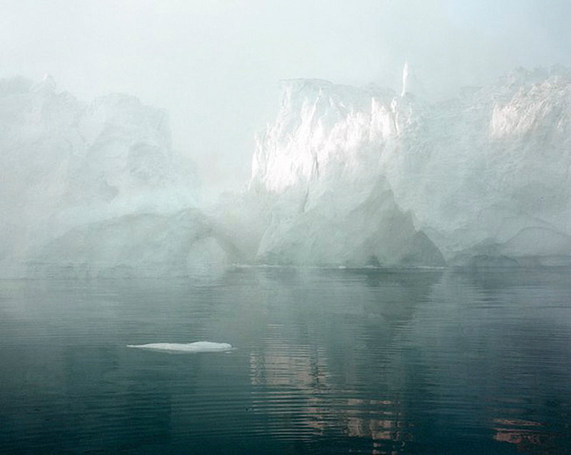
It is Ilulissat Icefjord 7, 07/2003, 69°11’59’’ N, 51°08’08’’ W by Olaf Otto Becker and my copy of it is around 117 x 95cm and beautifully printed - those ghostly shades of minty aqua are utterly beguiling. If I make one picture this good in my lifetime, I will be very, very happy.
It is my understanding that Becker takes a wood'n'brass 8x10 sheet film camera off up the coast of Greenland in a Zodiac inflatable, on his own (now that's what I call artistic commitment!) with a GPS device which is used to record the exact co-ordinates of the spot from which the shot was taken. These co-ordinates are part of the work itself: the idea is that in ten or thirty or a hundred years time, the exact same spot could be found and another, comparative record made, to show how much of the ice has melted and by how much the landscape has been changed by the changing climate.
Burtynksy, Lyon, Gursky and Becker are all concerned with the impact of human activity on natural landscapes. It's a genre I love and I have purchased work from all but Gursky (might have missed the boat on that one, price-wise!) but this one image above transcends any genre. It has the sensibility of a painter (Becker moved from painting to photography) and the romantic aesthetic of one of those gorgeous Edwardian explorer watercolours that showed people parts of the world which they could never hope to visit, and which they stood in wonder of. I stand in wonder of this image. It really is the best of the best.
Wish-List for 2014
The annual excuse for a grumble thinly disguised as a wish-list:
- A MFT sensor that shoots a lot further above the format's weight, so I can use that gorgeous Oly 12-40mm zoom more often
- Canon to show us that they can do a world class >40mp full frame sensor
- Sony to do a version of the A7R with an electronic first curtain shutter, a true RAW file format with adjustment profiles in metadata, and a Pro menu mode that excises JPEG completely, along with all the modes and functions associated with it. And a proper Auto ISO system. And IBIS. Really, if they do this, I will perform unnatural acts for them.
- Someone to make an excellent, expensive range of amazing primes in Sony FE mount
- The upcoming Sony Zeiss FE 24-70mm F4 OSS to be really good
Hmmm, most of those seem Sony based. Don't tell Canikon: they might actually DO something.
A happy and successful 2014 to all
Tim
This site is not for profit but I do support the charity Photovoice. I wrote about it in depth a while back and that article is here. If you have found this article useful and are feeling generous, I would hugely appreciate a donation to the charity, even just a pound or a dollar: every little helps. You can donate here and the Virgin Giving site is secure and takes cards and PayPal. The Gods of Great Photography will smile on you if you donate. I promise.
*It might seen odd to put in contention a camera that I have yet to review in depth, so I want to say a word on that subject first: the Sony A7R has been in my hands for the best part of a month so far and I have already published an article on how various Leica M lenses perform on it with adaptors, and a review of the Sony Zeiss T* 35mm F2.8 native FE mount lens. I had planned to publish a review of the camera itself before the end of the year but I am now going to wait. This is for several reasons.
Firstly, I am trying to get an interview with a Sony engineer to ask various questions about what is going on 'under the hood':
- is it truly a 14 bit pipeline for RAW images - and if so, why are the files sizes so small?
- what processing is applied to RAW files and when? (shading corrections, 'diffraction reduction', compression, and a few more…)
- are there any significant bugs due to be ironed out in firmware updates and if not, are the things I suspect might be bugs actually 'features'?
Secondly, the first copy of the 35mm F2.8 lens I had was imperfect and I have yet to get hold of an FE 55mm F1.8 - and until such time as I have tried more 'native' glass, most importantly the upcoming 24-70mm F4 OSS, I don't feel ready to have a final view A camera is part of a system, and until I can write it up as such, I'd rather not write it up.
Thirdly, my first attempt at finding a Nikon lens adaptor was a mild mis-fire. I have just received a good one, and want to shoot some more with it before I have an opinion on this important facet of the camera's potential.
My full review, therefore, will have to wait until January or indeed February of 2014.
Nonetheless the camera has made quite a stir and so I have placed it on my shortlist.
]]>Over the years I begged him to tell me the secret. "At home," I would say, "I do it all properly: I make stock the slow way, I add herbs and wine, I thicken and reduce and strain and generally mollycoddle the damned stuff, but it is never as good as yours."
Eventually he cracked. "I have a dirty secret," he said. "I use Bisto."
I was utterly shocked.
Bisto, for those who are not familiar with it, is the sort of thing that I imagine people in the 70's made gravy with. It comes most commonly in the form of granules and, when added to hot water, saves a lot of time and effort. But in the competitive world of new millennium home cooking where everything has to be either fresh, seasonal and local or exotically imported, it is the sort of ingredient that some advanced amateurs would not easily admit to using. To find that a professional chef, and one whose gravy was the sine qua non of gravies, the über gravy, used this stuff, was shocking.
"I make the gravy properly first," he blushed, "boiling bones or carcass with vegetables and herbs, skimming off the fat, reducing, the whole thing. And then at the end I add a little Bisto. Most professional chefs to it," he added, trying to reclaim his pride."They won't admit it - but we all do it."
So let's take a look at the ingredients on a packet of Bisto Chicken Gravy:
Maltodextrin, Potato Starch, Salt, Vegetable Oils, Flavourings, Colour (E150c), Flavour Enhancers (E621, E635), Dried Chicken (2%), Whole Autolysed Yeast, Emulsifier (E322) (contains Soya), Vegetable Extract, Spice Extract,, Pepper Extract, Onion Oil.
Oh, and I should add that per 100g, it has sodium equivalent to 12.08g of salt. That's 12%.
Yum yum yum.
So what does this have to do with the Sony FE 35mm F2.8 ZA lens?
Plenty.
A few years back, when Hasselblad announced that their Medium Format system designs were now going to involve making corrections for certain lens characteristics in post capture processing, some photographers imagined the end of the world. Now, rather than designing a lens with low distortion and good control of various aberrations, the argument went, camera manufacturers would strap on any old bottle and then tweak the results in software. It was the beginning of the end of 'real' lens design, and This Was a Bad Thing. Instead of making gravy in the time-honoured way, the photographic industry was proposing to bang in the Bisto at the last minute. Shocking.
The Sony 35mm F2.8 is the logical extension of this process: it has a lot of help at the Bisto stage. In trying to be small, light, excellent and cost-effective on a camera with a short flange to sensor distance and therefore quite a steep peripheral ray angle, it needs all the help it can get:
Distortion, CA, Colour Shading, Luminance Shading, even 'Diffraction Reduction Technology' (and of course Noise Reduction, Sharpening, Saturation and so on)...
...all remedial processes applied in-camera or in-post, to tweak the files for their public appearances.
This makes it either very simple or very complex to use and understand. You can turn corrections on, select JPEG and shoot away in the knowledge that you'll get 36mp files of very good quality that, depending on aperture, are acceptably sharp at the edges and even corners, have moderate-to-no levels of colour shading, pretty much non-existant CA, and no discernible distortion. Alternatively, you can turn all the corrections off, take your time, expend some effort, and make gravy the hard way - and with very nice results.
I think this is largely a good thing.
We don't live in the past: we expect modern tecnological miracles from our equipment and we want this to come cheap. Sony is charging far less for this camera than, for example, the similarly-sensored D800E from Nikon will set you back. They are delivering it in a much, much smaller and lighter package and with much better Live View and a focus system which, if slower and less capable in the area of continuous and tracking focus, is IMHO the most accurate way of focussing a lens I have yet found in a high resolution system. And if, in order to achieve this bargain priced quart in a pint pot, they had to use some Bisto, so be it. The proof of the gravy is in the tasting, especially when the Bisto is largely optional.
So let's make some gravy.
I'm going to get the irritation (and it is a big irritation) out of the way first: it is hard to know which corrections are applied when, and to which types of file. The camera Menu options list has a Lens Comp tab, and under it there are choices for Shading Compensation, Chromatic Aberration Compensation and Distortion Compensation. Each of these is either 'Off' or 'Auto' and there is no mention in the rather slim camera manual of whether each or all of these applies, when set to Auto, to RAW as well as JPEG files. As it turns out, Shading Compensation (which covers both colour and luminance vignetting) is applied to both JPEG and RAW files when set to Auto, whereas the Distortion Compensation is applied only to JPEGs, leaving RAW file distortion to be corrected, if at all, in post. Chromatic Aberration Compensation is the same: it is applied to JPEG files only and, as an aside, is not fully effective.
This makes for some very complex decisions, best summarised as follows:
- Shading corrections are adequate or not, depending on your taste and on aperture: many people, when shooting critical work, will prefer to do their own corrections using a Lens Cast Calibration shot, taken at the same time through a diffuser. The best way to do this would seem to be to leave shading corrections OFF and use Lightroom's DNG Flat Field plugin with an appropriately shot calibration file. It is possible to shoot with corrections on Auto (which means ON) and then apply a Lens Cast Calibration correction to that file in post, but adding corrections to corrections is intuitively sub-optimal: it feels like an unnecessary link in the imaging chain that will lead to a degree of degradation in the final result.
- Chromatic Aberration Corrections are not applied to RAW files even when set to Auto and are incomplete as performed on JPEG files in camera (but 'better than nothing') and the problem is in any event rare. It is generally best, therefore, if you are shooting in conditions likely to provoke such a problem and you want the best possible results, to shoot with corrections turned OFF and then treat the problem in post: again, this keeps the imaging chain short.
- Distortion Corrections are not applied to RAW files even when the camera has them set to Auto. This is problematic: the lens has mild but complex moustache style distortion and this does not correct well in post unless a lens-specific profile is used. Lightroom does not yet have such a profile. Thus, if you want a distortion corrected file, you will need to shoot a JPEG.
This is all rather tedious: I would like the option to apply or not apply each of these corrections to a RAW (or at least part-baked) file in-camera. Ideally, I would also be offered the choice to make separate choices for colour shading and luminance shading. Moreover, remembering which corrections do and do not apply to RAW files is onerous and prone to error.
That's my biggest beef with the system - the rest is quite good news. Let's look at various aspects of the lens in more detail.
Chromatic Aberration
Here are two crops, from the same frame, shot as RAW+JPEG and with corrections turned to Auto in camera. The first is from the RAW file and the second from the JPEG and I should add that this was a torture test, because CA is really quite hard to provoke. I had to overexpose and shoot directly into the sky.
As you can see, the in-camera purple fringing correction is not applied to the RAW file and even in the JPEG file is not fully corrected. I am not a JPEG shooter, so I will be leaving this set to OFF and will correct it in post when needed.
Shading
Just like the RX1, the A7R has a short flange to sensor distance and this means that the light rays reaching the peripheries of the sensor arrive at an acute angle and this can lead to somewhat severe luminance vignetting and to 'colour shading' effects too. This tends to be worse with wide angle lenses and at wider apertures and contrary to popular opinion, is not a problem only for users of adapted legacy lenses. The FE 35mm F2.8 on the A7R has both problems to a moderately severe extent and the in-camera corrections are only partial.
Here is a series of frames shot through a thick perspex sheet known as a Lens Cast Calibration sheet. They show how, at a variety of apertures, the problem manifests in a spectrum from quite severe to reasonably mild. They were shot with the lens focussed close to infinity and all in-camera corrections set to both ON and OFF.
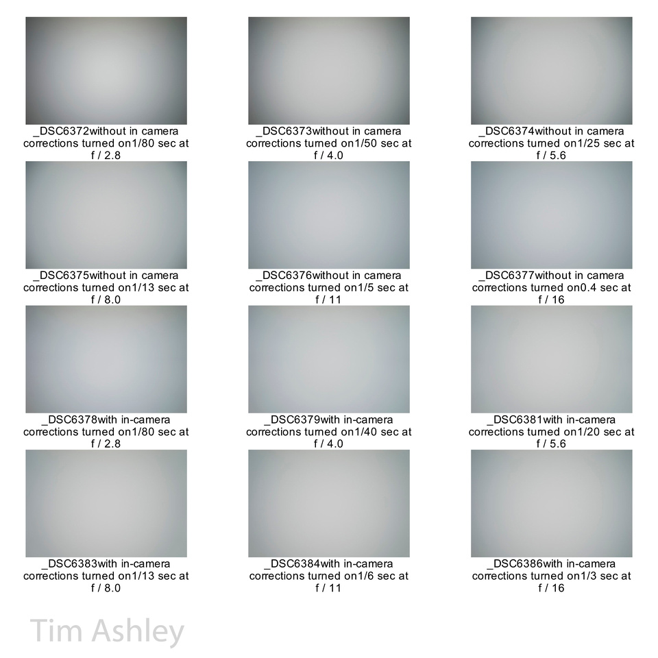
As you can see, turning in-camera corrections ON makes a significant difference but doesn't eliminate the problem entirely. I have two theories as to why this is, bearing in mind that the Leica M240 has the same problem. The first is simply that applying a full correction will under certain circumstances 'stretch' the colour data in the file too far, leading to excess noise in those areas of it where the colour data has had to be pushed around the most, especially at higher ISO. The second is simply that in truth, the only calibration profile that fully fixes a colour cast is one made from a calibration shot taken at exactly the same time as the file to be corrected. The specifics of the calibration shot are affected primarily by aperture, then by focus distance and then by ISO and the colour temperature of the light under which the image is made. So making one profile that always works is simply not possible unless a truly massive number of permutations are made and stored in-camera. Even then, the slightly varying alignments of each individual copy of a lens would make the exercise of making a general library into more of a hopeful exercise than a completely successful one.
So we need to live with the fact that in-camera corrections will never be fully effective. This may be why Sony doesn't allow colour shading corrections and luminance shading corrections to be individually selected: often, the problem is less visible in a brighter sky (an "ETTR" sky can look quite clean even at F2.8) and is more pronounced in a darker one, and of course traditional vignetting gives darker corners which might exacerbate the appearance of the effect.
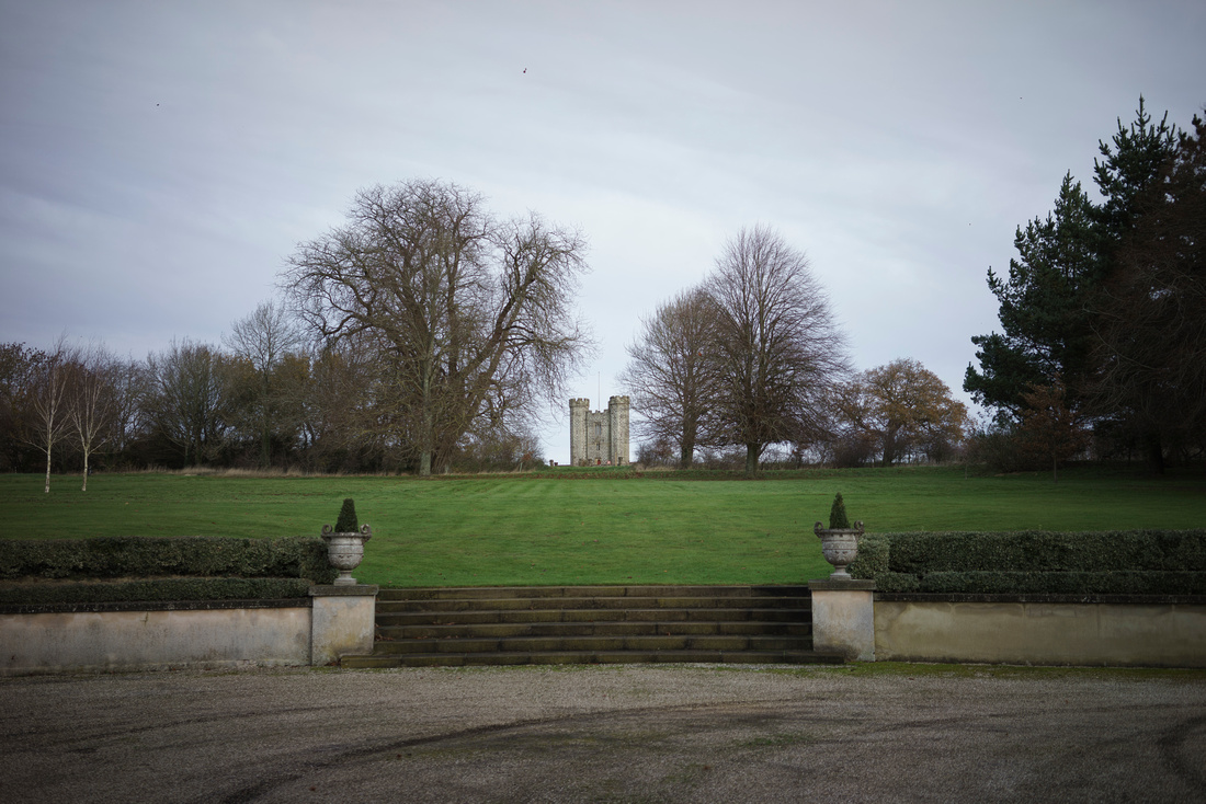
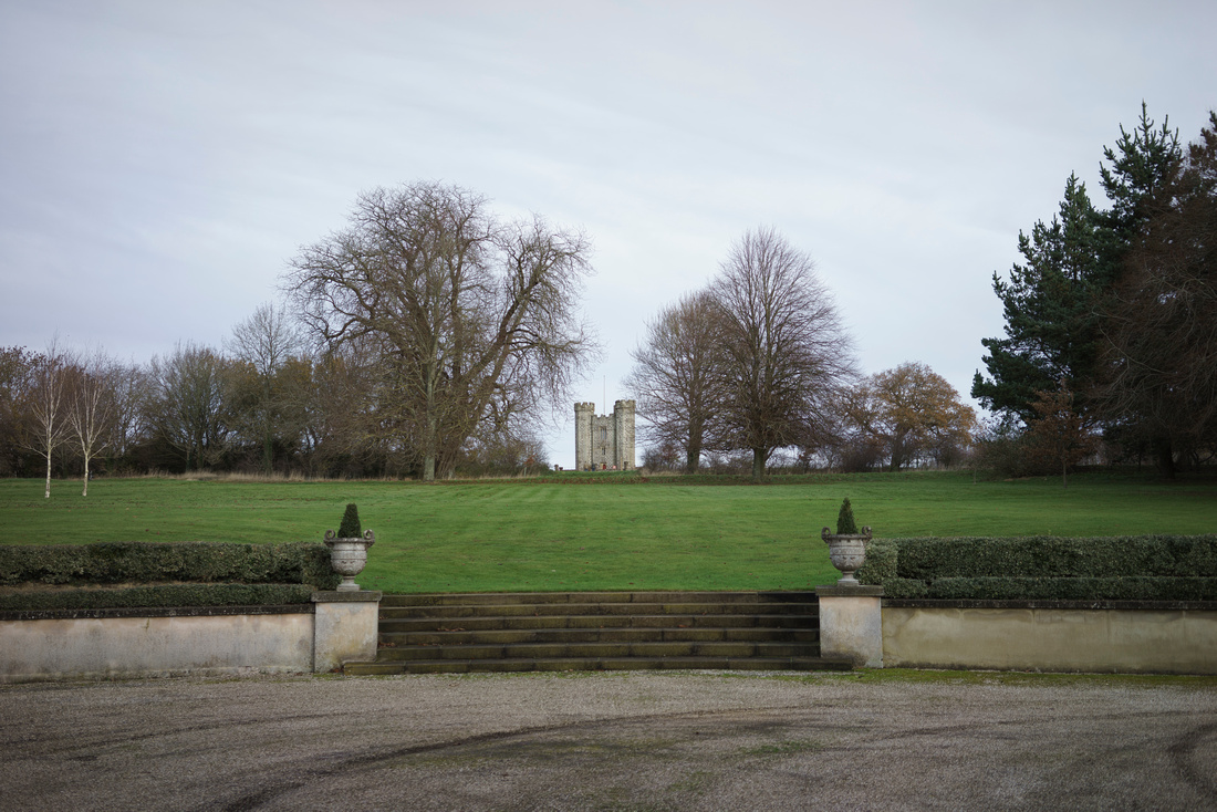
Let's see what this means for an average real-world file at F2.8, the aperture most badly affected. The following series of photos shows the same scene shot with:
In-camera corrections OFF:
In-camera corrections ON:
The first frame corrected with its own bespoke LCC profile using Lightroom's DNG Flat File plugin for both colour and luminance shading:
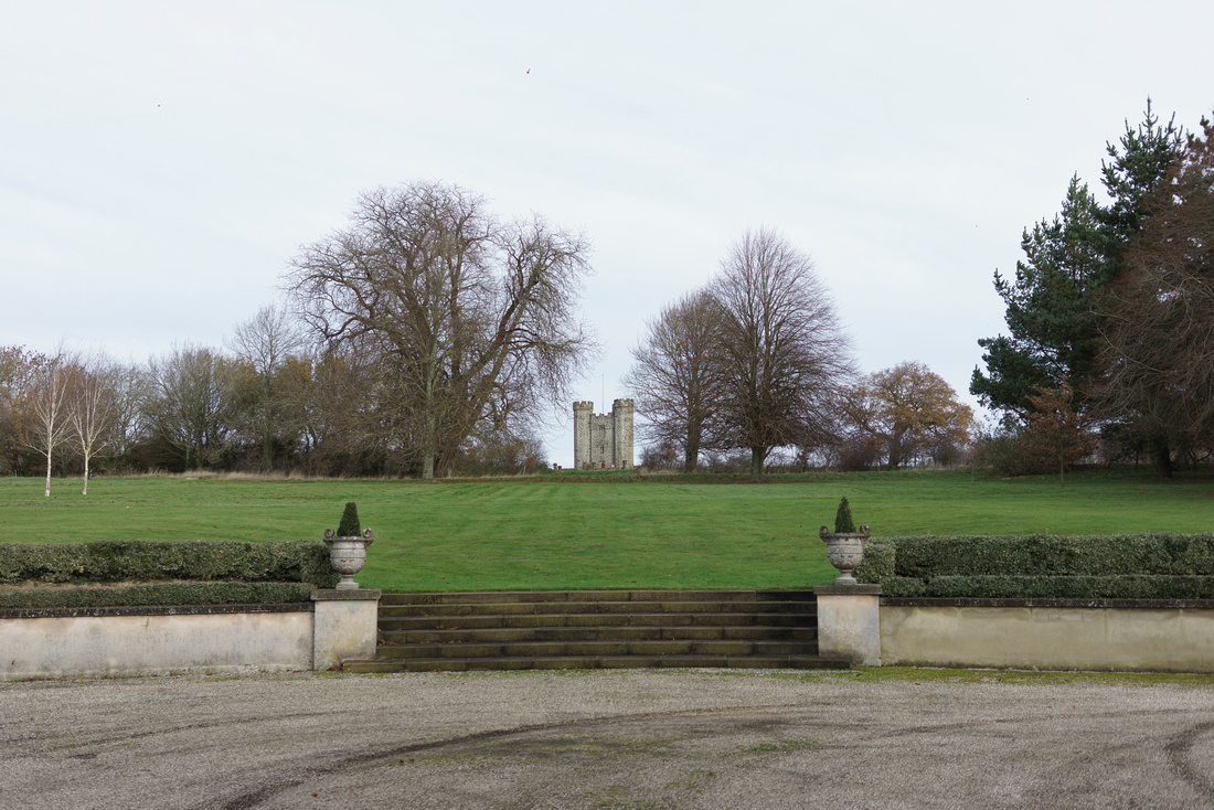
The second frame corrected with its own bespoke LCC profile using Lightroom's DNG Flat File plugin - note: this is a 'double corrected file' because I have added Lightroom Plugin corrections on top of the in-camera corrections:
Finally, the first frame (no in-camera corrections) corrected with LR Flat Field plugin but only for colour, not for luminance, shading:
Please note: this series of images is available here and you can download them at full resolution in Adobe RGB for more accurate assessment: Zenfolio converts the images on my blog pages to sRGB and that makes proper assessment from this page alone somewhat difficult.
Added 9th December 2103: notice that the first and last images in this series look very similar: this bothered me again and again. A correspondent suggested that there was no colour correction going on at all when using the in-camera 'shading correction' option, merely luminance shading correction. Then Lloyd Chambers noted something similar. I took another look and I have a call in to Sony engineers to try to get a definitive answer. Having found no useful answer in the manual I searched for another resource and found the online HTML manual which contains somewhat more detail: you can find it here and I quote from it:
"Menu item details
Auto (default setting):
Compensates for darker corners of the screen automatically.
Off:
Does not compensate for darker corners of the screen."
In other words, it seems that there is no claim that colour shading correction is going on at all.
I think the reason that I and so many people thought there was is probably buried in the mists of time: the RX100 and RX1 both had shading correction and reviews of them at the time widely considered them to be applying some color as well as luminance correction. It is easy to allow the evidence of one's eyes to back up the idea that a partial correction is indeed taking place because as luminance is lightened, the appearance of the intensity of colour shading is ameliorated. I hope to bottom this out with Sony in the near future but in the meantime, I can only suggest that if colour shifts across the frame bother you, you learn to shoot and deploy calibration frames as discussed elsewhere win this article. If I can get Sony's confirmation on this matter, I will re-write the relevant sections of this piece.
Now, everyone will have their own takeaway from this depending on their personal preferences. Mine is informed by the fact that different scenes are affected to differing extents and that one example is just that: one example. No general practice can be drawn from it. But I do have some general observations:
It would appear from a theoretical perspective that best practice would be to always shoot with corrections OFF in camera, then to make a bespoke LCC calibration shot for each frame and apply it later. Additionally, it would seem best to apply this calibration only to the colour shading and not to luminance vignetting: some degree of vignetting is usually pleasant and it is better to work with the natural shape of the vignette of the lens in question than to add vignetting back in Lightroom.
But there are some significant 'howevers': it seems to me that I, and I think most photographers, will find the in-camera corrections satisfactory most of the time. It also seems to me that carrying an LCC diffuser sheet isn't in the gestalt of the camera. Nonetheless I will generally carry one but unless I am treating the A7R like a Medium Format camera (when I write my review of it I will explain this deployment in more detail) I will shoot with corrections on and where I am a bit concerned about the susceptibility of the scene, I might either shoot a calibration frame at the time (note: if shooting with corrections ON you must shoot BOTH the image and the calibration frame with them ON) or use one from my library (again you will need two libraries: one with corrections ON and one with corrections OFF) in post, bearing in mind that library corrections are never as effective as bespoke ones but will often help 'enough'.
This seems to contradict what I said above about not adding corrections to corrections and about keeping the imaging chain as short and pure as possible. It does. But the downside is so irrelevantly small (at least at lower ISO) in my experience so far as to be irrelevant.
The takeaway?
- For most shots, leave corrections on but shoot an additional calibration frame if concerned
- For very critical shots, shoot with calibration off and and shoot a calibration frame
Focus
Focus speed and accuracy are, of course, a function of a system and not of a lens alone. My takeaway is that the speed of Auto Focus is gentlemanly rather than acute, but perfectly acceptable to me. I very, very often use MF in any event and, especially when used with the EVF and magnification, this system of lens and camera is the best I have ever used. For AF, select the smallest of the three available focus frame sizes so as to get optimal accuracy but do be aware that even with the small frame, the camera will sometimes choose something behind the subject. In cases where this is a risk, switch to MF.
Per tracking, I wouldn't bother with it myself. My preferred method is to turn peaking on and hit the shutter when the subject triggers the peaking.
Focus Shift
I won't bother to post the test results because at a few inches and a few feet, I see no measurable focus shift. There are shots in the gallery of a Spyder target and you are welcome to peruse them.
Flare
The weather here hasn't given me the cloudless sunny skies that one needs to fully test for flare but the following frame was shot with a very bright but slightly hazy sun in the frame. It shows that flare is very well controlled indeed. T* coatings are well known for their abilities in this regard but I give some of the credit to the weird and wonderful lens shade (shade rather than hood, because it fits more or less flush with the front of the lens) which is effectively a rectangular porthole through which the lens peers from a deeply recessed cavity. It is highly effective at protecting the front element of the lens, too.
Added 9th Dec 2103: I was shooting casually at a Christmas Fair this weekend and found the below effect, which is extremely unattractive: it is very reminiscent of the purple ghosting found when shooting the Panasonic MFT 7-14 F4 lens on an Olympus E-M1, which I am told is because of a difference in optical filtration approaches between the manufacturers, with Olympus filtering certain wavelengths in the lens and Panasonic choosing to do so on the filter pack. Whatever the explanation, I will be looking out for this in future with the 35mm F2.8 because not only is it irreparable in the RAW file, but in the Panny/E-M1 case it can show up in much less extreme circumstances (such as a church interior where purple ghosts of windows appear on walls some distance away) and can make the lens unusable in certain circumstances.
Resolution
I save this most important aspect of performance almost to last because it is a thorny and complex question and I am not certain I yet have the answer. This is due to some inconsistent results in my field testing. But I do have some preliminary thoughts and suggestions.
First, let's look at the MTF:
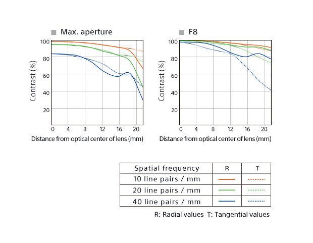
- The first thing to note here is the significant astigmatism between sagittal (here called Radial) and Tangential performance, especially in the MTF 40.
- The second is the generally wavy shape of the MTF 40 and to a lesser extent the MTF 20.
- The third is the fact that the general impression is of falloff towards the edges.
These factors are symptomatic of a complex set of design objectives and compromises and indicative of a hard lens to understand and, potentially, to work with - probably with compromised edges and corners and quite possibly with a wave-shaped field of focus.
The good news is that most photographers, most of the time, will find the lens a joy to use: it is always sharp on centre, usually quite sharp at the edges and sometimes acceptably sharp in the corners. It has lovely colour and contrast, very nice micro-contrast (not quite up to classical Zeiss standards but pretty good). You can use it as a point and shoot and it will rarely let you down.
The bad news is that getting to understand how best to sharpen the edges is a a frustrating exercise, and that in the process of learning, you will encounter slippery behaviours that seem to come and go at different apertures and subject distances. For example, the effects of the curved and possibly wave-shaped field of focus seem more pronounced at distance than at close range.
My copy seems to have a mild de-centering, within my tolerance (though I might eventually get it looked at) and most often not noticeable at all, so please take that into account when you look at the examples.
First, a close-range series: the scene looks like this, and clicking on the image will lead to frames shot at all significant apertures, with no distortion correction. For reference I post immediately afterwards an out of camera JPEG of the same frame to show you what distortion correction looks like for the lens. In the gallery, every shot is followed by an in-camera JPEG version of exactly the same frame.
My takeaways from this series:
F2.8 is a reasonable if not stellar compromise across the frame. Centre sharpness is good, edges better than I expected from the MTF and corners not at all bad other than the effect of my possible de-centering (note: de-centering sometimes makes one side look better than it otherwise would, at the expense of the other, and that might be happening here)
For the F4 frame, I re-focussed so as to be utterly sure that any residual focus shift was accounted for, and the centre is shaper but the edges are a touch worse. You might argue that this is due to the re-focussing but I don't think so: I think it is because the lens starts to exhibit field curvature as you stop down. Other series I have shot seem to bear this out.
F5.6 is great on centre and good or better elsewhere: the effect of extra DOF seems to fight the curvature, and win.
F8 is starting to show tiny, tiny diffraction effects over the frame but is still excellent - and my soft lower right corner is tightening up nicely with DOF
From F11 onwards diffraction takes more of a toll but F11 is still very useable if you need the DOF.
Now a more distant series (again, click for the full series, all downloadable at full size)
At F2.8 the edges are a little soft but when viewed at 50% on a 100DPI screen or printed at 200DPI, they might just pass.
At F4 things have tightened up a touch across the frame and resolution on centre is excellent whereas at the edges it is merely good. This seems the best aperture for a larger print
At f5.6 the centre shows tiny, tiny loss of resolution from diffraction whereas the edges grow more noticeably softer.
At F8 the central diffraction is more notable but detail levels are still pretty good. The edges remain a little soft.
F11 and 16 are progressively more of the same, however F11 gets a good balance between DOF helping the edges (remember, we suspect field curvature) and keeping good levels of centre sharpness. F11 has, if anything, slightly better edges than F4 and depending on your intentions, might even make a better print than F4, even with the slightly lower centre sharpness.
As we can see from the above, the prognosis at distance seems slightly different from that at close range. I will throw in here a series as above shot at a diagonal angle (click to visit the series) so you can make your own judgements about corner performance at distance:
For my money, F8 is the best compromise here but F11 follows closely. Taken overall therefore, my surprising conclusion from all of the above is that F11, despite the diffraction, is the best overall aperture for those wanting to make print that are sharp to the edges and corners at larger sizes. A touch of Clarity will tighten things up a little and there is the added benefit of there being less of an issue with colour shading at this aperture. My only caveat is that I have yet to determine to what extent the camera's 'diffraction reduction' technology is applied to RAW files. I doubt that it is, but I will investigate this in more detail in my upcoming review of the camera itself. In the meantime be aware of the possibility that the relatively good performance at smaller apertures might be getting a touch of Bisto.
BUT. But but but. That recommendation is for frames shot with focus carefully made on centre and this means that the field curvature that develops at F4 and F5.6, where centre resolution is best, will as above affect the edges. I have found that focussing a little further into the frame on centre will often let you have 'the best of both worlds'.
Here is an example. These two frames were shot at F5.6 with focus in different places: clicking on each will load a full-sized version in your browser and you can drop in into LR or Photoshop for comparison. Focus in the first is on the facade of the red brick building centre, and in the second is on the rectangular mesh rooftop structure far behind and slightly to the right. It shows some moiré on the mesh.


Overall, therefore, the lesson is 'know your lens' (or bracket focus!) if you want the best results. If you are mildly unfussy, any frame at F5.6 or F8 will likely give you great results. If you are very particular about your edges and especially your corners this might not be the perfect lens for you but with a bit of thought and effort, it could be.
I want to add here thoughts about two similar lenses. Firstly, the 35mm Zeiss F2 on the Sony RX1. This is an absolutely lovely lens, famous for amazingly sharp edges even wide open. I love it. But I would prefer to use the FE 35mm F2.8 for serious work because with effort I can get good edges and corners and do so without the midfield weakness that often afflicts the F2 lens. Not everyone will agree but for me, the FE is overall the more useful lens.
Next, the Sigma F1.4 35mm Art lens that I use on my Nikon D800. This is a lens that has gorgeous rendering wide open, but can be a pig to extract sharp edges from. Again, unless I were going specifically for the 'look' characteristic of the Sigma, I would find the FE lens easier to get sharp edges from. Your copies might vary!
Bokeh
An F2.8 lens is never going to be outstanding in this respect but I think the FE 35mm F2.8 does very nicely. Here are some examples:
Field of View
The lens is billed as a 35mm but I have my doubts. It certainly has a narrower field of view than my Leica 35 Lux or Sigma 35mm Art lens, I would guess possibly about equal to a 37mm lens but I have no accurate way of measuring this absolutely rather than relatively. JPEG distortion corrections knock a little more off this, as will RAW processor distortion corrections, pushing it further towards 40mm. No biggie, but for those for whom 35mm is not quite wide enough, this could tip the balance.
Form Factor
Small, almost tiny, and very light, this lens is well-made and has a funky and effective shade. I can't imagine it being improved on in any of these respects.
Conclusion
This is a cracking little lens. A lot is asked of it: it has to deal with the highest resolution sensor in the 35mm world, and do so with good performance across a wide range of parameters. It has to be sharp, contrasty, have good colour and micro-contrast, nice bokeh, have low aberrations and high flare resitance and yet be small and light and not too expensive. That's a lot to ask. Sony and Zeiss between them have done a really nice job and I enjoy the way the lens handles and the images it produces. My reservations are minor and are to do with the complexity of thought and practice needed to get the very best results from the it. This is not, however, unusual at this price point and so I consider the lens to be not only good, but also good value. My fear is that many users might be initially put off by the tangible weaknesses of corners and edges at some apertures, preventing them from realising the more subtle and balanced range of abilities the lens posesses.
My one wish is that Sony had decided to make a more expensive, more ambitious, albeit possibly slightly larger and heavier lens; one that was sharp from the edges wide open and to the corners by f5.6 and maybe had an F2 aperture. But that's just me: the truth is, Sony have pitched the system a fair bit lower in price than the D800E and made a choice of lens design to match. What is very good news is that this lens on this camera produces results that stand shoulder to shoulder with the similar focal length options I have tried on the Nikon but for less money and at a far lower excess baggage charge. Some of this is achieved by diluting the purity of the lens design proposition in favour of sharing the load with a certain amount of help from in-camera processing. I don't care, the results are good.
Aaah… Bisto! My dirty secret. These days, I use it too...
This site is not for profit but I do support the charity Photovoice. I wrote about it in depth a while back and that article is here. If you have found this article useful and are feeling generous, I would hugely appreciate a donation to the charity, even just a pound or a dollar: every little helps. You can donate here and the Virgin Giving site is secure and takes cards and PayPal. The Gods of Great Photography will smile on you if you donate. I promise.
please note: this review refers only to the use of the lens on an a7R. The A7, which I have not tried, has a different sensor with different 'toppings' and the in-camera corrections will be different as a result, as will the results of shooting tests. My guess, for what it is worth, is that the lens will be even better on the A7.
]]>I am glad I said that because now the A7R has come forth, it turns out that half my M lenses are effectively un-usable on the camera, and of the rest, all but one are marginal or compromised. As expected, colour shading issues plague the files but with most lenses corner and edge sharpness is not as bad as some people feared and is, at least on some lenses, not notably worse than with an M240.
I am writing this piece to share some thoughts and give access to test images I made for my own use, rather than as a scientific proof of any particular opinion - so please take it as such. But my own future usage will be dictated by the results shown in this gallery. There are a lot of images in it, and though I have labelled those which are of diagnostic use and where the EXIF doesn't contain all the required information, you might have to dig around to find the files you want. I apologise for this but I am pressed for time at the moment and I am also working on a more in-depth review of the camera itself.
That review will have to wait for its completion until such time as my FE mount Sony Zeiss 35mm F2.8 arrives: I don't see the point in writing a review of a camera until I have been able to use at least one lens designed specifically for it. But in the meantime I will say the following:
- The file quality is great but is not, to me, as good as a D800E, despite being based on the same sensor. It is close, but there is more shadow noise.
- The ergonomics aren't too bad but are a mish-mash of consumer and professional aspirations. In particular, the implementation of Auto ISO isn't great. Better than many, but not as good as it should be and indeed with some small firmware tweaks, could be.
- This camera would really, really 'knock the ball out of the park' if it had EM-1 style IBIS. As it is, you will need to use 1/(3 x focal length) as a shutter speed if you want high levels of confidence about shake. You will often get away with less, but don't rely on it.
- Some of the PlayMemories Camera Apps are not yet released and the most exciting, the Lens Correction app, looks promising only in some ways: it will be able to write the corrections into the RAW file (good) but from my reading, will not be able to deal with colour shading issues unless they are simple, linear and symmetrical. Which they often aren't.
- The ability to send a file via Ad Hoc Wifi to an iPad (in other words, no external network is required) is crippled by the fact that the file sent is only 1616 x 1080 pixels and I can't find a way to change that. Also, setting the system up is a mindf%@£k
- The manual is a disgrace. The worst, most incomplete and inadequate I have ever seen. Sony goes from treating its customers like children to treating them as if they were psychic geniuses.
- Sony's IDC seems to me (when I can briefly get it to work without crashing) to be a pig without lipstick.
- Lightroom 5.3 RC is the only mainstream RAW converter that currently converts the files. It gives hard edges quite a pronounced jagged appearance and I don't feel able to assess image quality fully until it is out of beta.
Back to M lenses. Given that Sony have taken the unusual step of releasing a camera that has no native lens availability (though some are now arriving) there is a huge adaptor frenzy going on at the moment, with people creating astonishing Heath Robinson setups of obscure lenses on often bizarre adaptor combinations. It's all great fun and some people seem happy with the results. My own experience has been only with M lenses and is as follows:
18mm Super Elmar suffers very intrusive and complex colour shading and it never cleans up enough for serious use, at any useable aperture. Here it is at F3.8 and F8:


Additionally, it requires F11 to get the corners acceptable, by which time it is diffracted. Even at F8, the edges are only just acceptable to me.
The 28 Cron is less badly afflicted by colour shading but it is still too strong for me to want to try to work with. Here are F2 and F8 examples:


In terms of resolution, again F8 is required for a goodish edge and F11 for a sharpish corner. Another 'also ran' on the A7R then.
The 35 FLE has notable casts but you might get away with it at F5.6, which aperture is the first to also show good edge sharpness. F8 is into diffraction territory but not badly, and will generally give an acceptable corner. Not a bad result and the look of the files can be gorgeous, with very good separation of planes - but only at those apertures where the colour shading is a problem. It also has a wavy field of focus, which doesn't suit my style but is ameliorated by the A7R's flexible focus point - something you can't say about the M240. But the lens does, at F8, provide a better overall performance than my Sigma F1.4 35mm ART lens when used on a D800E so it will have its uses, though if the FE3528 is good, I won't need the Leica lens.
The F1 Noctilux was never going to be a 'technical' lens on any camera. It has very severe vignetting on any full frame camera when shot wide open, and it also has notable colour shading on the A7R. Here are some examples at F1 and F8:


The lens requires F8 to F11 for good sharpness across the frame but that isn't really the point of this optic: it has a gorgeous, sexy, dreamy rendition on any camera and I can live with the colour shading issues by using it for B&W up until F5.6 and crossing my fingers thereafter. Always a keeper, the F1 Noctilux is my main 'cold dead hands' lens.
The 50 Lux Asph again has 'liveable with' colour shading. Here are F1.4 and F8 frames:


In terms of sharpness, the 50 Lux has some mid-field issues that mean that F11 is required for cross frame performance that pleases, but, crucially, both it and the Nocti have less diffraction than I would expect at this aperture on this camera and I would happily use either. Another keeper for now, but I will see how the FE5518 does before making a final decision as to whether the Lux gets used on the A7R.
The 90mm Macro Elmar is one of my favourite lenses with pretty much any camera it mounts on. Colour shading on the A7R is a non-issue and sharpness seems good across the frame - I have not shot Test Shots as such, no brick wall types, because it was evidently just fine in normal use especially at F5.6 and pretty good at F4 and F8. Bit of CA, which cleans up nicely. The only 'buts' are that the use of magnified focus is tough with an unstabilised lens of this length (the subject is very jiggly and there is some Jello too) and that you will need at least a 250th and even that does not always work perfectly. But it is a small and lovely and light lens and very useful.
All the above lenses, with the exception of the 90mm Macro Elmar, have CA issues at wider apertures but they are all 'dealable with' in post, except for the Nocti at F1 thru F2, where the fringing is so wide that to remove it is to fundamentally alter the shot. Again, B&W only at these apertures.
Overall, then, a predictably mixed bag of results but I would say about as good as I hoped and not as bad as I feared: none of these lenses seem, in terms of sharpness and the apertures required to achieve it across the frame, to differ very greatly from their performance on the M240. The bummer is that Cornerfix seems not to work well on the files in my efforts so far: in fact it makes the results worse. There are other, more labour intensive ways of dealing with the colour shading but that is IMHO a slippery slope...
What I would certainly say is that if you already own a bag of longer M lenses but can't afford an M240, the A7R is an interesting and useful option. But if you can afford an M240, it's a better choice. However, if you are starting from a blank sheet, you would not assemble a system of A7R and M glass.
Similarly, be aware that adaptors of any sort introduce further problems: they involve another set of joins that are subject to tolerances and potential errors; they run the risk of losing functionality such as AF, IS and Aperture control; they are mostly going to be so large as to obliterate the size and weight benefits of the small A7R body.
In summary: unless the first FE lenses off the production line (and crucially, the 24-70) are very good and are quickly followed by more choices, or unless you want to use very particular legacy lenses for very specific looks or purposes, you'll be better off with a D800 if you want 36mp. For now.
Added Nov 3rd: Please note, I have been experimenting extensively with the Adobe Lightroom DNG Flat Field Plugin and it makes for a much simpler and more effective way of dealing with these colour shading issues than any other I have yet found. Even files shot with in-camera shading corrections turned ON and even when shooting with a the native FE mount 35mm F2.8 lens, there are residual colour problems at wider apertures that benefit from this treatment. I will cover examples and workflow suggestions in an upcoming article on that lens.
This site is not for profit but I do support the charity Photovoice. I wrote about it in depth a while back and that article is here. If you have found this article useful and are feeling generous, I would hugely appreciate a donation to the charity, even just a pound or a dollar: every little helps. You can donate here and the Virgin Giving site is secure and takes cards and PayPal. The Gods of Great Photography will smile on you if you donate. I promise.
"Since we're all having our 2 Cents, here are mine:
Cindy's file does indeed seem to have a tiny, tiny, tiny magenta issue. It is absolutely within 'normal' variance for almost any system.
By 'system' I mean 'soup to nuts' - from lens to sensor thru RAW pp to display thru to eye and brain.
As other people have noted, normal vignetting can create small colour shifts, as can the natural variance of colour in a sky, and the uneven distribution of IR and UV across a sky, especially when taken into account with the amount of filtering on lens (screw-on and coating) and on sensor.
Then there is the fact that even very good monitors can have uneven display colour and brightness. I, like Jono Slack, have rather slacked off the frequency of calibrating my monitors because even when freshly calibrated, my 30" Cinema Display, when viewed next to my Eizo 30", gives the game away: the Apple display is blue and the Eizo is red, relative to each other. Viewed alone, each looks very good.
Next is the issue of the normal variance of human colour vision. Naturally the medical profession has decided to categorise and pathologise this, preferring to see it in terms of Norms and Abnorms rather than variance, though countless studies have shown that 'colour blind' people can determine patterns that 'normal' people cannot, and can often distinguish colour variations that 'normal' people cannot. Variations in abilities are what sustain populations, let's leave it at that.
Next, the fact that we perceive colours culturally and with gender bias. We are all familiar with the complaint that asian manufacturers favour certain skin tone renditions that look odd to western eyes. We are also aware that females, (and experienced male photographers!) are more likely to be able to use accurate language to distinguish between magenta and pink, or purple, mauve and violet. Using accurate language places a requirement on the speaker to perceive more diligently: my colour vision has become a lot more accurate since I started trying to see accurately, rather than seeing like a British boy raised in the 60's when knowing the names of anything other than red green and blue would cause a large pink question mark to appear over your head...
In every step of the imaging chain, in every situation, there is room for variance from what is 'true', 'accurate' and 'normal'. Your file is very comfortably within the sum of those variances IMHO. And when something is clearly wrong it is clearly wrong - such as the colour casts in this white frame from an 18mm Super Elmar M on an A7R - it will be obvious:

Additionally you will not, ever, accurately bottom out (let alone be able to eradicate accurately in post) a colour cast with a shot of a blank grey sky or a white wall. The light falling on a wall will be almost impossible to get perfectly illuminated and, unless lit by very accurately temperature controlled flash, will be subject to the same variances as a sky. To do this properly (and even then not 100% reliably or accurately) you need a Lens Cast Calibration sheet as used by MF shooters. They cost a few dollars and save a lot of time and yet very few people bother to source them. If you use one, you will see that, for example, a file from a Sony RX-1 with in camera colour shading corrections turned on still has some colour shading. And that is a camera with an extremely closely tuned ecosystem of sensor, lens and bespoke processing.
Most work does not require perfect colour accuracy. Photographers who work in fields where it does, do not use zooms with adaptors on what are fundamentally consumer cameras.
Inaccurate colour renditions can be part of a photographer's style.
There are highly successful artists, in both photographic and other media, with highly personal colour vision - and yet their work can be enjoyed, like the work of a deaf Beethoven, by a wider audience.
Rant over. The file is fine."
In truth, film speed itself was, though not generally treated as such at the shooting stage, a semi-variable: one made an educated guess at the time of loading the camera as to which film speed would likely suit the anticipated shooting conditions and took it from there.
Very experienced photographers would treat ISO as a much more freely altered variable. A film could be pushed or pulled during processing, for example, or it could be swapped for one of different sensitivity by rewinding a half shot roll and replacing it as desired. But it was never a truly variable variable. You couldn't change it immediately and frequently at will, on the fly, with the same ease as you would change aperture or shutter speed.
It seems to me that this mode of working, this mindset, has permeated the design of digital cameras and that the time has come to change this, for good, much more comprehensively than any manufacturer has yet been willing to attempt.
A recap:
Shutter speed is varied according to whether one wants to show or hide movement, and to reduce or eliminate camera shake, especially with longer lenses.
Aperture is used to control depth of field or to enable a lens to be used in its 'sweet zone' of sharpness.
ISO is not varied for its own sake: in the great, great majority of use-cases it is desirable to shoot at the lowest ISO possible given the requirements placed on it by the primary needs of shutter speed and aperture. One will almost never choose, on purpose, to shoot at a higher ISO than one needs. There may be rare decisions to shoot high ISO for creative reasons but they are rare indeed and largely obviated by post processing possibilities. Most modern sensors can be effectively regarded as "ISO-less" (shooting at base ISO and then applying push and pull to the processing of the signal to achieve apparent ISO variation) and in practice this means that for every extra step of ISO the photographer is forced to use, a step of DR and colour fidelity are lost. Very good sensors can hide this quite well up to what would, historically, have been regarded as impossibly high ISO levels but it is nonetheless generally true.
So though ISO is the 'poor cousin' of the three variables in terms of its apparent creative flexibility, it is the 'enabler' for the other two variables and as such, a system that allows it proper levels of automatic flexibility benefits them greatly. The trouble is, no one has yet come up with an algorithm for controlling this that adequately mirrors the decisions a photographer would make.
Of course there is now a fourth variable, Image Stabilisation, which can affect the required formula and I will take that into account as I describe the system I would like to see.
First, examples of the best and worst systems currently known to me.
The best is in the Nikon D800/E. The photographer has the option, in setup and menu, to choose a maximum ISO and to decide a minimum shutter speed. This can be a fixed speed, such as 1/100th sec, or a relative speed rated as Slower, Slow, Normal, Fast and Faster. Normal equates to approximately the old '1 over focal length' rule, so if the mounted lens has a focal length of 50mm, the shutter speed will be around 1/50th Sec. But wisely, Nikon allows for the fact that a high resolution sensor generally requires two or three times that shutter speed if used without a tripod and if optimal results are to be achieved. But the Faster/Slower system also allows a photographer to take account of whether stabilisation is being used, and to make adjustments based on personal factors such as whether the shot will be well braced or not and whether the photographer has steady hands, or is shivering with cold or being buffeted by wind. So the system is pretty flexible, but to my mind still requires too much intervention: if switching from a stabilised to non-stabilised lens, for example, one has to delve into menus to make parametric changes.
The worst I can currently think of is that in the Olympus E-M1. This otherwise excellent camera holds one major trump card over its larger sensor competition: In Body Image Stabilisation. Doesn't matter what lens you have mounted, IBIS gives you up to five stops of improvement - and it works. However, the Olympus Auto ISO system insists on using a minimum shutter speed of approximately 1/effective focal length. So for example, shooting a 40mm lens, which equates to 80mm in the traditional sense of Field of View, will cause the camera to select a higher ISO whenever the shutter speed threatens to drop below 1/80th second. However, shots can easily be made with excellent sharpness at 1/10th of a second (often lower) due to the IBIS. In effect, this means that the camera will often shoot at ISO 800 when it could be shooting at ISO 200 - and this completely wastes the advantages conferred by the IBIS and results in too many shots taken at too high an ISO, in which range of operation the E-M1 rapidly becomes less convincing than cameras with larger sensors.
I have noticed with the E-M1 that the effectiveness of its IBIS varies with focal length: with wide angle lenses it really does offer up to five stops of stabilisation but with the Panasonic 100-300mm zoom mounted and shot at the longer focal lengths, one generally does need to shoot at '1 over focal length'. In other words, the camera defaults to the 'worst case' scenario when it could quite easily be a lot more generous with some focal lengths than with others. I have explained, in my recent review of the E-M1, how to work around these problems but the solution is clunky and IMHO should not be necessary.
The Leica M240 suffers a different problem: it will often choose the nearest shutter speed to the 1/focal length formula but is quite capable of 'rounding down' to the nearest shutter speed it offers, even though the high resolution sensor generally requires around twice the shutter speed indicated by the 'old rule'. It really is as if the Leica engineers have not fundamentally thought about anything for about forty years.
The Sony A7r does not initially look promising: its Auto ISO system apparently also works on a 1/focal length rule though I hear that requests have already been put in to Sony engineers to look at this again. My guess after limited shooting time with the camera is that it will generally require twice the focal length as a shutter speed, possibly three times because the mechanical shutter has a hefty clunk to it.
However, it is possible to shoot the Sony in what might be called 'Shutter and Aperture Priority'. In other words, the photographer selects Manual Mode and sets the shutter speed where required for stabilisation and subject movement needs. The desired Aperture is then selected and the camera will vary ISO accordingly, taking all the strain of variability and acting, as it should, as the enabler for the two creative variables. But, and this is absolutely key, the manual Exposure Compensation Dial can be used in this mode (unlike with the E-M1 which requires a clunkier and more time-consuming workaround) so that one can choose to have the ISO automatically adjusted taking desired compensation into account. Excellent.
This Sony system is as close to what I would like as I have yet seen. But I still think manufacturers could do better. The system I would like is as follows:
The photographer sets 'broad use' parameters in the menu system. These include Max ISO and optionally Min ISO, and then, crucially, 'multiple of focal length' (similar to the D800 but more explicitly) for TWO shooting scenarios: with and without Image Stabilisation. The photographer can then choose to have, for example, '1/focal length' to be the rule governing stabilised shooting and, say, three times that shutter speed for unstabilised shooting. The camera knows whether stabilisation is present or not, and adjusts the shooting rule accordingly. Then, without leaving Aperture Priority mode the photographer can shoot, with or without exposure compensation, and always have the camera select combinations of shutter speed and ISO that achieve the desired aims.
This system would work best for systems with lens-based stabilisation because those systems are more finely tuned to individual focal lengths. For IBIS systems such as that of Olympus, where stabilisation seems to offer fewer stops of assistance at longer focal lengths, further parametric or automatic systems could be put in place.
For now, I am looking forward to shooting with the Sony system: it seems a good way of achieving my aims. But I do wish that camera manufacturers would finally get over their 'film hangover' and, instead of offering me an endless array of 'Granny by Moonlight' or 'Snow on the Beach' modes, get Auto ISO right.
Doing so would very often save a stop or more of ISO and would, in so doing, add more to IQ than another year or two of sensor development.
What do you think?
]]>I'm not going there: I am not sure I understand the various dial'n'button combinations myself, let alone possess sufficient knowledge to explain and asses them in detail. So instead, this mini-review is going to take the course of a meandering stream, taking in various scenes and vistas but going nowhere fast. Sorry! But on the bright side, DPReview and various other sites have already posted pretty exhaustive analyses if you need to see a breakdown of the Menu structure or a comparative analysis of high ISO performance.

Let me begin with a mildly controversial observation: despite the fact that the sensor in the E-M1 is (one of) the best seen in any MFT camera to date, it is only, just, barely, 'good enough' for me. Very often the files look great, really surprisingly good and a great testament to progress in sensor design. But sometimes, even at ISO 200 and correctly exposed, they are really straining to satisfy let alone impress. Like a teenager going to his or her first big 'do' they look convincing only from a distance: close-up inspection reveals a child in adult clothing, a pretender, a wannabe. In fact on some frames, a 100% view of the file looks more like an RX-100 file... more like a very good compact than a professional grade camera.
I have thought a fair amount about when and why this is a problem and I look at it like this: take the current 'best of breed' sensor in the sub-medium format sector, the D800. Then compare it to the E-M1. The E-M1 sensor is physically 26% of the size but has fewer pixels. I can't find reliably exact data but as a rough estimate, the pixel pitch of the D800 is 4.9µm and that of the E-M1 3.7µm but in addition, one in sixteen of the E-M1 pixels is given over to phase detect AF and has no recordable light gathering abilities. You might therefore argue that the effective pixel pitch is more like 3.5µm. In other words the 'adjusted' pixel size of the D800 is around 40% larger and, importantly, many people already regard the D800 sensor as a 'oversampling' device. Compare the Oly sensor to the pixel sizes offered by full frame sensors in the 18 to 25mp range and it becomes clear why it has a comparatively modest DXO score. You can't beat the current rules of physics.
ISO 8000 with a lot of processing!
Whatever the exact comparative numbers, it is clear that the Oly has notably smaller pixels than those of the true Pro category and that some of them are given over to AF, which means that processing the signal off-sensor requires even more interpolation than a traditional de-mosaicing algorithm. This doesn't mean that the results aren't impressive: they generally are. But it does mean that they can't be relied upon to be impressive when the going gets tough. And even with the wind in the right direction, there can be something a little unsettling going on 'under the hood'.
Here is a (rather boring!) example: this frame was shot at ISO200 and reasonably well exposed - it has a good looking histogram, though was not exposed 'to the right' because I wanted to preserve some sky detail. If you click through and download the larger, 2304 pixel (50%) size, you will see that the OOF grass areas are quite 'digital' looking - and not in a good way. Remember, this is when viewed at 50% size, equivalent roughly to a 23" print.
The file was developed in LR with sharpening of 50/07/70/20 which is my standard input sharpening for low ISO files from this camera and somewhat lower than I would like to be able to give it.
Clearly this is no train smash. It's pretty good given the constraints of sensor size and it would make a perfectly reasonable print at 20". It is, for me, 'good enough' - but not by a wide margin and as I have said above, that margin deteriorates fairly quickly as the shooting conditions worsen.
So that's the 'less than great' news. The good news is that this rarely matters at all, for several reasons:
- Any subject matter with some detail for the sensor to 'get its teeth into' will mask this effect very well. I have any number of frames of complex, in-focus textures which could be from a cropped D800 frame. In fact I have a lot of wow! I had no idea MFT could look this good frames.
- At a print size of 20" or smaller it is so rarely an issue as to be largely irrelevant to me.
- The in-body IBIS is so good (there's a fly in this ointment that I will later come to) that even with an F2.8 max aperture lens in really quite low light, I have been able to stick to low ISO shooting nearly all the time. In fact with a very wide lens such as the Panny 7-14 or a fast lens such as the Panny 20mm F1.7 I have been able to shoot inside cathedrals on cloudy days at ISO 200. Sports shooters will see this all rather differently though!
- The shadows in E-M1 files are much cleaner than I was expecting.
My final (for now!) take on the sensor IQ of the camera, therefore, is that for 90% if the conditions under which I am likely to shoot it and 95% of the print sizes I am then likely to want from it, it is at least good enough and often much better.
Sensor IQ is only part of the equation however: what about that other vital part of the imaging chain, lenses?
Readers of this blog might have already seen my review last week of the new Olympus 12-40 F2.8 zoom. It is a very fine lens indeed. In that review I observed that larger sensored cameras often have problems with the availability of good mid range zooms. There isn't a 'mid' for Nex that convinces me and after much experimenting with full frame, the best I have tried is the 24-70 F2.8 on Nikon. That is a very good lens in almost every respect but it has one major flaw, which is its performance at the widest end, which doesn't sharpen up to the edges until after diffraction has dulled the centre. Even at 28 and 35mm it still needs stopping down to give what I consider acceptable sharpness across the frame.
People will no doubt observe that a slightly soft edge at 36mp is often very acceptable when down-resed. I have done it and in brief, for a 24mm FOV shot I would prefer to use the E-M1 with 12-40 than the Nikon system if my aim was for a 20" print with good edges. The system is better for this purpose. And whilst it is certainly true that at longer parts of the zoom range the Nikon system will give overall better results (more and bigger pixels and a lens that has hit its stride) this does, for me, mean that for most of the use-cases where I want a mid-range zoom I choose the Oly system and not the Nikon. My need for clean edges at 24mm FOV is more pressing than my need for huge prints in the rest of the zoom range.*
So for me, the E-M1 has ousted a D800E for really quite a lot of the time despite being less objectively capable most of the time. It is as simple as that. Olympus has worked out something that has evaded Sony and some others for ages now: a lot of photographers are buying an entire imaging chain, not just a great sensor and making a really good lens in a key focal length range can obliterate a host of other advantages. An imaging chain is only as good as its weakest link. You would think this to be self-evident.
On the subject of other lenses I will remain delphic, not out of hidden wisdom but out of almost total ignorance. People say that the 75mm F1.8 is wonderful and I have received a number of other tips which I am on balance not likely to follow: the scope of this system, for me, is for travel/casual/walkabout/bad weather use and that mostly means mid-range zoom. Honestly, if I am going to a particular place on purpose to take the best quality images of it I can, I will much more likely take a D800 or IQ180 system, depending on how far it is from the nearest car park...
I have, however, tried various of my legacy lenses and there are some interesting finds:
- My Leica M 50 Lux with adaptor has very soft edges despite the large size of its imaging circle compared to the sensor size of the E-M1.
- ADDED 7th Nov I have tried my treasured Leica M 90MM F4 Macro Elmar with a Novoflex adaptor and it is easy to focus and gives sharp corners and edges from wide open. Great result. This is such a tiny, light, high quality lens that it will make a useful travel companion but I will test if further for colour shading and CA before using it 'in anger'. I will report back in more detail.
- My Panny MFT 100-300 is useful at a pinch but frankly is outclassed by the sensor. Often it gives very nice results but often it is visibly stretched. Emergency use only, really.
- My Panny 7-14 is as beautifully sharp and easy to use as ever, a lovely lens. It is, however, of limited use on the E-M1 because it is very prone to purple ghosts of bright light sources in the frame. To me, this gives the lie to the MFT consortium hype. I will return to this. This lens also first revealed to me the idiocy of the E-M1 Auto ISO system, a topic to which I will also return...
- My Panny 20mm F1.7 is also as sharp as ever, a great lens - but again, colour aberrations are strong and are not corrected in-camera though they can be satisfactorily dealt with in Lightroom.
I will probably try the Oly 9-18mm and I will certainly buy their new Pro 40-150 F2.8 when it launches but otherwise I have no desire to get into the rest of the lens range: for me this is not a broad system camera, it is a great way of covering the FF equivalent of 18-300mm with good quality stabilised zooms in a lightweight travel and walkabout system. For 'proper' systems, if you have the financial luxury of owning more than one, there are bigger and better choices with bigger and better sensors.
Let's take a quick look at the Purple Problem on 7-14mm Panny. Here are two examples:
Even at web sizes (and by clicking the images you'll go to a gallery that gives you the option of downloading them at 50% of original size) you can see the purple stains that this lens produces so often on the E-M1. It is really annoying because it is a tremendously impressive piece of glass but truth is, you just can't trust it on the Oly.
This leads me to a whine: the MFT consortium was originally set up with the apparent consumer benefit of interchangeability of lenses and bodies between participant companies. It just doesn't work and a lot of the glass I purchased in the belief that it would will now need to be sold. This is particularly annoying because MFTs design philosophy is to do 'less in the lens and more in the processing' - in other words, lens designers can, whilst making their usual set of compromises, afford some laxity on things like distortion and aberrations knowing that they will gain size and weight benefits or higher maximum apertures. But that does depend on the 'problems' being corrected in camera and the fact is that MFT cameras will correct other manufacturers' distortions but not their aberrations. The purples you see above are essentially uncorrectable in post. I don't know how Panasonic manages to do in camera what can't be done in Lightroom but for whatever reason it is very irritating. Beware, therefore of buying into the E-M1 if you are an existing Panny user with a bag of lenses (or vice versa) because it might not work well for you.
Next up: the farrago of the E-M1 Auto ISO system.
As noted above, a major saving grace of the E-M1 is the IBIS, which allows for much lower ISO values to be used than you might expect. This can, in many use-cases, do a lot to level the playing field with other, larger sensored systems where certain key lenses (the Nikon 24-70mm F2.8 for example) do not offer stabilisation. And yet Olympus has decided to use an Auto ISO system that seems determined to stop the user from benefitting.
The D800, for example, allows you to specify whether you would like normal, fast, faster, slow or slower as your shutter speed when you are configuring your Auto ISO behaviour. An example: with a 24mm lens it will allow a shutter seed of 1/25th if you set normal. If the light is too low, it will up the ISO for you. But if you set the option to Fast, it will allow no lower than 1/50th, and Faster allows 1/100th. Smart, eh? This allows the user to decide based on the size, shape and weight of the lens, on his or her own tendency to shake, and on the degree of perfection of stillness required in the shot, what level of shutter speed protection is required. The Oly offers no such option. Instead it relentlessly chooses shutter speeds far higher than are actually needed and therefore habitually selects too high an ISO, thereby pissing away the advantage that all that technology should be giving it. Madness. It generally selects a shutter speed of 'twice the focal length' - so for a focal length of 40mm results in a minimum shutter speed of 1/80th**. In an unstabilised system high resolution digital system it is considered good practice to do exactly this - but the IBIS is claimed to offer several stops of benefit!
I have found a good workaround. I set the camera to Manual mode, then use the Button/Dial/Lever configuration to give me a setup that allows the front and rear wheels to control shutter speed and aperture. I then set the rear dial, when used in 'selector switch two' position, to give me control of ISO. I then choose my preferred shooting aperture, set the shutter speed to the lowest I can confidently get away with with IBIS on, then flick the selector to position 2 and use the ISO control to change the exposure. Doing it this way allows you to see in real time a readout of your under/overexposure and so you can effectively use the ISO wheel to control exposure compensation. But it shouldn't have to be this way: it is fiddly, stupid and annoying.
Talking of control wheels and switches and menu options... ugh. The camera is touted by its fans as being endlessly configurable. It isn't. It allows for about a billion different configurations of its many dials, switches and buttons and even for a very experienced photographer it can take a very long time to find one that suits them. Now this would be fine were it as configurable as one would like - a fair price of steep learning curve in exchange for ultimate personalisation. But I keep finding simple things that I would like to be easily able to do that I cannot easily do. For example, I always shoot RAW and I nearly always shoot AUTO WB, knowing that I am going to tweak in post anyway. Not wanting to control WB in camera often, I would like to configure the control wheels so that neither of them changes WB. But it can't be done unless you also lose wheel control of ISO. Which means that I spend my life accidentally changing WB. Grrrr.
But the biggest 'switch and dial' gotcha is the positioning of the power switch on the left rather than the right of the body. If I ever give up on the E-M1 it will be for this reason. My muscle memory, deeply programmed by almost every camera I have owned, is to lift the camera to my eye with my right hand whilst simultaneously using my right index finger to turn it on. With the E-M1 this is not possible. Try telling that to my autonomous nervous system...
Finally, a mildly philosophical observation: the E-M1 doesn't know who it is for. In an effort at at capturing every possible user segment, it has piled in a load of stuff that I and a lot of other people will not use. In-camera HDR, 'Art' filters, Scene Modes, Picture Stories - all sorts of low-end consumer bollocks that gets in my way. It gets in my way on the buttons and dials and it gets in my way in the menus.
Now I know that this all costs nothing significant for Oly to add, and might well broaden the appeal of the device so much that the extra sales cause unit costs to plummet, benefiting me. I do understand. But it it still really irritating and it makes the camera rather schizophrenic: one minute it's a hardy, fast shooting, built-like-a-tank pro machine for those who want to travel light - and the next minute it's a Fisher Price device for near-children. Sometimes I just have to hold my M240 for a minute to sooth the irritation.
With all that off my chest, it is back to Praise Mode for my conclusion.
The camera is mostly gorgeous, mostly perfectly balanced and thought out, mostly excellent at what it does and mostly, as I have argued above, at least 'good enough' in terms of IQ. Paired with the excellent 12-40 F2.8 zoom it provides me with something I have never before found: A small and light camera that lets me do almost anything I want in any weather and get results that meet my minimum requirements.
Honestly, if it weren't for the above mentioned lens, I would enjoy but not keep the E-M1. And if the Sony A7R is as good as I hope (it might well be) and their stabilised F4 24-70 zoom is as good as I need (frankly I doubt it will be) then I might have a difficult choice to make. But at least for now, Olympus has provided a system that does, for me, things that no other system can do.
If, for this reasonably dedicated photographer, the E-M1 and its attendant cast of lenses can crowd out a Nikon D800 system for a lot of uses, then Micro Four Thirds can indeed be said to have come of age - for me. And I suspect for quite a few others too.
This site is not for profit but I do support the charity Photovoice. I wrote about it in depth a while back and that article is here. If you have found this article useful and are feeling generous, I would hugely appreciate a donation to the charity, even just a pound or a dollar: every little helps. You can donate here and the Virgin Giving site is secure and takes cards and PayPal. The Gods of Great Photography will smile on you if you donate. I promise.
* there's a thread on Reddit at the moment that clearly demonstrates how keen people are to shoot first and read later so please, if you are tempted, don't!
** an arcane workaround involving changing the default minimum shutter speed for flash shots can alter this slightly but I wouldn't bother. I should also note that the minimum shutter speeds it chooses for longer focal lengths seem to be more relevant possibly because IBIS offers fewer stops of benefit with longer focal lengths?
]]>From First Glance to Marriage in an Hour
You know the drill: first glance across a crowded room leads, if you're lucky, to first date. If that goes well, there's the first and subsequent bases to reach, then an engagement and then marriage, kids and finally divorce or death.
So it is with cameras and lenses. And I always know when I'm ready for us to live together when I stop worrying about getting any marks or dings on the item, forget where I put the receipt, start purchasing filters/spare batteries and so on - like I say, you know the drill.
The Olympus 12-40mm F2.8 for Micro Four Thirds and I moved in together after about an hour and now we're married and having babies. I never want to be parted from this lens. For the simple reason that it is the only mid-range zoom at any price, on any system, that I have ever owned that seems to have no notable flaws. It is sharp from edge to edge (and pretty much from corner to corner) from F2.8 thru F8 at every focal length. It has very little tendency to flare or ghost, it has no CA that I can yet find, its distortions are manifest only at the wide end and are well (but not completely) corrected in-camera, even for RAW shooting, and it looks, feels and behaves the the Pro lens its title claims it to be. It also seems to have very little field curvature that I have yet seen. Note: Ming Thein has suggested a slight differential curvature that can make the centre improve at the wide end as you stop down but the edges degrade, with the opposite happening at the long end. I am yet to see that, but these things can be quite scene-dependent and even variable between copies of a lens.
Now, all of that might be what one would hope for from a really good zoom but in truth, even with the most expensive glass, it is often hard enough to achieve in a prime lens. I spent a good part of the past eighteen months trying to get a good mid-range zoom for my D800E and after many failed repairs and replacements of the 24-120, I ended up with the 'trinity' 24-70 F2.8 lens, about as good as one can get but still not very convincing at the wide end. I recently tried the Sony 16-70 F4 OSS E-Mount for Nex and found it (or at least my copy of it) wanting. And my fond memories of the Canon 24-120 F4 are tempered by a look back at the images it made. Lovely but by no means perfect.
So on returning from a first dusk walk with my Oly I was really quite surprised, looking at the resulting files, to find that there was nothing wrong with it at all. No soft edges, no smeared corners, no odd field effects, no purple edged branches. Nothing. Now I do know that at least some of this is down to the famed MFT in-camera corrections and that these corrections do involve a certain amount of processing or 'half-baking' of the RAW files - but I don't see any strong evidence of it. The files, at least when viewed on a Retina screen or a normal monitor at 50% view, do not look stretched, tweaked or pushed about. Zooming in to 100% isn't exactly pretty but then, the EM-1, despite having reputedly the best MFT sensor yet, is never going to produce immaculate files at the pixel level. The sensor is too small for that and the technology has not yet smashed through that roadblock though in time I'm sure it will.
But for now, the combined efforts of the EM-1 and the 12-40 are utterly convincing according to my expectation of a system of this type, which is that it be able to produce a convincing print 20" on the long end, without needing remedial shooting techniques to tease an acceptable result. What is more, and I have tested this to my own satisfaction, for a 20" print at low ISO and 24mm FOV I would prefer to use the Oly system than the D800 system (with 24-70mm) for wide shooting because it gives better results on average across the frame with clearly better edges. Honestly.
And, because the IBIS in the EM-1 allows for stupidly low shutter speeds, you can shoot at low ISO even in low light as long as your subject isn't moving. Whereas on the Nikon's unstablised lens/body combo, much higher shutter speeds are needed. For example, a 24mm FOV shot on the Nikon requires 1/100th second when shot with the large and heavy 24-70mm F2.8 but the Oly combo can shoot the same scene pretty reliably at 1/12th or lower. Conservatively that's about three stop advantage, often four. Which means an Oly shot at ISO200 will be up against a Nikon shot at between 800 and 1600 -at which point the file quality is quite well matched but the Oly frame has sharper edges and corners.
Here is an aperture series shot on a tripod with delay, magnified manual focus, IBIS off. I bracketed this several times for focus and got the same results every time. I shot at 12, 14, 18, 25, 35 and 40mm at every F stop and my summary for the lazy reader is:
- At every focal length F2.8 thru F5.6 will give sharp images edge on a 20" print. No need to finesse this, just shoot.
- At every focal length F8 'will do' but the effects of diffraction are noticeable
- At every focal length F11 is soft and F16 and F22 pointless, as you'd expect
- At 12 and 14mm the centre and edges are best at F4
- At 18mm the centre is best at F4 and the edge at F5.6
- At 25mm the centre is best at F2.8 and the edges equally good at F2.8 and F4
- At 35mm the centre peaks at F4 and the edges at F5.6
- At 40mm the centre is best at F4 and the edges equal at F2.8 thru F5.6
I moved on to a flare test. Here are two shots, one with the sun centre, and one with it near the edge. Of course there is some visible flare and some more subtle veiling flare, but it is very well-controlled given the circumstances. Both these shots are at F2.8 and the situation improves as you stop down.
I can't show you any chromatic aberrations because I can't find any of note.
Distortion is not quite 100% corrected at the wide end but is so subtle that you are unlikely ever to want to take further steps. Here are shots at 12, 24 and 40mm.
Bokeh is generally quite nice though possibly a little nervy with very sharp edges. Here are some soft and hard subjects with fore and aft bokeh at 40mm and F2.8
As for the 'look' of the lens - it is very nice. Not a character lens at all, but not lacking in style. It has a 'gentle but firm' rendition that becomes more attractive the more you see it. It is calmly confident of what it can do, and rightly so.
The lens looks and feels lovely, and comes with a good cap and hood. And it has two big 'extras': the first is a clutch that lets you pull the MF ring to either set the lens on MF or AF, and if you set it on MF and focus it then go to AF, it will remember your previously set focus distance when you pull the clutch back to MF - great for videographers who need to 'pull' focus from one point to another. The second bonus is a programmable Fn button on the lens, which I have set to Magnify.
Vignetting is, for me, a non-issue because I quite like a little bit of it and that is all this lens has - but if you enable shading corrections in the camera menu, it will disappear. All my shots were made with shading correction off.
This being the tashley blog, I simply have to find at least one fault and it is this: for me, the lens is slightly less convincing with distant landscapes because it can't quite pull together the fine detail of far foliage. This is quite likely due to limitations imposed by the sensor and not the lens but I have a sense of there being a tad more detail extracted at close and medium distances than at infinity. This is far from unusual and in any event the results are at least 'good enough' and, given the problems that so many full frame wide lenses have with edge sharpness and distance landscapes, I think the Oly combination is overall surprisingly good. There is a short-form, handheld aperture series of the following scene here, and I leave it to you to decide if it will be good enough for your needs.
This landscape series highlights a problem with making broader assessments of the lens: which, of the lens and the EM-1 is the constraint on IQ? My feeling is that at optimum apertures, generally F4, the 12-40mm can outperform the sensor on centre and match it at the edges but that if MFT pixel densities increase, the lens will face a challenge but should be satisfactory for the same print sizes and might stretch to a 24" print on a 25mp sensor.
A brief word on Macro: this is not my special area at all but I thought I'd give it a quick go and was amazed: the following shot of a padlock hasp (unorthodox I know but it was too windy for flowers and insects!) was made with the lens hood literally touching the padlock itself. This doesn't claim to be a macro lens but I think that's pretty impressive. Nuff said.

Finally, AF is fast, accurate and decisive but I did have one or two mis-fires, especially with tracking subjects, though no more than with a good FF DSLR.
Sometimes I wish I was one of those guys that monetize their blogs: I'd make a click-thru bonanza from this lens. But hey ho, I'm the loser. You should buy this lens anyway, even if you don't like zooms. And if you don't have a Micro Four Thirds camera to put it on, you should buy one of those too - preferably the Olympus EM-1, which I am currently greatly enjoying and will soon review.
This site is not for profit but I do support the charity Photovoice. I wrote about it in depth a while back and that article is here. If you have found this article useful and are feeling generous, I would hugely appreciate a donation to the charity, even just a pound or a dollar: every little helps. You can donate here and the Virgin Giving site is secure and takes cards and PayPal. The Gods of Great Photography will smile on you if you donate. I promise.
]]>There are two particularly tempting bones that the News panel of DPReview regularly throws us:
1) A new, better mid range zoom for a camera we already have.
2) A new camera that will offer improved IQ and resolution to users of much-loved legacy lenses - and for me that often means Leica M glass.
Sony has announced just such items of late and though they would appear largely unrelated, bear with me: there's a possible link that might make you think twice.
The Sony Zeiss 16-70mm OSS F4 for Nex E-mount cameras, announced a few weeks back, immediately grabbed my attention. It is no secret that some of the Nex range cameras (I have a Nex-7) offer terrific sensor IQ but have been somewhat hobbled by the lack of really good native mount glass. In particular, many of the zooms have failed to impress and have in my experience not unleashed the potential of the sensor. So when the 16-70 Zeiss was announced, I reversed the decision I had made to eBay the Nex-7 and sat back to await the arrival of the new lens.
Fantasy plays a large part in the anticipatory saliva evoked by a good press release. In my mind, this was going to be a really useful lens: it would be the Nex system's answer to the venerable Canon 24-105mm F4, covering exactly the same FOV, with the same aperture, stabilisation too, and at the same price point. I imagined a rosy future with a very small and light travel kit that would cover nearly all my bases.
At the same time, Olympus announced the OM-D EM-1 and the new 12-40mm F2.8 Pro lens. So of course, being a confirmed gear nympho, I ordered all of the above. Again with the fantasy: the Oly gear would have a less good sensor (smaller, fewer pixels, less DR, for me the 'wrong' aspect ratio, worse ISO performance) and the Oly lens would have a less useful focal length but probably perform to a roughly similar IQ standard. But unlike the Nex, the combination would focus very quickly and, joy of joys for those of us with active canines, would be really well weather sealed.
So I had a plan: get both systems side by side and see which, overall, best meets my needs for all occasions (dog walking, inclement weather use, travel, day trips) when I don't want to carry a D800 system but might well need results that are good enough to sell.
I can't make that comparison yet: the EM-1 has arrived but the 12-40 is backordered. However, I was able to pick up the Sony Zeiss lens earlier this week and I can tell you now that our love affair was about as short as this opinion (I can't call it a full review, I gave up part way through...) will be. I found the optic about as disappointing as an ordinary kit lens, but at a multiple of the price. It also has quite notable purple fringing. And it doesn't feel like a grown up lens should.
I will link below to a gallery with some sample shots and you can draw your own conclusions. Mine are as follows:
At 16 and 24mm the edge performance (I didn't dare look into the corners) is not acceptable, to me, at either F4 or F5.6. It tightens a bit (but not enough) at F8 but of course by then the overall performance is starting to take a diffraction hit.
At 35 and 52mm F4 is still unsatisfactory at the edges, F5.6 might just satisfy an unfussy user and F8 is ditto diffracted.
At 70mm I gave up: it started to spot with rain and I packed the lens away in the sure knowledge that I wanted to return it, ASAP, and that it would therefore need to be unsullied by rain marks. Please forgive my seemingly cavalier attitude to the completion of this test but as far as I am concerned, however good the lens might prove to have been at 70mm it would not have earned a place in my bag. In any event, I have used it informally at that focal length and it failed to impress me. My lens might be a bad copy, and it seems to have a slight de-centering, but I have heard of other users having similar issues to those I have identified above.
The link to the images is here and they can all be downloaded at full resolution as 92% quality JPEGs. Let me explain them briefly. Everything is shot in RAW and developed in LR with clarity to +12 and sharpening of 50/0.7/70/20. The wharf side shots are at every major focal length (bar the 70mm as described above) and F4 thru F11. They were shot using wireless remote with OSS off on an Arca Cube/Gitzo CF rig, with manual focus on the distant railing, centre made in magnified manual live view and re-focussed at each focal length. The subsequent images are informative if more informally shot, all being handheld with OSS and AF. The distant hillside was shot at 16mm and F4 thru 8 with focus centrally on the far line of trees. The shots of the tower were the same focal length and aperture but with focus made using flexible spot, with the spot located over the tower itself and with no recompose. Again, please draw your own conclusions... Finally, a random forest shot to show the fringing, which I have left untreated. It isn't terrible, it isn't untreatable, but it is not mild and it is more than I expected and is again, like the overall performance of the lens, quite 'kit'.
So back the lens goes for refund and, ever the optimist, I await the arrival of the Oly 12-40 to see how it performs. I don't mind really: despite the extra focal length range of the Sony Zeiss offering, shooting it reminded me of why I never really enjoyed using the NEX-7 with its slow start and wake times and clunky interface. The EM-1 may not have quite such an impressive sensor but Lord is it made by photographers for photographers... and I will write more about that when I get the lens.
So what is the link to the announcement of the Sony A7 and A7R, you might ask?
I see it like this: I am hugely impressed by Sony sensors. I have an RX-1 and a D800e and they give the best results I have seen, period. So the idea of seeing such sensors in tiny, interchangeable lens bodies is tempting enough for me to have ordered the R variant. But I am aware of the potential fly in the Sony ointment - not enough glass, not soon enough and possibly not good enough (for me). And I think the E-Mount Sony Zeiss I discuss above is a warning sign. Frankly, IMHO Zeiss is ill-advised to let optics of this quality out of the door under their brand name but the fact that they have chosen to do so means they they are willing to, and might do so again. And guess what a key lens in the new FE range is? A Zeiss 24-70 F4 OSS** at a price slated to be very similar to that of the E mount lens I found so disappointing above. I will proceed, but with great caution and a firm grip on my sales receipt...
Aside from the new FE lens range co-announced with the A7 and R, there's the promise of an adaptor fest: vintage, legacy, loved lenses of almost any marque can be dusted off and mounted on either of the slimline siblings. And for quite a few people, that means M lenses.
Of course, the adaption of M lenses to other cameras has a fraught history: due to flange/sensor distance issues of some historical complexity, M lenses very often give ray angles to the edges and corners of non-M cameras that can mean colour and luminance shading and poor edge resolution, even on cropped sensors. The forums are littered with posts from people whose hopes have only been partially met as they gamely bolted M glass onto Nex cameras, MFT cameras, all sorts of cameras. It often just doesn't work well. Case in point, I tried my treasured M 50 Lux on the EM-1 yesterday and the edges are mush.
To the hopeful photographer it's always going to be different this time, though. The current narrative is that the new micro-lens array on the R will be enough to alleviate the problem. Forum Folk are currently gleeful at the prospect of a full-frame camera up to 36mp in resolution that not only takes M glass but has a built-in EVF and the luxury of a flexible focus point. And at a fraction of the price of an M240.
Don't believe it until you see it. It might happen, of course: never say never. But always accept that it has to be a maybe.
Firstly, even the M240 struggles to deal with the colour shading issues, as I have documented in my series of reviews on this blog. Note: I have not yet tested the latest firmware to see how much of an improvement it offers in this area but other users report positively. So, bearing in mind that the Sony can't possibly have in-body lens detection and pre-processing for M lenses*, so keep your hopes reasonable, despite the promise of a helpful micro-lens array on sensor. Unless of course you want to run Cornerfix on every shot. I don't.
Secondly, unlike the EM-1, the new Sonys don't offer any in-body stabilisation. Not a deal-killer but it would have been nice to use M lenses in that way.
Thirdly, I have proved to my own practical and theoretical satisfaction that the M240 RF is very often a better way of focussing M lenses than is the use of the EVF, magnified, peaked, whatever. The reasons for this are extremely complex and are laid out in my various reviews of the M240 and its lenses on this blog and on the piece on field curvature that I co-wrote with Roger Cicala but I will reproduce a very brief summary for those who don't want to read much more of my interminable prose...
Nearly all wide and standard focal length lenses have a degree of 'field curvature' which means that the plane of good focus is not, as you would hope, a thin or thick (depending on aperture) zone, exactly parallel to the sensor and with its near boundary parallel to its far boundary. Instead, depending on the particular lens, aperture and subject distance, it is generally curved, of varying thickness, and may be wavy in shape too.
Even when wide open but much more so when stopped down, there is more than one distance from the camera at which you can satisfactorily 'place' focus if you want the central subject to be sharp. But it is possible to place it such that the edges (and/or other parts of the frame) are not in good focus because they may not fall within the 'shape' of the field of good focus.
Thus, when focussing with Live View, it is possible to 'see' good focus in magnified view, and to activate the 'shimmer', at a range of focus distances. Wide open and close up, that range can be as little as half a centimetre deep. Stopped down and at distance, it might might extend to several metres. Some of those focus distances might get all of the subject plane in focus and some quite possibly will not. But there will always be one exact focus distance that is optimal and, with a well calibrated rangefinder and very accurately machined lens focus cams, the system will find that distance. But with Live View, you have little chance of finding that distance unless you always focus wide open and then stop down to shoot - because Live View will encourage you to place the central subject in the middle of the field of focus, rather than in the 'best' place overall when the rest of the frame is considered.
The only exception to this general rule is that lenses which suffer from notable focus shift as they are stopped down will give better focus on the central subject when focussed using Live View if shot when stopped down. Also, certain types of subject pattern (anything with regular repeats) is easier to focus using Live View.
In other words, EVF focus is not a universal panacea for focussing M lenses. It is an extremely helpful option, in most cases will be very satisfactory, and on the A7 and A7R will be super-useful because they will (unlike the M240) offer the ability to select the focus point. Which means that for lenses with significant field curvature such as the 35 Lux FLE, you will have a better ability to focus peripheral subjects accurately. But for planar subjects shot stopped down, IMHO the M240 rangefinder is still the king.
If you do buy one of the Sonys and, on trying it with certain M lenses find that you are getting frames where planar subjects seem to wander in and out of focus there is an easy solution: focus wide open then stop down to shoot.
This may all sound like angels on pinheads but sometimes, to get a shot just right, you have to balance on a pinhead - and knowing how many angels you'll be sharing it with can really help you work out where to stand...
A final thought: I know for a fact that an awful lot of photographers have been waiting for a small high resolution full frame camera that, in exchange for those benefits, offers a very high quality EVF in place of a mirror and prism assembly. It is a trade off that large numbers of us are clearly willing to make. Sony, ever innovative and ever able to see and fill a niche, looks to have come up trumps.
So what I have to say to CaNikon is this: remember IBM, think about Windows. Laurels can be surprisingly prickly.
* after I first published this piece I noticed this forum post regarding a Sony app that will allow just such correction profiles to be made and applied in camera, though it is not yet clear if they work for RAW files and there will in any event be some extra work and expense involved to add this capability. Like I said, never say never...
** Here is a link to a sample file from the A7R shot with the upcoming 24-70 F4 OSS at F5.6 though it doesn't say what focal length was used. The edges look fairly good, the corners less so... but not too bad either.
This site is not for profit but I do support the charity Photovoice. I wrote about it in depth a while back and that article is here. If you have found this article useful and are feeling generous, I would hugely appreciate a donation to the charity, even just a pound or a dollar: every little helps. You can donate here and the Virgin Giving site is secure and takes cards and PayPal. The Gods of Great Photography will smile on you if you donate. I promise.
]]>
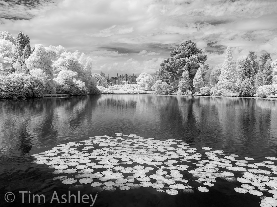
As I noted in my last blog post, I will be writing for On Landscape from time to time - the fee they pay will got to Photovoice and I do hope that some of you will take a moment to look at those parts of the On Landscape site that are free of charge and decide to take the plunge and subscribe for at least a short while. It's a great publication, featuring world-class image makers and covering a wide range of matters of interest to landscape photographers. It also has a mature and pleasant community of readers whose discussions are a cut above the online average!
]]>Part of the subject matter would be gear views and reviews. I was in the middle of an exciting re-evaluation of my equipment needs involving a switch from medium format digital to the Nikon D800 system and that meant two things: firstly, I would be buying a lot of new equipment and secondly, I would be assessing which pieces of gear were keepers and which were not. That meant testing. And what better discipline, I thought, than to have a reasonably rigorous real-world testing regimen and a place to sort and record my findings?
Besides, I was already sharing the results of whatever product evaluations I was doing in various online forums and would often find myself searching online for something I had written months or even years before, in order to remind myself of the attributes of some long unused lens or camera. It seemed more sensible to keep my own findings all in one place for future reference.
I decided that I would not accept 'freebies' - to this day I haven't accepted anything for free or any loan of equipment that I felt might compromise perceptions of my independence. I would not take advertising. I would not seek or receive click through revenue, again in order to protect my independence. And most importantly, the blog would be about a lot more than gear. There would be guest photographers, reviews of exhibitions, essays on creative approach and technique and a general effort to impose my own Weltanschauung on the readership. This lead to articles such as the one I wrote on the question of What is Fine Art Photography? - a piece that raised some eyebrows, some hackles and, I hope, some issues.
All very good. But what has in effect happened is that I have slowly and unwittingly (no one to blame but myself for this) become a slave to the web stats and to the self-imposed feeling that I should be providing weekly content.
Those web stats. Hmmm. They are a fascinating and frustrating thing.
Equipment reviews are the web stat winners. An in-depth piece or series of pieces on a high-profile camera or lens can get tens of thousands of readers. Very gratifying and something I am sure I could monetize if I wanted to. But the pieces on guest photographers receive much lower footfall, and if I venture into a subject as recherché as, for example, photo-ethics, the visitor count goes off the proverbial cliff. So after more than eighty articles I have learned that this blog is not going to become a free-thinking, holistic salon where creative types move effortlessly from deep tech to high art in witty and erudite discourse. It just ain't gonna happen and there's no point crying over it.
And, slightly disappointingly, the donations to Photovoice that have resulted from my occasional requests have been very, very few and far between. I calculate the revenue at less than 0.004 cents per page view, of which there have been many, many hundreds of thousands.
It is curious, also, to see the seeming contradictions: on the one hand the stats tell me that writing about the Leica M240 or the Sony RX-1 will bang the visitor rates right up. Here's a list of the top ten articles in terms of footfall:
- The M (Typ 240) - Leica's new baby reviewed
- Sony RX1:prepare to be a lot amazed and a little annoyed
- D800E and Moiré: What PP gets rid of it best?
- Leica 50 R Cron on Nikon Mount with Leitax Adapter.
- Sony RX100 Part 2: lens & ISO
- Sony RX100 Part 1: A Viable Camera for Exhibition Quality Prints?
- Six Months of the D800: did it deliver?
- Leica M 240 with 35mm F1.4 FLE - some observations
- The 24mm PC-E
- Sigma 35mm F1.4 DG HSM: Possibly Great
But on the other hand, some of the angriest emails and comments I get are from those who want to tell me, as if it weren't already perfectly clear that I know this, that 'good photography is about more than just the equipment'. I wonder if they might like to know that a thoughtful piece on visual memory garnered only 500 visits? Or that a world-class Guest Photographer can command as few as 1,100 views? That's about 2% of what a juicy piece on a sexy piece of gear can get.
In other words, people want to read about gear. And interestingly, very specifically, they want to read material about gear which has been written from a very particular perspective, that of the technically and contextually aware field user. They are not prepared to rely on the more lab-based tests popular on-line, and they want to think in terms of systems rather than of individual components.
For now, though, I have run out of new gear that I personally plan to buy. My big re-shuffle has ended up with a feeling that I 'need' a D800E system and an RX-100 and I love using and therefore want to keep my IQ180 with Alpa/Rodenstock, my M240 system and my RX-1. That is far too much gear already and my cupboards are full. There's also a Nex 7 in stock somewhere, a full 5D II system, a capsule Pentax SLR system, some micro four thirds stuff.... all that has got to go.
On top of the fact that I am now in disposing rather than acquiring mode and will consequently have less stuff to review, I have been asked to write from time to time for OnLandscape, a rather brilliant online magazine that I was already subscribed to. It does, commercially, much of what I originally wanted to do here and it will pay a fee, which can go to Photovoice. On top of that, I will no longer feel guilty about taking exotic loan gear because everyone knows the deal by now, both with me and with OnLandscape, and I hope both are well-trusted. So, rather excitingly, next week I will be taking delivery of both an IQ180 AND an IQ160 Achromatic for review. Very nice.
So where does it leave this blog? Well, I have decided to back off from providing weekly material. It might be called a 'blog' but it has become more of a micro-level review site and the only way to continue with that, which might be interesting, would be if I were to start to monetize the content in some way. At that point it becomes a business and that's just not what I want. It would distract from my being a photographer.
Instead, I will revert to blogging in a more traditional sense. Comments on stuff that interests me, links to new photographers that excite me, brief thoughts if they strike me. Readership will drop like a stone but hey ho, on we go! This might all change with time, who knows, and when I do happen to purchase new gear and have something useful to say about it, I will do an in-depth review as ever - it is just that this will happen much less frequently.
Last word: Thank You to all the regular readers and correspondents who have been so full of encouragement and support and so generous with their thanks and praise. It has been a real pleasure writing for you and hearing your responses and I have learned at least as much as I have shared.
Tim
|
This site is not for profit but I do support the charity Photovoice. I wrote about it in depth a while back and that article is here. If you have found this article useful and are feeling generous, I would hugely appreciate a donation to the charity, even just a pound or a dollar: every little helps. You can donate here and the Virgin Giving site is secure and takes cards and PayPal. The Gods of Great Photography will smile on you if you donate. I promise. |
]]>
Hi Mr. Ashley,
when I came across your blog and read your articles I was a little puzzled. The reviews all have a high technical standard and are written to be objective. But as a Leica shooter myself I asked myself by which standards you judge the lenses. After all Leica is famous for producing a lot of the finest lenses currently available and your reviews sometimes sound like you're from a future with a much higher standard.
Don't get me wrong, endless praise for Leica glass is neither my thing nor would I write that myself.
But I have a VERY hard time following your conclusions on 2 of the lenses I own (28 Summicron, 50 Summilux asph). Your observations on these lenses may be a bit subjective (28=boring e.g.) but I have tried to find the same things like you did and I couldn't. I'd have to work at pixel level (note: I'm shooting a M-E, not M240) to find a softness in the Summicrons corner and the "mid-field weakness" that the Summilux is supposed to have is not as pronounced with my copy.
I'd be more than happy if you could find the time and answer me, as it leaves not only myself but a whole section on a German forum puzzled (and currently arguing about 28 Summicron vs 35 FLE vs 50 1.4 asph which started with people bashing the 50 1.4 asph for being soft wide open).
Greetings from Germany
Marc
Dear Marc,
- Some people dislike being told that an expensive thing they own and cherish is less than wonderful
- Some people love the exact same thing because they have half noticed it and been frustrated
- Some people will live in denial
- Some people are not sufficiently qualified to form an accurate opinion
- A small number of people really do have copies of the lens that don't have a problem (it seemed to be many chrome copies of the pre-FLE 35 Lux that were OK, for example)
- Some people get very aggressive
- Some people get very confused
- Sometimes you, the reviewer, have a bad copy of the lens or have made a mistake
- Sometimes, the manufacturer ends the argument by agreeing with your findings and redesigning the lens - which is what happened in the case I mention!
|
This site is not for profit but I do support the charity Photovoice. I wrote about it in depth a while back and that article is here. If you have found this article useful and are feeling generous, I would hugely appreciate a donation to the charity, even just a pound or a dollar: every little helps. You can donate here and the Virgin Giving site is secure and takes cards and PayPal. The Gods of Great Photography will smile on you if you donate. I promise. |
]]>
Some of the Huge'n'Perfect crowd still use film but most seem to be headed digital. And whilst we have all seen definitive articles that 'prove' 10x8 film produces 'better' IQ than an 80mp digital back, we have also seen articles that prove the opposite. There are, as they say, many roads to Rome and I have seen amazing and very large prints made both ways. So this article is going to look at the equipment requirements of doing it digitally.
What does it cost to achieve technical perfection in, say, a 125 to 145cm wide print?
Let's take a look at the cost of a very high-end system from Phase One, Alpa, Rodenstock and Leica. I am specifying a system that allows movements (tilt and shift) because at these prints sizes, you generally need to be able to get your perspective and your field of focus right in camera. But I am also saving money where I think it makes sense by only selecting those options I consider to be of core importance. Brace yourself: you could spend an awful lot more than this and remember: this is a one lens system...
| Used, low actuation Phase One IQ180 back (same sensor as the IQ280 but a lot cheaper) with 6 month warranty - I'm going to allow this one as a dealer-certified used purchase: that saves a good deal of cash up front and these backs are built like tanks so buying used makes sense. Comes with back plate, batteries, charger etc. | £16,000 |
| Alpa STC camera (as part of a kit: separate price is higher) | £2,511 |
| Generic nylon hand strap so as to avoid paying £££ for a Rosewood version from Alpa | £20 |
| Back adapter allowing Phase back to attach to Alpa body | £899 |
| Alpa/Rodenstock 40mm F4 HR Alpagon lens (short barrel version to allow use of Tilt Shift adaptor) | £4,400 |
| Alpa Tilt Shift adaptor (up to 5 degrees, up to 17mm) | £975 |
| Alpa High Precision Focus Ring (attaches to lens and allows fairly exact setting of focus distance) | £215 |
| Phase One Sync Cable (the most basic version, allows lens shutter to actuate IQ180 back but requires Zero Latency mode) | £39 |
| Leica D510 laser distance measure. This generally works reliably outdoors on 'nature' only up to about the maximum marked focus distance of this particular lens. If you want to add another longer lens later, you'll probably need a Leupold or similar: allow about the same cost again. | £399 |
| Lee Universal Lens Hood (much cheaper than the Alpa version, less elegant but takes filters) | £116 |
| Lee adaptor to attach hood to lens | £35 |
| Set of 3 Lee graduated NF filters (you'll need them sometimes even with the DR of the IQ180 | £168 |
| Capture One Complete Universal Lens Calibrator (two thick, white, optically correct perspex diffusers needed to make Lens Cast Calibration exposures to eliminate colour shading and vignetting) | £49 |
| Gitzo GT354 6X Carbon fibre tripod (no central column tripods allowed if you want guaranteed rock-steady results) | £524 |
| Arca Swiss Cube tripod head. I know, you'll think this is crazy but everyone who has ever purchased one thinks it utterly essential. | £1,125 |
| Cards, readers, cloths, shutter release cable, DOF and tilt angle apps etc. | £200 |
| Total (assuming no sales tax or shipping costs) | £27,675 |
Of course you could spend a great deal more: you could go for the IQ280 at a cost of at least £10,000 more. You might want to add such basic niceties as an Alpa masked viewfinder at around £1,279 including shift mask. Or an Alpa Sync Release with appropriate cable, allowing 'one shot' use without having to put the back into Zero Latency Mode (which eats batteries) - at an additional net cost of £670.
But staying nice and basic, economising where sensible, this cost of £27,675 ($43,422 or €32,390) is the entry level for technical perfection in very large digitally captured prints for certain types of subject matter. Assuming you're paying nothing for training and workshops.
So what can you make from it? Let's assume you're a world-class fine art photographer who can sell a limited edition fine art print for, let's say $10,000 - and as we all know it might be a heck of a lot more than that. The math is interesting. Let's take a theoretical but close to real world example: if the edition is in two sizes, one very large and one quite large (say 140cm wide at $10,000 and 90cm wide at $7,000 respectively) and each edition is of five, with one Artist's Proof which you don't sell, then you're grossing $85,000. Of course you'll be paying your gallery anything up to 50% and there are printing, framing and a host of other costs. But you could more or less the cover the cost of this system with one image - if you are lucky, famous and brilliant.
There's another way: Marcus Lyon, for example, has seen one of his limited edition prints sell for $79,406 at Christie's. The original edition size of the Lyon print sold at that price was 7 (you do the math!) but, interestingly, Marcus does nearly all his work on Canon 35mm cameras and then stitches and composites them in post - a method that doesn't work for all subjects and circumstances but of which he is master. In fact he is so good at it that it took me a lot of convincing that the images weren't captured with medium or even large format systems.
So what can you do with a medium format digital system that you can't achieve in any other digital way?
Given that you can get any sized print by stitching and any kind of DOF by focus stacking, the answer is simple: anything that has to be captured in just one exposure and then printed very large cannot be made on 35mm. For those circumstances, there is only one option. And it doesn't come cheap.
Finally: for those who haven't seen a full sized image from one of these systems, here are three example shots using the exact same combination shown in the table above. I am sorry not to share un-watermarked images I consider to have possible future potential (the second and third) - with appropriate treatment those might always prove saleable so I won't give away high quality files of them just in case. But these files are technically reasonable (I am new to this system so still bottoming it out) and each in its way would have been difficult to achieve in any other manner if a very large print were required.
Clicking on the images will load a full-sized version. The first two images were shot using the Leica Disto to establish focus distances and depths and the second one additionally used the excellent iPhone app OptimumCS-Pro by George Douvos that I reviewed a couple of weeks back. This, combined with the Disto, allowed precise placement of the DOF such that only the items I wanted were in focus, specifically the foreground rock and the cairn placed above and slightly behind it.
The third image was shot using a little tilt and some rise, so as to get the DOF to cover pretty much everything from foreground to distance. Additionally, the second and third images have been treated with the Photoshop Alpa Lens Corrector plugin.


|
This site is not for profit but I do support the charity Photovoice. I wrote about it in depth a while back and that article is here. If you have found this article useful and are feeling generous, I would hugely appreciate a donation to the charity, even just a pound or a dollar: every little helps. You can donate here and the Virgin Giving site is secure and takes cards and PayPal. The Gods of Great Photography will smile on you if you donate. I promise. |
]]>
Honestly, I was fairly certain at the outset that the M240 would not be a 'keeper'. I didn't like the speckled and banded higher ISO sample files I'd seen and my first few days' shooting indicated that it was full of ergonomic errors, annoying oversights and necessary but unattractive compromises.
Another flawed beauty, I thought. Fun for a few dates but after that...
 18mm Super-Elmar
Question: if I thought the camera likely wouldn't please me, why did I buy it? Answer: because I own a lot of Leica glass and because, having put my Phase One IQ180 up for sale and making the switch to the Nikon D800E, I was frustrated by the extreme difficulty involved in finding wide lenses for that camera that could resolve, across the frame, the resolution the sensor promised. So I hoped that somehow the new Leica would pull a rabbit out of the hat. There were, after all, several perceived and potential benefits to the the system that might make it work well for me:
- Access to not only M lenses but also pretty much any lenses via adaptors.
- Small size, low weight, amazing ratio of these things to image quality.
- No shutter slap.
- A 'current market standard' pixel count.
- Better high ISO performance than previous Ms
- More DR than previous digital Ms
- Weather sealing.
- Better battery life than previous model.
- Live View and EVF for focus rather than the (in my experience) unreliable rangefinders in previous digital Ms.
- Live View focus means that rangefinder's weakness in dealing with focus shift is no longer an issue.
- Live View means no parallax when composing and therefore no problems with exact alignments in composition.
18mm Super-Elmar
Let me now list, briefly, the notes from my M240 original review that fell on the negative side, along with some irritations and problems that have emerged since then:
- Need to remove baseplate (and therefore tripod plate) to get at battery and card.
- Terrible ergonomics of exposure compensation.
- Poor Auto ISO programming in firmware: insufficient shutter speed ratio options, useless operation in Manual mode.
- Poor Auto WB and odd colour profiles.
- Inability to move the zoom/focus spot away from centre when using Live View.
- EVF 'shimmer' focus mask hard to see.
- EVF does not show exposure warnings in Review mode without additional button presses - inconsistent with LCD review operation.
- EVF (I use the Olympus version) shows incorrect framing thereby reducing the hoped-for compositional benefit of using it.
- Rangefinder hard to use for framing wider than 35mm.
- Colour cast corrections not good enough on some lenses.
- Still some evidence of magenta cast on synthetic black fibres.
- Single pixel noise in shadows when boosted, and higher ISO banding.
- Clunky Live View operation and switching, complex and deceptive metering options.
- Metering sometimes gets it 'totally wrong' - as if metering a completely different scene.
- Colour aliasing resulting from the lack of an AA filter is still a problem sometimes despite the smaller pixel pitch.
- Really mucky sensor - seems to pick up and retain dust a lot and be hard to clean.
In addition to the above impressive list of 'issues' I have ascertained that the legendary M lenses are not, technically at least, a 'magic bullet' compared to the glass available for the Nikon system. In-depth tests of each of my lenses on the M240 revealed the following headline points:
The 35mm F1.4 Lux FLE has an odd, unpredictable and inconsistent shape to its curved and wavy field of focus such that F5.6 or even F8 can be required to get a planar subject sharp to the edges, even when very skilfully focussed. Bokeh is nervy, OOF areas a little hectic. Technically, I would rather use the Sony RX-1/Zeiss combination or the D800 with a good copy of the Sigma 35mm F1.4 Art lens. Creatively, however, the 35 Lux has a beautiful look and lovely clarity. Overall, a great lens but not reason enough in itself to stick with the M system.
The 50 Lux has soul, beauty, biting but delicate separation of planes of focus, and gorgeous bokeh. But the new sensor has started to make the technical abilities of the lens creak a little: it has some mid-field weakness and, even when focussed very skilfully, this requires an aperture of F8 to eradicate and by this time, there is a touch of diffraction kicking in. Still a beauty, but the blush is fading from the rose.

18mm Super-Elmar
The 18mm F3.8 Super-Elmar has strong and complex distortion and requires F11 to tighten up the corners, by which time diffraction has taken its toll on the rest of the frame. Fairly strong astigmatism means that the Leica Look is not at its strongest in this lens. Everything else is good: bokeh, correction of colour shading and fringing, predictability of focus. Overall, useful but not wonderful.
The CV 15mm is useless on the M240. Whichever lens coding I try, every shot is ruined by extreme colour shading. For B&W use only.
The 28mm F2 'cron is boring on the M240 and the optical design is starting to show its age: F8 is required for sharpness across the frame but diffraction is kicking in at this aperture. Even at F5.6, astigmatism in the design means that images lack Leica Look micro contrast and sparkle. Colour shading is not fully controlled. The lens is, however, predictable in terms of field shape and is well behaved in use.
On the subject of the 50mm F1 Noctilux, I quote myself: "This lens is indeed the stuff that dreams are made of. But nightmares too, if you want it to be a consistent and reliable friend. Learn it inside out and it will reward you more than any other optic I know. Use it as a point and shoot, and you will shoot yourself in the foot." You'd have to read the whole article to see why this is the case but in short, a very wavy field of focus combines with focus shift to create a brew that is creatively fascinating but technically hard to master. But no other lens has this astonishing look.
The 90mm F4 Macro-Elmar is a joy. Oddly, corrections for colour shading aren't very effective but otherwise, the quality of this lens is just lovely and its tiny size a boon for travel use.
So overall, my testing of this selection of lenses on the M240 has given the lie to the idea that I might want to keep a hand in the M game purely because of the lenses. Some are starting to show their age on the new, high resolution sensor and some are simply 'tricky'. Many require F8 to give a good planar result - and my frustration with the Nikon system was that I kept on needing F8 to get good planar results. So the Leica system offers no real benefits there. In fact, the Sony RX-1 is still the best game in town for frame-wide sharpness at wide apertures on a wide lens.
In addition to the startling revelation that Leica is not immune to the laws of optics, I have learned one further thing from all this testing and this one thing is utterly key to getting the best from the M240. And that key is: you should nearly always focus using the rangefinder, rather than Live View, with nearly every lens*.
That's right. Bold, italic and highlights. This startling fact is completely unexpected, utterly unintuitive, impossible to explain simply and absolutely vital.
 35mm Summilux FLE
To get the full picture you will need to read my piece on 'how to focus a tricky lens' and all of the individual lens reviews linked to above. But here goes an attempt at a brief explanation:
Nearly all wide and standard focal length lenses have a degree of 'field curvature' which means that the plane of good focus is not, as you would hope, a thin or thick (depending on aperture) zone, exactly parallel to the sensor and with its near boundary parallel to its far boundary. Instead, depending on the particular lens, aperture and subject distance, it is generally curved, of varying thickness, and may be wavy in shape too.
Even when wide open but much more so when stopped down, there is more than one distance from the camera at which you can satisfactorily 'place' focus if you want the central subject to be sharp. But it is possible to place it such that the edges (and/or other parts of the frame) are not in good focus because they may not fall within the 'shape' of the field of good focus.
Thus, when focussing with Live View, it is possible to 'see' good focus in magnified view, and to activate the 'shimmer', at a range of focus distances. Wide open and close up, that range can be as little as half a centimetre deep. Stopped down and at distance, it might might extend to several metres. Some of those focus distances might get all of the subject plane in focus and some quite certainly will not. But there will always be one exact focus distance that is optimal and, with a well calibrated rangefinder and very accurately machined lens focus cams, the system will find that distance. But with Live View, you have little chance of finding that distance unless you always focus wide open and then stop down to shoot - because Live View will encourage you to place the central subject in the middle of the field of focus, rather than in the 'best' place overall when the rest of the frame is considered.
The only exception to this general rule is that lenses which suffer from notable focus shift as they are stopped down will give better focus on the central subject when focussed using Live View if shot when stopped down. Also, certain types of subject pattern (anything with regular repeats) is easier to focus using Live View.
 90mm Macro Elmar
Luckily, the rangefinder in the M240 is way, way better than on any previous digital M I have used. Mine is so perfectly calibrated that it focusses all my lenses absolutely optimally all the time at every distance. And after several months of ownership and thousands of frames shot, after several journeys packed and jostled in a bag, after the temperature and humidity changes brought about by the shifting seasons, it has not budged a micrometre.
To me, this is almost miraculous. I, in my early fifties and with well-corrected but typically compromised eyesight, can rangefinder focus lenses from 18mm to 90mm (and as fast as F1) with extreme and repeatable precision. Much, much more accurately than Live View on any system I have ever used, much more accurately than Phase Detect AF on any system I have ever used and much more accurately than a Rodenstock Medium Format lens with a High Precision Focus Ring and a Leica Disto laser finder with tested accuracy of +/- 1mm.
And this is worth an awful lot, because the best lens on the best sensor is nothing without great focus.
What this means is that there is something different about either the design, assembly or tolerances of the RF in the M240 as compared to previous models. I don't care if anyone believes me - and I don't care if Leica has said nothing to this effect (why would they admit that earlier versions were less than wonderful?) - it is absolutely the case. This rangefinder rocks. I use it to focus, and then I compose in the EVF if I need greater accuracy or am using lenses wider than 35mm. And it seems that quietly, this is what a lot of experienced photographers are doing, too.
So I find myself in an unexpected position: I bought the camera because I had the glass, and because the introduction of Live View and and EVF would finally mean I could use it properly as compared to the duff and drifting rangefinders that had so frustrated me before. And now I find that the glass, though nearly all very good, is not the reason to keep the camera. Neither is Live View and neither is the EVF. The reason to keep and cherish the M240 is the rangefinder. And that is not what I expected at all.
I shot for two days recently with M240 and 18mm, 35mm and 90mm lenses. Over the course of over 150 frames, all shot with the rangefinder, not a single one was out of focus. I will leave it at that.

The M240 has another trick up its sleeve too: phenomenal IQ at low ISO. Get a shot correctly exposed and well focussed on one of the better lenses and I think, at a pixel level, it gives better results than anything I know. Really. When Mark Dubovoy recently wrote over at Lula that on screen and in print, he preferred the M240 files to the D800 files, there was a sh!t-storm of disagreement. But he was right. And I have slowly realised that even the Sony RX-1, a camera that I thought had the finest pixel level detail I have ever seen, is not always the winner - especially when compared to the best parts of a frame shot on the M240 with its best glass. The M240 files are rich, smooth, very very free of noise despite the base ISO of 200, and have wonderful clarity and depth. Sure there is some banding and speckling at higher ISO but in real world use it is very rarely a problem. So I will go out on a limb here and say that the sensor is the best I have used. Maybe not overall (it could do with better ISO performance and a stop more DR) but for a well lit, well exposed scene it can't be beaten, unless you want to print larger than about 30".
The Final Word
The M240 was going to be all about the glass and Live View. The the sensor would be 'good enough' and the rangefinder would be halfway to obsolete. But with the exception of my prediction that the ergonomics would be the usual Leica mix of amazing and daft (they are) I was wrong, wrong, wrong.
I have never been this wrong about a camera.
The M240 is all about the extreme accuracy of the rangefinder and the gorgeous performance of the sensor. Together, they make an unbeatable combination. And given that this combination is very small and light too, I now use it more than anything. I can live with all its quirks and rough edges: most of them are 'dealable with' in firmware and none of them is a deal-breaker.
The D800 is relegated to jobs for which it has very specific skills (speed of focus, higher ISO work, long or zoom lens work) and the IQ180 is back from my dealer unsold, now married to an Alpa STC and Rodenstock 40HR and used for whenever I need huge output size and have the time to work for it. The RX1 also has its niche purposes and I continue to carry it from time to time.
I am very lucky to have all of these cameras; but I know which one will be getting the most use in the foreseeable future.... except, it has to go back now, to have its strap lugs replaced.
Well, this is Leica.
* based on the reasonably broad range of lenses I have tried but assuming that I am talking about only Leica M lenses, since other brands may not specify their focus cam shapes in the same way as Leica seems to.
|
This site is not for profit but I do support the charity Photovoice. I wrote about it in depth a while back and that article is here. If you have found this article useful and are feeling generous, I would hugely appreciate a donation to the charity, even just a pound or a dollar: every little helps. You can donate here and the Virgin Giving site is secure and takes cards and PayPal. The Gods of Great Photography will smile on you if you donate. I promise. |
]]>
So what was needed, from my personal POV, was an app that had the following two chief characteristics:
- Parametrically independent of specific equipment (no need for camera specific app updates).
- DOF definitions that can be tailored to the user rather remaining mired in the past.
Browsing the App Store recently I found a new candidate, TrueDOF-Pro and, even more useful, its sibling OptimumCS-Pro. I have been trialing them extensively and, though they are not yet perfect (compared to me 'dream team' fantasy) they are already very useful to me on a daily basis. Even better, their Author, one George Douvos, is astonishingly friendly, knowledgeable, responsive and keen to engage with his customers. So things can, as they say, only get better.
Before looking in a bit more depth at each app specifically, I want to make a few points which are general to both and which indicate the originality of thinking involved in their conception.
Traditionally, DOF has been defined in terms of Circles of Confusion. I won't go into the theory, you probably know it already and it is too long a subject to trot out again here but in short, old-style DOF calculations looked at what precision of level of detail the human eye could not discern beyond in a print, given certain assumptions about what distances the print would be viewed from, usually in terms of a multiple of the diagonal dimension of the print. Hence the laughable but widely held belief that people in galleries automatically step back to a viewing distance in proportion to the size of the image. They might well do for a moment. But then they will get up to as close as they can comfortably focus, probably a foot or eighteen inches, and stare intently before stepping back again. This behaviour is particularly evident in experienced, big-budget purchasers of high end fine art photography.
Now this is absolutely NOT to say that they won't buy an image that is less than technically perfect at nose-distance: they are a sophisticated audience, quite capable of discerning whether the creative intent of the image does or does not require enormous resolution. But there are photographers out there (Burtynsky, Crewdson, Kander, Gursky and many, many others) who make and sell very large prints at very high resolution.
These large print sizes (say, over a meter on the long side and sometimes much larger) do not just test the peak resolution of the imaging chain: 'print big, look close' also places enormous strain on the DOF in the image. DOF needs to be treated by both makers and consumers of photography as part of the creative intent of the image, and as such it needs to be understood, controlled and accurately deployed. For some images it is in effect a production tolerance.
Which is where Mr. Douvos comes in: his apps let the photographer set their own parameters for what is 'acceptable' DOF rather than relying on ancient tables or meaningless scales engraved around the edges of lenses. Better still, they allow for those parameters to be conceived of and entered in terms either of traditional COC or, IMHO more usefully, print size and resolution. And all this in a system that, uniquely, factors the effects of diffraction into the equation - so finally COC is truly useful again.
This diffraction accounting is very important: with high resolution digital systems the photographer can no longer count on stopping down to F22 (let alone F32 or F64) to get the required DOF. F16 is a desperate measure for most of us and many won't even stray beyond F8 unless we really have to. The Medium Format Rodenstock 40mm HR lens that I will use in some examples later in this piece comes with the manufacturer's recommendation to shoot only at F5.6 and F8 for best results. But traditional DOF scales just keep on in a linear fashion to F64 with no concern for diffraction.
Not any more: both these apps will take diffraction into account and I do believe that is 'a first'.
In detail:
TrueDOF-Pro
Screenshots tell most of what you need to know:
 The main working screen allows you to enter your lens focal length, aperture and the shooting distance that you have set. These, calculated according to the parameters you have chosen in the settings screen, determine the DOF readout. In the example above, my 40mm lens and aperture of F8 combine with my the shooting distance I have set of approximately 2.5 metres to suggest that everything between two and three meters will be in 'acceptable focus'.
Notes:
- By pressing the 'S2' or 'S3' buttons, you can choose to show the distance scale with more of an emphasis on mid or far distance work.
- Pressing the 'HF' button sets the focus distance to its optimal hyperfocal distance: in other words the 'far' focus range (top red line) is set to infinity and the 'near' (bottom red line) is set to wherever the app calculates it - assuming you set your camera's focus to the distance indicated by the blue line, which is the indicated hyperfocal distance. The numerical readout windows are self-explanatory.
Simple, eh? Let's take a look at the setting screen:
Using my preferred parameters, it looks like this:
 This requires more detailed explanation.
- The key choice is to select between 'Blur Spot Diameter' and 'Print Quality'. The above screenshot shows 'Print Quality' mode selected. I will come back to this.
- Next, using the top left buttons, set the physical width of your sensor.
- Then mid left, your intended physical print width.
- Finally, bottom left, your desired print resolution.
This is all simple with the exception of that final point: print resolution. It is expressed in terms of Line Pairs Per Millimetre and this is not a measure that will be familiar to all (or even most) users. It took me quite some time to calculate how to enter this value, taking as a starting point the measure of resolution with which I am most familiar. Let me explain.
When I make an image with a view to making and selling a fine art print, I generally shoot with a final print size in mind. Of course sometimes I can't know this in advance, and sometimes an image made on a 35mm sensor might be good enough as a piece of work for me to want to print it larger. But in general I shoot with the following in mind:
- 35mm sensor 18 to 25mp - 22 inches (equal to between about 250 and 272dpi).
- 35mm sensor 36mp - 34 inches (equal about 216 dpi).
- Medium format 80mp - 100cm (equal to about 258 dpi) but with the possibility of up to 125cm (equal to about 206 dpi).
The above list is absolutely full of human inconsistencies and quirks: the smallest print size is for historic reasons that I have almost forgotten but relates to a show I had where most of the images were shot on a 5DII but some were on smaller format cameras and I needed a compromise print size that worked across the board. It then became my standard size for editions of prints from frames shot on 35mm. Then along came the Nikon D800 and, if I was showing only work from that camera, I would go as far as 34" on the long side because that gives an image about as large as I can print with margins on my 24" roll printer.
The medium format print size is determined by the fact that from experience, when I send these frames out for commercial printing on larger format printers, 125cm is about the largest I can go and get a print to the quality that satisfies me when viewed up close, at a distance of around 12-18 inches. On top of all that, I flip flop quite happily between inches and centimetres, having been educated in both systems. This is useful because common photographic calculations also flip flop between imperial and metric.
In other words, my criteria are a mess. And I don't think I'm alone in that.
However, there is one clear message that comes through: for a good camera with no AA filter and assuming a good capture, I know, reliably, that I will be happy to print to around 210 dpi (actually if pushed, I will go as low as 180 dpi as long as the capture is really good and I am printing on textured fine art paper, which is more forgiving than gloss). And it is that base level of resolution that I need to use in my DOF calculations. In other words, if an object in an image appears acceptably sharp when printed at around 210 DPI* from an un-cropped frame, then I consider it to be 'in focus' - which means 'within my DOF'. So a DOF calculator which lets me specify print size and resolution is absolutely perfect for me.
Trouble is, my head for resolution, like most photographers', works in DPI (accurately, PPI but for this purpose they are the same thing) but these apps work in line pairs per millimetre.
Here is an example of how to convert:
I know that I can get a good print at an output resolution of 210 DPI
1 inch = 25.4mm
210 PPI /25.4 = 8.26 pixels per mm
8.26 pixels per mm = 4.13 line pairs per mm (two adjacent pixel columns, one black and one white, equal one 'line pair').
In other words, to get DPI translated into Line Pairs Per Millimetre, I merely take my preferred DPI for printing and divide it by 50.8 - and then enter that value into the app.
Eagle eyed readers will spot that though my 210DPI equates to 4.13 LPPMM, I have entered a value of 5 into the screenshot above. This is because the maximum print width that can be specified is 1000mm but I want to print to 1250mm: so to get the 'right' value I have to adjust the 4lppmm in the ratio of 1:1.25 and that gives a value of 5 (trust me, I have checked all this with the app's author and he agrees my arithmetic).
This is a very long-winded way to describe what value you should choose to enter into one parametric window - but it is necessary. Once you understand it, it won't need to be changed often at all.
BTW there is also the option to work with Blur Spot Diameter rather than Print Quality. This will please those who are happy with traditional COC values as a way of thinking of resolution. I am not going to cover this because it isn't how I prefer to work but I will say that the difference between Blur Spot Diameter and COC is irrelevant when it comes to knowing which value to enter: just dial in the COC that you are happy with as if they were the same thing. The true difference is that BSD will take diffraction into account without your needing to think about it any further. Again, I checked this with the app's author.
For those wanting to establish the BSD value to enter into the app, simply calculate a normal COC by taking your sensor's pixel pitch (width of sensor in mm divided by number of pixels on that side), doubling it and multiply by 1000. For example, a D800E's COC calculated this way is 10 microns, though a D800 might resolve slightly less well due to the AA filter. You get the idea.
Having set those parameters according to the above explanations, you can just go back to the main screen, set your shooting distance and fire away in the knowledge that whatever objects fall within the distance parameters of the two red lines will appear in acceptable focus at your chosen print size and resolution or COC settings.
Or can you? Does it work?
Mostly. There are some problems though.
- Firstly, very few camera systems let you set shooting distance with the requisite degree of accuracy. I used a High Precision Focussing Ring on my Rodenstock and even that isn't quite precise enough.
- Secondly, even if your lens were to allow you to set focus distances to the exact millimetre, the means of entering and reading data in the app are not refined enough for truly accurate use: the scales are simply too course for you to read a very accurate value from.
- The inaccuracies in 1) and 2) above might cancel each other out - or they might stack up. To get an accurate system, every component must be as accurate as possible individually.
- There are some aspects of optical systems that no calculator (except possibly made by the lens manufacturers using data they don't share) can help you with. Focus shift (residual spherical aberration) can blow all this out of the water, for example: the app has to assume no focus shift because it is a parameter that varies from lens to lens and behaves differently depending on how that lens is deployed. And the individual shape of a particular lens's field of focus, which will vary with aperture and distance, means that the placement and depth of the field of focus varies across the frame. Finally, individual lens designs (asymmetrical for example) can change the math a little, especially at macro distances. Again, nothing is going to help you with any of that other than 10,000 hours of practice and a sharp eye.
Nonetheless I have already found the app very useful in the field - and far more useful than anything else I have tried. I will give some examples below. I want to add this though: the thing that sets experienced photographers apart from the 'my cousin's got an SLR and can do it for half your price' crowd is the 10,000 hours of practice we have. That 10,000 hours means that we have a sixth sense for DOF and can often judge it very finely. So I think this app is of most use to the less experienced user, or to the expert who is using some new equipment and wants a short cut, or to those who want a sanity check or require greater precision than usual and need the best starting point for some bracketing. All that said, I have been using it blithely and getting really nice results.
All of this is a very useful update to a fundamentally traditional way of using DOF. For something more revolutionary, there is another app: OptimumCS-Pro has a very neat special trick: you tell it the distance to the nearest and furthest objects in your field of view that you want in acceptable focus and it will tell you if it can be done and, if it can, exactly where to focus and what aperture to set. Neat, eh?
It basically works in a way very similar to the above description but there are some wrinkles so let's take a more detailed look.
Here's the main screen:
 You will recognise the left hand input dial for lens focal length. But in the central panel, instead of you entering your shooting distance you enter your near and far object distances. The app then calculates the optimal focus distance, indicated by the red triangle marker. It also tells you, in the left-hand panels, which aperture to set and, with the blue triangle marker, what resolution you will get expressed in either line pairs per millimetre (shown) or optionally in Blur Spot Diameter (if that's how you roll). The keen eyed reader will see that though this suggested combination gives you a suggested F10 and indicates that within the zone indicated by the distance markers, a resolution of around 22 line pairs per millimetre will be achieved in a 250mm wide print. The very observant reader will also notice three little dots below that, and they refer to the resolutions that would be achieved were you to opt for apertures of one, two and three stops lower than suggested.
Now all of this is excellent in theory but there are some problems.
- For those who think in DPI rather than LPPMM, some math is required to understand what the resolution numbers mean. Effectively, it is the reverse of the process I described for the first app, above, but with the additional need to convert for the print size, which in this app cannot be set parametrically and is fixed at 250mm. In the arithmetic above I showed that 210DPI is, for a 1250mm print, 4.13 lppmm. So for a print one fifth that width we translate that into a requirement of around 21 lppmm. But this is an irritating further step when working quickly and the inconsistency between the two apps is notable.
- The slider blobs for entering distance are hard to set accurately (they move as you lift your finger) and they are so big that you sometimes can't get them close enough together to set the distances you want to set. Also, the scales are too impressionistic to either set or read a distance to the degree of accuracy required.
Before we look at how well this works let's take a look a the setting screen, where some other neat possibilities are revealed.
 Firstly, you will see that this is the place to set your sensor width. Next, aside from the buttons for Info (help) and useful external links, you will note two further options: one is to work with Blur Spot Diameter (I described this above in reference to the first app and the implementation and implications are similar here). But more excitingly for users of technical cameras, there is the option to work in Image Space rather than Object Space. If you don't know what that means, it won't matter - but if you do, then it might prove extremely useful to you.
Does it work?
I have played, used and tested - three different activities. In play mode, it's a hoot, I really like it despite the niggles. In real world use, it provides at worst a very useful close starting point to getting things exact and it will now be a part of my normal workflow. In fact on a challenging shoot today it just worked, every time. You can't say better than that. Here's an example, and clicking it will load a 50% resolution image in a new window. The aim was to get the front of the desk and everything on the desktop in focus and everything else out of focus. Not easy at close distance and with 80mp... but it worked perfectly: in fact, if you look very closely you will see that the right hand table leg (square carving at top) is sharper than the left - and that is because the one on the left was very slightly closer because I was very slightly off perfectly square to the subject. Now that really is precise!

But in testing, the app doesn't quite prove itself as well, performing more as a great guide than an indisputable oracle. I have my theories as to why this might be but first, let's look at two quick tests.
For these, I used an IQ180 on an Alpa STC technical camera with a Rodenstock 40mm HR lens fitted with a High Precision Focussing ('HPF') ring. In order to measure the exact distances involved I used a Leica Disto D510, an extremely accurate laser distance measure. I also used as much care as I could muster. Theoretically this combination should give about the tightest results currently possible.
The first test involved two barcodes placed at 2 and 3 metres distance. For reference I put two further barcodes in frame at 50cm before and behind my main subjects. I then used the Disto to focus on the 2 metre subject and shot it accordingly at F10, then repeated the exercise for the 3 metre subject. These provide good benchmarks for 'the best the system can do'. Next, I used the app to determine the optimal focus distance and aperture (f10) then I shot at that distance as marked on the lens's HPF ring. Then I looked at the results at 50% zoom on a 100dpi monitor, which emulates my required DOF quite well, especially given that this combination of shooting parameters should have given at least 22 lppmm resolution for both near and far targets compared to my requirement of 21 lppmm. Then I also shot a frame at F8 which should have given me resolution just below my requirement. The results are below in the order stated and they clearly show that for the F10 shot, whilst the 3 metre target is close to acceptable when compared to its benchmark, the 2 metre target isn't.
(All frames reproduced at exactly half of shot pixel dimensions. If you are unsure that your browser is rendering them inline at the right resolution, clicking any of them will load the image into a new window from which you can drag it into Lightroom or similar for reliable viewing)


 I put these results in 'close but only a cigarillo' territory: not quite accurate enough for critical use. But this is quite a close range test, and at close ranges all inaccuracies are magnified by the fact that DOF is much narrower at close distances. And clearly, I was trying to shoot with as little headroom as possible to see how the system performed at the margins.
So I ran a 'close to real world' test, with two Reikan targets at more or less random distances but significantly further away. The nearest target is at 4.73 metres and the furthest (hard right) is at 6.473 metres. Behind that, for blur reference, is a Rodenstock box at 7.1 metres.
Entering 4.73 and 6.473 gave a suggested focus distance of around 5.4 (it is impossible to read this distance exactly from the app's scale) and an aperture of F6.3 so I set the camera accordingly at that aperture, at which I should have achieved a massive overshoot of over 30 lppmm compared to my required 21 lppmm. So I also shot a frame a stop wider, which should have given me 26 lppmm - still a significant overshoot.
The results are as follows and in the following order:
- Disto focus near target at F6.3
- Disto focus far target at F6.3
- App suggested focus distance and aperture (f6.3)
- App suggested focus distance but shot at F4.5


 It is clear to me that the results are acceptable but not perfect, despite the indicated resolution overkill. In fact the near target appears slightly closer to its benchmark frame in the F4.5 shot than it does in the F6.3 shot, which is initially counterintuitive. In any event, the results are better than in the first, closer range test, as we might expect.
So what's going on? Here are my theories (and remember, the app is performing as part of a complex system with many other parts which all contribute to the result):
- I screwed up ( I don't think so but hey, it happens).
- The Disto measurement should be taken from the diaphragm rather than the sensor plane, as I did (try finding the answer to that one in a hurry but I believe I did this correctly).
- The math or the theory in the app is wrong (I seriously doubt this).
- The input and readout scales on the app are not usable with sufficient accuracy (I am quite certain that is true and I suspect this to be the main, but not the only, cause of end-result inaccuracies).
- The High Precision Focus Ring on the Rodenstock is either not perfectly placed (I installed it myself, standard practice, but I was very careful) or not perfectly accurate or is insufficiently finely calibrated (quite possible: the near and far benchmark frames are pretty good but they might well not be absolutely optimal).
- The lens has some focus shift when stopped down (I tested it, it does, a little - and this is probably why the near target is a touch better in the F4.5 frame).
For whatever reason or combination of reasons, the imaging chain of which the app was a part in these tests wasn't quite able to 'nail it' in either of these tests. I think there are too many steps in the process which are vulnerable to minor imprecision for the end result to be perfect. But this might well not be the fault of the app at all and at the very worst, its suggestions work as a very close starting point. At greater distances and in my real world use it is proving extremely useful.
I have been in contact with George about these issues and he is actively considering making updates that address some of them. In particular, he is interested in making the transition to using DPI as the resolution measure, rather than LPPMM. And he is keen to make the input and readout accuracy more refined. He was also very responsive to some suggestions I had regarding the sorts of FAQs that might be addressed in the already excellent Info/Help section.
Conclusion
Neither of these apps is a quite a miracle - but they are both a true blessing. I haven't found anything nearly as useful elsewhere, and they are hardly expensive. Any serious photographer would find them useful but, for users of lenses with impressionistic distance scales, the results might be less predictable. For my purposes, both apps taken together constitute about the best value 'bang for your buck' of any photographic purchase I've made. Everyone should have them.
* this 210 DPI is a very convenient number: it makes good prints and it is also very close to both a traditional 100dpi monitor displaying an image at 50% zoom or a Retina screen showing an image at 100% zoom - in other words, it lets you preview your resolution and your DOF quite accurately before you print, with no effort)
|
This site is not for profit but I do support the charity Photovoice. I wrote about it in depth a while back and that article is here. If you have found this article useful and are feeling generous, I would hugely appreciate a donation to the charity, even just a pound or a dollar: every little helps. You can donate here and the Virgin Giving site is secure and takes cards and PayPal. The Gods of Great Photography will smile on you if you donate. I promise. |
]]>
I have now shot enough frames on the M240 to believe that it takes second place, in the interchangeable lens sub-medium format category, to no camera but the D800/E when judged by overall IQ alone. But when system size, weight and flexibility of focussing method are taken into account it is actually a better camera in most of the respects that matter to me, for prints up to about 30" wide.
A close 'D800 system' competitor lens in terms of image quality is the Nikon 85mm F1.8G. It is huge in comparison to the Macro Elmar, albeit benefitting from being over two stops faster. So if you, like me, sometimes want to travel light without compromising on quality, then the difference in bulk between these two lenses is very material. A really nice travel kit is the 35mm Lux FLE and the 90mm M-E, a setup that can cover a huge number of bases in terms of subject distance, field of view and light gathering ability if used carefully. Carrying a D800 system with lenses of similar ability (say, the 85mm 1.8G and the Sigma 35mm F1.4 ART lens) will incur a very significant penalty in terms of weight and bulk. So, as long as you don't mind the added mugging risk (perceived or real) then the Leica system wins hands down for travel. IMHO.
Let's take a look at the Macro Elmar in detail.
Bad news first: the colour shifts endemic to the digital M system are not fully dealt with in current firmware for this lens. You would think that by a focal length of 90mm this problem would be long gone but it isn't, and it remains sufficiently significant to risk being visible in real world use. Here is the F4 frame and clicking on it leads to a gallery with frames shot at all apertures. I expect this behaviour to improve with further firmware updates but for now, it is the main fly in some otherwise effective ointment.

An aperture series follows. The F4 frame is shown here and clicking on it leads to frames shot at all apertures. These are available from that gallery at full resolution, should you want to peep in detail. They were shot with focus made with the rangefinder wide open and then not changed throughout the series and, in common with most of the lenses I have tested on the M240 this is the best way to focus if you want the best average performance across the frame, particularly if you value sharp edges on planar subjects. I will come back to this.
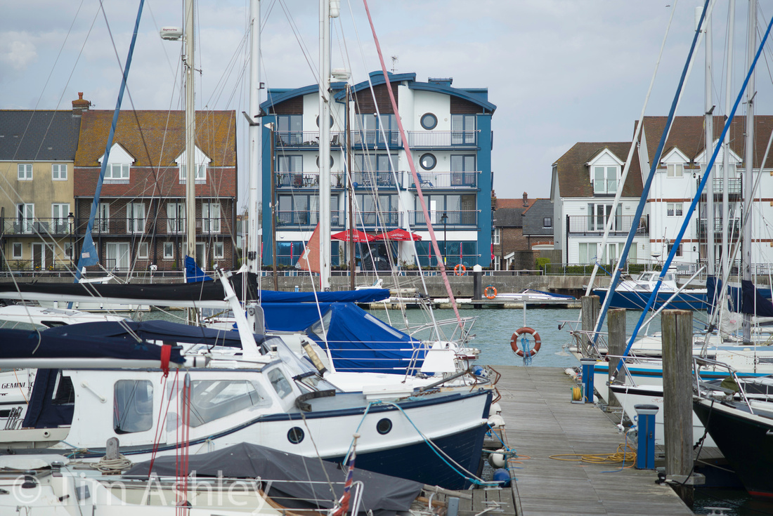
My observations are as follows: performance from centre to edge is already more than acceptable at F4 and the best average across the frame is at F5.6 with diffraction setting in at F8, just. F11 is still pretty acceptable and beyond that, I would not stop down further unless there was a pressing DOF need because diffraction becomes a real issue.
The field of focus seems only very slightly curved and the MTF suggests that this is the case. However, it is just sufficient (and visually it is clear that the effect is due to the MTF 40 astigmatism between sagittal and tangential) for the edges to appear a touch weaker when focussed in certain ways. For more information on this very complex subject, you might want to read my articles on the 35mm Lux FLE and on Field curvature but in short, if you focus the Macro Elmar with the rangefinder you will probably get better edges at F5.6 and F8 than if you focus it using the EVF when stopped down. That is my experience of the lens and it accords with both theory and with the MTF. It results, in brief, from the effects of moving the overall zone of good focus into slightly different positions when focussing wide open versus focussing when stopped down. In any event, the proof of the pudding is in the eating and I have made very nice 34" prints, sharp from edge to edge, by focussing the lens with the rangefinder alone.
In terms of focus shift, there may be a very slight tendency for the field of focus to shift backwards as you stop down but in my usual series of close range tests, it isn't at all clear and in any event, the point of focus always remains in good focus. However, the above-noted tendency of the lens to focus distant planar subjects better in terms of edge sharpness when using wide open focus rather than stopped down focus might indicate a the slight focus shift - it's just that the centre remains in good focus either way, so the edge behaviour is the 'tell' that might indicate this behaviour.
One point to make: the M240 is of sufficiently high resolution to mean that the old rule of 'shoot handheld at 1/focal length' is no longer enough to guarantee good results. I find that many shots at 1/90th second show a little motion blur and unfortunately the M240's Auto ISO settings don't let you specify any other ratio (as of this writing: I expect this to change in future firmware) so I suggest using a minimum shutter speed of 1/125th.
On to colour aberrations. I rarely see any, at least not of any significance. This is at least in part due to the fact that the modest maximum aperture puts the lens into safe territory in this regard. Below is a shot at maximum aperture taken into a bright sky and you will have to hunt very hard to find any 'purples'. Click the image to load full a resolution version in a new window.

If the lens seems impressively immune to fringing, the story regarding flare is slightly less rosy. Most of the time it's just fine (the hood is deep and I always use it) but if you shoot into the sun, even with the sun out of the frame, you can get images that look like the following - and no, it wasn't a foggy day!
The upside of this veiling flare is that for contre jour portraits, it can provide a creatively desirable effect. Which raises a philosophical/psychological point: if a lens (or camera, or outfit, partner, holiday...) has enough about it that you love, its flaws become not just forgivable, but something you commit to working with until you can find a way of enjoying them. Here endeth the lesson.
Distortion is quite well controlled but there is an oddity, which is that to me, an image corrected using the 'official' profile in Lightroom, looks less good than an uncorrected version. Here follow uncorrected (first) and corrected versions of the same shot.
 Bokeh characteristics are very 'pleasant' but not utterly stellar. Here is an example of bokeh both near and far in one shot, wide open:

One useful trick the lens has up its sleeve is the indicated by the 'Macro' designation: it used to be available without the Macro adaptor and that is how I purchased it, so I am limited to a close focus range of .77m but with the adaptor, you can get to .5m and a magnification ratio of 1:3. However, even without the adaptor, the lens can make pleasant close up images and for these, a tripod and EVF can guarantee the sort of accuracy in focussing which is harder to achieve with the rangefinder alone.
Conclusions
I consider the look of the lens in general to be very 'kind' - it is a medium-high rather than high contrast optic, it is very (but not surgically) sharp - and the 'pleasant' bokeh rounds out the gentle but accurate style in which it renders. It is also extremely versatile and makes a great portrait lens (I am sorry not to include a portrait shot here, time and unavailability of beautiful people at close hand has not allowed me to make one I like). It also absolutely keeps up with the advance in sensor resolution offered by the M240, though I suspect that it will show a graceful decline at ever higher resolutions, probably remaining truly useful not much beyond 30mp for those wanting sharpness across the frame. But for now, it packs all the power of much larger, heavier lenses into a tiny package, with the added bonus of macro ability should you want. I use it for a really wide variety of subject types and as noted above, it is perfect for travel.
The 90mm F4 Macro Elmar is so small and unassuming, so quirky in form and in action, so unlike any other lens, that it can sometimes be tempting not to take it altogether seriously, to assume that it trades quality for convenience. That would be a mistake. It is an absolute gem.
Here are some more shots, all available at larger sizes in the gallery.
note to readers: this is the last in my series of reviews of a variety of lenses on the M240. Soon I will be publishing a global roundup review of the entire system, with several thousand frames under my belt, and an answer to the question I posed a the outset: "for those who love their M lenses, is the M240 a great way to use them or does it start to show their weaknesses?" In other words, given that I, personally, purchased the M240 as a way to use my existing glass, will I keep the system now that I have looked at all the lenses I own in some depth?

|
This site is not for profit but I do support the charity Photovoice. I wrote about it in depth a while back and that article is here. If you have found this article useful and are feeling generous, I would hugely appreciate a donation to the charity, even just a pound or a dollar: every little helps. You can donate here and the Virgin Giving site is secure and takes cards and PayPal. The Gods of Great Photography will smile on you if you donate. I promise. |
]]>
It is simply not possible to make lenses that perform perfectly at the enormous maximum apertures possible with the Noctilux and whilst some of the 'issues' that occur with very large apertures are an integral and indispensable part of 'the look', others are merely troublesome. I received an email yesterday from a reader who has just proudly put his new F0.95 version (a lens I do not own) on his M240 and, shooting wide open against the light, been very put out by the resulting coloured fringes around the highlit edges.
So the key to these lenses is to know what they can and cannot do and to use them accordingly. And of course, these abilities will vary from camera to camera: for example, the F1 lens has a very, very odd field of focus when shot wide open and how this interacts with a particular camera will depend on the method of focus and the exact point at which the size of the sensor crops the image circle of the lens. This makes the 'feel' of the lens very different on, for example, Micro 4/3rds sensors, APS sensors and full frame. Whether you have sharp edges or midfield weakness will vary accordingly. In addition, the lens has notable colour shifts and these will appear in different places and with differing intensities according to the micro-lens configuration of each particular sensor.
In other words, like all lenses, it is not possible to summarise the F1 Noctilux in a general way. It is a different lens on each different camera model. So today's piece will look in particular at how it performs on the M240 only.
The first two uncropped images, both shot at F1, are very instructive. Click on them for larger versions.

 The thing that is immediately apparent in both shots is the 'doughnut vortex' shape that results from the interaction between the lens's wave-like field of focus, bokeh characteristics, and highly detailed subject matter. That swirl, so pronounced in both these images, can be accompanied by unexpected placement of focus, too - as in the first image. Planar subjects will show this very clearly, subjects with depth will hide it but its effects can be felt rather than very explicitly seen.
It is this effect that lies at the root of the dreamy feel of shots made wide open. Understanding how to place and use it lies at the root of using the lens well. Other contributors to the effect are the high degree of astigmatism wide open, veiling flare, the very shallow DOF, the slew of colour aberrations and the high degree of vignetting. In fact the vignetting can be so strong as to make full correction an impracticality and, at F1 through F2.8 it can affect metering quite significantly.
So let's look at the colour and vignetting issues in more detail.
The M240, with coded lenses, (which mine is) will apply corrections to the colour casts so often found in the interactions between M lenses and M sensors despite careful design of the micro lens array on the sensors. Each lens is different and the effect depends on the FOV of the lens (wide angled lenses tend to be worse), the aperture, and the distance of the rear element of the lens from the sensor. These factors, taken together, create a 'ray angle' at which the light coming through the aperture is directed towards the sensor. This angle is 90 degrees on centre, but a lot more acute at the edges and it is at the edges that the problem is most evident as different wavelengths of light are transmitted and bent to different extents.
Wide open, (and with current firmware version 1.1.0.2) even with corrections applied, the F1 Noctilux on the M240 is not perfectly corrected for colour shifts:
Click on the image above to go to a gallery that has a full aperture series. What is and isn't acceptable for colour shooting will vary from photographer to photographer but for me, if I want acceptable colour accuracy from the lens, F5.6 or F8 is required. That is 'no biggie' because this is primarily a creative lens and I tend to use it in B&W (do we dream in colour?) or on scenes where colour accuracy isn't important. The shots also show the extent of the vignetting, which again does not clear until F8 and which has a characteristic sharp edge, making it hard to correct. Again, use the lens creatively and not technically when shot at wider apertures.
The lens is also prone to standard chromatic aberrations of the types that lead to fringing. Indeed at wider apertures, these fringes can be so wide as to be very hard to correct without affecting colours in the rest of the frame. But in B&W the effects are merely part of the soft glow of the lens, and are therefore welcome. Here is a crop from the centre of a frame shot at F1 against the light. Clicking on it will lead to a series thru F4, at which aperture it is well enough controlled for my needs.
A quick look at distortion: I consider this a non-issue with the lens - it is not extreme and it is easy to correct. Here are uncorrected and (largely) corrected frames, though there are no profiles available in Lightroom so the tweak must be done manually.
An aperture series with the lens is very instructive. Here is an F1 frame and clicking on it will lead to the entire series. When viewing that series you will, by clicking to view a larger version and then by mouseover, be able to load full-sized versions.
 For the lazy reader here are my observations:
- Between F1 and F2.8 the scene retains the dream-like feel for which the lens is famous but the centre is pretty sharp even from F1.4 and given that there is no strong back-lighting, from F1.4 colour fringing is not as intrusive as it can be. Colour shifts are clear in the sky but hey, this is a dream, right?
- F4 and F5.6 appear superficially to have tightened up but closer examination shows that there is still notable midfield weakness. This is still visible to the careful eye even at F8.
- F8 is the first aperture at which the lens should be considered capable of a more 'technical' performance but the midfield weakness doesn't really clean up to my standards until F11. However, at F11, diffraction is a little less than I would expect and I would happily shoot the lens at either F8 or F11 from the point of view of cross-frame sharpness, colour shift and fringing and vignetting if I wanted a clean image. F16 is too diffracted unless one really needs the DOF.
But the story doesn't end here. At close range, the lens has very notable focus shift on stopping down from F1 thru F5.6. Indeed, whether you focus with either EVF or RF wide open (and on my M294 the results are about the same) near-field subjects will move radically out of focus at F1.4 thru F4 and not really get back into full focus until F8. This is evident from the series linked to from the below crop, which was shot with RF focus. But don't worry about the fact that initial focus is at somewhere between -3 and -2 on the scale: I did that on purpose so that you can see how the focus moves rearwards.

Piecing the above series of findings together is complex but there are strong shooting implications to be drawn from the exercise.
- The focus shift does not affect the series shot across the harbour to any significant degree. The DOF at distance is enough to 'contain' the focus shift. But at close range the shift can lead to a carefully focussed subject being totally OOF.
- The harbour series was shot by focussing once, wide open, with focus agreeing between the EVF and the RF. But I also shot another series in which I used the EVF to refocus every frame as I shot down and that series was a mess. This is because the RF is very well calibrated to take account of how the field of focus moves and changes as you stop down. You will need to read my article on field curvature and on the 35mm FLE Lux to appreciate in full why this is (I won't repeat all that complex material here) but in short the rules for successful shooting of the F1 Nocti on the M240 are:
- At close range use the RF to focus if shooting wide open but use the EVF to focus if shooting at apertures between F1.4 and F5.6
- At distance shoot using the RF to focus
These suggestions really work for me in the field. But of course there are distances somewhere between close and far and I am still working on that! My provisional suggestion is that 'close' runs up to about three to four meters. However the wave-shaped field of focus, which clearly asserts itself even at F5.6, makes the issue more complex so I add rule three:
- If you want to focus and recompose, bracket like crazy at any distance and any aperture under F11 when at close range.
So we have established that this lens is one tricky customer, right? But it has a serious upside: it can make images that I, personally, really love. Here are two.
 (the above frame is very cropped, the below frame only slightly so. Both shot at F1)
 This lens is indeed the stuff that dreams are made of. But nightmares too, if you want it to be a consistent and reliable friend. Learn it inside out and it will reward you more than any other optic I know. Use it as a point and shoot, and you will shoot yourself in the foot.
Finally: for the non-Leica shooter who wants to emulate this look at a far lower cost, try the Sigma 35mm F1.4 Art lens in most popular mounts. It will give you a fair dose of the dream (but without the F1 and without the swirl, both of which I personally treasure) for around an eighth of the cost and it will do so with AF, though given the choice between focussing the Noctilux at F 1.4 with the EVF and the Sigma on a D800E with AF, I would take the Nocti every time for focussing accuracy as long as the subject was on centre.
Here are two very similar shots, both at F1.4, one with each of these lenses... don't try to guess which is which, just ask yourself if you prefer one to the other.
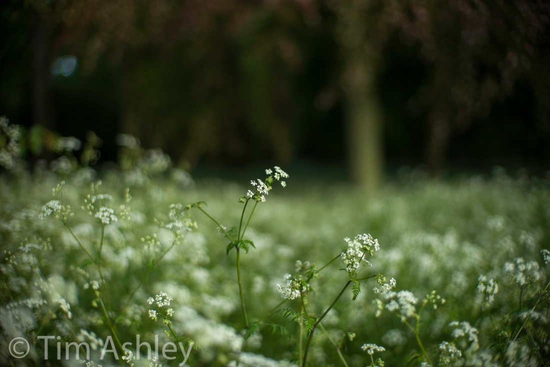
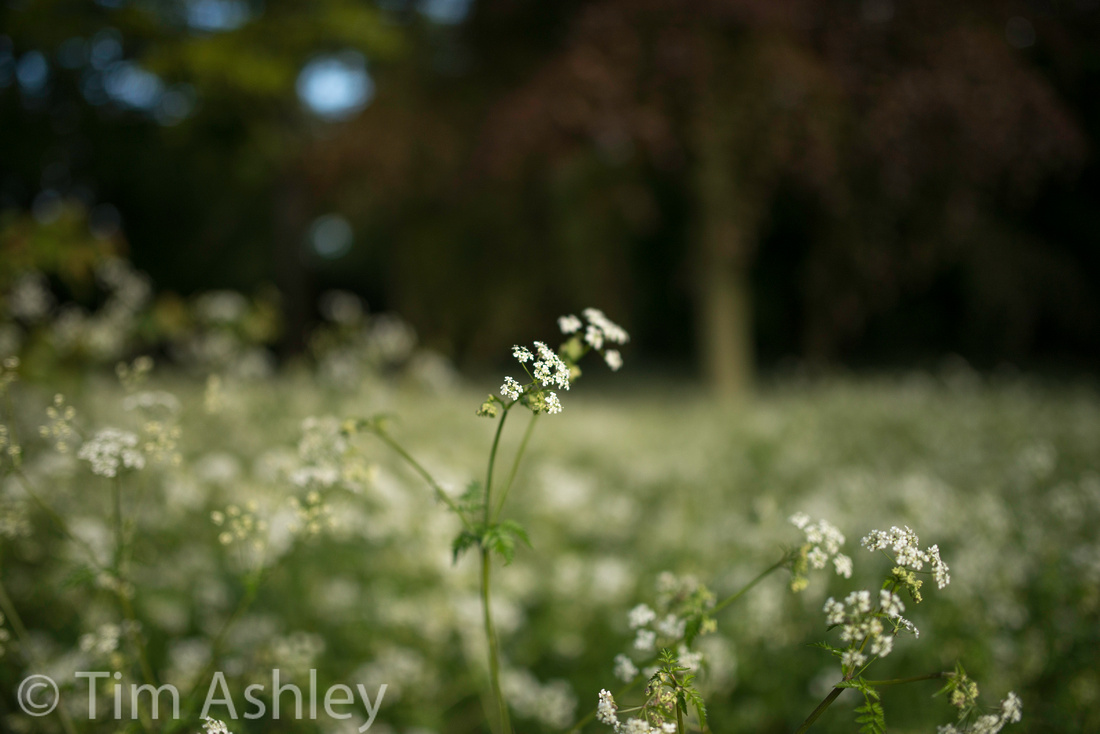
|
This site is not for profit but I do support the charity Photovoice. I wrote about it in depth a while back and that article is here. If you have found this article useful and are feeling generous, I would hugely appreciate a donation to the charity, even just a pound or a dollar: every little helps. You can donate here and the Virgin Giving site is secure and takes cards and PayPal. The Gods of Great Photography will smile on you if you donate. I promise. |
]]>
This was never an exciting lens on the M8 or M9 - always very useful, always a little dull. Its virtues are many: it has a reputation for good flare resistance, medium high contrast that can handle a bright day, fairly low distortion, good sharpness, low field curvature and no notable focus shift. For these reasons and for the fact that it has a very reliable placement of DOF in use, and that it is a useful focal length for travel, street and landscape, it was one of my most used lenses. But on the M240 it has gone from 'slightly dull but useful' to 'not as good as it used to be'. Consequently it has also slipped from 'most used' to 'little used'.
Why?
In short, it isn't sharp enough across the frame until F8 to fulfil the 'bigger prints' promise of the M240 sensor. I put this down to the peripheral falloff in the sagittal and tangential MTF 40 even at F5.6. It also seems to lack sparkle and micro-contrast across the frame - a phenomenon that I put down to the wave in tangential MTF 40 and the astigmatism between sagittal and tangential. Also, colour shifts across the frame are evident with current M240 firmware, even when the lens is stopped down. It is still far better than most lenses on most cameras, of course, but it is no longer a must-have, for me at least.
The aperture series tells all: the lens just doesn't get its act together at the edges convincingly until F8 and that is where diffraction is just starting to take the shine of the cherry on centre. Click the image to go to a gallery which has all files from F2 thru 16 and take a look.
For me, that just isn't interesting enough: it's not as if the lens has enormous character or sparkle to compensate, either. But it does have enough micro-contrast on centre to provoke moire on the M240 - see the following file (click for full size or merely look at the provided crop below).

 As you can see, it is not just the colour artefacts that are clearly evident: there's also the 'maze' shaped pattern moire so familiar from the M9 and so very hard to process away convincingly. I once lost a shot that really mattered to this effect.
On the M9, the lens corrections for the Cron weren't perfect. I don't have test frames from that combination to show a comparison but what matters here is that as a system, the M240/28Cron combo (with current firmware as of March 2013) doesn't do quite well enough and there are some residual shifts, even when stopped down, that will sometimes show up in the sky and possibly in other types of subject. Here is the F2 frame - click on it to go to the entire series.
Moving on to distortion - below are uncorrected and corrected frames and for me, they show that this is a non-issue.
 Onto flare. Generally, the lens handles it very well if shot with the hood on, but its reputation for being bullet proof in this regard is misplaced: you can provoke it quite easily though I must say that few lenses can cope with having the sun in the frame like this and that generally the lens performs well as long as this situation is avoided. Here's what happens when it goes wrong:
 On the plus side, it is really very hard to provoke colour aberrations of the fringe variety. The above file, when viewed it a 100%, shows almost no purple problems, when most fast wide lenses would be afflicted.
So there are some moderate problems with the lens but there are also silver linings and they are not to be underestimated. It performs in a generally well-mannered and predictable fashion on the M240 and, unlike with some other lenses, I do not see strange interactions of focus shift and field curvature (despite that mini-tsunami MTF) that can lead to anomalous results when using stop-down EVF focus. Instead I find, as I always previously did, that it lets me very reliably place the field of focus where I want it. That may also partly be a result of my long experience with it but for whatever reason, it is very useful. Scenes such as the following are deceptively difficult to handle with some lenses but with the 28 Cron, you can get pretty much everything, near to far, in great focus handheld and with no sweat, albeit at F8 - click for full size.

Should you want to do the opposite and explore the lens's bokeh characteristics, a few examples follow. I add more shots than usual here because this is one of the Cron's stronger points: wides often have an obviously 'nervy' bokeh but this one is relatively smooth. Click for larger files. All shot at F2 and F2.8.


I might have become mildly hooked on tricky lenses (such as the 35 Lux or the Nikkor 28mm F1.8G) because here, with the 28 Cron, I have a solid, reliable lens that doesn't mess me about. With the exception of the potential for some residual colour cast issues and the need to stop down to F8 for certain kinds of scene, it does pretty much what you want pretty much all of the time. But I don't expect it to remain current much longer than the current or next generation M: it needs a makeover at some point. Not urgently, but soon-ish. It should achieve edge sharpness by F5.6 and the colour shifts should be better controlled.
And it's boring.
|
This site is not for profit but I do support the charity Photovoice. I wrote about it in depth a while back and that article is here. If you have found this article useful and are feeling generous, I would hugely appreciate a donation to the charity, even just a pound or a dollar: every little helps. You can donate here and the Virgin Giving site is secure and takes cards and PayPal. The Gods of Great Photography will smile on you if you donate. I promise. |
]]>
There's an amazingly rich and varied auction of contemporary landscape photography coming up next week to raise funds for Positive View, the highly influential 'new kid on the block' charity for participatory photography in the UK. Some of the contributing photographers are listed above and, rather than reproduce all the images here, you might want to have a look at the catalogue because, whether or not you are able or willing to support the charity by bidding on a print, it contains some amazing images from many of the world's elite photographers and represents a veritable tour d'horizon of what is hot in the genre.
Positive View (run by the very well connected photographic expert Andrew Page) was founded in 2011 and has already staged some fascinating exhibitions. It aims to make significant grants to other organisations with the established methodologies to run participatory photography projects with young people. This auction (on Wednesday 15th May 2103 at Christie's in London) will see the formal launch of the Positive View Education Program, through which these grants will be made. Global auction house Christie's have very generously waived all fees - which will make acquiring one of these amazing images even more of a bargain.
As regular readers will know, I am an ambassador for Photovoice, an amazing charity that has for many years been honing the participatory methodologies that Positive View seeks to encourage and support.
Photovoice 'does what it says on the tin' which is:
"PhotoVoice’s mission is to build skills within disadvantaged and marginalised communities using innovative participatory photography and digital storytelling methods so that they have the opportunity to represent themselves and create tools for advocacy and communications to achieve positive social change."
The charity has been doing this since 2003, with roots stretching back a further five years. I personally give proceeds from some prints sales to them and support them in other ways too - including encouraging visitors to this site to donate! I have also worked on one of their projects, for users of mental health services, over the course of many weeks and can testify to the transformative powers of the method. I watched people who have been dealt a very poor hand in life blossom before my eyes as they gained the skills and confidence to document their own lives and to allow other people to see those lives from an inside perspective. Many of the participants also made work that put my own to shame, in terms of honesty, originality and sheer creative zest.
Photovoice gets its hands dirty: its dedicated staff and volunteers have worked with street gangs, victims of sex trafficking, children's rights groups, sexually exploited children, and a host of other projects with vulnerable and disadvantaged children and adults in the UK and around the world. They do this in circumstances that are often uncomfortable or dangerous and they do it with very limited funding.
So if you are a photographer with any belief that image making with a camera has the power to transform the way that you, and others, see the world - and if you would love to combine your passion with some directly relevant charitable giving, please consider looking at the auction lots. You don't have to be there on the night: there are instructions on the Positive View site as to how you might bid in either the Live or Silent auctions from anywhere in the world. But if you do want to be there, let me know via this site and I will try to arrange tickets - I can't promise, they are the hottest tickets in town at the moment, but I can try.
And for the gear heads: I have two images in the auction and they were both shot on a Sony RX-1 (which I have previously reviewed on this site) so, as you can see, that diminutive camera really is capable of results that can hang in any company.
Thank you for listening.
Tim
]]>
(Photo: Library of Congress. Photographer unknown.)
When I introduce this piece as 'a Layman's Guide' I refer, of course, to myself as the layman: for all I know, you have a PhD in astro-optical design and regularly grind your own elements. But for the rest of us, struggling with ever-increasing pixel counts and the need to understand our existing lenses whilst acquiring new ones wisely, field curvature and the impact it has on focus can be 'the last frontier' of learning and one of the most difficult to conquer: lens manufacturers and reviewers provide MTF data and information on distortion and chromatic aberration, sometimes even DOF tables but I have never seen data on field curvature. And yet it can have a significant effect on what is and what is not in focus in every frame you capture, with certain lenses. Understanding it can help you both visualise the field shape of an individual lens and adapt your focus technique accordingly.
A sign that we have graduated beyond Photography 101 is that we begin to develop a proper sense of depth of field*. We know that it is deeper with wider lenses, smaller apertures and greater subject distance and we know, with some experience, that we can 'place it' where we want it. We also pick up some nuggets about circles of confusion and viewing distances and so on. But as pixel counts rise, I know I am not the only person who has noticed 'shape of field' effects more often, and struggled to pin down both the causes and how best to manage the effects.
I am always jealous, when debating the potential merits of a lens online with other folk, to hear the suggestion that I should 'rent one and see.' The market for lens rentals is comparatively underdeveloped in the UK and I long for access to a company such as LensRentals, an Aladdin's Cave into which I can peer but not enter. And peer I do, especially at the excellent blog of Roger Cicala, the only man I have ever seen wearing a lens case as a hat.
Roger sits at the perfect intersection, for me, of theory and practice. He loves lenses, loves finding out what they are capable of, and has a profound technical understanding of both what to measure and how to measure it. I am very grateful and honoured that he has agreed to contribute to this article. So: I am going to write an explanation of my understanding of field curvature (won through sweat and a bit of layman's study) with a mixture of simple theory and practical examples and suggestions - and then Roger is going to tell us all where I am wrong and what other considerations we might take into account.
Let's start.
Imagine, for now, that we live in a two-dimensional world where the scenes we photograph have depth and width only. This will help my diagrams make more sense and will also facilitate an initial understanding of the subject for the uninitiated. I will add height, the third dimension, later.
When we first learn about depth of field, we generally have it explained to us like this:
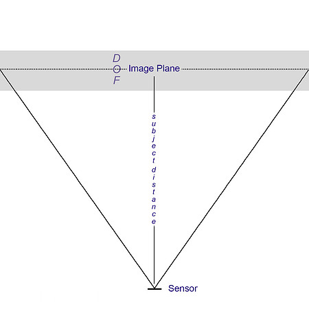
Fig.1
Schoolboy geometrists quickly spot, however, that the edge of the planar subject is further away from the sensor than is the centre. Thus, if a lens focusses at the same distance across the frame, then the 'shape' of the in-focus field will naturally be curved. Theoretically, that curve would be a section of a circle with the sensor at its centre (I am taking some short cuts here to keep it simple). And that means that the edges of our planar target would fall outside of this arc and therefore, if shot with very thin DOF, be out of focus.
In practice, there are several solutions to this:
- Make the sensor or film curved so as to compensate (popular in astro-photography but also used in some film cameras)
- Use the optical design to compensate, by changing the shape, grouping and material of the elements and groups within a lens.
- Let it all hang out
Lens designers have several competing and often mutually exclusive aims: they want large maximum apertures, low distortion, minimal chromatic aberrations, controlled vignetting and low astigmatism to name a few. And correcting for natural field curvature (literally bending nature) is to some extent incompatible with some of their other aims. So in practice, all modern digital camera and lens systems shoot somewhere between 2) and 3) above.
The result of this is that almost no lenses you will ever use have a perfectly flat field, and almost none have a perfect 'section of a circle' field. Instead, they come in varying shapes such as 'croissant', 'wave' or 'runway' (my terms) and, these shapes can direct their acute angle towards or away from (rearwards field curvature) the sensor.
Now let us add in, with the help of some diagrams, the idea of depth of field to the idea of 'shape' of field. Note that these shapes are simplified and idealised in order to illustrate certain types of curvature. In the real world the shapes are more complex.
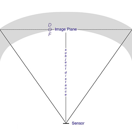 Fig.2
Fig.2
In the above diagram, the field shape is an arc which is not a perfect section of a circle. In other words, the lens design has partially corrected the field curvature by flattening it. And, because we have stopped the lens down a little, there is now some depth to the field of focus too. In fact, there just enough correction and just enough depth to get the entire planar subject in focus. But if we place the exact point of focus slightly differently, we move the position of the field of focus relative to the subject plane and this happens: the edges are out of focus. Bear with me here: the exact shape of the field of focus shifts as you change your point of focus and that makes matters more complex but for now, it might help to ignore that factor!
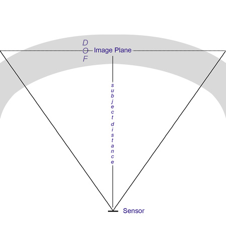
Fig.3
Field shapes can also be 'wavy' as noted above and as the following two diagrams show, this wave-shape (again a result of a compromise between competing design aims) can either not matter or matter quite a bit depending on exactly where you place focus:
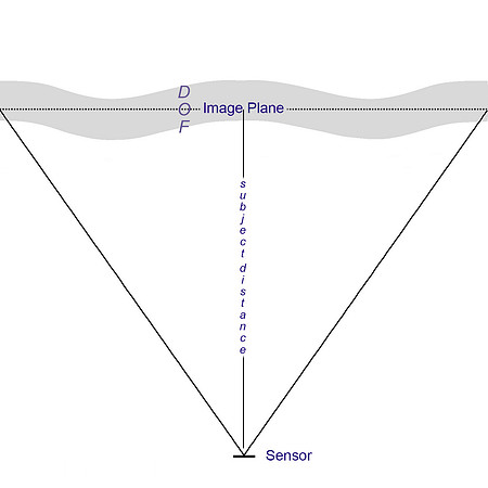 Fig.4
Fig.4
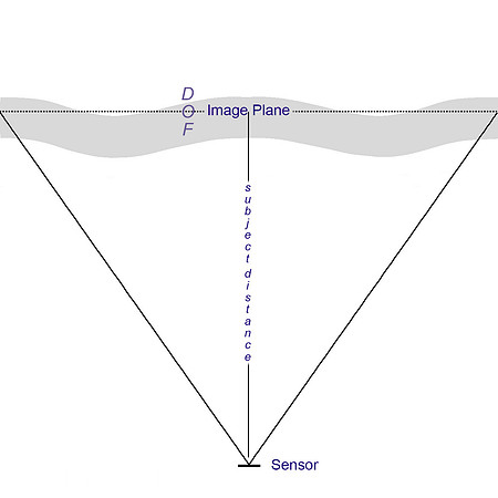 Fig.5
Fig.5
The second diagram (Fig.5) is a simplified explanation of what might be happening for some cases of 'mid-field weakness' in a lens: the 'placement of the field of focus' has moved closer to the sensor relative to the first diagram because the lens has been focussed to a slightly shorter distance. The subject on centre is still in very good focus but parts of the mid-field sections of the image plane are slipping in and out of the field of focus. I have made focus-bracketed series of shots which seem to indicate that this is happening.
Field shapes vary widely: quite possibly both wave shaped and curved, for example. One frequent field shape (see my review of the Nikkor 28mm F1.8G for a very graphic illustration of this) is the 'runway':
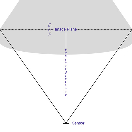 Fig.6
Fig.6
If you ever have images where a middle-distance planar subject is in good focus edge to edge, the distant parts of the frame are sharp on centre but OOF at the edges, you have a runway on your hands. It looks like this: excuse the odd tint! The yellow area is an approximate focus mask, focus is at the distance of the easel. Clicking on it will load a full-sized D800E version of the same file but without the tint and mask so you can look in more detail at the exact field of focus, which actually extends to the very far horizon in places.
Fig. 7
Now let's escape from some of the simplifications of the above so as to approach a more practical set of observations.
Firstly, let's add the third dimension: height. In the above diagrams we have looked at a 2D cross section of reality but of course, the shapes we have been looking at need to be visualised in three dimensions. This is too complex a topic to illustrate without interrupting the larger flow of this piece and in real world use it is often enough to stick with the 2D visualisation - but if you want to go further, think of it like this: the example above shows a roughly runway (or triangular) shaped field of focus in 2D. in 3D this is more like a cone. Of course some of that cone-shaped field of focus is bisected by the ground itself so what you see on the ground is a triangular shape because (schoolboy geometrists again!) a triangle is one possible cross-section of a cone.
The second part of the problem is that my field experience indicates that the shape of this 3D form changes, a lot, even within the use-case of one lens on one camera: the distance at which you set focus and the aperture you choose combine to determine that shape, but it might change radically as those parameters shift.
The third part of the problem is that, having imagined the exact shape and position of that form within the cuboid of your image field, you need to imagine how it intersects with the physical elements in your scene (tiny foreground grass, short, nearby people, tall mid-distance trees, far mountains).
Phew. This really is a pig and I am sorry I'm not able to describe it more simply.
So: how do we discover the shape of this form, and what are the practical implications when choosing and using lenses?
In an ideal world [Roger, can you do this? ;-) we would all really appreciate it!] we would have a nice little 3D rendering app on our smartphone that allowed us to enter the following parameters:
- Camera
- Lens
- Print size
- Viewing distance
- Focus distance
- Aperture
- Height of sensor from ground (so we can see where the ground intersects the 3D shape of the field of focus)
The app would then pump out a 3D rendering of our cuboid 'frame' and within it, a shape representing the field of focus. It might look a bit like this, for example, and we could see it get fatter and thinner or more or less concave, or even change shape completely, as we changed our parameters. We could then grab it and rotate it so as to visualise how the elements within our image might intersect with it.
Fig. 8
The bad news is, I don't see this happening any time soon. The good news is, it exists already, sort of: it's called the human brain: really experienced photographers learn their lenses and, whether consciously or not and possibly by use of focus or aperture bracketing, manage to match the shape of the 'form of focus' to the 'stuff in their pictures' so as to give the results they want.
We're not all that good, though. I'm certainly not. So here are some practical tips:
Firstly, look at MTF graphs: here are two entirely fictional MTF 50 graphs at F5.6 for two imaginary lenses. They assume no astigmatism (so perfectly aligned saggital and tangential plots). They show two fairly familiar shapes and, all other things being equal, they indicate that the first lens might have some form of field curvature (whether forwards or rearwards) and the second lens might have a 'waved' field shape. There are other factors that can affect the shape of the MTF too - but charts like this can be a clue.
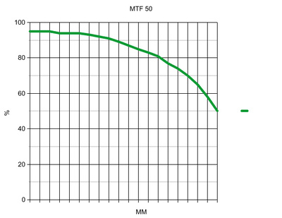
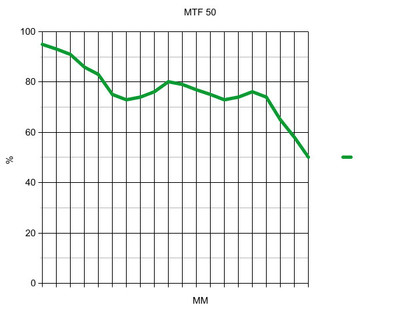 Fig. 9
Secondly, find a large field with some distant trees. Get someone to stand so that they are centre frame and about one third the height of the image field. Focus on their face very carefully and then shoot wide open and at F5.6 and then look very careful at the shots at 100% on screen paying particular attention to the blades of grass: the areas where the grass is in focus can really help visualise the field shape, albeit in a two dimensional plane.
Lastly, shoot a highly textured brick wall (the biggest you can find) at, say F4 and from as far back as you can get, preferably at least 25x the focal length of the lens . Focus it as perfectly as you can, using a tripod. Now shoot another frame with the focus pulled a little closer and another with focus pushed a little further. See which parts of the wall are in best focus in which frame. Any tricky aspects of a lenses field shape can be revealed by such a test and it is surprising how a lens that you think is just 'soft at the edges or corners' can show itself capable of better performance in those areas with just a small change of focus.
For most photographers, most of the time, none of the above matters. For a start, the 'shape' of subjects in the image will very, very often hide these issues. But to many of us it does matter often enough: some lens that seems always soft at the edges might just need a slightly different fine tune setting, for example. Small changes can genuinely help. Some lenses, and I have recently named here the Leica 35 Lux and the Nikon 28 F1.8G, just feel 'tricky: they seem to be giving inconsistent results and that can make it hard to achieve uniform focus across the field. This is usually, in my experience, due to unexpected shapes of the '3D form' that describes the field of focus. A 'tricky' lens can become a great lens if you just learn to focus it differently: that might involve changing you fine tune value, or habitually deciding to slightly back or front focus it at certain apertures. Of course, the problem is that as you shift the point on which you place exact focus, you shift the shape as well as the position of the field itself (a fact ignored for simplicity's sake in the diagrams above) so getting it just right is an iterative process.
A really good example of this is seen in shooting certain lenses on the new Leica M240: focussing through the rangefinder (on my copy at least!) tends to place the entire field of focus of some lenses slightly further away than shooting with the EVF when stopped down and this can, depending on the shape of the field, either be a good or a bad thing. Now it is important to know that this isn't a mistake as such: there is a certain depth of field when stopped down and an EVF can 'see' the subject as being in focus at any one of a small range of distances, whereas the rangefinder is agnostic of aperture and therefore of DOF - and seems to have been calibrated to 'get it right' when working with the focus cam shape on the particular lens. The RF seems to work particularly in favour of lenses with small focus shift and some forward field curvature.
This has implications for all EVF users on any system, and they are I hope clear enough not to need further description.
All of the above also has implications for the accuracy of 'focus and recompose' with some lenses, and for the importance of accurate peripheral focus sensels on DSLRs when used to shoot off-centre subjects on lenses with 'interesting' field shapes - because if the field of focus is curved, then subjects on, say the thirds, may not be in perfect focus when a central object on the same plane is in focus.
Here are two images to illustrate what all of the above can mean in practice. They are both taken from the additional material I added to my recent review of the Leica 35 LUX FLE on the M240. They were shot as part of a 60 shot series including many brackets and iterations so as to provide representative rather than one-off results. A Gitzo 3 series CF tripod with Arca cube and self-timer were used. Both are shot at F4. The first was focussed with the EVF wide open (which gives pretty much the same result as with the rangefinder) and the second is focussed with the EVF stopped down.
Remember, this is the same lens, same camera, same time, same position, same everything apart from the slightly different focus offered by two pretty accurate methods which happen to place the field of focus slightly differently. The differences are very clear, very educative and not in my experience very unusual with this type of fast wide lens.
EVF focus wide open shot at F4: the centre is good (though a touch softer than the second shot) but the rest of the frame is much, much better.
EVF focus at F4 shot at F4: the centre is a touch sharper than the first shot but much of the rest of the frame is a mess though the extreme corners are moving back towards sharp focus.
So what has happened? My theory is that the known slight focus shift of this lens means that if you focus wide open and then stop down to shoot, the entire field (and shape) of focus moves backwards from where you placed it by focussing wide open. This does not perfectly suit the central POF if you are looking for absolutely critical focus but it does work well for the frame as a whole.
But if you stop down first and then focus, the central POF is looking excellent but the rest of the frame looks quite poor. This shouldn't be too much of a surprise: Leica M lenses were designed to be focussed at no particular aperture but to do as well as possible at all of them on average and, vitally, to focus well wide open. If you focus stopped down (in the new world of EVF) you are shifting the focus field around in ways that were not originally anticipated by the lens designers and which give, on average across the frame, a less good result with some lenses. So EVF shooters on the M240 take note: I have found that stopped down EVF shooting tends to pull the entire field a touch closer with certain lenses. DSLR shooters using 'phase detect' AF are affectively focussing wide open too, but unlike rangefinder shooters they often have the ability to make quick, in-camera tweaks to the fine-tuning of this system. They might benefit from adding as much + compensation to fine tune as they can get away with considering their wide open shooting needs.
In any event, the nice thing about the above two frame example is that even if I had presented the shots the wrong way round, or focussed badly, or had a significantly warped target, the fact would remain that the frame that is sharpest on centre is weak at the edges and the frame that is best over the whole frame on average is a tad less sharp on centre. That is the exciting world of field of focus, folks.
Lastly from me: 'interesting' field shapes can be useful in real-world photography. The 'cone shape', for example, is great for shooting an avenue of trees receding away from you in landscape orientation, because the shape of the field of focus matches the shape of the subject.
The real world has few planar subjects - and yet pretty much every piece of lens data you will ever see coming out of a lab is captured using a planar target. One man straddles the boundary that separates lab from real world. His name is Roger Cicala of LensRentals, and he will now talk more sense than me...
Roger Speaks
Field Curvature and the Area of Focus
Justice Stewart Potter, ruling on a pornography case, stated, “I can’t define it, but I know it when I see it”. Field curvature, to me, is exactly the opposite: I can define it, but I’m not sure I always know it when I see it.
I can definitely see field curvature in most photographs taken back in the days when men were iron and ships were wood. Have you ever noticed that in old group photographs the photographer often arranged the subjects in an arc? A good photographer back then knew the field curvature of his lens and arranged the subjects to keep them in the plane of focus.
Fig. 10: Chaplains of the 9th Corps, 1864. Library of Congress. Photographer unknown.
Way back in 1840, Joseph Petzval used the world’s first parallel computer (actually 10 artillerymen skilled in trigonometric computations) to determine, the formula for field curvature, which we still call Petzval’s Sum. When Petzval’s Sum = 0 the lens has no field curvature.
Petzval’s calculations also showed ways of using thick meniscus elements and air spaces between the elements of a lens to reduce field curvature. When high-index optical glasses became available around 1900 it became possible to nearly eliminate field curvature – at least in theory.
Because field curvature is defined mathematically, the lens designers (and manufacturers) know exactly what the curvature is for each lens. A very few lenses (mostly older Leica and Zeiss) actually gave us the theoretical field curvature information in chart form – but almost none do these days.
The Zemax diagram below shows the computer derived field curvature for a simple lens. Note that the curvature is different for different wavelengths of light and for sagittal and tangential rays (more about that later – I know you’re excited).
Fig. 11: Computer generated field curvature diagram. www.johnloomis.org The curvature represents one – half of the image from the center to one edge.
Field Curvature in Modern Lenses
Field curvature is less of an issue in today’s lenses, of course, but many people wonder why it still exists at all. One reason is that all lens designs are compromises and in some cases a lens designer decides leaving a bit of field curvature is better than having other aberrations.
Another reason is that as photographers we use the term ‘field curvature’ when we are really describing ‘area in best focus’. When the area in best focus is curved or complexly shaped we say the lens has field curvature.
The curvature we see in our photographs is somewhat different than what an optical physicist designing a lens would consider field curvature, or what shows in a graph like the one in Figure 2. That’s because the area of best focus in a lens is influenced by all of the aberrations that lens has, including field curvature.
But we photographers (as Tim has done above) use the term ‘field curvature’ to describe what should really be called ‘area of best focus curvature’.
Going PhotoGeek for a Minute
If you want to skip the geeky stuff and scroll down to the Some Real World Stuff heading below, I’ll understand.
Two of the 7 primary aberrations, field curvature and astigmatism, are rather interrelated. In a lens with no astigmatism, sagittal (along the line from the center of the lens to the edge) and tangential (at right angles to the sagittal line) lines are equally sharp.
Fig 12: No Astigmatism
Most lenses do have some astigmatism, however, so the plane of focus for sagittal lines and tangential lines are slightly different. Focusing the same lens slightly differently would give something like the two images below.
Fig. 13: In a lens with marked astigmatism, changing the focus slightly brings either the sagittal or the tangential lines into sharp focus, but not both.
The tangential and sagittal lines not only may have slightly different planes of focus (astigmatism) but may also have different field curvatures. Lens designers sometimes use this phenomenon, purposely creating some astigmatism and giving the sagittal and tangential lines slightly different field curvatures to get the best compromise for their lens.
In the image below, for example, the tangential lines are blurred along the edges and corners, while the sagittal lines are blurred in the mid field. Changing the focus slightly might reverse the effect. The designer has created a lens where something is always slightly out of focus, which might be much better than a lens where some part is very sharp and some part is hugely out of focus.
Fig. 14: Complex astigmatism with field curvature
It’s getting rather complex, isn’t it? And that’s just the beginning. Lens designers must also balance minimizing other aberrations and maximizing resolution with reducing field curvature. What we perceive as the area of best focus is also affected by spherical aberration, coma, and longitudinal and lateral chromatic aberration.
And those are just third-order aberrations. There are also 5th, 7th and even higher order aberrations. But I hear you begging. I won’t go there.
But one thing that is important to remember is that each aberration increases with distance from the center of the lens and with aperture – but the two factors affect each aberration differently (and exponentially). Stopping down your aperture affects the different aberrations differently.
Field curvature and astigmatism, for example, worsen linearly with aperture, but as the square of distance from the center. So stopping down decreases them somewhat, but not as much as distance from the center increases them. Coma is the opposite: it changes linearly with distance from the center, but as the square of aperture. So stopping down decreases coma much more than field curvature. Spherical aberration is completely related to aperture and stopping down has a huge effect on spherical aberration.
The takeaway message is this: stopping down the aperture improves field curvature and astigmatism somewhat, improves coma a lot, and improves spherical aberration most of all. The sum total of these effects changes our ‘area of best focus’, which is what we photographers really mean when we say 'field curvature'.
That’s why I’m not too worried about the manufacturers not giving us computer generated field curvature graphs like Figure 2. Their field curvature isn’t exactly what we see anyway.
Some Real World Stuff
In the real world, testing for field curvature (area of best focus) in an optical lab is difficult and requires specialized equipment – and even then will probably only gives you a result at one focusing distance and aperture.
I spent a lot of time trying a dozen different techniques to find something simple that a person could do at home to evaluate their own lenses. (This included setting up test targets of a dozen ‘Lens Align’ rulers side-by-side, photographing large charts made up of dots, lines, and multiple AF1951 targets at various angles, etc. None of them were very effective).
What is fairly effective is the simplest thing of all – take appropriate pictures and look at them them. A lawn of cut grass with a target in the center works well. For closer imaging a simple grid, like my $12 work mat or a mulched garden (shown below) is excellent.
If you have a camera with focus peaking you can get a fair idea of the field curvature right in the viewfinder. If not, opening the image in Photoshop and performing a quick ‘find edges’ filter and a parameter adjustment or two will highlight the areas of best focus just fine.
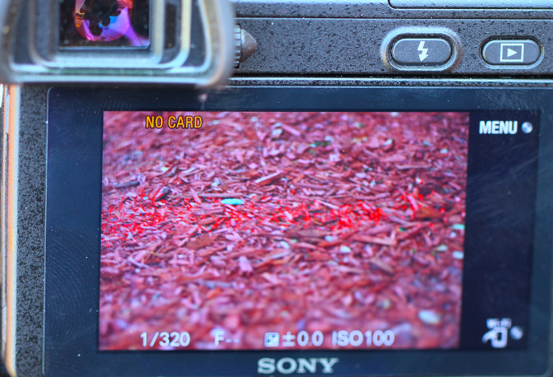
Figure 15: Focus peaking (bright red) shows this Leica 90mm f/2.5 lens, like most telephoto lenses, has very little field curvature at 12 feet focusing distance (at least on a crop sensor camera).
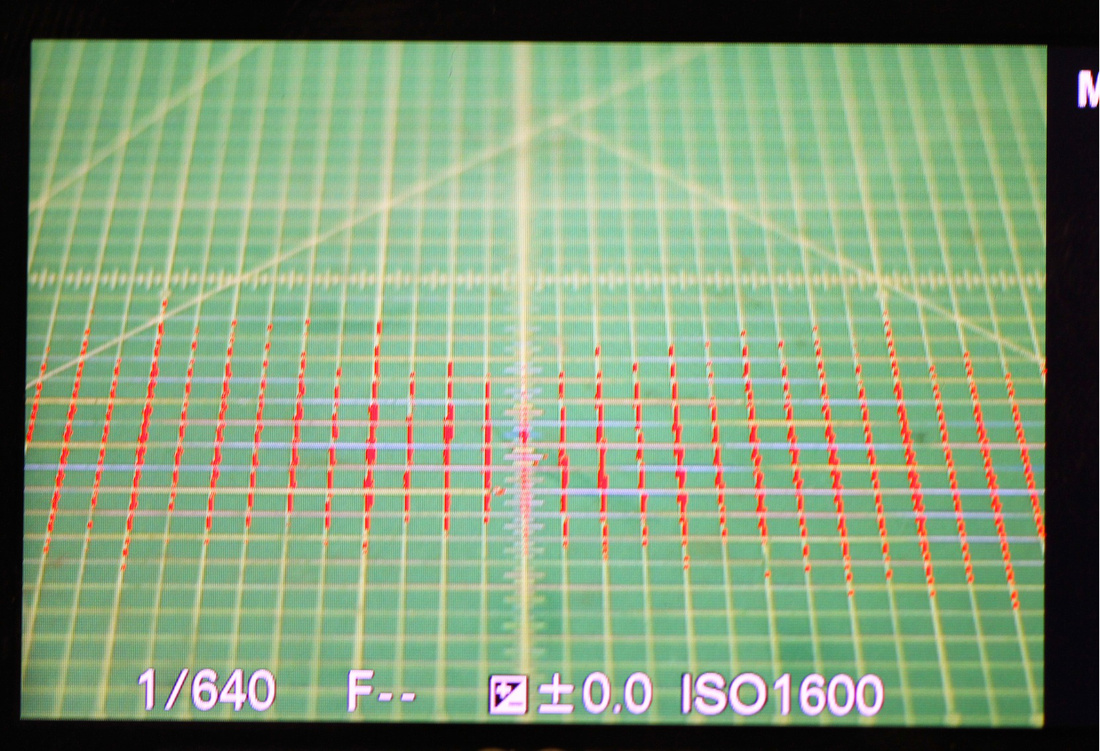
Fig. 16: This Voigtlander 75mm f1.8, on the other hand, shows a complex field curvature at 6 feet distance. Notably the depth of field is narrowest in the center of the image becoming wider away from center. I should note for these demonstrations I chose slightly telephoto lenses to allow a narrow enough depth of field for the demonstration at these distances.
What Generalizations Can We Make?
1. Anecdotal reports suggest that wide-angle rangefinder lenses exhibit more noticeable field curvature than SLR lenses. This may be because of differences in rangefinder focusing or because few rangefinder lenses are reverse telephoto design. (Reverse telephoto designs have more lens elements, giving the designer more opportunity to correct field curvature.)
2. The actual curvature is improved to some degree, and often changed in shape, by stopping down. Of course, increased depth of field helps mask field curvature.
3. Field curvature increases as the square (3rd order curvature) or 4th power (5th order curvature) of the distance from the center of the lens, so it naturally is more severe toward the edges of a full-frame image. Lens designers know this better than us, though, and use their tricks to minimize this – which results in more complex curvatures affecting the mid range, etc.
4. A given lens may exhibit different curvature at different focusing distances.
5. Taking a few controlled photographs and evaluating them with a bit of pixel-peeping will give you a good idea of the field curvature in your lens.
6. The lens’ MTF chart, particularly if it shows a ‘dip’ in the mid range or widely separated sagittal and tangential MTF, may hint that a lens has field curvature.
Now the truth is that the majority of lenses these days exhibit very mild field curvature, if any. But there are certainly a few that do and those few tend to be superb wide-aperture prime lenses. If you have one or two of those, taking a few minutes to evaluate the pattern of its field curvature (and I still prefer the term ‘area of best focus’) can improve your photography.
© Roger Cicala 2013
* I am going to assume the following rough but practical definition of field of focus in this article: "a picture element is considered to be within the field of focus if, at your chosen physical reproduction size (whether on screen or in print) and your chosen viewing distance, that element is subjectively in good enough focus for your needs." We could redefine all that in terms of circles of confusion but really, what's the point?!
| This site is not for profit but I do support the charity Photovoice. I wrote about it in depth a while back and that article is here. If you have found this article useful and are feeling generous, I would hugely appreciate a donation to the charity, even just a pound or a dollar: every little helps. You can donate here and the Virgin Giving site is secure and takes cards and PayPal. The Gods of Great Photography will smile on you if you donate. I promise. |
]]>
So why the reader requests for information on using super-wides with the M240? Well, they all centre on interiors and architecture. Which is not to say that this lens may not be very useful for landscape use, possibly even the more dangerous forms of reportage, too - but it does indicate that a lot of actual and would-be M240 users want a super-wide for rendering man-made forms accurately.
Let's take a quick step back and look at the marketing information, so as to ascertain the claimed abilities of the lens. These focus on a number of areas: the 'retrofocal-like' architecture, with two aspherical surfaces, is supposed to offer 'outstanding image quality at a maximum aperture' with low vignetting (for the focal length) and distortion that is 'virtually undetectable to the human eye'. 'Absolute sharpness' and 'Superb Depth' are also claimed.
It is important to recognise that the marketing brochure to which I have linked and from which I have quoted is current on Leica's website but was clearly written some time ago since it repeatedly references M8 and 'traditional M' (i.e. film) cameras. But the name of the game of my current series of articles is to discover how various lenses perform as part of a system when mounted on the M240. So, in the Brave New 24 Megapixel CMOS World, how does the 18mm Super-Elmar-M do?

Leica's Technical Data PDF for the lens gives some useful pointers. Specifically, the MTFs indicate that the lens probably has a great deal less field curvature than, for example, the 35 Lux FLE. The F5.6 graphs show a calmer, flatter plot though astigmatism is more of an issue, indicating that the lens might exhibit less of that Limpid Leica look, and lower micro-contrast. However, those MTFs, whether measured or calculated (it isn't clear which) were published before the M240 was a twinkle in the eye of the M9 let alone the M8, can't speak specifically to the actual performance on the new camera though in practice, as we shall see, their implications seem to be borne out.
I will look at distortion and cross-frame sharpness by reference to the same set of images.
Below is a frame shot at F3.8 and clicking on it will lead to a gallery containing an aperture series shot thru F16, all of which are available for download as full-sized images - mouseover top left of image in gallery for download options.
The series was shot in RAW on a levelling head using the camera's horizon, focussed using the RF wide open then not refocussed between frames. Despite careful use of technique, the subject plane is not perfectly square to the sensor and this speaks to the difficulty of composing in an EVF which has lower resolution and clarity than one might like, and which shows an inaccurate FOV compared to the captured image. However, I do not regard the skew as material to my conclusions given the DOF involved - and it is not an infrequent result when using super-wide lenses, which are very sensitive to tiny alignment errors. I would add that lens corrections are not applied here, but whether applied in-camera to a JPEG or in LR 4.4 to the RAW file, will trim an amount from the resulting image that makes the final corrected shot quite similar in FOV to that shown through the EVF.
Developed from RAW in LR 4.4 with no lens corrections. Sharpening at my usual 60/0.7/70/20.
Observations:
- There is a notable 'moustache' distortion, far from 'virtually undetectable to the human eye,' to the images and it is unpleasing on images that require rectilinear correctness.
- Frames at F3.8 and 4 are weak at the edges and corners. F5.6 is peak on centre, but the edges require F8 to achieve good sharpness and the corners are best, but still not really tight, at F11.
That doesn't sound great. However, there is an easy workflow for those images that really do require optimal rectilinearity and cross-frame sharpness. The frame below is the result of this method: (click for full sized version)

Method:
- The f5.6 file was given LR4.4 Automatic lens corrections, straightened according to the vertical of the central window and then given a +3 manual Horizontal lens correction. There was no sharpening.
- These settings were then copied to the F11 file
- Both files were exported as full sized TIFFs and then processed in Helicon Focus at default settings. The resulting file was saved as TIFF and re-imported to LR4.4 where it was given sharpening of 60/0.7/70/20.
There are other ways to get the same (or possibly better) results but what I hope this shows is that a file can be made using aperture bracketing that, when easily processed, give a result which is acceptably rectilinear and sharp enough across the frame for a double page spread, or even a 30" print. Most shots of most subjects at F8 will not require any special treatment, because most of these minutiae 'get lost' in the shape of normal subject fields.
I hope that answers the two biggest concerns, distortion and peripheral sharpness, that I have heard about this lens on the M240. Let's look at the lesser issues.
Colour shading is impressively well controlled, I suspect dues to the 'retrofocal-style architecture'. The image below is an F3.8 frame and leads to a series thru F8. IMHO, this is a better performance than I expected and better than many other current M lenses up to 50mm.
Purple fringing is well controlled. You can provoke it, but it is easily dealt with. Here is a 100% crop of an F3.8 frame exposed strongly to the right against a brightly overcast sky. It is hard to make the lens do worse than this:
 Focus shift is just detectable between F4 and F5.6 but it is so tiny that even converting the crops to JPEG has made it impossible to see. This doesn't mean that it is totally insignificant - at greater subject distances it might very slightly influence the placement of the DOF - but it barely registers as field relevant.
Field curvature is present but quite well controlled. It is worth noting that my shots made with RF focus tend to place the field of focus very well relative to the subject, but that, as I have discovered with other lenses, 'stop down EVF focus' has a tendency to bring the field a little closer. I will be writing more about this next week but for now, if you (like me) have the habit of focussing by twisting the ring 'from near to far' then you will probably find the same thing, since the central subject will start to appear very sharp in magnified view, and the peaking will shimmer, at slightly closer distance than the RF would choose. This happens even if the EVF is used to focus wide open and is due to the DOF of the lens and the lack of a very wide maximum aperture capable of providing clear focus 'pop'. The result is that some frames at F5.6 and F8 might, if 'peeped' to the extreme, have softer edges and less chance of a sharp rendering of central distant subject matter when focussing on nearer-ground subjects. If you find that happening to you, RF focus is the remedy though I must say, as long as you know what is going on here, the EVF can make 'placing' the field of focus exactly where you want it a less daunting task. So in general I regard this as being as much an opportunity as a problem, albeit one that will require a little training.
Bokeh is not a prime consideration with a lens this wide but when it does occur, it really is quite pleasant: follows a frame and a crop to illustrate it at F3.8 and close to minimum focus distance.
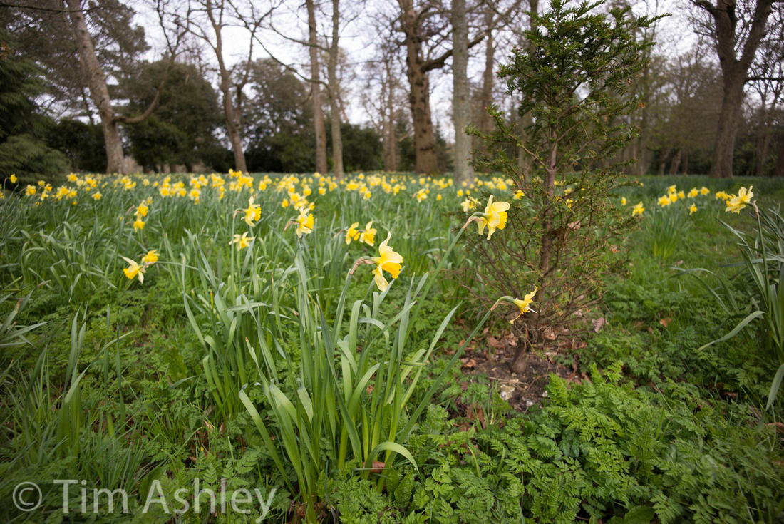
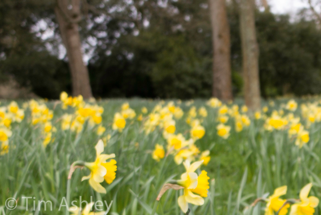
Conclusion
Here are two frames that illustrate my final thoughts. Both shot with RF focus, the first at F5.6 and the second (I think) at F8.

 Neither has had anything fancy done to it, other than standard LR automatic lens corrections. The first is bright, sharp over most of the frame, not obviously distorted. The second is fine, but close inspection shows the thatched roof in the corners to be very weak despite my having stopped down to F8. But neither of them, nor any shot I have yet taken with this lens on this camera, has much real life or soul.
The Leica Look has a lot to do with bokeh, but also with the way that transitions between focussed and OOF areas are handled. It might also, some think, have something to do with subtle field curvatures and the way they can emphasise a subject. And it certainly has a lot to do with micro contrast. There's also the 'secret Leica Sauce' that has people permanently speculating as to its mystery ingredients. So this lens was never going to be a prime candidate: it has too much astigmatism, I think, to give a full dose of the limpid clarity we love in the brand - and it is too wide to major on subtlety of DOF transitions. It also struggles, frankly, to get sharp across the frame on the M240 and for some of the major uses people will have for it, that will be an issue. But for those who need to shoot at this focal length, it is somewhat better than good enough: for some of the tasks people ask of it, it is being asked to do the job of a technical camera lens but on a rangefinder camera - and the fact that it can keep up at all does it credit, though it must be remembered that this is not a cheap piece of kit.
An interesting alternative might be an adapted Samyang 14mm F2.8, a lens which has impeccable everything apart from some crazy distortion. But, like the Super-Elmar, that distortion can be corrected. Another option, the CV 15mm, is so badly afflicted with colour shading on the M240, even when coded as a WATE at 16mm, that I count it as effectively useless. Alternative codings such as for the 21mm f2.8 pre-asph or asph improve things a touch but not enough. I will cover this in a bit more detail at some point.
Please note: I originally wrote a much longer article but as a result of a 'save error' which I naturally blame on Zenfolio's blog software rather than on my own personal stupidity, that piece was clicked into oblivion. I need to move on to working on the next article, which I hope will be genuinely exciting and on which I will be collaborating with a guest expert of some renown, so I simply don't have the time for a full re-write. What you have read above is, therefore, a précis and I apologise if it lacks full explication in places.
This site is not for profit but I do support the charity Photovoice. I wrote about it in depth a while back and that article is here. If you have found this article useful and are feeling generous, I would hugely appreciate a donation to the charity, even just a pound or a dollar: every little helps. You can donate here and the Virgin Giving site is secure and takes cards and PayPal. The Gods of Great Photography will smile on you if you donate. I promise.
]]>
I was struck very strongly, at the end of the first day's shooting, with two things: how amazing the 50 Lux was - how easy and well-tempered to use and how consistently lovely the results - and how tricky and troublesome the then-current 35 Lux was. But the problem was and remains that I am much more a wide shooter by temperament and so, though I realised on that trip that the 50 Lux was the best lens I had ever shot, I got into a pattern with it that is by now familiar: I keep it with me, use it comparatively rarely, then get blown away by it when I do.
It has almost perfect manners. It has gorgeous colour. It has wonderful bokeh. It has a truly beautiful, glowingly soft but sharp wide open performance and it then tightens up into something which is both accurate technically and poetic artistically. It can separate out layers of subject depth into layers of focus and de-focus that seem to make all elements of a scene articulate with each other harmoniously.
It has soul.
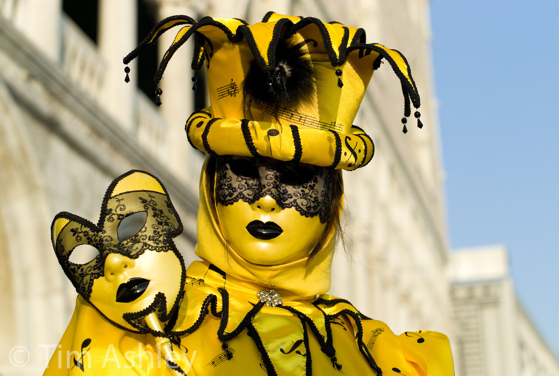 50 Lux on M8, Venice 2007
So when the M240 arrived, my second task was to see whether the 50 Lux was going to impress on the new higher resolution sensor - or whether it was harbouring weaknesses that would finally be exposed. My first task, BTW, was to ask the same question of the 35 Lux FLE, a lens whose focal length is arguably more important to the Leica gestalt. Regular readers will already have seen the piece I published last week on that subject.
Unfortunately there hasn't been time for a trip to Venice : but some casual shooting made it clear that though the lens is still a star, some minor questions needed answering so I have run my usual set of tests and I have discovered in the course of so doing where the fault lines are, and where future, even higher resolution sensors will start to test this classic lens to its limits and, unfortunately, beyond. But that is a technical judgement, not a creative one: creatively, the lens remains as utterly wonderful as ever.
I want to illustrate that point first. Take a look at the following F4 M240/50 Lux file (click for a full size JPEG). If possible, load it into Lightroom or other retina-aware program and at it on a Retina screen or make a 26" print. It isn't a great shot but it does show this fabulous ability to separate out planes of subject into their own zones of focus, a trick which lesser lenses can do easily by using extreme OOF areas but which the 50 Lux specialises in doing with much smaller differentiation of degree of focus. If you want the Leica 3D look, this lens can provide it in spades.

A quick usability comment: for some reason the M240 with 50 Lux is better at guesstimating accurate aperture information than is the M240/35 Lux combination. Not perfect, but better.
On to some tests. Firstly, I have run my usual series of focus shift tests at close range, and they indicate, as was the case on previous cameras, that focus shift does exist but is very mild. In fact, the original point of focus stays well within the developing DOF as the lens is stopped down. This is important to know because it means that at least at close range (and as it turns out at distance too) a well calibrated rangefinder will do just as well stopped down as wide open, even at this new, higher resolution point. The series of shots is here.
Next up, colour shading. We generally expect this to be largely tamed by the time we hit 50mm focal lengths, given that it is classically more of an issue with wider lenses, but there is still a touch of it when using the M240/50 Lux combination and though it is most evident at f1.4 as one would expect, it hasn't completely gone even by F5.6. The entire aperture series is here but I will post in-line, by way of illustration, the F2 frame versus the identical frame from a D800E series where the Nikon has an adapted 50 Cron mounted, also shot at F2.
 Bear in mind that the Nikon has no 'knowledge' of the lens that is mounted on it, other than that is a 50mm focal length. It is performing no in-camera corrections. the Nikon file (second) has a touch more luminance vignetting. But the colour shading is remarkably neutral compared to the Leica file, which has benefitted from some in-camera correction already. A few points here:
- The degree of colour shading is mild and will very rarely cause a problem. Cornerfix could deal with it very well if it were to be problematic and the accurate-ish reporting of shooting aperture my the M240 with this lens would make that piece of processing easier,
- Future firmware updates will probably make it even less of an issue.
- Its existence in the Leica file and not the Nikon results directly from the geometries involved in rear element to sensor distance and ray angles and is a natural by-product of the two being different types of system. The RX-1 has a similar problem.
Nonetheless, certain files do seem to have a very mild, often almost imperceptible shift towards the purple in blue skies at the edges. Is it just my imagination (or my monitor or processing) that this frame shows such an effect?

Next, chromatic aberration: at F1.4 as shown in this crop, there is notable purple fringing but it is quickly cleaned up in LR and comes under rapid control as one stops down. IMHO 'no biggie'.
 Bokeh is the killer app for this lens: it is a hell of a lot nicer than the 35 Lux and is very refined at all degrees of defocus and at all distances. Here is an example (and crop) which readers might want to compare with the very similar one I made for the 35 Lux last week.
 Distortion is very low indeed. Here are uncorrected and corrected examples:
Now for my usual harbour-side aperture series. This was very informative. It can be viewed by clicking on the below image, which is the F1.4 file. Original resolution files can be downloaded by right-clicking on the smaller images in the gallery and then selecting Download Original. Note: these files are shot RAW and then developed in LR4.4 with sharpening at 60/0.7/70/20 and NR at default. They are most usefully looked at with whatever degree of zoom gives you approximately a 200dpi view, i.e. 50% on a normal monitor or 100% on Retina. They were shot on a tripod with delay, having been focussed once wide open using the Rangefinder and then confirming that in the EVF. This series is file numbers 1563 thru 1570. Other similar looking files in the gallery should be ignored for this purpose.
For the lazy reader here are my notes:
- F1.4 Sharp on centre but with a hint of glow. Edges soft and glowing.
- F2 Centre sharp, edges soft, first hints of colour aliasing seen.
- F2.8 Centre excellent, edges good, a little zone of weakness seen left centre left and right centre right. Colour aliasing seen.
- F4 Centre excellent, edges very good, mid field weakness and colour aliasing still seen.
- F5.6 Centre and edges excellent, mid field weakness tightening up and colour aliasing at its strongest.
- F8 As above but a tiny kick of diffraction softness evident, and this takes the edge of the aliasing. Mid field weakness tightens nicely. Possibly the best compromise for even focus across field combined with control of aliasing.
- F11 Diffraction more evident but still very useable if you need the DOF.
- F16 quite soft due to diffraction but aliasing still just visible.
Some comments on this:
- The colour aliasing seems to me to be improved on the M240, as we would expect given the higher sampling frequency of the sensor - but as with all systems with no AA filter, aliasing is always a risk and will need dealing with in post.
- The mid-field weakness, which was sometimes slightly evident on earlier digi-M cameras, is more noticeable at the greater enlargements available with the M240. This means that as future pixel counts rise, the lens will become more of a 'look' lens and less of a superb technical performer at larger print sizes. This is possibly why Leica have introduced the 50 F2 Apo.
- The midfield weakness may be caused by a mild curve or wave in the field of focus. The astigmatism between saggital and tangential is also possibly a factor. You can see the MTFs in Leica's Technical Data Sheet. In any event the effect will likely get 'lost' in the field shape of most images. But it does seem to me that the mid-field weakness I have observed is a bit more than I would expect from MTFs 20 and 40 at f5.6, though my MTF reading skills might have topped out by this point... but often, I can look at an MTF and get a reasonable sense of what will happen with the actual lens when I use it and in this case, that is less true. Calling all optics experts... help!
I am finding it quite hard to get a real sense of the fied shape of the lens, despite knowing it reasonably well: it seems to have a mild rearwards shape at the edges when wide open but more conventionally forward shaped when stopped down. But in most cases, you're unlikely to notice: like I say, it is generally pretty mild mannered.
I shot the aperture harbour-side aperture series, as noted, with focus taken wide open and then not re-adjusted as I stopped down. But I also shot a series with the EVF at maximum magnification, refocussed between each shot (on the word Pride on the red umbrella) and this was very instructive: the centre performances were fairly similar but the edges seem a tiny touch weaker in some places and sharper in others and the entire field of focus was closer in the 'stopped down focus' series. This is noticeable in that the boats in the foreground are in much clearer focus in many of the mid-aperture frames. Compare, for example, these two frames:


The first frame is the 'refocussed when stopped down' and the second is the 'focussed once wide open', both at F5.6. and if you are a truly compulsive peeper, you will layer the two files in Photoshop, align them perfectly at mid-opacity, then switch to 100% opacity and flip between them...
Note also that the 'stopped down focus' shot also has a slightly better performance in the weak mid-field areas - not uniformly but on average.
This once again highlights the differences in focussing using stopped down EVF versus wide open EVF or Rangefinder. At this distance and aperture, there is in effect (and as as zone focus addicts will know) a zone of focus rather than a plane of focus. I say 'in effect' because in truth, there really is only one exact distance from the camera that is in exact focus at any part of the frame, but the sensor cannot sample that degree of detail, therefore we have the 'effective zone' which is that area of the field that appears in good focus even at high levels of zoom (50 or even 100%) on screen.
Now: that effective zone is not planar: this is a very fast lens, and fast lenses, even at 50mm focal length, tend to have a touch of field curvature which may in fact be more of a slight 'wave' than a curve.
I am going to write a separate article about this soon, hopefully with some input from a 'guest star' optical expert. But for now, looking at the above shots, my feeling is that the rangefinder shot has the boats out of focus because the very mild focus shift of this lens means that as you stop down, the zone of focus shifts backwards, keeping the subject in focus but moving the 'effective zone' away from the foreground. The EVF, when 'refocussed for each new aperture' has a margin of error because the effective zone is 'thick' when stopped down and there are more depths within it that seem in good focus, even at high magnification. But in general and on average, it will tend to place the POF more centrally within the zone. In other words, on average, stop down focus will place the entire effective zone closer to the camera. And the fate of those parts of the frame which fall near the boundaries of the wave-shaped zone will depend on exactly where they fall. Hence the fact that now with two lenses, I have observed that the 'stop down' and the 'wide open' approaches both generally give good focus at the point of focus, whatever the aperture but that they can distribute focus rather differently across the rest of the scene.

Long winded, speculative but of some serious practical use: the EVF was heralded as having various advantages. Exact focus was one of them. Many people hoped that this would provide a good alternative to the RF for when the RF drifted out of calibration as some of those in the M8 and 9 seemed to do from time to time, or would be useful in conditions or with subjects which are not well-suited to RF focussing. It was also going to be useful for lenses with a degree of focus shift that outstripped the depth of field, such as some copies of the pre-FLE 35 Lux. But what I am learning is that with lenses with some degree of field curvature and some degree of focus shift, the results can be surprising and can be quite individual to each lens. With the 35 lux, wide open focus seems always best, even when you then stop down. With the 50 Lux, which has a notably flatter field, both approaches have their advantage depending on where you want to place your 'effective zone' and on your sense of its shape at each aperture. All other things being equal, my experience so far is that the stop down approach with the 50 Lux tends very often to bring the zone closer and can mildly ameliorate the mid-field weakness. Your own 50 Lux on your own M240 may behave slightly differently but I suspect that this will be a good generalisation. And it is also a useful thing to know when out shooting: it really can help one to 'place' the effective zone relative to the subject.
One last observation: I have found a few frames at very wide apertures that seem to imply a rearwards field curvature in parts of the frame. I believe Lloyd Chambers found something similar. Here is an example shot at F1.4 and clicking on it will load a full-sized version. It was a 'focus and recompose' job on the two sheep foreground left (not perfectly done!) but do look around the field of focus, especially at the edges:

It will be clear to anyone who has read all the above that I don't have a degree in optics. But I have used a lot of lenses and had to bottom out their real-world oddities over the years - and for me at least, this exercise has made it easier for me to feel confident of when to choose which focussing method. I may have described it falteringly, but it works.
Back to the lens: My copy continues to make me very happy. I would probably want the 50mm F2 Apo if I were looking for very technically accomplished images such as planar architecture. But in every other sense, the 50 Lux is as satisfying on the M240 as it was on previous bodies.
There's life in the old girl yet.

This site is not for profit but I do support the charity Photovoice. I wrote about it in depth a while back and that article is here. If you have found this article useful and are feeling generous, I would hugely appreciate a donation to the charity, even just a pound or a dollar: every little helps. You can donate here and the Virgin Giving site is secure and takes cards and PayPal. The Gods of Great Photography will smile on you if you donate. I promise.
]]>
I have called this piece 'some observations' because truly bottoming out the performance and the behaviour of some lenses is a Very Big Job - one that requires shooting at every aperture, distance and point of focus and comparing it to an actual or remembered database of peer group lenses. And it's a job that often begins anew when the lens is mounted on a new camera.
The 35 Lux FLE is just such a lens. In a word, it is tricky. Marvellous, wonderful, possessed of impressive technical and artistic qualities, but tricky. And in this it is the diametric opposite of one of the lenses with which I intend to make some comparative observations, the Zeiss 35mm F2 on the Sony RX-1, which is about the least tricky 35mm lens I have used.
A brief historical note: the FLE is a redesign of the previous 35 Lux and has a floating element, aimed at reducing spherical aberrations, in order to reduce the focus shift that plagued the earlier lens.
Lenses have three important dimensions of performance for me: sharpness, beauty of rendering and predictability/consistency. And it must be said that some of the most beautiful renderings go hand in hand with unpredictable and inconsistent behaviours. The 35 Lux FLE is a good example of such.
I'm going to start by showing two files, which can as usual be downloaded at full size by clicking on the images below. They were shot within minutes of each other, on the same tripod, with each camera fitted with its own plate so that as little was disturbed as possible during the switchover. I also made best efforts to position the lenses similarly over the axis of the tripod.
The first is from the M240 with 35 Lux FLE at F4. Focus was on some cobwebby detail in the centre, via live view in the EVF.
 The next is from the RX-1, similarly focussed:

Merely looking in detail at these two files (try using the Compare view in Lightroom for example, with the images synched and locked at 100% view and then panning around) will show the trickiness to which I refer. The Sony/Zeiss file is sharp all over, to the edges and corners. The Leica file is about equally sharp at the POF but from there towards the peripheries it wanders in and out of sharpness. No wonder this lens has a 'roller coaster' MTF. For example, the red column of plastic labels mid left is notably soft, the edges are possibly a touch better and the corners are pretty much as good as the Sony Zeiss.
Note that this was focussed with the EVF as described, and was taken reasonably early in my career with the M240, before I realised that the RF is often a better way of focussing - I will come back to that point. I don't have a RF focussed shot of this scene, and I think that it is most likely possible to focus the lens so as to give a better overall balance of focus across the image but what the above examples do show is that the EVF isn't a universal panacea to focus issues and that the lens has an unusual field shape.
That field shape. Hmmm. If only it was in some way consistent from aperture to aperture and at varying subject distances. But it is in fact a slippery bugger, snaking around as you stop down and as you focus at different places within the depth of the scene.
Here is an example at F1.4:
 This was focussed on the near, centre daffodils using the EVF. Observe how the field of focus is croissant-shaped, with DOF extending further away from the camera at the sides.
Now look at this example:

Shot at F5.6, from a tripod with a levelling base type head (Arca Cube) it was focussed on the left-hand urn with the RF and then recomposed. Observe that the field of focus here is the inverse of the example above: it is now a 'runway', with the ground sharp almost to the extreme gravel corners, the urns sharp, and a cone of focus pointing towards (but not quite reaching) the tower. The trees at the edges are out of focus as is the mid distant grass at the edges.
If you shoot a hundred shots, some with the EVF at shooting aperture and some with the RF, at a variety of distances and a variety of points of focus within the field depth, you will find (or at least I think I have found!) roughly, that:
- at F1.4 the field is most often croissant shaped with the arms pointing away, but only if you focus close: the effect diminishes as you focus further away, with the field of focus becoming flatter.
- at F2 the field is flatter
- at F2.8 and smaller, the forward pointing 'cone' starts to develop but for shots where the POF is at or close to infinity, there is a sub-shape at fF4 and 5.6 whereby the centre area in the immediate foreground is soft and the sides sharper.
- Most importantly: if you focus wide open with the EVF before stopping down to at least F5.6 or, more simply, use the RF, then it is usually the case that everything in the same plane as your POF will actually BE in at least reasonable focus, at pretty much any aperture or distance.
Let's look at two aperture series. The first was shot with initial focus wide open confirmed in both EVF and RF on the word 'Pride' on the red umbrella. The aperture was then stopped down for successive shots with no re-focussing between stops. The second was focussed using the EVF and then re-focussed at each full F stop, also with the EVF. I fully expected, given that this lens has slight focus shift, to find that the second series would be better. I was wrong.
Click on the image below to go to a gallery with the entire series. Full sized images can be downloaded for comparison. The images have captions to indicate aperture and shooting method.
Observations:
- The first (no-refocus series) is 'best'. It achieves sharp edges earlier and indeed comparing the two series aperture by aperture, it seems to me that the 'refocussed' series is tending to focus a little closer, bringing the 'cone' referred to above nearer too, and therefore leaving the edges 'outside the cone' such that they are not critically sharp until F8, which is one stop later than the series that was not refocussed between stops.
- Diffraction is not an issue until F11 and not a serious issue until F16. Shooting at F8 is therefore indicated for maximum safety if you are seeking planar sharpness without losing out to diffraction
- For the curious, this article on the Sony RX-1 lens has a similar aperture series and that lens is sharp to the edges from F2 and notably sharper here than the Leica lens. But as a system, the Leica is resolving a little more on centre across the aperture range: for example, the word Pride on the red umbrella is legible in all the Leica files but merely implied in some of the Sony ones. But the Sony lens is not tricky: you focus it, the subject is sharp. That's it.
The first observation above requires some thought. The poorer performance of the lens when 'stop-down focussed with EVF' is something I have observed time and again in many, many images and there are three hypotheses that spring to mind - and it is possible that they are all factors.
- That the EVF is ambiguous at stopped down apertures because it has more DOF within which to report accurate focus and because the resolution of the EVF is not high enough to judge the best point of 'snap'. The shots in the 'refocus' series at f2.8 and F4 might support that, being notably weaker at the edges BUT they are still very sharp on centre so I suspect that the explanation is more due to...
- The possibility that the (new?) rangefinder is extremely clever: as we have seen in the field shape examples above, there is a switchover of field shape somewhere around the F2 to f2.8 mark. There is also slight focus shift in the lens (which I will show below). Combinations of focus shift and changes in field shape make lenses notoriously hard to focus such that a planar subject is adequately sharp from edge to edge. If they are focused stopped down on centre, the POF may get placed anywhere within the DOF and that can lead to the edges falling within or outside the field of focus, depending on exactly where the POF ends up. But even a really clever rangefinder has only one choice: at the widest aperture of the lens, there is still some DOF and the RF has to choose whether to place focus towards the front, centre or back of that DOF. If the lens has focus shift, it will be wise to bias towards the front but possibly not too much so: if the field shape changes in a complex manner with changes in aperture, then knowing the parameters of that must inform the decision too.
- The chance that the new sensor has a thinner image receiving layer and can therefore tolerate less accurate placement within the DOF of the image as projected onto it.
Whatever combination of these, or other, factors is at work (and actually there is a possible inconsistency: the EVF/refocus shots seem to focus a touch closer, which is what I expect to see the RF doing from its performance at closer ranges - maybe the RF is even smarter than I think!) this setup really works: I find that RF focus gives the best results with this lens, closely followed by EVF focus 'wide open before stopdown', with EVF focus at shooting aperture a less satisfactory third place.
{NOTE: I refer here to the RF being clever but that is shorthand. The rangefinder has to do the same thing in response to inputs from every lens it encounters so the cleverness lies in the exact design of the cam inside the lens mount that transmits information to the RF roller. It is that and the accuracy and repeatability with which the RF responds to it, which determines exact placement of the POF in the DOF for each specific lens.}
On to Focus Shift
The following series of crops, shot with focus made by the rangefinder, shows that the focus shifts slightly backwards as the lens is stopped down but that the POF always stays within the DOF. Starting at F1.4 and then stopping down through full stops to F8. I will link to the series here for you to download, if interested, and look at in an appropriate viewer by tabbing through them at 100% view. If you do you will see that the point of focussed is biased towards the front of the DOF wide open and then moves progressively backwards but always remaining within the DOF. This shows an ideal calibration of the rangefinder to the lens. {Note: I inadvertently shot this series in Auto ISO so the files increase in ISO as I stop down, giving an exaggerated impression of increased acuity. Please see this series as an example of the positioning of focus, not the absolute degree of acuity.}
Colour Shading
Here is a series from F1.4 thru F8. It shows that the colour shading is not defeated but quite well controlled, probably a little more so than in the RX-1. It is shot at a cloudy mid-morning sky through a Phase One Lens Cast Calibration sheet, a thick piece of optically neutral perspex that completely diffuses the light.


Chromatic Aberration
The lens has shows notable fringing at F1.4, but it cleans up well well from F2 onwards and is quite easily dealt with in post. I show first a crop from the 35 Lux FLE and then a crop from the same scene shot with a Sigma 35mm F1.4 HSM ART lens on a Nikon D800E, also at F1.4
 Distortion
The lens has moderate distortion only, and unless you are shooting flat horizons or architecture, you will not need to correct it. LR 4.4 has the correct profile and I show an uncorrected and then a corrected scene to show the effect.
Bokeh
Lens designers have to make an awful lot of decisions. If they want a fast wide lens, then ceteris paribus they will risk more distortion, field curvature, spherical aberrations (possibly leading to focus shift) and chromatic aberrations. Physics can only be pushed so far. On top of this, there is the desire to achieve flare resistance, light weight, focussing accuracy etc. etc... and then there's the problem of bokeh, which might end up looking nasty. Bokeh is damned complicated: are the OOF highlights round, elliptical or polygonal, and if polygonal, how many sides are visible? Are they smooth or 'doughnut' shaped? How do strong lines or grids appear when when they are OOF? How quickly and smoothly does focus fall away? And who prefers which mix of these characteristics? In other words, it is part science and part personal, artistic preference.
The 35 Lux FLE has 9 blades and bokeh which is quite nice but not perfect, to my eye. It has nice falloff, but it renders OOF highlights with a 'doughnut' tendency and it renders OOF lines rather busily. In fact, its bokeh overall is a bit too busy to fully satisfy me.
Here is the same shot taken with the 35 Lux and with the Sony RX-1 at F2, their widest common aperture, followed by crops.
 To my eye, the RX-1 looks nicer.
Now for OOF strong line rendering: again, Leica then Sony but no crops this time - the effect is visible at almost any size.
 Again, IMHO the Sony wins: it is less 'hectic' in this respect, though it has a less rapid falloff, evident more in some shots than others, which gives the impression of more DOF. In fact the field of view of the Sony lens is wider than 35mm - I suspect that it is closer to 31 or 32mm and this will indeed give it more DOF (and might contribute to its apparently better average sharpness across the frame at wider apertures) than the 35 Lux on the M 240.
I no longer have the Sigma 35mm F1.4 lens for my Nikon D800E so I cannot provide comparative shots but its rendering of bokeh is really quite similar to the 35 Lux: a little nervy, but with very nice falloff. Both lenses can go to F1.4 rather than the F2 of the Sony, so they can both be made to look more obviously 'arty' but the actual quality of the bokeh is IMHO best on the Sony.
Conclusion
The 35 Lux is a very, very important lens for the M system: it is the classic 'street shooting and reportage' focal length and Leica's reputation rests quite heavily on its ability to make very fast lenses that are small, light, sharp and accurate. Hence, I believe, the priority given to redesigning the 35 Lux when its predecessor's weakness on digital sensors first became evident. So, how did they do?
Given the constraints, very well indeed. The lens is very good. But it is not as good as I would like. As noted serially above, it has a 'tricky' field of focus such that to be sure of capturing planar subjects on the M 240, an aperture of F8 is IMHO needed. It has somewhat busy, nervy bokeh and it has quite a lot of colour fringing and colour shading wide open. But no one can work miracles and it is clearly a good compromise between differing performance requirements - and one which is well suited to the Leica gestalt of small, light, fast, very sharp (at least on centre) at every aperture and pleasingly artistic.
I also think that the artistic impact of a lens does not just depend on its bokeh and its colour characteristics: I think that a curved field of focus can be creatively very beautiful - it can literally focus attention on the subject if well used, and have that subject surrounded by an attractive glow of slight OOF. It can also create dream-like fields of focus where nothing is quite as you might rationally expect.
For that reason, I think that it is a great lens, on the M240, for beginners and experts. Beginners will be unlikely to notice the problems and will merely get a lot of lovely Leica Look for their money. Experts will quickly recognise and learn how to work around and then positively use its complexities. But intermediate photographers, those with enough experience to know when something is 'off' but not enough to work out exactly what or why, will be better served by the lens on the RX-1, with its un-fussy ability to place focus exactly where you expect it to, time and again.
Finally: I think the 35 Lux FLE is both a better and a worse lens on the M 240 than on previous digital Ms. Better because for me, the new camera, whether through its rangefinder mechanics or the thickness of its sensor - or whatever other factor - makes this lens significantly easier to focus predictably. Worse because the extra pixels mean that at a pixel level, the odd field of focus effects (such as those in the example at the very top of this page) are more evident. Of course if you don't print any larger with the M 240 than you did with the M9 or M8, you won't notice a difference in a well-focussed file. But if you scale your print size with your pixel count, you will.
In the end, we all make system choices, not just lens choices. For my purposes I would prefer to shoot the Sony RX-1 or the Nikon D800E with a good copy of the Sigma 35 F1.4 HSM, with which it has much in common. But for those who love the M form factor and the rangefinder style of shooting, this lens is a cracker.
I would appreciate it if others using the M240 and 35 Lux FLE shared their experience in the comments section below, and if people interpret the examples I give above in a different manner to that in which I have seen them, please add your insights - this is a complicated lens and many heads are better than one!
This site is not for profit but I do support the charity Photovoice. I wrote about it in depth a while back and that article is here. If you have found this article useful and are feeling generous, I would hugely appreciate a donation to the charity, even just a pound or a dollar: every little helps. You can donate here and the Virgin Giving site is secure and takes cards and PayPal. The Gods of Great Photography will smile on you if you donate. I promise.
ADDED 13th April 2013
I then shot many series of F1.4 thru 16 and it will take quite a while to analyse the results so for now I have looked at the F4 results, since those are the ones that have sparked the controversy.
I shot these series:
- Focussed through EVF wide open and not refocussed as I stopped down
- Focussed through RF and that focus kept for all shots
- Focussed through EVF and refocussed between aperture changes
- Ditto for a second run
- Focussed through EVF and refocussed between aperture changes (focus 'coming from NEAR to 'first shimmer')
- Focussed through EVF and refocussed between aperture changes (focus 'coming from FAR to 'first shimmer')
- A series only at F4 where I tweaked focus minutely across many frames from near to far
Series 3) above replicates the focus method used in the original review. I quote myself from that piece:
"Note that this was focussed with the EVF as described [focus stopped down to F4, shot at F4] and was taken reasonably early in my career with the M240, before I realised that the RF is often a better way of focussing - I will come back to that point. I don't have a RF focussed shot of this scene, and I think that it is most likely possible to focus the lens so as to give a better overall balance of focus across the image but what the above examples do show is that the EVF isn't a universal panacea to focus issues and that the lens has an unusual field shape. "
What I found today was that this is pretty much exactly true. But there were other useful lessons: (all regarding the F4 only shots so far pending review of all 60 frames)
- Focussing wide open with the RF or EVF gives much better results across the frame. Pretty much all of the frame is between very acceptable and excellent, especially viewed at print resolution or 50% view
- Refocussing at F4 with the EVF gives, if anything, sharper results on centre but a repeat of the 'wandering in and out of focus across the rest of the frame' seen in my original shot
- Reaching stopped-down EVF focus from 'far to first shimmer' gives equally good results to the RF focussed shot across the frame
- Reaching stopped-down EVF focus from 'near to first shimmer' gives equally good results to the RF focussed shot on centre but very poor results across large parts of the frame
From this I conclude provisionally that my fist instincts were right: there is an uneven field of focus, probably wave shaped, and that when stopped down to F4 it is of a shape such that the EVF provides too much ambiguity to focus stopped down, because the POF needs to be focussed towards the back of the DOF in order to get as much of the planar target as possible within the field of focus.
This will be somewhat counter-intuitive to some users who, assuming that because the lens has a slight tendency to shift focus further away as one stops down, will feel that the safest way to focus is 'stopped down EVF'. In fact, because the actual point of focus remains (laudably) within the DOF as you stop down, despite this focus shift, one needs to be more concerned about focussing according to the 'shape' of the field of focus and this requires one to bias focus towards the rear of the field.
When you focus with the very accurate RF, or with the EVF wide open, this process then happens naturally: you stop down without changing focus and the lens's inherent focus shift moves so as to bias the POF rearwards within the field, thus compensating really nicely for the shape of the field.
But when you focus with the EVF stopped down, it is a crapshoot biased toward failure: coming at focus from FAR to 'first shimmer' gives a very good result but from NEAR to first shimmer, gives a good centre and a very poor average across the frame.
So: using the RF, the EVF wide open or the EVF stopped down but with a far bias are the best ways to get good results across the frame.
Phew.
Images, just two for now. Both at F4. The first is focussed EVF wide open and the second is one of two series I shot with the EVF stopped down but is typical of both those series.
EVF focus wide open shot at F4
EVF focus at F4 shot at F4
This is 'angels on pinheads' territory for many users and I do think that individual pairings of particular cameras and lenses will vary, but I think many users will get similar results and I do think that knowing this stuff, if it does hold true in a more general sense than my particular use-case, will help those who seek the best sharpness across the frame to achieve it.
One final note: the frame that was very sharpest on centre (by a tiny margin) did not have the best average performance across the frame. There is, as far as I can see, no possible focus setting that would achieve that, which is exactly what I would expect and is just not going to matter in practice!
]]>
I had kept all my M lenses for the very good reason that I hoped one day to see Leica ditching CCD sensors in favour of CMOS. Hell, even Phase One looks like it might one day go that way. CCD simply can't keep up with CMOS when it comes to higher ISO performance and dynamic range - being two sides of the same coin. There are those who disagree of course, but I believe them to be wrong. I also believe that the 'Leica Look' is mostly down to lenses and very little to do with the type of sensor used.
 The Leica Look: M 240 with 50 Lux at F2, ISO 400
Despite a long and productive history of M shooting (from film Ms through M8 and M9 variants) I largely stopped using the system a year or two back, and sold my last body several months ago. Frankly, Leica had fallen too far 'behind the pack' and very significantly better image quality was available elsewhere. Of course this does not mean that M8 and M9 shooters can't make world-class imagery. Far from it. And personally, many of my very best photographs have been made with M cameras. But the limited dynamic range and poor ISO performance was increasingly irritating to me, as was the lack of even rudimentary weather sealing. So I stowed the lenses and moved on.
I should add here one final disgruntlement I had with CCD: no live view, whether via an EVF or the rear LCD. I don't give a damn for video and may never use it on the M, but a permanent problem for me was the tendency of M bodies and M lenses to drift in and out of agreement with each other. The rangefinder mechanism, with its 'near and far' adjustments and its sensitivity to a variety of factors that could send it out of perfect alignment, was probably the single main reason I gave up on the M9: I simply got fed up with the tedious task of keeping a stable of lenses in agreement with a prima donna body. There were times when I would have killed for an EVF, just so I could track down these issues more forensically, and so I could still use the system until there was a convenient time to get the whole shebang re-jigged at Solms.
One more advantage of an EVF to the erstwhile RF user: exact composition. It's not just about framing: quite often I want to line up scenic elements quite exactly and with a rangefinder, parallax makes that very difficult and requires iteration between shoot and review. That's possible for static subjects, but not for those involving subjects that have life. To illustrate what I mean, here's a shot that required careful lining up - composed with the EVF and not perfect, but close enough given that I was standing in traffic...
 The Office of the Taoiseach. M 240 with 90mm Macro Elmar at F8, ISO 200
But one warning: the EVF and LCD show a little less field of view than the file you end up with. This might be due to a global assumption that lens corrections will later be made, and I need to test this more.
Fast forward to the present. Nearly everything I wanted is now on offer. The time has come to test the water.
I say 'nearly everything' because the fly in the ointment, for me, is the fact that Leica have not used a Sony sensor. This factor needs tackling head-on, before I get into the review proper. I believe that Sony make the best full frame sensors currently available: their colour depth, dynamic range and ISO performance are state of the art. The problem for Leica is that those lovely M lenses have a legacy sting in their tail: the rear element is very close to the sensor, which means that sensels at the edge of the array receive their light at a very sharp angle compared to those on an SLR. The result of this is that very particular micro-lenses are needed on the sensor in order to avoid serious problems with colour shifts across the frame, especially with wide angled lenses. Uncorrected (and in fact the problem is dealt with by a mixture of hardware in the form of micro-lenses and software in the form of image processing at the firmware level) this leads to unattractive shifts in colour across the frame, typically involving green/cyan and red/purple 'taints' which can make skies in particular look distinctly odd.
The problem is that the micro-lens arrays needed to mitigate the problem are very bespoke: they have to be exactly designed and manufactured for a particular series of distances and angles. It's not that Sony can't do it - they have already, notably on the RX-1, though it is not entirely successful on that camera - rather it seems that Leica wanted a slightly different approach to the strongly tilted peripheral micro lenses that were used on the M9 and which gave them quite a processing job to do in order to avoid colour shifts. So they chose CMOSIS, who were able to offer a shallower light well over each photodiode and a taller, more high-domed micro lens which reduces both crosstalk and light loss due to reflection at the peripheries of the sensor. The idea behind this is to eliminate colour shifts, though some colour vignetting remains*
Overall, CMOSIS have done a very good, but not a perfect, job.
If you (like me) believe that DXO sensor scores are significantly meaningful you will agree with what I have written about this elsewhere:
"The M 240 is the 11th highest ranking sensor they have ever tested. But if you ex-out the medium format cameras (because you're a 35mm kind of a guy/gal) then it is 8th. Now, exclude the egregiously high MP D800 and E, and the lower MP D4, because you are looking for a 25mp camera, and you climb to 5th. Now look at the four cameras above you: three of them have, in effect, the same Sony 24.3mp sensor.
In other words Leica has managed, on its first outing with a CMOS sensor and using a manufacturer which is not widely known, and having to work around the very specific micro-lens requirements of the M mount, come up with the third best sensor ever tested, in its MP class. And to beat every Canon camera ever tested. Now that is pretty damned good."
I will cover the practical implications of this sensor choice in more detail later in this piece, but for now there is one further thing to add: the great advantage of the M 240 in DXO testing is that its dynamic range at lower ISOs is great, and almost in the same league as the Sony sensors in the RX-1 and D800/800 class. It actually beats the Canon 1DX and 5DIII comfortably. However, looking at the graphs that map DR against ISO show that the Leica takes a relative dip somewhere around ISO 640 and from 800 onwards, the story is less rosy. So as has always been the case, the current generation digital M is still relatively disadvantaged at higher ISO and not just in terms of SN ratios - it gives up its DR performance by more than its peer group as ISOs rise.
 Interior, St. Patrick's Cathedral Dublin. M240 with 18mm F3.8 at F4, 1/30th, ISO 800. Boosting shadows in the RAW file here creates a bit of a mess 'under the arches' but otherwise the file is nicely clean. See below 100% crops, the first is from the above file with no exposure alteration and the second is with +50 on the Shadows slider.
I want to say a brief word about resolution too. There are those who feel that over a certain MP count (as low as six for some, 12 or 18 for others) little significant advantage is gained by incremental resolution. I disagree. I think we are entering an era of 'oversampling' where we no longer need to compare images at a pixel level but rather at comparable print or screen sizes. Indeed, this is what DXO already does by normalising its measurements to a notional 8mp. But higher pixel counts do have advantages: other things being equal, they let you print larger. Smaller pixels, more densely packed, help sensors without AA filters to avoid moiré more effectively (in fact I can confirm that moiré, though sometimes present, is less of an issue than it was on the M9). Downsampling high resolution images with good lenses to the same resolution as lower resolution sensors shot with the same lens usually results in files with more visible detail. But notwithstanding all the above, some people have claimed that the M 240 has no actual resolution advantage over the M9. I suggest that those people read Roger Cicala's excellent piece here, in which he clearly shows this not to be the case (at least with the 50 Lux attached), especially at the corners.
And now onto my experience of the camera so far
(please note: I only shoot RAW and everything I show and tell refers to RAW files, even when the examples given are JPEGs developed from RAW. However it is not my intention in this piece to give a zillion crops showing detail and noise comparisons with other systems - I will do some of that in a later piece.)
In short, the files are lovely but they are not as good as the other cameras (D800E and RX-1) I am currently using. There is evidently a bit less dynamic range and this manifests in more files under normal shooting conditions where there are both red and black 'blinkies' on the LCD and in the RAW developer. There is also a notably poorer ISO performance at anything over 800 and there is, more worryingly, a tendency for a subliminal tartan banding pattern in shadow areas, which becomes supraliminal when you push the files around. I have also found such banding in normally developed RAW files at an ISO of as low as 2000, where the shadows and exposure have not been altered in the RAW developer.
Does this matter? To me, somewhat. I shoot a lot of landscapes and this is a discipline that requires as much DR as you can throw at it and as much ability to 'deal with' shadow areas in post as possible. But honestly, if I were to exercise the care with exposure that I have become accustomed to being lax about with a D800E or RX-1, under most of the conditions in which I habitually shoot this would not be an issue. I have shot several comparative files on a D800E and M240 in daylight and the shadow areas of both have been equally flexible, for all practical purposes, as long as I Expose to the Right on the M at higher ISO. At lower ISO, it is less important.
 Balloons, deflating. M 240 with 28 Cron, 1/250th at F5.6 ISO 200. A lot of slider tweaking to a two stops underexposed file to give a moderately HDR effect. The file holds up well, though I am sure an RX-1 file would be cleaner.
However, when shooting in darker conditions, this can become more of an issue. Here is a file I shot the other day at ISO 2000. Clicking on it will give a full-sized JPEG developed from RAW in Lightroom with sharpening at my usual 60.0.7/70/20 and with NR (but not colour NR) turned off. A file from an RX-1 or similar would be notably cleaner and, crucially, the noise would be random rather than mildly tartan in pattern:
 There are, of course, a hundred possible caveats to the value of this example: Lightroom does not yet have a bespoke profile, my sharpening is a matter of choice with which others may disagree, NR could have been deployed (though colour NR was, at a value of 25/50 in LR) - in fact any number of steps could be taken to mitigate this. But bottom line, even as low as 2000, there is a problem that needs dealing with which is simply not an issue with some other current generation sensors.
Consequently, I tend to try quite hard to avoid ISO values over 2000. If really needed I will go to 3200; but as for the 'push' 6400? Well, unless you find Howard Hughes snogging Greta Garbo under your porch lamp, forget it. They were right to provide it as an emergency setting and right to call it 'push' but by now, we all know that some competing systems give perfectly useable files at higher ISOs - and that fast lenses and gentle shutters are not always enough to make up the difference.
I must add here that I am particularly sensitive to banding and tartan: I can often sense banding at smaller degrees of zoom before I can see it having zoomed in. Other people's tastes and perceptions will vary and in any event it is certainly the case that large, semi-shadowed areas with little detail will show up the problem - whereas when there is some detail for the sensor to 'get its teeth into', it will be far better masked. In fact I could make a shot at 3200 that would look great and another that would look pretty poor. So please take my opinion as a generality from which your own might diverge.
There is another problem: boosting shadow areas can produce a starscape of bright single pixels, rather like 'hot' or 'stuck' pixels. These are quite quickly dispatched in Capture one V 7.1.1 using the Single Pixel NR feature, though I do not otherwise like that program for M 240 files - it seems to give a slightly over-sharpened and coarser look though the colours are quite good.
Does any of this matter? Not to a deal-killing extent, by any means. Good technique will make up for most of it. And the simple fact is that a 25mp shot taken with a really good lens shows more resolution than a 36mp shot taken with a lens that produces a few pixel widths of blur in certain parts of the frame. In other words, if the promise of Leica M glass is fulfilled on the M 240, then there are sufficient IQ advantages to the M system to outweigh these minor issues.
 High and Dry. M240 with 18mm F3.8 at 1/180th, F8 ISO 200. ETTR and then quite a bit of slider action in Lightroom still leaves quite a clean file.
This brings me on to the next point: the Nikon D800 has, for the past year, been showing up the existing cadre of Nikon mount lenses, from all manufacturers. Many of the existing lenses just can't keep up with the sensor. So there is potential for the M to score big points here - provided that the new, higher resolution sensor doesn't start to embarrass the previously venerable lenses. This is a separate and larger topic, which I will cover in future posts devoted to looking at the performance of the M 240 with certain classic lenses. After all, you are buying a system, not just a sensor and some ergonomic and haptic features. Talking of which...
Usability and Design
No one but no one else makes cameras that feel as good as this. As an object, It is beautifully crafted, as befits its heritage and price. Just holding its makes you feel creatively inspired. I like the little sticky outy thumb grip thing, too, and the new font and menu system. It all feels just right. But I do sometimes wonder if the desire to remain loyal to the Leica gestalt means that decisions are made for that reason, rather than for the logic of best handling because as a functional camera, it does have some issues. For example, it is simply daft and annoying that the baseplate has to be removed in order to get at the battery and card because this means detaching one part (said baseplate) entirely and putting it down separately. It also means that getting at the card means removing any tripod plate you have attached. Admittedly this is most annoying when running tests, which often require a tripod, rather than in real world use - but I do know a lot of photographers including myself who do sometimes use a tripod with their M in the real world.
Another example: the means of achieving exposure compensation is via a combined press of a small, stiff, recessed and poorly placed button and a simultaneous rotation of the rear control wheel. Sometimes it works, sometimes you miss. Practice might eventually make perfect but crikey, really, honestly, we're adults here: at least give us the option to control exposure compensation with a simple twist of the control wheel, which at this point in its life cycle as a wheel has no other function. Sure I might jog it accidentally. But if I do, I will man up and take the blame. Just give me the choice, please.
The rangefinder itself seems to have been redesigned and, with my lenses at least, is a great deal more accurate and reliable than on my previous M bodies. So much so, in fact, that for now at least (time will tell if it 'drifts' as the older design was liable to do) I prefer to use the rangefinder rather than the EVF for critical focus. Really. I ran a test with the camera on a tripod and a target at intermediate distance and with each of my six lenses (including an F1 Noctilux) and wide open, I focussed three frames with the RF and three with the EVF and it got every single shot perfect with the RF, whereas the EVF scored two shots out of 18 noticeably 'off'. Kudos to the rangefinder.
Another interesting thing about the rangefinder, and this might just be luck rather than RF judgement, but when shooting my normal 'harbourside' series of tests shots, I ran several focus bracketed series on the 35 Lux FLE (against the Sony RX-1 but that is another story for another day) and with the particular set that I focussed once, wide open with the rangefinder and then shot at every full stop from there without changing focus, I got better edges than in the set where I used the EVF to re-focus after every change of aperture. To me this means that the RF 'knows' how to focus this lens so as not to be fooled by its slight residual focus shift - and in a very precise manner; whereas the EVF merely chooses the best focus at each aperture on centre, thereby shifting the field of focus as the lens exhibits slight focus shift. This makes no notable diffence to the sharpness on centre but it does have a bad effect on the edges, probably due to field curvature. I will test more for this with other lenses and report back.
One further comment on the RF: if you wear spectacles, you can't really use it for framing accurately with lenses wider than 50mm because your eye cannot get close enough to the window to allow you to see the whole field of view. In fact, you have to peer around the edges with a 35mm lens even to see the frame lines - and with a a 28mm lens or wider, you are flying blind. I can't see that this could be changed other than by going for a lower X factor in the finder, which would create further problems elsewhere. But it IS a problem. Sean Reid and others have been great proponents of the RF system because, unlike an SLR finder, it lets you see 'outside the frame' and this can help with anticipating and framing the subject. Fine, with 50mm and longer lenses: but if you wear specs it comes at the cost of often not being able to fully see inside the frame.
 Hard to Frame through the Rangefinder with Spectacles On! 28mm Cron at F5.6, 1/750th. ISO200
So: the RF is mostly good but how about the EVF? Pretty damned nice actually. Not quite as nice as the OLED on the RX-1 for sure, but no slouch. However, there are some quite 'first generation' touches to it that annoy. Firstly, you can only focus on the central point. There's simply no option to move the focus zone around the scene. And this does matter, because lenses with field curvature can cause subjects placed on the thirds to fall out of the zone of focus if you use a 'focus and recompose' method. Next, maddeningly, you have to manually press a button on the EVF itself to switch between EVF and regular Live View LCD usage. This quickly becomes annoying, in particular for those of us who instinctively chimp on the LCD and have yet to acquire the muscle memory to switch constantly backwards and forwards with the button. I spend a lot of time staring at a blank LCD while the EVF merrily displays the shot I just took. A firmware update should allow an option to 'always display review on LCD'.
One mistake/oversight/restriction which is IMHO unforgivable is that, having gradually forced myself to use the EVF for image review, I discover that the over/under exposure 'blinkie' warnings do not display after taking the shot. If you return to shooting mode, then press Play in order to once more see the image review, there they are: but I made quite a few poorly exposed shots because I assumed that those warnings would display automatically, as they do on the LCD if you are in the correct Info mode. WTF?
A further problem is that the focus peaking 'shimmer' is too often very hard to see. Others have noted the same. Again, this might be addressed in a firmware update. And if you wear spectacles, you simply can't look through the RF properly if the EVF is attached because the EVF physically gets in the way of the edges of your spectacle frame. I should add here that I am using the Olympus version, though I understand it to be identical other than cosmetically.
The LCD suffers the same problem as the EVF when it comes to the inability to move the focus point around the screen. I'm sure there's a good reason why they couldn't do this but really, it is a waste of the potential of Live View. Enough said. Otherwise the LCD is pretty nice, though in review mode when zoomed in, it tends to make images look slightly blurry even when they are in fact pin sharp. But for live view focussing in fully zoomed mode, it kicks the arse off a D800 and takes no prisoners. Again, enough said.
Exposure methods have been updated in this brave new CMOS world of metering directly off the sensor. In addition to 'Classic' (for which read 'using a diode to measure light bounced off a white stripe painted on the shutter blades') there is now 'Advanced', which means taking direct sensor readouts of the actual scene, in real time, and running them through an algorithm to determine optimal exposure. The latter will usually, but not always, give a more well-judged exposure but this improvement comes at a cost: to read exposure directly off the sensor the shutter has to be open. So: power on, brief pause, shutter opens ('did I accidentally take a shot?'), metering starts, shutter button fully pressed, shutter closes to end metering, shutter opens and closes again to make exposure, shutter re-opens to continue metering. Basically, it's like using a Fuji X100, where various things are opening and closing all the time like bedroom doors in a French farce and you quickly lose track of where you are. Or at least I do. Familiarity might eventually ameliorate contempt but for now gimme 'classic' when I'm in a hurry.
I use exposure compensation all the time in any event, so if I am going to compensate a slow and clunky system, I might as well compensate a really fast, quiet and deft one. It's great that the option is there, really it is, but I personally will not be using it much and actually the wise choice is to set the camera to Classic because in normal (non Live View) RF shooting, the camera will then meter that way but in either EVF or LCD Live View, the shutter has to cycle as described above in any event and so it will always use Advanced. The only advantage to using Advanced all the time is to achieve consistency of exposure behaviour and for people who learn a system to the point of instinct, that might matter.
Within the Advanced system are options for Spot, Centre Weighted and Multi Point so be sure to make your choice here because as I say above, in any form of Live View (LCD, EVF) Advanced mode is always active. Confusingly, the 'Advanced/Classic' choice is made from the Menu button but 'Spot/Centre/Multi' is selected from the Set button. Actually there's a logic to that but it sure as hell is counterintuitive.
 Famine Memorial, Dublin. Exposing in Advanced Multi Spot mode got this exposure around a half stop too dark for a JPEG but I was shooting RAW and the file is around 2.5 stops underexposed for ETTR so I have boosted the shadows. M 240 with 90mm Macro Elmar at probably F5.6 or F8, 1/250th, ISO200
The on-camera 'blinky' exposure warnings have a bit less of a tendency than some other systems to panic too early. I have set mine to blink at values of 0 and 253, which seems to work for me and which makes them behave in a manner more like that shown in Lightroom. Setting them to 0 and 255 on the other hand seems to make them the highlight warning impossible to trigger, even when areas of the frame are clearly 'blown'.
While we're talking exposure, a word on the functioning of the Auto ISO System: it needs to be changed. There's a bug in it (FW 1.1.0.2) and there's a 'low hanging fruit' firmware upgrade that could make it more useful: according to the example given in the manual, if you set the Auto ISO parameter to 1/focal length, then, provided that you are not up against the maximum ISO ceiling you have specified, the system will increase ISO rather than allow the shutter speed to drop lower than 1/focal length. The example given is with a 50mm lens, not allowing the shutter to go slower than 1/60th. In use, however, this is not the case: with a 50mm lens the camera allows 1/45th and with a 35mm lens it allows 1/30th. These are certainly the nearest conventional shutter speeds to the reciprocals in question but they are clearly below that reciprocal.
For some shooters, those with extremely steady hands, this will not matter but to me it does. Firstly, anything that behaves differently in practice to its behaviour as described in the manual makes one feel uncertain of the integrity of the system. Secondly, we are not in Kansas anymore: this is not a 12 or 18mp camera. At 25mp, assuming that one might want to use those extra pixels to make larger prints, camera shake is starting to become more of an issue. On the 36mp D800E for example, it is widely felt that though one might 'get away with' 1/focal length sometimes, to be safe you need two or even three times that shutter speed. Sure the Leica has no mirror and has a lighter shutter action but it really does need at least 1/focal and I have lost shots to slight shake because of its tendency to drop a little lower. I suggest that Leica fix this bug, and that in addition they allow (as does the firmware in the Nikon) the option of selecting 1/focal length, 1/twice focal length and 1/three times focal length. This will be entirely irrelevant for at least some shooters but for many of us, it will give us a higher proportion of bankable shots.
 Table for Two. 18mm F3.8 at F8, 1/45th ISO 200. Nothing but sharpening and a touch of extra Vibrance.
As an aside, I have been made aware that for those using zoom lenses, the Auto ISO system currently uses the shortest focal as the one from which it deduces a '1/focal length shutter speed' and then sticks to that speed even as the zoom length increases. I am not sure what Leica can do about this since the lens doesn't 'tell' the camera which focal length it is using, but it might be possible for the default value to be skewed towards the longer end of the range.
Another problem with the Auto ISO system, and I understand that this is not a bug but a user request, is that the Auto ISO function doesn't work when you are in Manual Mode. Instead, it reverts to the last used manually selected ISO, which may have been manually selected so long ago that the user has forgotten what it was.
This came as something of a surprise to me: I was expecting to find that when already in Auto ISO mode, shifting from A on the Mode Dial to a manually chosen shutter speed would cause the camera to select whatever ISO was necessary to get a correct exposure with the combination of aperture and shutter speed I had selected. But apparently Leica listened to the wrong people during the beta phase. The rationale of these people is that they want ISO to be fixed under these shooting conditions in order for them to use the shutter speed as a means of controlling exposure compensation. I am not sure what they think the exposure compensation function is for. But in any event, if that's the way they roll, all they need do is switch to manual ISO rather than in effect making AUTO ISO become, unpredictably and silently, Manual ISO at some legacy value that is probably no longer relevant. I hope Leica changes this.
Auto WB seems to me no better nor worse than other cameras in the peer group. You have to expect to tweak it yourself from time to time and critical use will always require use of a WhiBal card.
Colour rendition is a thorny issue. I don't shoot JPEG so I won't comment on how well that works but so far, using Lightroom, it is obviously not quite there yet though I was struck in my harbourside test shots by how close it was to the Sony RX-1. I am sure that when Adobe release a full profile things will improve in the slight problem area, which seems to be the reds. Rendition in Capture One might be a touch better for now, but these things really are about some quite personal (and some might say cultural) preferences.
 Snap! I grabbed this shot because out of the edge of my eye this fast-striding man seemed to be wearing a jacket that was well colour matched to the door he was approaching. The effect is partly lost in translation to the photograph, but whether that was my colour vision or the way Lightroom is currently 'doing' colour from M 240 DNGs won't become clear until Adobe releases a profile. M 240, 28mm Cron F4, 1/90th at ISO 200.
Divine or Magenta? I will leave that up to you to decide. Here's a shot of a camera bag, made of purest nylon in fetching shades of black. Click it for a large version in ProPhoto JPEG format. Old hands at digital M will know what I mean, new hands shouldn't worry unless, on a well-calibrated wide-gamut monitor, they see a a bothersome amount of magenta in the nylon bag...

A final note: Weather sealing is now provided. I think they use the phrase 'splash proof' and clearly you can't retrofit this to the lenses themselves but nonetheless the move is a welcome one.
Enough blather now, it's time for an...
Interim Conclusion (pending upcoming wider testing with a variety of lenses)
There is so very much to like in the latest digital M. IQ that almost catches up with the best and beats a lot of the competition. Access to amazing lenses from the M range and now, via adaptors, the R range and beyond. Live view and an EVF. A new, larger and longer-lived battery (though it does give the camera a bigger booty). Better high ISO performance and improved dynamic range. A noticeably better rangefinder mechanism. There is a long, long list of improvements here, and most of the niggles I have identified will likely be sorted out in firmware.
So is the new M, part evolution and part revolution as it is, a success?
The photographic world is made up of four kinds of people:
- Stalwart 'Rangies' - people who just love the style and form-factor of RF shooting, and unless the camera they are using is really lagging the field, they will put the RF experience and the lenses that come with it ahead of ultimate sensor IQ and system flexibility.
- People who don't yet know if they are in category 1) above, because they haven't tried.
- People who can swing either way, and will be swayed heavily by IQ and/or price and or any number of other factors.
- People who have tried and just know it's not for them.
Leica is unlikely to sway many category 4 types but it should do very nicely from selling to category 1 in the short term. The M 240 is likely to please those people greatly, though some of them, sniffy about such modernities as COMOS, Live View, EVFs and Video, are already harrumphing their way back towards the M9.
But in the longer term, as R&D costs rise and economies of scale grow, they might need to sell more stuff, to work on category 3, so as to help create the sort of buzz that attracts the category 2 crowd.
I personally am a big 'category 3' man, so I might be a good guinea pig - or perhaps a budgie in the coal mine. There are some things I like about rangefinders and some things I don't but I can use them proficiently and have fairly good levels of experience both with them and with other systems. But I am in no way emotionally wedded to rangefinders or indeed, yet, to any particular system. I don't love my D800E, for example, in fact it irritates the hell out of me in some ways. But it is mostly damned good at its job and, with a 24-70mm F2.8 zoom attached, it weighs just 100g more than the M 240 with 28 Cron, 35 and 50 Lux and 90mm Macro Elmar - and you don't have to change lenses all the time. I do love my RX-1 (though it too has faults) but I dislike its lack of flexibility regarding focal length. But as a discreet shooter, it certainly has the M240 beat, being smaller, lighter and a lot quieter.
All things considered, what I think so far is, I just don't know if I'm going to keep the M 240 or not.
It looks nice. It feels very nice. It produces very good files (not quite as good as I'd like but largely as good as I need) and I have great faith in Leica to fix those things I have mentioned above which are broken, incomplete or poorly conceived. Leica are keen as mustard, responsive, engaged, dedicated and they listen and respond. Their firmware updates are, historically, intelligent and timely.
So let's say that all this stuff does get fixed, even down to the stuff that is merely my preference rather than a particular fault. Let's say that I also discover (though I do have one or two doubts) that my treasured M lenses are not outstretched by their new stable mate. How would I feel then? Would I add the M 240 permanently to my armoury, possibly replacing the RX-1 and even the D800E?
I think probably (but not certainly) not. I think I have found, since shooting the M 240, that I prefer the files on the RX-1 and the D800E and that the Zeiss lens on the RX-1 is in many ways better than the 35 Lux FLE. I will post more about that in future, when I come to some system comparisons. And yes, I do know that you can't compare apples to oranges but hey, sometimes you have to choose a piece of fruit.
I have also rediscovered that lenses shorter than 50mm are a pain for spectacle wearers to use through the rangefinder and that, useful though the EVF is, I want it to be a switchable internal one like Fuji make. Add-on EVFs catch on things, feel carbuncular and don't lock in place securely (if at all) and that applies equally to the RX-1.
But. But but but. Those M lenses that I have kept, my cherished babies, have such a lovely look - better on the M240 than on any alternative. They make me seem to be a better photographer than I am, and I like that.
So that's where me and the M 240 have a chance of making a go of it. The lenses might keep us together. And if they do, I will be secretly rather happy.
I will let you know how it goes. But one thing is for sure: the M 240 means that you can opt for a digital M because of the lenses without that also being despite the camera.
In the meantime there is a rag-tag gallery of M 240 shots here - some are cropped and some are not. Some have had a little tweak done here and there. They vary per ISO and lens and you can download the full sized 92% quality JPEGs if you want to do some peeping.
I support the charity Photovoice with time, money, prints and love. I wrote about it in depth last year and that article is here. If you have found this review of the Leica M 240 useful and are feeling generous, I would hugely appreciate a donation to the charity, even just a pound or a dollar: every little helps - and this site is otherwise free of any revenue raising whatsoever. You can donate here and the Virgin Giving site is secure and takes cards and PayPal. The Gods of Great Photography will smile on you if you donate. I promise.
* I have shot samples using specialist equipment that shows this colour vignetting on the 18mm F3.8 lens in the form of red edges at all apertures up to and including F5.6. I include below for reference the F4 file. The effect is gone by F8. I expect Leica to carry on improving the firmware treatment of this issue and it therefore does not greatly concern me at this point. However over the next few weeks I will be reviewing the performance of the M 240 with a variety of lenses and I will test for this problem with 28 and 35mm lenses, both of which may be affected. I will present all those results as I cover each lens in turn.

]]>
As I noted in last week's post, I have always found DXO's Sensor Scores to be a very reliable guide to the performance of a camera sensor. Their lens scores, however, are necessarily less comprehensive.
In brief, this is due to the fact that no lab-based test can give you the skinny on the full complexity of a lens: factors such as field curvature (and the way it changes with focal length, focus distance and aperture), tendency to focus shift, efficacy of VR systems, quality of bokeh, performance of the optic at 'further than lab test' distances - all these things mean that a lens that tests well on DXO can be a somewhat different beast in the field. And the truth is, the ones that test well are sometimes a little less good in real life.
Before I start, it is worth noting that the great bulk of my experience is on the D800e rather than the D800 - and this can make a very significant difference. Roger Cicala at LensRentals was surprised to find, for example, that the Zeiss Makro Planar 100mm T* f2 lens performed so very much better on a D800e than he had expected, having tested it on a D800. It is also worth noting that Roger's view on build quality can put a different gloss on lab results too: he has said of one of the 'upstart' brands that, great though the performance of their most famously good lens is, a look 'under the hood' made him doubt that it will stand up to long term use as well as some of the more established brands.
To The Meat
I will generally include the 'top three' in each category other than where I own one lower down the list that I think deserves more consideration . I don't include DXO's detailed results - this piece is intended for readers who have already read their excellent series of articles and are seeking further opinions based on a wider range of real world factors. Note that the ranking DXO has allocated is based on their DXOMark scores, and these include Perceptual MP (perceived sharpness), Transmission, Distortion, Vignetting and Chromatic Aberration. My preferences tend to favour lenses with high sharpness and low chromatic aberrations. I am somewhat forgiving of distortion if it can be 'fixed' well in post, and transmission and vignetting generally don't bother me unless egregiously poor...
| Nikon 70-200 F4 |
| Nikon 70-200 F2.8 (older version) |
| Tamron 70-200 F2.8 |
I say: I agree, but they really need to test the Nikon 70-200 F2.8VRII because clearly the choice is between it and the new F4 optic. IMHO the F4 is more useful. It has the newer VRIII which is worth an extra stop, making it effectively as fast as the F2.8 lens unless you really need extreme bokeh or ultimate action-freezing ability. I have had both, and the F4 version on the D800E is at least as good as the F2.8 VRII version, doesn't lose focal length to 'breathing' at close range at the longer end, and is smaller and lighter, by a big factor. Not weather sealed, though.
| Nikon 24-70 F2.8 |
| Sigma 24-70 F2.8 |
| Tamron 28-75 (Note: NOT the 24-70 F2.8 IS) |
I say: I agree that the 24-70 is the best choice overall but they need to include the newer Tamron, which may not be optically quite as good (in my experience) but it's a pretty close call and it has stabilisation, and is smaller, lighter and cheaper. It's also important to be aware that the winning lens here, the Nikon 24-70 F2.8, is not very impressive at the widest setting.
| Zeiss T* 15mm F2.8 |
| Sigma 20mm F1.8 |
| Zeiss 21mm F2.8 |
| Samyang 14mm F2.8 |
I say: unless you are planning on shooting a lot of architectural work, I would choose the Samyang. It is the sharpest lens here, and that sharpness reaches the edges and corners very nicely. It gets marked down a lot due to fairly strong and complicated distortion BUT that actually doesn't matter for most subjects and when it does matter, it can be easily cleaned up in PTLens, without losing much sharpness. It is also small, light and stupidly cheap. I also have the Zeiss 21mm and it's pretty nice but I wouldn't take it to the grave - it isn't as good to the edges as I'd like and it has some field curvature.
| Sigma 35mm F1.4 HSM (ART) |
| Nikon 24mm F1.4G |
| Samyang 35mm F1.4 |
| Zeiss 35mm F1.4 |
| Nikon 28mm F1.8G |
I say: the Sigma is lovely but it does have two 'issues': firstly, its bokeh can be a bit too nervy if there are strong, repeated lines in the background. Secondly, I have had three copies and each has had mild but annoying decentering - and I suspect that this masks some field curvature, which might make it a tricky lens for landscape use. Mine all required at least +20 fine tune, too. I haven't tried the Nikon 24, the Zeiss or the Samyang but the Nikon 28mm is the second sharpest of the above group, very nearly as good as the Sigma, and though it can also be a bit tricky as a result of its field curvature it is capable of very sharp results indeed and I do use it successfully for landscape work. It has a nice 'look' wide open and is also very small and light. It is my choice - but then I prefer a 28 to a 35 in any event, and my 24-70 F2.8 Nikkor is pretty damned good at 35mm for when I do need it.
| Sigma 50mm F1.4 HSM |
| Nikon 50mm AF F1.4D |
| Nikon 50mm AF-S F1.4G |
I say: I have none of these lenses - I shoot 50mm quite rarely and when I do, I prefer the amazing quality of my adapted 50mm F2 Leica R Summicron for critical use, or the flexibility and great quality of my 24-70mm F2.8 Nikkor zoom for travel use.
| Nikon 85mm F1.4G |
| Nikon 85mm F1.8G |
| Zeiss 100mm F2 T* Makro Planar |
| Samyang 85mm F1.4 |
I say: the two Nikkors have the same scores, though the F1.4 version rates a little higher for sharpness. However, the F1.8 is a lot cheaper and it is still extremely sharp. I love this lens - and it focusses very reliably too. I also have the Zeiss and find it to be much sharper than the DXO score implies though not necessarily greatly better than the Nikkor F1.8G. The Zeiss has radical problems with LoCas even to F4 and sometimes F5.6 and if it didn't do great service as a macro lens, I would sell it. But my surprise verdict is that however good the Nikkor F1.8G is, the new 70-200 zoom is nearly as good and is a lens I always have with me when travelling. So for most use-cases, that's the one that gets shot.
Other Lenses to consider
DXO have covered a very wide variety of bases with this series of articles but there are two other things I'd like to see added in time. One is the performance of the new Zeiss F2 135mm Apo and the other is the vexed question of Perspective Control lenses. Nikon's lack of compelling wide T/S glass has proved a bit of a road block to some would-be D800 owners, who appreciate Canon's offerings in this area. My personal feeling is that the 24mm PCE (not yet DXOMarked) isn't up to the D800 and that I would ideally like the choice of a 17mm version, too. The upcoming Samyang 24mm alternative might offer a solution and I would love to see it covered by DXO.
Conclusion
So there we have it: DXO's lens scores are, for me, the perfect place to start when narrowing down a list of potential lenses - especially given their attention to detail in testing lenses individually on specific camera bodies so as to get truly relevant measurements. But other factors often mean that, for individual photographers, real-world considerations must be used in addition. For that, I always use Photozone, Camerlabs and DigLloyd. Notwithstanding the above, I agree with nearly all their conclusions and where we differ, it is generally due to a particular and pragmatic requirement of my own. There is no other website that has compared so many lenses on the D800 and am personally very grateful to them for having done so.
Next week, being the Easter break, I will likely not be posting: but I am working hard with the Leica M240 and will be taking it on a trip to Eire in search of subject matter that will show it off to its best! Watch this space...
|
This site is not for profit but I do support the charity Photovoice. I wrote about it in depth a while back and that article is here. If you have found this article useful and are feeling generous, I would hugely appreciate a donation to the charity, even just a pound or a dollar: every little helps. You can donate here and the Virgin Giving site is secure and takes cards and PayPal. The Gods of Great Photography will smile on you if you donate. I promise. |
]]>
I'm rather a fan of DXOMark personally - and am often amused by others' reactions to the way it captures and presents camera sensor data. To be sure, the summaries are by their nature a 'boiling down' of a lot of information into an easily digestible and somewhat comparable format. But there is an awful lot of explanation available on their site as to how the information is measured and what it means - and, most importantly, what it does not mean. But IMHO, their sensor measurements are more useful than their lens measurements (ironically) and in any event it is certainly true that an individual photographer is always right to choose the rendition they prefer from any system. Nonetheless, I have never seen a DXO Sensor score for a camera with which I have experience that disagrees with my own 'unmeasured' feeling for the qualities of that sensor. I therefore consider it a very useful guide, for cameras I am thinking of buying, as to whether or not the imaging performance of their sensors will suit me or not.
But not everyone, it would appear, feels the same.
DXOMark on Camera Sensors
Regular as clockwork come the new threads: "DXO Mark Rates CaNiSon R2D3!" screams the OP, and then the hubbub grows. Suddenly, everyone's an expert: but many people's willingness to accept a DXO Mark score varies in more or less direct proportion to whether they own and like the camera in question and how well it was rated.
A classic example is the recent furore relating to DXO's scoring of Leica's M 240, M9, ME and M8 cameras. Here's an assortment of quotes from some well-know fora where these things are discussed...
"It just tests a few very specific properties of the cameras' sensors which however have no significant correlation with the cameras' image qualities whatsoever."
"Ken Rockwell in a laboratory"
"dxomark should be renamed "NikonPRMark". Bought and paid for."
"..how can anyone believe that such a scoring system can give any real appreciation of a camera and its usability?"
"As a man once said; 'There's lies, damned lies, statistics and then DxO benchmarks' "
"these kinds of tests are about as useful as dropping two cameras off a cliff and rating them by which one hits the ground first"
Doh!
So let's lay some ghosts to rest.
Firstly, DXOMark say quite explicitly: "DxOMark does not address such other important criteria as image signal processing, mechanical robustness, ease of use, flexibility, optics quality, value for money, etc."
In other words, it doesn't matter whether the battery lasts for three frames or if the ergonomics are worse than a brick: this is just about the sensor. And that is as it should be: there are plenty of other places to go if you want to know how the camera handles or if it has a reliable AF system.
Secondly, DXO are very clear that the 'main headline score' has three constituent parts, being Dynamic Range, Colour Depth and ISO performance, and that each of these metrics are of differing levels of interest for different kinds of photography: Landscape, Portrait and Sport. Sure, those categories aren't perfect but for heaven's sake, it's pretty clear isn't it?
Thirdly, many people resolutely refuse to understand that the scores are resolution independent. All cameras are normalised to an 8mp baseline and that is as it has to be: resolution depends on the number of pixels, the existence and strength of an AA filter and the quality of the optic attached. If you are measuring sensor performance only, you have to normalise to a baseline or you will automatically be measuring things other than the performance of the sensor. If you want to know about resolution, look at the lens tests, which are all specific to individual cameras and therefore to individual sensor/AA filter arrays.
Fourthly, the way in which DXO captures, interprets and weighs the data is mostly pretty clear. The only exception as far as I can see is the question of how in-camera pre-processing of RAW data ("Part Baking") affects the measurability of SN ratios at high ISO. I've read all the stuff and I am still not 100% sure I understand it. It seems that they can detect when it is being done but it is not clear to me how they then take that knowledge into account.
But in general it is my contention that if you read the bumf, take the headline score for what it is, and have a good general understanding of photography, then a DXOMark score is incontrovertibly extremely useful. Especially if you understand that 'colour depth' (effectively the breadth of the sensor's output colour gamut) is not the same as 'colour rendition', which is the sensor's output gamut as interpreted by a RAW converter according to the profile it uses and how good it is at de-Bayering.
And back to those Leica scores: DXOMark said of the M9/M9P/ME sensor that "these cameras offer the worst image quality DxOMark have tested on a full frame sensor, with the exception of the 10-year-old Canon EOS 1Ds" and that seemed to annoy some people. It is, however, factually true, and whilst it certainly doesn't stop owners of those cameras from making amazing images, it seems plain wrong-headed to disagree with it as a finding.
Many complainants, though, seemed less churlish about the rather more flattering findings for the M-240. And in fact I think that they are better, even than they look: at first glance, it looks as if the M-240 is the 11th highest ranking sensor they have ever tested. But if you ex-out the medium format cameras (because you're a 35mm kind of a guy/gal) then it is 8th. Now, exclude the egregiously high MP D800 and E, and the lower MP D4, because you are looking for a 25mp camera, and you climb to 5th. Now look at the four cameras above you: three of them have, in effect, the same Sony 24.3mp sensor.
In other words Leica has managed, on its first outing with a CMOS sensor and using a manufacturer which is not widely known, and having to work around the very specific micro-lens requirements of the M mount, come up with the third best sensor ever tested, in its MP class. And to beat every Canon camera ever tested. Now that is pretty damned good.
Better still, if you are using those lovely F1.4 lenses and taking advantage of the low vibration shutter and no mirror slap, then it's really the colour depth and the DR that are of interest, and the M-240 scores very well on those metrics. So no wonder there were fewer howls of rage when DXO published their M-240 score.
DXOMark on Lenses (and this time the Doh's are on me)
Compared to lenses, sensors are quite easy to measure: they have fewer significant parameters, are subject to fewer permutations of use-cases and seem to be manufactured to a higher degree of uniformity. And so it is that while I have always found the DXO Camera Sensor Scores to be very useful and to chime closely with my own impressions, the lens measurements are, to me, far harder to understand and far easier to disagree with. This is for several reasons:
When it comes to DXOMark Scores, especially regarding zooms, some confusion reigns: in one place the rubric states:
"The DxOMark Score corresponds to an average of the optimal quantity of information that the camera can capture for each focal.The quantity of information is calculated for each focal length/aperture combination, and the highest values for each focal are weighted to compute the DxOMark Score."
Putting aside the potential confusion engendered by the poor translations (I assume a 'focal' is a 'focal length?) which sometimes mar the site, there is the additional confusion of the apparent contradiction between the above and another statement on the site:
"The DxOMark Score shows the performance of a lens, mounted on a given camera body, for its optimal focal length/aperture combination and for defined exposure conditions."
As it turns out, both are true: it says elsewhere that
"Each focal length/aperture combination provides a numerical value. The highest value is the DxOMark Score."
But just when you think you're catching on, you find another nugget:
"the highest values for each focal are weighted to compute the DxOMark Score."
I think I have an average ability to take in complex information, but boy do you have to work at it with DXO's lens scores - and in this case I am still not sure I understand. There is further information available through yet more clickable links but at some point of delving into ambiguities and contradictions I gave up. Sorry.
My working assumption is that the little graphic that expresses the DXOMark Score shows a black line as the average score within a blue 'zone' that shows the range of scores over the entire focal length range - but I am unclear as to whether this also includes performance at the severely diffraction limited smallest apertures. And if anyone from DXO is reading this, you have a link on your Testing Protocols page that promises more information about DXO Analyzer but it leads to a page that... does not mention DXO Analyzer at all.
Moving on. There is no attempt made, as far as I can see (a prize of an Easter Egg to the first person who can show me DXO's protocol for determining shooting distances) to explain or elucidate the subject distances at which lens tests are made. This matters because some lenses are known to be better at close range than at landscape distances. Others have field curvature effects that are more or less significant at differing distances and apertures and in zooms, these can even change their type (curved "in" versus "out" versus "sombrero") at differing focal lengths. In fact field curvature is in my recent experience one of the main things that can severely compromise the performance of a lens.
Some lenses just can't 'do' sharp edges and some can, but not in the same plane as the subject - so though DXO's Accutance Mapping provides a very useful visualisation of flat field sharpness across the frame as measured at one aperture and (presumably) one subject distance, it doesn't show you the 3D 'shape' of the field of focus, nor can it tell you how that shape varies with subject distance and with aperture. These are important things to know about a lens and my experience can only be found by shooting 'in the wild' though I must stress that I am merely a 'very interested party' rather than an expert in optical design and measurement so maybe I'm missing something here?
Neither can I find any mention of focus shift, a phenomenon that can severely affect the focus performance of a lens. One might agree that lenses should all be tested via focus bracketed series, preferably at the shooting aperture in magnified live view, but that is not always possible. And clearly Phase Detect AF systems are focussing wide open in any event. Focus shift is an optical property of a lens, not a feature of a focussing system, and should therefore IMHO be included. Nor is there a peep, for zooms, as to whether a aprticular model has a tendency to require widely differing AF Fine Tune values at either end of its zoom range. For Nikon owners in particular, this is very important information.
The frequency and tendency of a lens model to decentering is another huge contributor to lens performance. With some current lenses, even ones which score very highly indeed on DXOMark, decentering seems almost endemic. And yet I can find no mention of it on DXO. And I have to add that if I were a manufacturer sending a copy to the DXO lab for review (or maybe they buy their own copies at random?) I'd make damned sure I sent them a 'good one'.
For these reasons and others (optical, such as bokeh and non-optical, such as the performance of stabilisation systems) I find that though DXO lens scores are a rich and useful data point, I cannot read them with the degree of confidence that I can apply to their sensor scores. In addition, therefore, I also read results from my favourite lens review sites, such as Photozone, Camerlabs and DigLloyd and I garner much useful information from the wonderfully experienced and generous readership of GetDPI.
Then, when I've waded through all that and finally purchased the damned lens, I go and shoot it. And that's when I find out what it's really like.
Coming next week: DXO has published a list of the best lenses for use on the D800 - next week I'll give my own, based on real-world considerations.
- Seeking very high technical abilities in one's equipment does not mean that one intends always to deploy them in one's images. In other words, if I had a Ferrari, I would expect to be able to drive to the shops in it.
- Abstraction or creative interpretation of a scene can come as much from framing and the treatment of light as they do from 'effects' such as those created by optical systems or post-processing. Look at the work of Burtynsky (especially his dryland farming series) or Gursky or Kander to see how large format cameras and technical cameras, often used with movements, produce work which is both technically perfect and creatively inspired.
That second point is particularly important to me: the pursuit of technical excellence is absolutely not about making the final image clinical, robbed of all artisinal imperfections. Rather, it is about getting the camera out of the way, so that its presence is not felt in the end result. For certain types of image, grain/noise, distortion, poor dynamic range, differential sharpness across the field, poor colour rendition and flare are merely distractions and reminders that the world is being seen through a device rather than through an eye. All this comes down to the creative intent at the outset.

 In other words, you can often throw detail and information away at a later time, but you can't add it. Which raises the question of whether you should use all the technical guns at your disposal in order to capture the scene 'perfectly' and then reduce quality later in order to get back to your original creative intent. I feel, intangibly, that it is more honest to capture the original scene with the as close to the look of your creative intent as possible. That honesty shines through, and it stops people from becoming addicted to the obvious looks of Hipstamatic and Nik and HDR, to 'fun with filters', to outsourcing their creativity to a programmer.
 Many people will agree about the qualities of lenses that have these 'look' abilities. You often hear people using words such as 'creamy' or 'dreamy' and so on. But other 'looks' are rather more open to debate. The bokeh characteristics of, for example, the Leica M 35mm Summilux FLE and the new Sigma 35mm F1.4 ART lens are somewhat controversial: many people like them but others regard them as 'nervous' or 'hectic'.
The yellow mask shows roughly what is in focus at F5.6. I focussed the lens on the same plane as the easel. As you can see, its field of focus is not so much curved as cone-shaped. Like a runway. Great for shooting a receding avenue of trees but not so great for getting everything in focus in one plane, though it can be done as long as you know where to 'place' the cone and provided your copy doesn't suffer focus shift, which apparently some do.
Many people will agree about the qualities of lenses that have these 'look' abilities. You often hear people using words such as 'creamy' or 'dreamy' and so on. But other 'looks' are rather more open to debate. The bokeh characteristics of, for example, the Leica M 35mm Summilux FLE and the new Sigma 35mm F1.4 ART lens are somewhat controversial: many people like them but others regard them as 'nervous' or 'hectic'.
The yellow mask shows roughly what is in focus at F5.6. I focussed the lens on the same plane as the easel. As you can see, its field of focus is not so much curved as cone-shaped. Like a runway. Great for shooting a receding avenue of trees but not so great for getting everything in focus in one plane, though it can be done as long as you know where to 'place' the cone and provided your copy doesn't suffer focus shift, which apparently some do.
As the mid 'Trinity' lens it covers a vitally useful mid range of focal lengths and it does so largely to a much higher standard than the only other similar lens in the lineup, the 24-120 F4 VRII, a zoom which hold much promise but whose mechanico-optical compromises mean that it is so prone to asymmetrical performance, with one side much softer than the other at most of its range in such a reportedly high proportion of copies, that it has limited professional utility.
First, to repeat my definition of the minimum standards for acceptable performance of a lens, prime or zoom, on a full frame 35mm camera:
The lens should, at each focal length, when shot at mid-distance, be able to pull together, across the frame from left to right hand edges, a sufficient degree of sharpness such that when the file is down-resed to the equivalent of a 25mp sensor and then viewed at 50% on a normal 100DPI screen or 100% on a Retina screen, it does not look actively soft anywhere in that left-right zone when examined at halfway up the picture height; and it should achieve this preferably by f5.6 and certainly by F8. In addition it should show no notable asymmetry between left and right edges.
As you might agree, that still leaves a lot of room for a lens to show faults: I allow quite a lot of distortion, I tolerate all sorts of 'fringing' aberrations such as LOCAs, I can accept some degree of flare. Field curvature I can live with, even learn to use quite positively and soft corners I can overlook to a degree. But soggy edges in a professional lens are just not on.
Here's a quick summary of my findings from using the so-called 24-70 F2.8G:
Sharpness and micro-contrast, in those parts of the frame where they are strong, are very very good indeed and quite Zeiss-like. Distortions are tolerable, to me, across the range. There are some fringing aberrations at times but no more than one would expect. Control of flare is good. Auto Focus Fine Tune is tricky.
- 24mm - at far mid-distance the edges are weak even to F8 and barely acceptable even at F11 and they are asymmetrically so. Less problematic at closer range but still not great. Good central sharpness even wide open will allow at least some use at this focal length but does not make it anything other than a compromised performance. Very, very weird shape of focus field. More folded than curved. WTF?
- 28mm - needs f5.6 or f8 to tighten up acceptably at far mid distance but at closer range is good to the edges by f4 and the corners are nearly OK by f5.6. Actually it's pretty good at this focal length and easier to use than the 28mm F1.8G. Very useful.
- 35mm - needs f4 to 5.6 to tighten up and the corners are pretty poor at far mid distance, but this is mostly field curvature and so can actively benefit a shot. Better to the edges than either copy of the Sigma 35mm F1.4 Art that I have so far used. At closer range, sharp to the edges already at f2.8 and the corners are very nearly there by f5.6. Very useful indeed.
- 50mm - I love it. Pretty much as good as my adored Leica 50mm R Cron with adaptor. Damned useful.
- 70mm - as 50mm but slightly less so and with slightly less precise edges. Very very useful.
Before I continue, you might ask how I can be sure I've got a 'good one'? And the answer is that this lens was personally checked by Nikon UK's head of service dept and supplied to me as a certified good copy - and I have used it on a D800E tested by the same person.
The Detail
I have shot two full aperture series and uploaded them at full resolution but as 92% quality JPEG processed from RAW and with my usual Lightroom sharpening of 60/0.7/70/20.
The first aperture series is my normal one, at apertures from F2.8 thru 11. Each focal length was focus bracketed using Phase Detect AF, Contrast Detect AF and Live View MF with the best series being chosen from the F2.8 performance. A very serious tripod rig was used, as was delay and MUP. It looks like this:
 This test scene is comparable to all other reviews in this series of articles on key lenses for use on the D800. In addition, I have shot another series, at each major focal length and at apertures from f2.8 thru F8, but this time using AF-S Phase detect, no bracketing, hand held. Not only does this show a more 'real-world' use-case, but it is of a subject that gives a better idea of the shape of the focus field in a scene with more depth. It looks like this:
 Both series, plus quite a few other shots, are available here and I would advise that for those not accustomed to my 'system', you can click on a thumbnail to get a larger image and then mouseover the top left of that image to get a menu option to download the original and the top right for EXIF information. Examining them all in your favoured viewer at 50% will, I hope, lead you to some of the same conclusions as I have given in my summary above but will also show you more subtle things, such as, for example, the fact that the often-note corner weakness at 35mm is actually field curvature and can actively help get good corners if the subject shape is 'right'.
I have also shot a further two limited series of the dreaded brick wall variety (rather a beautiful wall though, Brasenose College, Oxford) just to show how at a distance of about twenty feet, the lens performs at 28 and 35mm in the all-important f2.8 to 5.6 range. That series can be found by clicking on the below image.
A note on Auto Focus Fine Tuning this lens: mine, after several round-trips through Reikan Focal, seems to need a +18 at the wide end and only a +6 at the long end. However, +18 seems to work pretty well as a compromise across the entire range (counter though this is to normal practice and to intuition) and I have no complaints about centre-point AF on this lens. Peripheral points are... variable but hey, this is a D800. Truthfully at 24mm the lens needs focussing as far as possible into the field and could probably do with a +23 but that's not possible and would probably screw up focus at other lengths.
Flare
Not a problem. Here's a shot wide open at 24mm with the sun in the frame. I can't provoke any flare issues at all. Kudos to Nikon.
 Distortion
At the wide end, distortion is notable but not 'killer' and by 50mm it is minimal. I can't see the need even to apply lens corrections other than rarely and for certain very specific subjects. Here are shots at 24, 28, 35, 50 and 70mm to show you exactly what it looks like.

Vignetting
Vignetting doesn't get tamed until f5.6 and even then it is visible. However it is endemic to fast zooms and actually, generally I like it enough to not correct it. Nearly all images I link to in this article are uncorrected and you can judge for yourself it will be a problem for you.
Field Curvature
I will go out on a limb here: other than at 24mm (and other than the extreme corners at 35mm in particular) this lens has no particular problem with field curvature. It's not a flat field lens - very few, even really good primes are, especially at the wider end of the spectrum - but it has an easy and predictable ability to get everything in focus at your chosen distance across the width of the frame if you stop down a bit. In fact it is easier to use on landscapes than either the 28mm F1.8 G or the Sigma 35mm F1.4 Art and is therefore currently my favoured landscape lens in this range. I do not say that lightly. But at 24mm it is a freak. Truly. I will say no more but the curious might want to look at the following shot in some detail because it is very, very odd indeed. Click the image to load a big'un and then wander around looking at what is and isn't in focus. For those who find it hard to guess, the point of focus was on centre at the exact same distance as the urns, but was removed between when focus was acquired and when the frame was shot. (note: this frame shot at F2.8 but when you stop down, a 'tunnel' of focus develops, broad at close range and narrow in the centre at distance).

To see how the odd shaped field of focus at 24mm can sometimes be used to your advantage, see the below image, clicking for a full-sized version. Shot at f5.6 it clearly shows how the 'cone' of focus can suit certain subject shapes:

Final Comments, Gallery and Conclusion
This is a big, heavy lens that means business. It feels rather Soviet: unbreakable but unrefined. A corollary of this is that, with no VR, you really do need to shoot at 1/ 3 x focal length on a D800 ('Faster' in Auto ISO settings) to be sure of eradicating shake. I think the shape and weight distribution of the lens make it one of the most difficult to hand hold that I have ever used. But I like the precision of the manual focus action.
I have walked in light to moderate rain with the lens for hours and it hasn't complained at all. It doesn't extend much as it zooms or focusses so there's no 'bare skin' showing to collect rain and then suck it back inside when you change focus or length because that small part of exposed barrel that appears is cleverly covered by the lens hood. Great news. And the hood kept all rain of the front element.
In real-world use, I found very, very few images compromised by the lens's quirks, other than at 24mm and even there, a surprising number of shots didn't suffer too badly - but some did, and I do not trust or like it at the widest setting. I should much prefer to zoom to 28mm and step back a bit where possible. The improvement is dramatic. But again and again I find that my most 'automatic' behaviour is to shoot at 24, 35 and 70mm and I will have to make a very conscious effort to change this so that 28mm gets used as the default wide and so as to ensure that I use 50mm wherever foot-zoom and required DOF allow, rather than 35mm or 70mm, just because it is a pity not to use the lens more at its best focal length.
All in all, this is great lens. I can't seriously fault it at 28 and 35mm and I can't fault it at all at 50mm with 70mm only a tad behind. In fact for most uses, it's in the same league as good primes. It's just a pity that it's so heavy, so odd at 24mm and has no VR. Given developments in Canon Land, I think we can expect a re-design within the next couple of years but in the meantime, unless I can find the mythical good copy of a 24-120, this is my new 'body cap' lens.
A final word: I have been looking for a lens that allows the D800E to best the Sony RX-1 at 35mm. I haven't tried every one on the market, just the 24-120 (an obvious fail as you might predict) and the Sigma 35mm F1.4 Art lens, which should in theory have taken the crown easily but, two copies later and a repair in progress, it doesn't come close. Now, however, I have succeeded: at f5.6, a D800E/28-70 at 35mm file downresed to 6000 x 4000 and compared to the RX-1 at the same aperture, wins, just. It clearly has more detail on centre, very slightly less at the edges, but no mid-field weakness, which is the one fly in the RX-1 ointment. The extreme corners are weaker on the Nikon setup but this doesn't often matter and as noted, can work to your advantage since it is focus field related. Now I can finally use my D800E instead of the RX-1 for landscapes at this focal length. If you want to see how this contest pans out, use the images from the harbour-side aperture series above and compare to those in this article on the RX-1.
Gallery
Test shots are informative but dry so here are a few images at a variety of focal lengths and apertures, nearly all un-cropped and un-lens-corrected, to show what a nice old piece of glass this is and to give you a feel for bokeh... click on each for a full-sized version.

 The Duchess Tree II 35mm F5.6 1/60th (Sorry for the central watermark but this one will sell)
 Geese, Meadows Building 70mm f3.5, 1/320th

The Tour, 70mm f4, 1/320th
 Christ Church Garden Gate, 29mm f2.8, 1/125th

Merton Chapel, 24mm f4, 1/100th
 Merton meadows path, 70mm f4, 1/320th
 Corpus Quad, 32mm f5.6, 1/125th

Coll. Exon 36mm f3.5, 1/160th
 Radcliffe Square, 70mm f3.5, 1/320th

Radcliffe Camera & All Souls, 70mm f2.8, 1/320th
 Garden, Coll. Exon, 35mm f5.6, 1/160th

Silence Please, 36mm f2.8, 1/160th

Bin Quad, 70mm f3.5, 1/320th
 Plates, Ashmolean, 24mm f2.8, 1/100th

Busts, Ashmolean, 70mm f2.8, 1/320th
]]>

And so it is with the GoPro: the pre-ownership fantasy involves carefree admission to a world of surf boards, off-piste ski areas, balmy climates and gnarly waves. Helicopters are a given, as are sylvan biking trails and hordes of slender, young people jiggling around on white beaches. Kayaks are ten a penny and white water rushes around every corner. So naturally I had to get me a GoPro Hero3 Black. It just seemed so right, so spontaneous, so 'let's put the hot back into photography'.
Trouble is, it is a PITA to use and for every thirty seconds of adrenaline rush final footage, I suspect a good few minutes might be spent with some poor gnarly dude off-camera, swearing, cursing, jabbing at buttons, removing and re-inserting batteries and shouting at blank faced iPhone app screens while the surf dies and the powder turns to crust. Because, if my experience is anything to go by, this camera and its associated ecosystem of hardware and software bits is not quite ready to hit the road, let alone the piste. I'll list the crap now so as to get it out of the way before moving onto the positive stuff.
- Mine seems to have done something to my brand new Sandisk card such that Macs and iPads have 'Sent it to Coventry' and only the Hero itself, via a USB cable, can reach it. Support case unsolved, though they did offer a replacement camera, which seemed disproportionate if generous.
- The iOS apps crashed completely last weekend - and judging by the on-line buzz I am not the only person who was afflicted. I think it related to the extremely irritating 'video and photo of the day' feature built into the app, which you cannot turn off, and which seems to stop it functioning when it can't find the media server. If this becomes more than a one-off occurrence, it will be really annoying because...
- ...the Hero has no rear screen, just a tiny front-panel monochrome LCD for accessing menu items via what appears to be the haptic equivalent of binary (two buttons to access all menus items, some two levels deep) but you can't use it for framing or to review captures.
- The on-camera menu system is a trial. For example: pairing the included WiFi remote control requires something like 17 button presses, alternating between the two buttons and God forbid you get the wrong sequence because if you do, the camera can freeze or require you to start the process again.
- The optional LCD Touch BacPac screen is not very accurate or responsive. It also sucks up battery life. And get this: the add-on Battery BacPac (your best chance of a decent shooting life) can't be used at the same time as the LCD BacPac. My camera with standard battery will shoot at 1080p 30fps for 68 minutes with the LCD screen on, 58 minutes with the LCD screen on and WiFi enabled and 88 minutes with no WiFi and no LCD. But if you spend any time with it powered on whilst you fruitlessly jab at buttons trying to get the menu setting where you want them, you'll be needing a spare battery or two. And a third-party charger, since the Hero charges its batteries in-camera via a USB connection.
- When removed from the protective housing (which you have to do in order to change or charge batteries or to access the memory card) the camera's lens is very vulnerable: its convex front element protrudes from its housing such that if the camera falls on its front, which it often does under the curl-tension of the USB cable, it risks damage. There is no lens cap supplied.
- Mine keeps locking up completely, requiring that it be taken from the housing, have the LCD screen unclipped, the battery removed and replaced and then everything re-assembled. GoPro support suggested that I re-install the firmware update that I first installed a few days ago. I did so and it still locks up. Case unsolved but the support guys are really helpful...
So let's move on to the good stuff. People who have access to surf boards, kayaks, helicopters, gorgeous mountain bike trails and balmy or raging waters will be able to make freakishly cool videos at a wide range of resolutions and frame rates - though a cursory review of the user videos available online will demonstrate that those who lack such facilities are reduced to strapping their GoPros to their dogs or putting them into their dog bowls or chasing their dogs with them.
I, however, have proud access to a swing. So I made a video of it at 720p and 120 fps and then slowed it down to make this lovely video:
Hot, eh?
But seriously folks, despite that list of peeves above, this thing is actually very cool when you get it working. Its fixed F2.8 lens has a focal length of 2.77 millimetres and a very wide field of view. Heavy barrel distortion...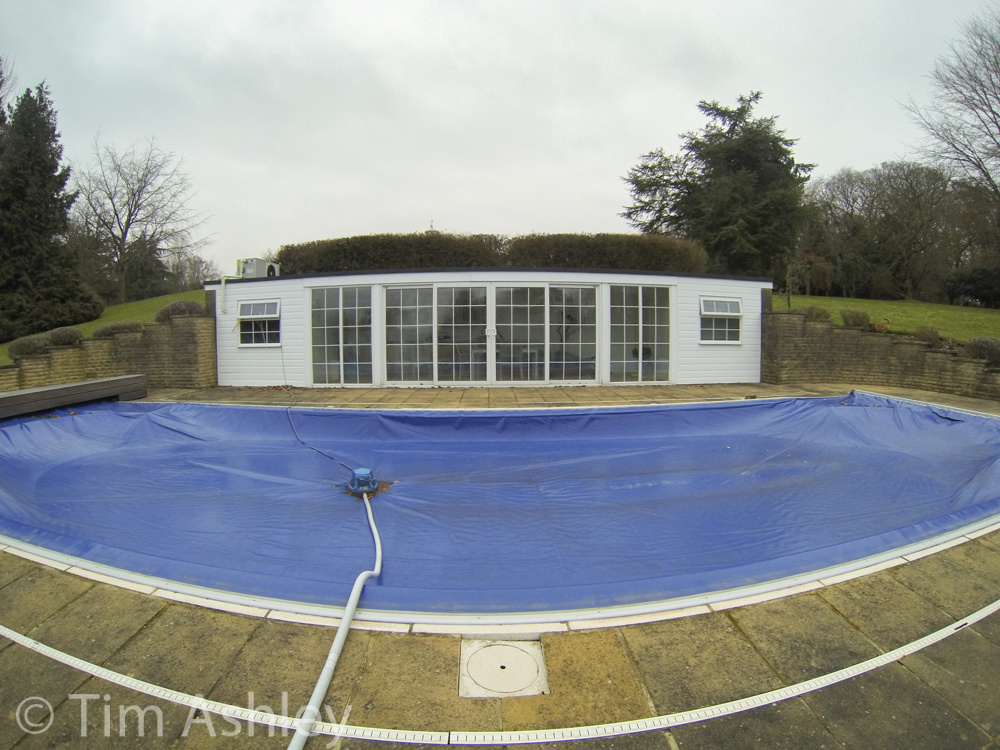
...makes for a mid-fisheye look which, though irritating in stills, has the effect of speedifying action shots: everything that moves seems to accelerate towards the edges of the frame. And of course, at this focal length, nearly everything is in focus.
Talking of stills: largely, don't bother. Fine for a snap but that distortion, plus the necessarily rather basic level of control over exposure and shutter speed (respectively: none and none) added to small-sensor dynamic range, make it a fun-and-emergencies-only type of thing. There is also very strong purple fringing:
So this camera should be used for what it is good at: videos of fast things in wet/cold/high places where other cameras don't dare to tread. It is probably more weather proof than you are.
Assuming that our putative gnarly dude manages to push the right buttons in the right sequence to get his setting as he wants them before the battery dies or the killer wave crashes, the range of what the GoPro can do is amazing. 4K Video? You got it, though only at a frame rate of 15 fps, so action shots are out at that resolution. 4K Cin (that's an incredible 4096x2160) at 12fps. If you want frame rates suitable for capturing subject motion (24fps or better) then there's 2.7K and 2.7K Cin or a whole range of better-known resolutions from 1080p down to WVGA.
Some of the coolest tricks are to be had at 720P (still technically HD) where you can shoot at frame rates of 120 fps. Now that really is amazing, because you can slow it down by a factor of 4 and STILL have 30 fps, so very, very smooth slow motion video is easy. And if you're aiming at web'n'phone display rather than HDTV and are happy with WVGA (848 x 480) you can shoot 240fps. Which means a slow-mo factor of twenty four, if conformed to 10 fps. Though even at these conformation ratios, some events are still 'blink and you'll miss it"...
The upshot is that if you're heading for the beach, mountain, forest or river, you can make videos that speed up and slow down, for dramatic impact, pretty much as far as you want. And due to the very effective underwater housing (included) you can do all this at depths of up to sixty metres. You can't do that with any other camera without third-party housings that cost a great deal and are a hassle to use. Whereas the GoPro clips into its own housing in half a second and is, so I hear, pretty safe therein.
Other useful tricks for the creative photographer: time-lapse from every half second to every sixty seconds; burst rates of up to 30 full-res JPEGS per second. So as well as lower resolution movies of balloons popping, you can capture flowers opening at 12mp, if you can live with the optical restrictions alluded to above. But do be aware that, though DOF is almost infinite with this lens, it does have its limits are very close range as the following video shows...
Made from around 900 time-lapse 12mp frames over several hours, the nearest daffodil was never in focus (though it looked to be so on the LCD) and the furthest daffodil left the focus zone as it opened. This sort of thing is still much better done with a decent DSLR and macro lens, the irony being that GoPro's free CineForm software makes importing hundreds of JPEGS and turning them into a movie an absolute breeze. One note though: an SLR with a shutter rated at 100,000 frames is going to waste 1% of its life on an exercise like this!
To conclude: there wasn't a ticket to Everest or Bondai in the GoPro Hero 3 Black's box. Chamonix remains frustratingly distant and the shoals and reefs of the Maldives are but a distant fantasy. But this thing smells of all those things and has the mojo to capture them thrillingly. It may have some operational idiosyncrasies and your lifestyle may not suit its capabilities but, like an unreliable friend, it is a whole lot of fun.
Hero? Hell, yeah! This thing will turn you into James Bond.
]]>
It is always hard to know just how much of problem there has to be before one is justified in returning a lens: it's tough on the retailer, however much the manufacturer deserves it and it is often fruitless. Zooms in particular are prone to skewed elements and actually very very few copies are 'perfect' - which means one risks a time-and-paperwork intensive process with no guarantee of an improvement. My criteria is, if one makes a 200DPI full frame print, is the asymmetry fairly evident at F4 and can you still see it without straining at F5.6? If so, back it goes. And about half the lenses I buy do go back.*
Anyhoo - return, replace, re-test, how dull. But necessary if you want to get value for your money when building a high-quality system.
I have had a TC-20E III for a while - I bought it to use on my 70-200 F2.8 VRII and was never wildly impressed with it but then one should not expect miracles or free lunches. It was useful for those rare occasions that I needed to go longer but tracking and VR performance seemed lacklustre and sharpness took a hit. In the end I rarely used it. But I had read that the 70-200 F4 was better with converters than its big brother so I thought I'd give it a spin.
Test results from my normal scene are linked as follows. I have shot the lens at:
If you want the quick summary it is as follows: the results under these conditions are quite good, and better than I was getting on the F2.8 lens. There are signs of LOCAs, as you will see if you look at high-contrast edges towards the edges of the frame - quite a few of them have magenta/purple fringes on one side and green on the other. And there is a slightly floaty, gentle if not exactly soft look to the 400mm shots. Best results are at F11 but there's not a lot in it. Shots need a clarity of +25 to tighten them up a little, though that is not done in these examples.
That should be the subject done and dusted. But it isn't.
The 'wharf-side' tests were shot on a very good tripod and head, with focus bracketing used to provide optimal series and with VR turned off. When you start to use the lens in the real world, hand-held with VR on and on subjects with less flattering and clear-cut details, the performance of the combo starts to fall apart somewhat. I'll give some examples but in summary, the lens+converter perform very well in the range of 140-200mm BUT that range is covered by the lens alone. Between 200 and about 270, performance is still fairly good. At 300mm it is acceptable and at 400mm, it is a rare shot that makes you feel the exercise was worthwhile. In fact, for really quite a high proportion of the shots at 400mm I would prefer to have used 200mm on the lens alone and then up-resed the file.
Here's an example: these two shots are both the best of focus-bracketed series, shot with MUP and delay on a great tripod. One is at 400mm and the other with an 'unconverted' 200mm. Click on both to load full-sized originals and then look at them side by side, with the 200mm shot viewed at 100% and the 400mm shot viewed at 50%. It is clear that an an upresed 200mm shot would print better than the 400mm shot.


Being surprised by this 'tower' comparison above, I returned to the 'wharf-side' series and found a 200m shot, which I then cropped to exactly the same FOV as the 400mm wharf-side shot linked to above. I upresed it in Photoshop and then printed both it and the 400mm shot at 24". There was nothing in it, despite the fact that those wharf-side shots are about the best I have achieved with the converter.
There are exceptions to the above: performance is better at closer range, for example, though still not great.
Here are some examples: they are crops, re-sized to 50% so as to give an impression of how they'd look in a 36" print.
 400mm Handheld F8 AF-C ISO 500
 340mm Handheld F8 AF-C ISO 450
 270mm Handheld F8 AF-C ISO 400
250mm Handheld F8 AF-C ISO 280
In conclusion: don't bother. Unless you are very interested in the 200-300 range and don't have the cash or the camel to carry a dedicated 300mm lens, I wouldn't use this combination at the longer end. It makes a D800E file look like it was shot on Micro 4/3rds with a kit lens.
There, I just saved you time and money!
This site is 'not-for-profit' but I do support the charity Photovoice. I wrote about it in depth a while back and that article is here. If you have found this review useful and are feeling generous, I would hugely appreciate a donation to the charity, even just a pound or a dollar: every little helps. You can donate here and the Virgin Giving site is secure and takes cards and PayPal. The Gods of Great Photography will smile on you if you donate. I promise.
* I would like to thank the marvellous Park Cameras here. I have used them for years and they are well-priced, friendly and efficient. Whilst completing the return paperwork for this lens and for the Sigma 35mm F1.4 that I purchased at the same time and which is also decentered, I asked them point blank, 'as you can see, I do test my lenses carefully and quite a few get returned - if this is a problem for you, please just tell me and I will buy them from Amazon in future, because I don't want to make a nuisance of myself here.' And they replied, 'absolutely not, please carry on just as you are.'
That is classy. There are manufacturers and service departments who could learn from that attitude.
]]>
With retail shipping of the camera due quite soon, Jono has just published a truly newsworthy piece based on these experiences: The Leica M (240) Introduction.
As he says;
"This article is not meant to be a review. There are others better equipped to do that, and you should be aware that on the one hand I’m not an independent voice; as always, my loyalty as a camera tester is to Leica: If I find a problem, then I tell Leica, If I like something, then I tell everyone else! On the other hand I hope that I’m an honest correspondent, and I won’t say anything that I don’t really believe to be the case."
So don't expect detailed side by side comparisons and metrics to peer group cameras, blah blah blah. Instead enjoy Jono sharing his experience of using the M as a photographer.
There's more in this article than anyone has previously been allowed to say. If you are thinking of buying an M then it is absolutely required reading.
Also today, Sean Reid, another Beta tester, has published an article in which he compares the new M's performance, in beta iteration, against some of its stable-mate and predecessor cameras. Sean's site is subscription only but the article is pretty much required reading for the true M aficionado.
And in this onslaught of new M-formation, Ming Thein, third leg of this beta testing stool, has also published his thoughts and experiences, which are nearly all positive. Ming's site is free to view.
I expect to be publishing the first in a series of in-depth review articles of a final firmware version of this camera myself fairly soon - so keep checking in here to see when the first one appears.
]]>
Ever happy to be the sacrificial lamb, I ordered myself one.
Let me rewind a little: aside from Streety-PJ-Urban Observational type work I never use this focal length. A 35 Lux on a Digital M is a lot of fun but for most of my work, I like the 20-24 range and the 80-200 range. But as regular readers will know I have reviewed the Sony RX-1 in detail and in the course of so doing, I realised that a) 35mm is more interesting than I thought for landscape and b) the 35mm Zeiss lens on the RX-1 is shockingly good, especially after 10 months of shooting the D800E, a camera on which almost no short lenses get sharp edges until they have crossed the border into diffraction land.
So my rationale for getting the Siggy was that I would like something wide that shoots sharp side-to-side on the D800, hopefully at least as good as the Zeiss on the Sony...
As usual I will deliver the bad news first: my copy has a slight decentering and in fact neither edge is satisfactorily sharp until F8 or smaller. But. But but but. The people at Sigma UK are absolutely delightful and extremely helpful and after sending them some sample images they have said that it should indeed produce sharper images at the edges. Even better, they were able to give this opinion quickly, by looking at shots I posted online for their review. Unlike engineers at Nikon UK who, I was shockingly told recently, 'don't have access to the internet...'
The upshot is that this will be a review that takes certain things on faith. Not completely: I have certified to my own satisfaction by focussing in Live View using the extreme edges that they can be very sharp, even on my copy. And better still, by careful iteration of focus using this technique I even got one (out of many) that was pretty sharp across the frame at F4, which is my yardstick here. But I take it on faith that a future copy will be able to do this without arcane focussing rituals and will allow a 36" un-cropped image that 'sings sharply to the sides'.
What I also did was to shoot the same scene at F4 on the Siggy/D800E and on the RX-1. And then I downsized the Nikon image to the same pixel dimensions as the RX-1 file and, bingo, on centre the greater sharpness of the Sigma/Nikon was evident. Now that really is saying something. You can see those files at full size by clicking here for the Sony and here for the Siggy/Nikon. Look at the word 'PRIDE' on the central red umbrella: you can read it clearly on the SiKon shot and not on the Sony shot. So at least on centre, the Sigma lens is mining the extra resolution of the D800E sensor. But it is also clear that the edges of the Sony file are far superior in this particular comparison. I will post again on this when I can test an optimal copy of the Siggy but in the meantime clicking here will give you a gallery with aperture series at both far-mid and close distances. Please note, the near series is focussed on the texture of the wall itself and not the plants growing up it.
That out of the way, and assuming that a good copy is nicely sharp to the edges at F4 and F5.6, then I can safely say that this is a damn nice lens. It is solidly and very nicely built. It has a lovely clean, smooth manual focussing action. It has low distortion (barrel, easily adjusted). I have found it pretty much impossible to make it ghost or flare. It has low aberrations. It is waaay cheaper than the equivalents in CaNikon/Zeiss world. In fact the only mild negatives are that it isn't fully weather sealed (rubber mount gasket only) and it is maybe a little heavy, courtesy of its build quality.
So let's look at some detail. And what detail! Wide open, this lens is very sharp and mine almost never misses focus using the central AF point. The scene was shot at F1.8, by hand with AF-S...
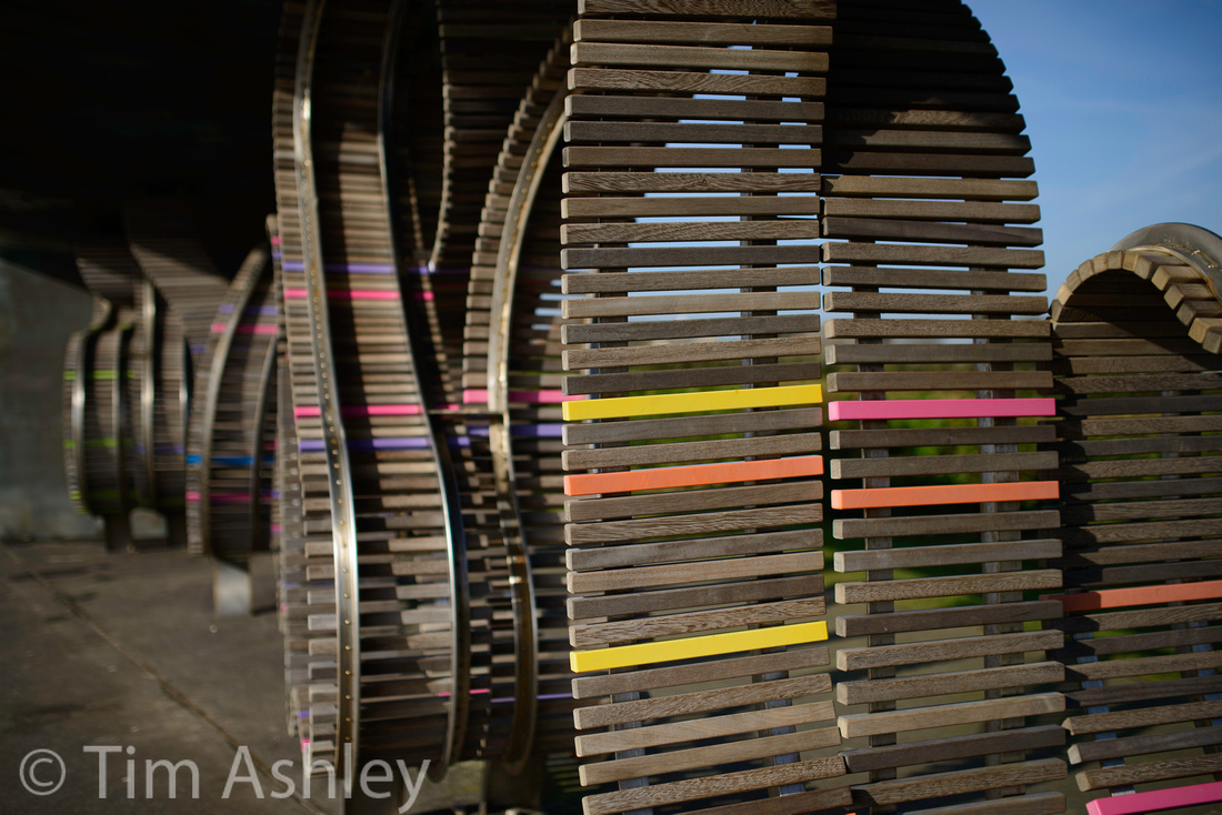 Here is a 100% crop from the centre:
 and here's a 100% crop from the subsequent shot taken at F2.8
 Now that is frickin' sharp. I can see colour aliasing in the woodgrain. Frickin' sharp. And (see the gallery for examples) it retains very very good sharpness, despite diffraction, even to F16 - so DOF freaks will be happy.
Here's one of, sorry, my dog Scooter. It's at F1.4 and ISO 1800 and I have cropped it slightly:
Ahh, ain't she cute? And ain't her right eye sharp? This was underexposed and handheld at 1/80th in very dim evening window light and if you look at it at 50% zoom on screen, the ISO noise disappears and the extreme resolution pops nicely. You can almost see the rabbit she's staring at through the window...
Here's a 100% crop and it shows the worst aberration I have yet managed to provoke: easily clicked away in Lightroom.
 I have read some comments to the effect that 'there's no free lunch' and that what one is giving up by buying this lens is a certain quality of bokeh compared to the CaNikon and Zeiss alternatives. Well, bokeh is very much a matter of taste but there are a number of shots in the gallery that show it at different apertures and distances and I must say, I think it's pretty nice if sometimes a touch 'busy'. Here's a couple of examples:

In fact, the first few shots I took on mine were inside at dusk wide open, and when I loaded them onto my Mac the first word that came into my mind was 'Leica'. That just about says it all.
I find this lens a joy to use: it is predictable, well-behaved, has a lovely rendering (including just the sexiest amount of natural vignetting wide open), damned sharp, well-priced and well-supported. It is both a 'look' lens (great character) and a 'technical' (great performance) lens. But is it a great lens? Possibly. Hell, I'd go for probably.
UPDATE MARCH 2103: unfortunately, after having tried three copies of the lens I have given up. Each one had sufficient decentering for me to want a repair or replacement and each copy also required what I regard as excessive positive AF Fine Tune (one copy more than the +20 maximum). So however much I like the look of this lens, its great control of aberrations and its extreme central sharpness even wide open, it isn't for me: if a 35mm lens can't get its edges equally sharp by F5.6 at the plane of focus after trying three copies, it really isn't for me....
UPDATE JUNE 2013: Finally got a good one, can't say if it was the fourth or fifth, I lost track... and it is not 100% absolutely perfect, there is still a very very slight asymmetry. But it is damn, damn good. Really damn good. Really.
This site is not for profit but I do support the charity Photovoice. I wrote about it in depth a while back and that article is here. If you have found this article useful and are feeling generous, I would hugely appreciate a donation to the charity, even just a pound or a dollar: every little helps. You can donate here and the Virgin Giving site is secure and takes cards and PayPal. The Gods of Great Photography will smile on you if you donate. I promise.
]]>
The rationale was that I'm anticipating switching my 24-120 F4 VRII for a 24-70 F2.8 'Trinity Lens' and the new mid-range zoom will be notably larger and heavier than the one it replaces. Hopefully, it will also be a lot better. But as a frequent flier, I am always trying to maximise my weight/quality ratio and frankly, wonderful though the 70-200 F2.8 is (and mine was a really nice copy) it is, courtesy of that wide maximum aperture, the size of an elephant's thingie. It also weighs really quite a lot: in fact with the mandatory tripod collar attached it weighs pretty much twice as much as the upstart.

200mm @ 1/200th F4, ISO 1400 handheld, click for 50% original
So when I started to see the reviews* of the new lens, many of which seem to be saying that it is ballpark just as good as its big brother optically, it seemed to me a simple trade: give up one stop of aperture (but gain one stop of VR ability) and lose half the weight and a lot of the size. Sure, you also give up the weather sealing but hey, the new one has a rubber mount gasket and it's not a 'suck and blow' design because all the focus is internal.
'But hang on', you might say, 'One stop of VR does not equal one stop of aperture: long lenses are often used for sports and action and these require fast lenses which allow fast shutter speeds.' And my answer is, 'sure, if you have a camera with AF up to that task but in general, the D800 is not that camera because tracking focus requires really accurate peripheral points and, err, well you know the rest....'
As a little pre-switch exercise I parsed my Lightroom library for every shot I ever took on the F2.8 lens and out of around 1000 shots, 200 were at apertures wider than F4 and of those about 20 had any kind of star rating and of those, precisely one would have been tough to achieve on an F4 lens. I can live with that.
Let me get the one bad piece of news out of the way first: as appears to be endemic with current Nikon production, by brand new copy of this lens has an asymmetry. It only shows at the widest end but it does require F11 to get acceptably sharp to the left hand edge and by F11, diffraction is starting to be visible. All this judged at 50% on screen (Retina 100%) so equivalent to a 200DPI, 36" print.
Beyond that (and to be frank I am not sure I have the energy to return/replace/re-test when the odds of getting a perfect copy seem dubious) this lens is an absolute cracker.
There has been a lot of whining about the cost of the optional tripod collar (included on the Trinity lens) but to be honest, at 850 grams, the collar is just not needed: the lens is light enough to allow the camera to bear the weight when tripod-mounted. In fact the lens is lighter than the mid-Trinity 24-70 F2.8 lens.
At mid-range, this is a very good lens but the real pleasure of using it is its performance at the long end, which is nothing short of gorgeous: the colour, contrast, edge to edge sharpness and sheer 'pop' of the images it produces are very nice.
Out of the box, the first thing I did was shoot a few frames at different focal lengths and apertures. These were all disappointing - soft and unconvincing. So I estimated an AF Fine Tune value on the spot and shot again. Bang.
But it was dusk, light stopped play, and I determined to execute a full Reikan Focal test on the lens in the morning. My estimated AF fine tune was spot on, as it turns out, and best of all both ends of the zoom require the same +12 value whereas my F2.8 Trinity lens wanted +17 at 70mm and -2 at 200mm, which was irritating.
I then went on to shoot my usual aperture series and the results of this can be seen here: there are shots at F4 thru 16 at 70mm, 135mm and 200mm and the files are downloadable as full resolution JPEGS developed from RAW. The scene looks like this:
For the lazy, my take is that at 70mm, F8 or F11 is needed if your edges and corners really matter but that peak central sharpness is at F4 and F5.6. At 135mm edge sharpness is already very acceptable at F4 and tightens up a touch to F5.6. But at 200mm, edge sharpness is impeccable at F4 and stopping down to F5.6 gives such a tiny improvement that I deem it irrelevant. The other good news is that at every focal length, though F8 and F11 show a slight loss of resolution due to diffraction, they remain eminently useable for those seeking the extra DOF or ultimate corner sharpness. Take a look and see if you agree. I have one warning though: at 70mm the mild left-edge weakness is clearly visible at F4 thru 8 but the right edges look very good. Don't trust this as an indication of how a really good copy would behave at both edges: in my experience, asymmetrical lenses tend not just to degrade one part of the image but also improve the opposite side and I believe that is happening here. The MTF charts show some notable astigmatism at the edges at 70mm and yet I am seeing quite a lot on the left and not much at all on the right...
Other factors:
The lens is a LOT nicer to focus manually than the 24-120, for example, despite the D800's crappy Live View zoom: it doesn't do that jerky hysteresis thing some G lenses do, overshooting and lagging as you turn the ring. It's no Zeiss in this respect, for sure, but it is fairly smooth and linear.
Distortion is there and is stronger than the F2.8 lens, especially at the longer end. Plus there is no lens profile in the current version of Lightroom so you'll have to correct files manually where the distortion matters. At 200mm I find a -6 about right but this really does depend on the exact focal length you choose since the distortion goes from pincushion to barrel via neutral as you zoom shorter. I regard all this as a non-issue: the files largely won't need correcting and when they do, it is easy and the cost in terms of IQ is low.
The lens feels nice. It is light, smooth, well made and not at all cheap feeling though it doesn't have that 'bullet proof feel' of the Trinity lenses. But the weight and size reduction make it a truly viable hiking and travel lens. I can walk with it for as long as I like with no strain whereas I had taken to leaving the 70-200 F2.8 at home - a real pity since this range is my favourite for hiking.
Focus, once correctly fine tuned, seems reliable (centre spot and near central group) and accurate, most impressively at the longer end where mis-fires are a rarity BUT at the shorter end, make sure you don't give the lens a chance to get confused by target ambiguities of pattern or overlapping distance elements. Also be aware that mine, at least, has a mild tendency to front-focus at the short end of its range though this is comparatively rare. Regardless of that, it's a 'high hit-rate' lens and that really matters.
Tracking focus performance seems to be about the equal of its Big Brother. But if that's your bag in a serious way, you'll already have a 1Dx...
I have yet to provoke any flare or haze or ghosting. Other reviews say that it can happen but isn't a problem: I haven't seen it at all.
There is a small amount of forward field curvature at the shorter end of the zoom. Manufacturers never really give good data on this and it can prove rather a chimera to track down since it seems to come and go at different intensities at different focal lengths, apertures and subject distances but I deem this iteration to be mild and, provided the top of your frame is sky, to be a force that helps sharpen your lower corners a tad...
I see little evidence of focus shift: there may be a tiny touch at shorter subject distances but DOF will have it covered. On a related topic, faster lenses find it easier to focus accurately (shallower DOF and more light = easier focus differentiation) but are more prone to focus shift. Compared to the 70-200 F2.8VRII I think the new lens has a slight advantage because, though it is focussing at F4 and therefore with more DOF and less light, it is not subject to the more notable focus shift of the older lens between focussing aperture at F2.8 and shooting aperture when shooting at F4 or smaller. All assuming phase detect rather than live view AF, of course. The upshot is that I think this lens will prove a little more accurate in the studio when shooting for sharp-eyed portraits at f4 or f5.6.
The new VRIII is indeed a one stop improvement over VRII: it is worth three and sometimes four stops, and it doesn't screw up your image if you leave it on at higher shutter speeds. Furthermore, it feels really nice to use: the visual effect is of greater stability than VRII but not of 'fake stasis' like the Tamron system, which can make slight recomposition a weird experience. So I set the 'Auto ISO' shutter speed selection to the middle setting, which means a shutter speed of 1x focal length, and it just works, as in this shot: (taken at about 1x focal length but I have shots to much, much slower that worked though I think 1/2 focal length is the slowest reliable speed).

Micro-contrast is wonderful at the longer ends of the range: take a look at this one (click on it to see a 50% sized version and look at the tractor and the separation of the trees behind it)... and be aware that this degree of ability to separate fine distant detail makes for a good landscape lens: in the full sized original of this, the twigs are distinct rather than turning into a furry smudge, and the few pieces of foliage are clearly delineated.

Bokeh is very nice. Nine blades of pleasure. See this one for fore and aft examples (click for 50% version)..
 and more bokeh here, an F4 shot at 200mm:
 and another bokeh example at 70mm and F4:

Some reviewers have noted that aberrations are a little worse than the 70-200 F2.8 VRII at F4 but though this might be true in 'torture test' conditions I am not seeing a problem here so far: these two shots, a 'before and after' treatment using LR to get rid of a touch of fringing, show the worst I have yet encountered: (click for 50% size)

 As a big improvement over the F2.8 lens, there is no 'focus breathing': in other words when you set the lens to 200mm and focus on a subject at close range, the focal length you get remains about 200mm whereas in the older lens it shrank at close range to around 140mm.
Finally a teaser: I have tried a small number of not-carefully taken shots with my TC-20E IIIx converter and... but you'll have to wait until I have been more rigorous with my technique: if this really is the smallest, lightest, good quality 400mm lens that Nikon makes, albeit with something of an aperture restriction, I will let you know soon enough. However, my Sigma 35mm F1.4 arrived today so it may be a week or so before the zoom gets any more love.
Conclusion
As seems so often the case, Nikon have manufactured a mildly dud copy for my pleasure. But charitably disregarding this mild asymmetry, the lens is a cracker. It focusses really well, it is sharp, often amazingly so. It is light, small, well made, well behaved and a pleasure to use.
This lens won't be the best choice for those shooting indoor basketball, theatre or floodlit sport but I am not such a person: the only fast moving thing I try to track is my dog and frankly, she makes Usain Bolt look sluggish and has outsmarted every AF system I have ever had.
So like I said at the start, I think I made the right choice in making this switch. All lens designs are compromises. This is a happy one.
* There's a real caveat here: DXO and various other reviewers have not used a D800 to test the lens and as usual, I caution that any tests on cameras other than the one on which you intend to use a lens are, as very best, a rough guide only. Luckily both CameraLabs and Lloyd Chambers had reviewed the lens on the current state of the art D800 and it was these two excellent reviews that tempted me in.
]]>Comparing three 24-70mm lenses on the Nikon D800e and the Canon 5DIII, he looks at the Canon f2.8L, the Nikkor F2.8 AF-S and the Outside Chancer, the Tamron F2.8 DI-VC.
Starting with a 'bench only' (i.e. no camera) 'Wells' test, he shows that in terms of pure MTF performance, the lenses score in exactly that order: Canon best, Nikkor next, Tamron close-ish to Nikkor but in third place. He then puts the lenses on the cameras (the Tamron comes in versions that fit both) and moves the whole shooting match to an Imatest bench, where they get put through their paces at 50mm and at F2.8 and F4.
The Tamron clearly does better on the D800e than on the Canon: the higher resolution sensor makes that result a likelihood. But the match is decided when he clearly shows that, though all three lenses show a great performance under all of the test conditions used, the 'second best lens on the best sensor' (my quotes, not Roger's) outperforms the 'best lens on the second best sensor'. The D800E with Nikkor 24-70 beats the 5DIII with Canon's new 24-70. So Nikon users worried about the fact that Canon now has the best mid-range zoom need not sweat it: the Nikon overall system of camera+lens is still the best bet, operational, QC and ergonomic factors aside.
Not only that, but the Tamron/Nikon system is about even with the Canon/Canon system.
We have always been taught to buy the best lenses we can afford. But it seems that that, my friends, is not always good advice.
A Caveat Emptor Update
Readers of last week's piece on the ongoing saga of my bloody Nikon 24-120 will, by now, probably be literally not agog at all as to how this little lens drama plays out. Have no fear, I will be brief: further telephonic and email intercourse with Nikon UK service, as well as with a world-expert on lenses, has led to some verrry interesting developments. Until the curtain falls on the final scene of the final act I will keep you on the edges of your seats but the denouement may well be more interesting than I thought...
Coming Up
Delayed but much anticipated, I hope very soon to test the new Sigma 35mm F1.4 DG HSM on my D800e.
35mm is a focal length I generally only choose on a Leica M (somehow it feels just 'right' in that context). On a a full frame SLR I prefer a 24 as my wide, an 85 as a portrait and then some form of longer tele. But shooting the amazing Sony RX-1 for a few weeks has brought me back into the fold and I will be adding the Sigma to my bag permanently if it does as well as I think in my field test. Oh, and I will do a 'Sony RX-1 versus D800 with Sigma 35mm' shootout... and that really should be fun. Lord, I really should get out more...
I will also be testing the much-anticipated Samyang 24mm F3.5 TS as soon as I can get my hands on one. The D800 system really lacks a good, wide TS lens, the Nikon version being, err, not as good as I'd like. So, from out of almost nowhere, Samyang might be the cavalry that rides to the rescue of Nikon for those users who really need such a lens. Their whacky 14mm lens is such a blast, so good, such amazing value that my hopes are raised.
Also coming up, a guest photographer who will almost certainly be a new name to you, and who will, I think, be a big name in future. Her work is just beautiful (a very large one will soon be hanging in Tashley Towers) and I know that many of you will enjoy it greatly
And finally a Clue
There is one camera, already announced and due quite soon, that I believe will be the most interesting and exciting of the year and which, for many, marks a genuine inflection point in the development of photographic gear. I hope, fairly soon, to have a copy of such and to put it through its paces. And for those of you unable to decode the above here's another clue: this camera, joined to a lens I already own, will participate in the above-mentioned Nikon/Sigma and Sony RX-1 Shootout.
Let the Saloon doors swing...
]]>Prime among these are:
- Will it be well enough made to function properly 'out of the box' and to do so for a reasonable time thereafter?
- If (1) above turns out to be 'no' then can I return it for a refund within a reasonable time-window?
- Failing that, will the manufacturer be able and willing to acknowledge the fault and repair it?
There are no surveys (that I know of) to give us a market-wide answer to these questions so most of us have to rely heavily on anecdotal evidence alone and, online at least, there is often a suspicion that some of the 'real user experience' anecdotes, both positive and negative, are the work of shills.
Would-be purchasers are wise to raid websites like Lensrentals and Reikan for something more data-rich than the merely anecdotal but even those sites are keen to express the limitations of their data sets and to add disclaimers relating to methodology etc.
We may have a sense that one brand or another is going through a rough patch, has released a problem camera or lens or simply doesn't value QC highly enough but we never have a big enough sample to prove it. In other words, some of the most important questions we need answered before we buy are simply unanswerable. Suck it, if you dare, and see...
My own personal experiences have been that Canon gear rarely 'unboxes unfit': I have returned one Canon P&S in all my years, and never a 'proper' camera or lens, and I have had quite a few. Leica has the occasional issue and their repairs can be slow, since they generally have to return to Germany, but the quality of service and repair is impeccable. I've had no real problems with Sony (but I've had far less Sony kit) and I had one, immediately rectified dud with Phase One - and I mean immediate, no questions asked. My experiences with Nikon have been, ahem, let's just say "less happy".
I made a major system switch last year from both Canon and Phase One into Nikon, tempted by the D800. Anyone who has read my reviews will know that I rate that camera, and some of the lenses available for it, very highly. But this quality of imaging ability has been somewhat overshadowed by my experiences of quality control and service. Now, I would be the first to say that my own experience cannot be regarded as statistically significant so I am going to share an ongoing case with you as an example not of any claimed systemic problem at Nikon but as an example of what I did wrong and what I strongly advise others to do correctly.
Itching to get my hands on a D800 and E after their announcement last year, I ordered some lenses in advance. My reasoning was that popular lenses would fall into short supply if the camera proved to be a hit and in this I was right. So I consulted Nikon's Technical Guide to the camera and was very pleased to see, in the list of recommended lenses to use for 'enhanced sharpness', the 24-120mm F4 zoom.
A wide-to-short-tele zoom is very useful to me: I travel a lot and whilst I fully understand the need for good primes, which I also carry, the flexibility of this focal length range is attractive. So I duly ordered a copy but it arrived more than 30 days before the first of my bodies. To be frank, even if it hadn't, the problems with it would have taken a while to surface: I was learning an entire new system and, with two bodies and many lenses, it was always likely that I'd miss something. As indeed I did.
Readers of my multipart review of the 24-120 will know that I find it to be a very useful and surprisingly good lens but that I noted a weakness on the right hand side of shots taken from around 35mm upwards on my copy. I reported, in my review, opinions of the lens that assumed that 'when I got it fixed' I would think it an important part of my kit.
And there is the rub. I will not bore you with the details in depth but the lens has now been back to Nikon several times, most recently accompanied by my remaining D800E body, and the upshot is that though I am able to demonstrate to my own satisfaction (and I have sanity-checked the results with others) that the lens+body combination produce a soft right hand side very consistently at many focal lengths, Nikon's UK service department - the very Head thereof, in fact - insists that there is nothing wrong with the results at all. They offered, grudgingly, a replacement camera it is true - but the offer came with the admonition that there was 'no point since there's nothing wrong with what you have.' They didn't offer a replacement lens, possibly because an NPS loaner they sent me showed a similar problem and it is still not clear whether the body or the lens is at fault. They did helpfully note that high resolution sensors are demanding and that I might want to read the above-linked technical guide.
In other words, they failed to gauge my level of experience and they patronised me. Oh, and they added that the sample images I had uploaded to a web page for their review hadn't been looked at because their technicians 'can't access the internet'. Tip: when dealing with Nikon, make sure you still own a CD burner, though many computers these days ship without them.
Regardless, their investigations showed the performance of my equipment to be 'within spec'. In fact they insist that there is nothing wrong at all.
Now as far as I am concerned there clearly is something less than acceptable with my gear. Of course the weasel words here are 'within spec.' So let's break this down into some possibilities:
- I suffer from Photographic Munchausen's and somehow manage to force the images produced by my gear to be blurry on one side only. Either that or I have foolishly low levels of expertise and/or understanding.
- The head technician is, for whatever reason, not doing his job properly.
- My gear performs well, but only in Richmond, London.
- Nikon's designated testing procedure is too bench-based and does not reveal significant 'real world' problems.
- The performance of my equipment actually is 'within spec' but I am excessively fussy and expect performance levels above what might be deemed reasonable.
- The performance of my equipment actually is 'within spec' but that spec is too loose to meet reasonable customer expectations.
Of these, it is clearly the last that is most cost-saving to any manufacturer in the short run and most likely to compromise their brand in the long run. There are several third-party lens manufacturers at the moment dragging their QC reputations uphill very effectively. Sony is starting to breath threateningly down the necks of the Big Two. So any manufacturer risks commercial loss if it allows 6) above to rule their production lines and repair facilities.
Anyhooo... there's certainly not a lot that I can do to affect the business strategy of a large company. But what we can all do, what I most certainly should have done, is not to assume that a manufacturer will agree with me on the threshold of 'within spec' versus 'faulty'. And the only way to avoid that situation is to test everything, thoroughly, within whatever return window is legal in your own country.
For me personally (and please vary your own approach according to your own trusted sources: maybe I really am too fussy or have unrealistic expectations) if I lived in a country with no legal right to return for full refund for at least a week or two, I would not buy Nikon for the foreseeable future. My definition of acceptable performance certainly seems to differ from that of their head UK repair technician.
As it is, and to mis-quote Macbeth;
" I am in Nikon
Returning were as tedious as go o'er.."
In other words, I've got too much recently purchased Nikon system kit to even consider jumping ship now. I'm stuck. And that really is my fault for not being a more canny consumer.
Supplement
I didn't want to swamp this piece with examples of what I believe to be wrong with my equipment but some people are bound to be curious as to whether my definition of 'not fit for purpose' matches their own, or whether I am an unrealistic perfectionist.
Accordingly here are links to some example files that show the degree of right-hand blur I am talking about and which Nikon's chief of UK service says he cannot find.
The first shot is simple: focus, best of several brackets, is on the Reikan target centre, which is aligned to exactly the same plane as the two box files left and right, at that height. Aperture is F5.6. Camera is on a Gitzo three series tripod with Arca Cube head and I used a three second delayed release.

The full file is here but but I will post below sample crops from the far left and the far right of the frame. Guess which is which:


And now a rather different test: the camera was shot identically to the above description but this time it was focussed on the distant tower. The camera was then swung, with focus remaining untouched, so that the tower appears on far right and far left of the two subsequent frames. To me the results clearly indicate that the right hand side of the lens focusses significantly closer than the left, and that this is the source of the problem.
What do you think? If you had these results at all focal lengths from 35mm upwards, would you think the lens faulty? If so, faulty enough to replace or expect a repair of? Please do let me know: I hope that I am a pragmatist and aware of the limitations of a lens with these design and price parameters but if my expectations are out of kilter with the rest of you, I'd like to know...
(click the images for full-sized versions)
]]>


Snow has many attractions for the photographer:
- People behave differently in it and dogs go crazy
- Landscapes get 'pared down' to their essentials: weak shapes are covered, strong shapes stand out
- It has many moods: poetic, dangerous, bleak, fun, bright, grey
- Colours are muted but strong colours really stand out
- Its impermanence has metaphorical power, as does its white purity
Leica S2, 180mm F3.5
Snowy conditions also present dangers and problems:
- The obvious personal dangers of being in it. What may present no problems to a Canadian can be a real risk to those from more southerly climes.
- The dangers to equipment of either permanent damage or temporary disablement
- Problems with exposure
Enough lists: let's look at some examples and think about some useful tips.
Firstly, it really helps if you have one of these to get around in!
 I'm only half-joking. Anywhere easily reachable by car or within a short hike will quite possibly be covered in footprints and filled with people. To get a simple, graphic look, these are generally not desirable. So some sort of off-road vehicle that doesn't rip the countryside to shreds but can get you further into the virgin wastes than other people are willing to trek can be very useful. The one above is electrically powered and is also a lot of fun.
Now two very useful tips regarding clothing and warmth: we all know how to dress against the cold but to keep your hands warm and functioning with the thin gloves you'll need to operate a camera, make sure your gloves do NOT have tight wrist elastic. It reduces circulation. Even smarter, wear thin capacitive gloves that let you operate smart screens, but when not shooting, wear thicker over-gloves. Next, to keep hands and feet warm, don't stamp and clap: just shake the extremity vigorously away from you.
 Wildbrooks, Amberly. Canon 5D with 24-105 F4 zoom at 105mm.
In terms of equipment, choose the size of your bag to match the distance you'll be hiking. Simple. Take the most waterproof gear you have and a dry dishcloth for wiping off the snow. Put on UV filters to protect lens elements and always take at least one lens with a really deep, non-petal hood (usually a telephoto) because that will keep snow off the filter. I have never enjoyed shooting from those odd plastic bag-like camera covers: they flap and sag and get very wet. Similarly, my preference is not to take a tripod: unless it is too heavy to trek with it is unlikely to add much stability in wind and on snow and ice. I once wasted a day of Icelandic shooting in vile conditions by taking an entire Phase One rig (huge and heavy and with many lenses) with a large but not-large-enough tripod. Uncertain footings and howling gales meant that nearly every shot was at least a little blurry. Luckily I had an M8 with me too, and that provided nearly all the good images.
I also aways carry some dry, fine quality paper tissues as well as a micro-fibre cloth: the tissues are an absorbent 'first stage wipe' and the micro fibre finishes the job. And I carry every battery I have, fully charged. They run down quick when it is cold.
A very popular piece of advice is to re-acclimatise your equipment to indoor life by putting it in a ziplock bag when you come indoors so as to slow the rate at which it warms up and therefore the rate at which condensation forms. I have never done this: cameras are usually at least a little externally damp when you're done shooting and locking them in a bag with that moisture seems not to be a good idea. Instead, I 'stage' them by putting them in a cool lobby before and after shooting, just removing the card on getting home in order to see what I've caught. But others swear by the ziplock method.
 Near Laugagerdiskoli, Iceland. Leica M8 with 90mm Macro Elmar.
Talking of equipment, if the snow is actually falling you won't be changing lenses much, especially with gloves on: I favour a three lens kit of 24, 35 and short telephoto and if possible at least two bodies so as to minimise lens fumbling. A good 24-105 or 120 zoom (if you can find one) would also be ideal.
 Black Beach, Vik, Iceland. Leica M8 with 90mm Macro Elmar.
Always carry a cell phone, and tell people where you are going and what time you expect to return.
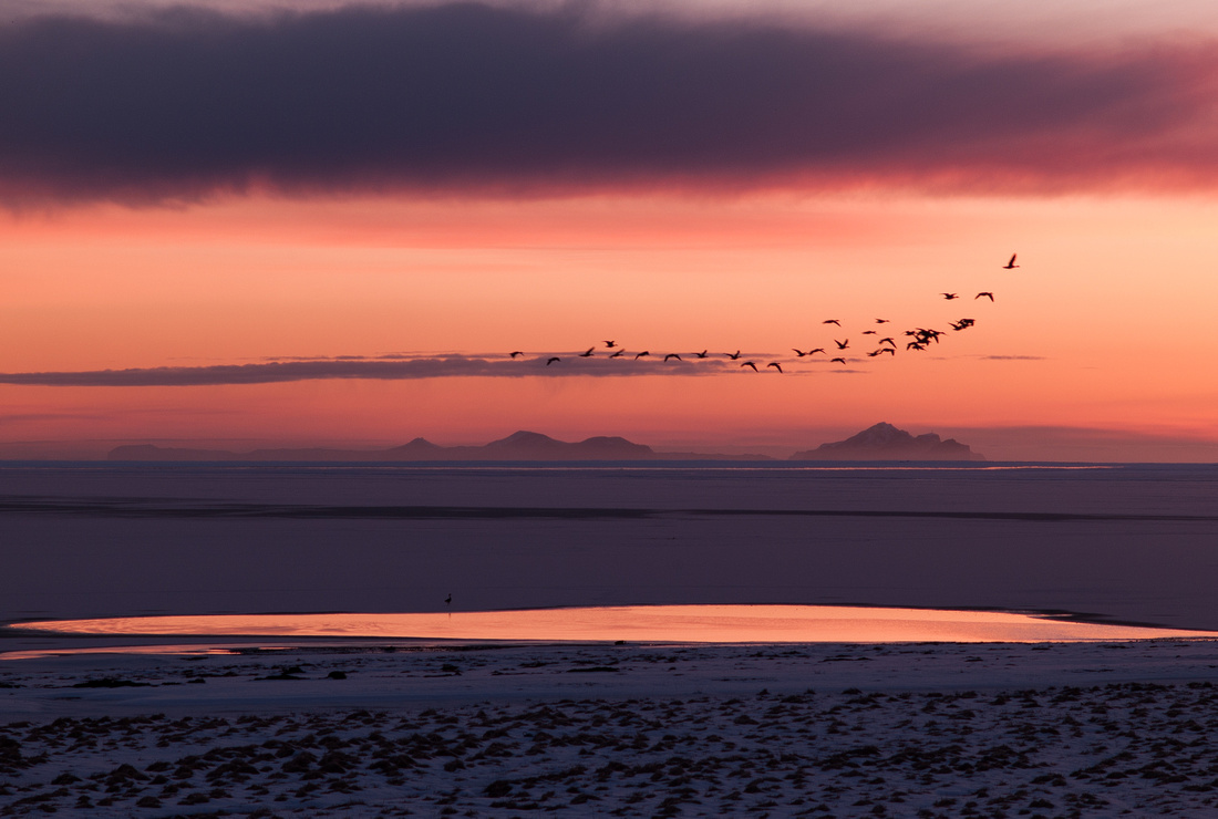
Vestmannaeyjar, Iceland. Leica M8 with 90mm Macro Elmar.
Next, exposure. If my grandma is reading this then I apologise for the egg-sucking lesson but set your camera to at least +1EV exposure compensation and watch the histo. The camera will try to make bright white snow look like 18% grey so you'll have to compensate but do make sure that you shoot RAW and that you don't blow the highlights. In reality, I think a little under-exposure is often useful for keeping detail in the snow so if your in-camera 'blinky' warnings are normally a little early to panic, trust them in the snow.
Modern cameras (i.e those with Sony sensors made in the last 18 months) have, finally, enough dynamic range to deal with snow scenes but even with such, a sunlit snowscape will provide real problems. Expose for the highlights and let the shadows worry about themselves.
White balance can be an issue but don't worry: a good rule of thumb is, 'anything goes'... even to extremes.
Green Birches. Phase One IQ180 on Cambo Wide RS with Schneider XL 35mm f5.6
In these conditions, you won't want to be fumbling with a whi-bal card and snow itself will often, if used to pick the white point, give a result that looks too warm. Actually, pretty much anything looks good other than 'too warm'.
So just use Auto WB and then adjust it by eye later. But the truth is that a wide range of different WB choices can look good, provided the shots aren't displayed side by side. In this article, the snow colours vary from slightly warm to an almost blue coldness and none of them is 'wrong' but they don't hang well on the same wall. If in doubt, go black and white. And try adding some grain too.
 Folly, Sussex. Leica M9 with 28mm F2 Summicron.
Talking of black and white, shooting graphically can suit it very well, but just as useful is a mildly desaturated look: let the snow limit the colour palette but give it a hint of help with the desaturation slider and maybe try some split-toning in post.
 The Duchess Tree, Sussex. Sony RX-1.
These sorts of graphic shot can look a great deal more interesting than the 'real' thing.
The double happy-hour, for me, is when there is snow and fog: it really allows you to isolate individual subjects and create mood:
 Copse, South Downs. Sony RX-1.
 Copse II, South Downs. Sony RX-1.
The above three images highlight another point: if you live, as I do, in the sort of climate where snowfall is rare and its durations short, it's useful to plan ahead. I walk (and shoot) a lot during the rest of the year but I always keep a mental note as to what I will shoot when it snows. I establish a priority list and when I head out into the snowy landscape, those shots get done first. One more point: the last image, above, shows a colour shift across the frame: look at the sky. I have left this uncorrected so as to show how snowy conditions can really exacerbate the problem with afflicted cameras (Leica M9 with wide angle lenses, and MFT camera with adapted non-retrofocus wides, Sony RX-1). For details on how to deal with this problem see here.
Another useful tip is to allow falling snow to create different layers of definition and contrast: use foregrounds as strong graphic elements against softer, snowier backgrounds. This lets you show how hard it is snowing without ending up with a 'flat' image.
 The Collector Earl's Garden. Sony RX-1. Creamtone.
As noted (and illustrated) above, dogs are a great subject in snow. Make your pet pose and you will likely be handsomely rewarded.
Zermatt, Switzerland. Leica M8 with 24mm F2.8 Elmarit
 The Collector Earl's Garden. Sony RX-1.
Happy shooting. Brrr...
]]>
Before I start, here are links to parts 1,2 & 3 with a brief description of what is covered in each: today's post, as a summary, will carry many assertions which are explored and demonstrated in much more detail in those previous posts and I hope they will continue to provide 'deep reference' for the curious.
Part One: File quality; ergonomics; processing options; comparison to peer group cameras; ISO series; Bokeh series; colour fringing; lens distortion; focus shift; flare.
Part Two: Colour shifts; Camera colour calibration; near, far and close Aperture Series; Lens conclusion; Focus behaviour & performance; Exposure and ETTR behaviour.
Part Three: The EVF.
Right. Lazy readers start here:
The Camera and its files
- File quality is very nearly the best I have ever seen and for most uses up to 30" prints I would rather have an RX1 file than a D800 file (due to lens issues with the D800 system) or IQ180 file. Files have top-flight dynamic range, great high ISO performance, files are very flexible for later processing.
- Without the EVF the camera handles like a glorified P&S and the Auto ISO system selects a minimum shutter speed of 1/80th, which is often not fast enough to prevent blur when held at arms' length. With no EVF, this camera only gives consistently great results when shot like a field camera: on a tripod, with slow and careful technique and manual focus.
- Aperture ring on lens is satisfyingly retro but pointless when shooting without EVF: when shooting thus, I revert to P mode and get the aperture I want by using the control dial.
- Fit, feel and finish are otherwise great BUT Sony should provide an external charger at this price.
- Price of 'official' Sony lens hood and thumb grip is egregiously high, and low initial availability very frustrating. Screw-in knock-off $6 hood from eBay is great and allows filters and cap to be used.
- Exposure system is good but files can most often handle up to a +2 stop over-exposure for ETTR fans - however this can increase noise in the sky, and can lead to cyan shift in blue skies.
- AF is somewhat 'hit & miss': the camera too often 'sees behind' the chosen subject, even when the subject more than completely fills the box-shaped focus area indicator.
- Tracking focus is not very useful. If you want to shoot moving kids'n'pets, this is the wrong camera.
- Auto WB is pretty good but careful shooters will use a WB card for critical use
- Silent shooting is incredibly discreet and quiet
- The camera takes too long to start up and it feels and sounds like a P&S as it does so.
- The camera, in general, does not apply options selected in-camera (such as distortion correction) to RAW files but it DOES apply Lens Shading compensation, if selected in the menu, to the RAW files. This is counterintuitive, inconsistent, AFAIK undocumented, and annoying

The Lens
- The lens is amazing. Low distortion, low aberrations, very little field curvature, low-to-no focus shift, fabulous micro contrast, lovely bokeh. It is worth two thirds the cost or more of the entire setup on its own.
- The lens is very sharp already at F2 but reaches a peak at F4. Remarkably it stays very good indeed through F8, even F11 is really good, and by F16 you are back to approximately the same quality as F2. F22 is for emergencies only.
- The lens is sharp edge to edge and corner to corner and this is true at near, mid and far distances.
- The lens has some, slight & occasional mid-field weakness peaking at F4. This is a bit of a mystery but I suspect either a mild astigmatism or a 'triple witching' of a combination of very slight focus shift, very slight field curvature and particular subject distance.
- Flare behaviour is very good but not perfect.
- Colour fringing can be provoked, is not serious, and is best dealt with in Lightroom.
- The combination of lens with body and sensor takes advantage of a non-retrofocal design as a result of there being no mirror, meaning the lens can be small and light BUT it risks some colour shifts, being a red-cyan shift across the frame, and in practice these are seen but can largely be dealt with either in camera or in post processing. See 'tips' section later.
The EVF
- The EVF is bright, sharp and clear with only minimal smear and lag. It feels good and it works really well.
- The EVF allows shooting speeds up to two stops faster than rear-monitor shooting, because of the stabilising effect of bracing the entire system against the face
- Using the EVF allows the RX1 to really come into its own and to realise its full potential as a very serious camera indeed
- The ability to angle the finder instantly makes the camera more flexible in terms of point of view, and some users might feel that it makes the camera more discreet.
- Using the EVF in combination with zoomed view Manual Focus and Peaking gives almost perfect control over placement of DOF and this is incredibly useful.
- The lack of ability to 'lock' the EVF to the body is daft. Some people are already using gaffer tape to keep it secure.
- The Diopter adjustment slider is too easily moved accidentally.
- The hinge for angling the EVF is too easily set 'off true' by a jog from a spectacle frame. It should be lockable or stiffer.
- The two included eyecups both obstruct full-frame view for spectacle wearers and shooting with neither exposes spectacle lenses to a hard surface that could easily cause scratches.
- Optimal use of the finder would require a way of achieving 'double magnified' focus zoom less clumsily than the current implementation.
- Optimal use of the finder would require the ability to assign a 'peaking on-off toggle' function to one of the controls. This can't be done.
- Auto switching between the LCD and the EVF is a tad too slow and, taken in conjunction with the slow startup time of the camera, enhances the 'P&S' side of the camera's character.
- I think that using the EVF drains the battery slightly faster, especially if using the LCD too, but I haven't proved this.

Tips
- When shooting using the rear LCD, Aperture Priority users will find the lens-collar based means of changing aperture rather un-ergonomic. Instead, shoot in P mode and use the top-rear control wheel to shift to the aperture you want.
- When shooting using the EVF I find it useful to set the EVF's info overlay to No Display Info and to use the LCD with the confusingly named "For Viewfinder' info screen, which has no image preview but does show ALL shooting information, along with a longer based histogram which is much more accurate that the normal histogram. These options are selected in Menu>Cog>2, where you will find the two relevant settings, called 'DISP Button (Monitor)' and 'DISP Button (Finder)'
- Understanding the way the camera adjusts aperture when focussing is vital to understanding whether you are getting an accurate DOF preview. The camera always focusses (and therefore previews) at the selected aperture for all apertures from F2 thru F8 BUT from F9 thru F22, it will open up to F8 for AF. So from F9-22, if you look at the preview while the camera is performing AF, you will get an inaccurate representation of DOF.
- Lightroom gives the best results for RAW shooters at lower ISOs but Capture One has more a more 'bespoke' approach to higher ISO files, giving different sharpening and NR combinations at each ISO with no user effort.
- Capture One has no lens correction profile for the camera but applying a 26% value in the Lens Distortion tab will do a good job.
- Lightroom's Camera Calibration Profiles are all interesting and the one that gives the best result will depend on personal preference and on the specifics of the actual image but in my experimentation, Camera Standard is the best place to start and, under normal shooting conditions, there is no advantage to be gained from making a 'home-brew' profile using products such as X-Rite Color Passport.
- When lifting shadows in underexposed areas in post processing, it is often a characteristic of Exmor sensors that natural greens (especially grass) can go a bit bright and sickly. My recipe for dealing with this in Lightroom is to dial in some minus compensation for Yellow Saturation & Luminance and to add a light touch of positive compensation for Green Saturation but not Luminance.
- To deal with Lens Shading (colour shifts across the frame) quickly and easily but sub optimally, set option for it under Cog>4 to Auto (even for RAW files) but if you want to deal with it optimally, set that option to OFF and shoot a lens Calibration library then apply it in post processing using Conerfix, as described in Part Two of this series of reviews.

The Final Word
When you buy the RX1, you buy both a camera and a lens. Obvious, but worth thinking about. On the one hand, the two have been built to match each other so well that together, they offer an absolutely peerless combination of light weight, small size, IQ and lens performance. I want to dwell on this for a moment: DXO Mark have just published a review of the Nikkor 28mm F1.8G lens and they state quite categorically that for Nikon Full Frame (and this means for the D800/E, currently the best camera there is overall), this is the best wide angle lens you can buy, optically. I own the lens (and a D800E) and I can honestly say, with no hint of an optical bench to tie me down, that the RX1 lens is better. It has very little if any field distortion, and that, combined with its other qualities, means that sharp-across-the-frame shots, very hard to get from a D800 with nearly any wide angled lens, fall out of the RX1 with no effort whatsoever. It is an absolute jackpot of IQ.
In fact I also own the fabled current generation Leica 35mm F1.4 Summilux and whilst that lens may have slightly more 'beautiful' (in the eye of this beholder) rendering, it is IMHO technically not as good as the Zeiss on the RX1 because it has quite strong field curvature and that means that it can be tricky to use, like the above-mentioned Nikkor.
Now let us consider today's release of the DXO Mark score for the RX1 sensor: it scores fourth best of every camera they have ever tested, and that includes treating the D800 and D800E as different cameras. In other words, it is third best, a mere one point behind the D600 (both cameras share slightly different implementations of the same sensor).
BUT - and this is a 'big but' - users of the D800 and D600 are, as described above, very hard-pushed to find a wide angled lens that performs to the abilities of the sensor. In other words, if you are primarily interested in the 35mm focal length, there may be no way, at any cost or size, of getting better full frame results than you will from the RX1. Sure, it has some (pretty limited IMHO) ergonomic 'issues' - at least some of which can be fixed with a firmware update. But so do all cameras.
Now I am not surprised to see these two new DXO results: for the past few weeks, I have been using the RX1 a lot not because it is small, light, new or because I am reviewing it, but because it is the best tool for certain jobs, bar none.
The downside of all this is that the lens is fixed to the camera. You have no choice of other focal lengths without carrying another camera and that on its own is reason enough for many shooters to never go near an RX1. And when the camera eventually goes obsolete or looks long in the tooth, the lens dies with it. This seems like a waste. But if this lens really is worth at least 2\3rds the cost of the RX1 (and a Leica 35mm Summilux costs a great deal more than an RX1) then a very strong argument can be made for the camera.
So it is finally, after weeks of shooting the RX1, time for me to p*ss or get off the pot.
- Is the RX1 currently the best possible way of shooting Full Frame at a 35mm focal length? Unless you need better AF, yes.
- Is its small, light form factor a big advantage in many situations? Yes.
- Is it worth the money? Undoubtedly.
But should you buy one?
Hmmm. There are a lot of different 'yous' out there, obviously, but I think the answer might be 'no'.
A D600 is cheaper and more flexible and at some point in the not-too-distant future, better lenses will come along. For example, the Sigma 35mm F1.4 that I hope to review soon might be a match for the lens on the RX1 and it is cheap. A D800 is also cheaper and more flexible and has much higher resolution and again, the Sigma could hold the key for those keen on the 35mm focal length.
In pounds Sterling:
RX1 costs £2,599
D600 + Sigma 35mm F1.4 DG HSM costs £2,250
D800 + Sigma 35mm F1.4 DG HSM costs £2,699
So my final answer, to all true, RAW shooting, video-ignoring lovers of amazing IQ, is:
if you want the best possible current combination of size, weight, quietness and IQ and are not too price-sensitive, get an RX1, if you can live with its (all forgivable) weaknesses.
If you are prepared to carry something somewhat larger, heavier and noisier but a LOT more flexible and extensible, just wait a few days until the first reviews of the new Sigma in Nikon fit arrive and if it is as good as people are saying, get one of those and a D600 or D800. if the Sigma is not as good (close ballpark) as the RX1's Zeiss lens, you might choose to wait until Zeiss announce one of their new-generation super high grade lenses in this focal length, but it won't be cheap.
I love my RX1, pretty deeply: but if the new Sigma lens is great, the RX1 is going. At heart I like my systems to be separable and if I want small and lightweight, I am willing to compromise more on IQ and go with an RX100.
The lens
]]>
This sounds harsh. But for me - and I suspect a large number of other RX1 users - a proper eye-level finder is vital. Why?
- Any camera, ceteris paribus, will be shootable to slower shutter speeds if it can be braced against something (in this case your head) rather than held at arms' length - and indeed the Auto ISO feature of the RX1, hobbled as it is to a non-user definable minimum shutter speed of 1/80th second, is not very useful when shot using the LCD, handheld: the sensor and lens are good enough to show up the blur that too often results.
- The ability to really 'look into' a scene is greater when viewing is conducted with the intimacy and crop-confinement of a viewfinder window.
- The ability to gauge manual focus, both with and without peaking indications, is greater through a viewfinder.
- The ability to gauge depth of field is greater through a well-designed viewfinder.
- The ability to compose and shoot in bright light is far superior when using a viewfinder.
So the task of the FDA-EV1MK is to fulfil the above requirements well, as well as to be well designed, clear and easy to use and correctly integrated into the system.
It does not fully succeed on all these counts.
In the Box
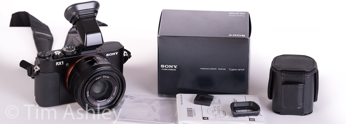 The box contains the EVF itself, with a contact blanking plate attached. The EVF is fitted with a soft eyepiece cup but also included is a 'regular' eyepiece cup. There's a small grey microfibre cloth, instructions in an array of languages, and a nicely made leather case for the EVF itself. This case has a velcro flap on the rear, by which it can be attached to the camera strap but few people will use it that way since it would be too bulky in relation to the size of the camera. Nor is there any way of securing the contact blanking plate inside the case: it rattles loose and will therefore soon get lost. This is poorly thought-out.
Features
The EVF has a small sliding diopter adjustment lever on the right hand side. Nestled inside the eyecup on the rear of the eyepiece itself is a sensor which detects when the camera is raised to the eye and, if set up to do so in the camera's Settings Menu, will perform an automatic switch between LCD and EVF display. If that feature is set to Manual rather than Auto, the small EVF/LCD button on the left of the finder will allow the function to be selected by the user.
Also in the camera's menu (under Cog>2) are two relevant settings called 'DISP Button (Monitor)' and 'DISP Button (Finder)' which allow the user to select which of the standard sets of screen information appear as you cycle through the 'DISP' button on the back of the camera. The options are the same for each but thoughtfully, different choices can be set for each. There is one exception: under the options called up in 'DISP Button (Monitor)' you will see that there is one information screen on the right hand side, topped with a check box labelled 'For viewfinder', which gives an information screen which contains all shooting data but no image preview. This is a very useful screen: it has a long-based histogram that is far more accurate than the smaller, standard histogram. It also shows the level. For tripod use, I suggest selecting this screen for monitor display and the 'No display info' option for the finder - so you have the best of both worlds.
In Use
I personally find the EVF bright and clear with a sharp view and a perfectly adequate refresh rate, though haters of EVFs will no doubt remain unconvinced: there is still a bit of flicker and a tiny bit of smear and lag.
The main irritations are two-fold: firstly, the diopter lever is too easily moved accidentally. This is is daft, poor design, and the fact that it happens at all IMHO compromises the entire project, not entirely but somewhat. Secondly, both eyecups limit the full view of the image for spectacle wearers. This is very slightly more so with the soft eyecup. It is possible to use the finder without either but there is no thin rubber surround such as you will find on, for example, the D800. This means that if you want easy access to a full view of the scene, you risk scratching your spectacles. Again, poorly thought-out.
Otherwise the EVF is very good. I find it pretty easy to judge focus both with and without peaking turned on but I would note that peaking, whilst very useful, is not foolproof, though it is better when used at the 'extra magnified' degree of zoom. Which brings me to two further irritations with the system: firstly, in order to switch from magnified view to 'extra magnified' view, you need to press the centre button of the control wheel. This is fiddly even when using the monitor - especially given the fact that I generally select 2 Sec as the Focus Magnify time in the camera menu, so there isn't much time to 'find' the button. It is more annoying when using the EVF because it must be done purely by feel. The second irritation is that, when focussing manually using DMF mode, one often wants to switch quickly between having peaking on and having peaking off. The menu item that allows this has the options High, Mid, Low and Off but it would be very handy if one of the customisable rear buttons could be set to toggle peaking merely between On and Off. This can't be done, but it could be merely a firmware update away.
I have found a clear tendency towards less camera shake when using the EVF, as expected, and I would put the improvement at up to two stops: very useful.
I have also found that the ability to judge DOF is GREATLY improved using the EVF but you need great familiarity with the way peaking works AND with the way that the lens focusses if you are to get the best out of it. Why?
Firstly, peaking is a guide but is not definitive, and is much more useful when combined with the 'extra magnified' mode (hard to select, as described above) and some experience. Being fundamentally contrast-based, it can be fooled but knowledge, based on shooting experience, of when that is likely to be a problem can greatly ameliorate the problem. Secondly, you need to know that the preview of DOF that you get of the scene, whether through the viewfinder or on the LCD, depends on aperture: the camera focusses at the set aperture for all apertures from F2 thru F8 but at smaller apertures, it will briefly open up to F8 in order to focus. So if you are using the preview through either the LCD or the EVF, be aware that if you half-press the shutter in either AF or DMF mode, the DOF you are seeing will be accurate for apertures of F2 thru F8 but not thereafter. In MF mode, it is always accurate and in all modes it is accurate as long as you have not engaged AF.
But in any event I quickly found that the EVF lets me refine DOF much more accurately, even hand-held, than does the LCD. I generally shoot at F8 or wider so I am nearly always getting an accurate DOF preview. My 'semi-fast' method with the EVF is to shoot in DMF mode with the aperture set to F2 initially. I tweak the lens so as to trigger zoom and peaking, focus on the nearest thing I want in focus, and then stop down to my estimated shooting aperture and see if the furthest thing I want in focus is shimmering convincingly. If it isn't, I stop down further until it is. This works pretty well, but even better is to slow it down and to use MF and a bit of iteration to find a point of focus somewhere a little further away than the nearest object whereby, at shooting aperture, everything need to be is in focus. Using this method, I can get very accurate results - and very satisfyingly, that accuracy has as much to do with what I exclude as what I include in the field of focus. Given that the lens on the RX1 is very mild-mannered and has few field curvature effects, one can really get selective focus down to a very fine art in this way. Better, I would tentatively suggest, that with pretty much any other system unless shot tethered.
In terms of power consumption, beware: I have not done a scientific test but power consumption seems higher to me when it 'auto switch' mode than with the LCD alone. When I configure it so the LCD is displaying the long-base histogram info screen and the EVF is simultaneously displaying the preview image, battery life seems to take a harder hit still. More testing is required but for now, if it's your first outing with the EVF, take a spare or two.
A word on the vexed issue of whether the EVF should have a locking plate to secure it more confidently to the camera: yes it should. I personally have had no problems so far but if I assume that one day it will catch on the strap, or an item of clothing, or something in a bag as the camera is taken out for use, then it seems an obvious oversight not to have included a lock. People are already talking about using gaffer tape. This is another example of 'not enough thought and care' on Sony's part.
Another problem is that the auto switch from LCD to EVF is a fraction too slow. This, taken in conjunction with the too slow start up time of the camera, adds to the overall feel of a 'not quite professional' product: the point'n'shoot gene has not been fully selected out.
Finally, a comment on the articulation of the finder. Tilting it up a tiny bit allows me a more comfortable angle to work at. Using it at more extreme angles of tilt, up to 90 degrees, has very quickly given me access to a much wider range of ways of framing a scene and this is a genuinely useful addition to the abilities of the system - and something which SLRs simply cannot do. Used correctly, it can also help 'anonymise' the shooter.
Conclusion
The EVF both could and should have been better. Not enough thought has gone into the way in which it or its case have been designed, nor into the way that it works as part of the system: the firmware tweak I suggest above is one example of this but another is the fact that neither the thumb-grip nor an external flash can be used in conjunction with the finder.
Those gripes aside, the finder does its job very well. It fulfils all of the major requirements a user will have of it and it unlocks the true potential of the RX1. Together, as a system, they might suffer from some compromises but overall, they work very well indeed and I would go as far as to way that I would actually prefer to have the finder as an external: the abilities to tilt it or to leave it at home or in the bag making the camera as small as possible when required, taken together, make it a winner.
]]>
Camera of the Year
I can remember the first Sony Walkman as if it had been released yesterday. But despite the hype at the time, the innovation wasn't so much size as use-case. Sure it was portable - but I'd had a portable cassette player for quite a while before that. What was original was that it came with stereo headphones and was designed to be listened to anywhere, even on the move. Trouble was, though smaller than anything that had gone before, it was still kinda chunky. Like most revolutionary ideas it seems so obvious now that it's hard to imagine a time when it simply wasn't there but for me, the moment when the idea really came good was when Sony introduced a model that was only a tiny fraction larger than a cassette case itself. At that point, it simply slipped into a jeans or shirt pocket and could remain unnoticed, often even when in use. I still recall, almost viscerally, the wonder of seeing that perfect gadget for the first time: how could they possibly make anything as small and perfect and jewel like as this little marvel?
Cameras, having started off at literally the size of a room, have taken a long time to shrink. From the first recorded observation of the principles behind the camera obscura over two thousand years ago, it took until the early 20th Century for a model to be designed that could even remotely be called 'pocket sized'. Then again, with the introduction of digital photography to the wider market in the 1990s, things had to be 'big to be good'. The first digital camera I used was a VGA Casio, sometime in 1997, and though compact it was terrible. The professional market really started to expand with the first Canon 1D in 2001 (I was lucky enough to use one of the first models) but the pocket market has taken a lot longer to develop. We've had the venerable Canon G series, some Coolpix models, brave efforts too from the likes of Fuji, Ricoh, Leica, Sony and Panasonic, but the search for the holy grail - a truly pocket sized camera with exhibition quality output, feature rich but fully controllable and professionally configurable and with a very good, fast mid-range zoom, did not bear fruit until this year.
Consequently I award my personal Camera of the Year Award 2012 to the Sony RX100. It's not perfect (the lens could be even better and the high ISO performance leaves it lagging larger-sensored rivals) but it is damn, damn good and I truly believe that up to about a 22" print and given sufficiently good light to keep ISO to 200 or below, it's output is good enough for exhibition purposes. And whilst I have certainly used other small sensor cameras for exhibition prints this size, even larger, they have all been, for me, technically compromised even if most viewers would not have known or cared. The pocket camera has come of age and for that reason, I consider this tiny Sony to be not only my personal favourite new kit of the year, but also the most significant in the market as a whole.
Second prize goes to the Sony RX-1 for packing amazing IQ into a tiny package with a wonderful, well-behaved lens. Damn the cost, this thing rocks. I am currently using it a lot more than anything else. I wish it had a 24-70 zoom but if it did, it would lose the killer IQ that the fab Zeiss lens gives it and it would lose the amazingly nice form-factor.
Third prize goes to the Nikon D800/E, a camera that has had medium format digital users selling their heavy, expensive kit in droves because the Nikon does 85% of the job (plus a lot of other jobs) at a fraction of the price and weight. I would have placed this camera first had it not been for the inadequate system infrastructure (not a single first-rate wide perspective control lens is available) and for the annoying issues surrounding its focus problems.
I am sure this will all get ironed out in time but for now we are still in situation whereby the market for semi-to-pro full frame 35mm system cameras is wide open: IMHO, Canon has the focus and the wider systems about right but I don't like their sensors - and Nikon has a wonderful sensor (and the balls to put it in a well-specced body) but I am unconvinced by the finished product and the wider system. I believe that mirrors will soon be all-but-obsolete and that pro-grade gear will move towards more advanced EVF-based systems with 'oversampling' sensors in the 80-100mp range. Sony is currently best placed to win and defend that niche, if it thinks clearly about what the most demanding image makers need.
Lens of the Year
One of the frustrating things about a sensor as good as that in the D800/E is that it shows every fault in the lenses you mount on it. It has made the Nikkor 24mm PC-E lens look dated, shown up focus problems with a host of other glass and demonstrated the design compromises in some of the finest 35mm format lenses ever made. In particular, finding wide angled lenses that focus well on the body and that are sharp to the edges without odd field effects, has been my biggest trial of 2012. So I award my Lens of the Year Prize 2012 to the Samyang 14mm F2.8 ED IF UMC in Nikon fit, a lens which is worth several multiples of its price. At under $400 it is about one eighth the price of the Zeiss 15mm F2.8 and from what I have seen is so nearly as good as to make little difference in most cases. If this were the one focal length that I depended on to make a living more than any other then I'd maybe get the Zeiss. For pretty much all my uses, there's nothing in it. I love this lens.
Second prize goes to the Zeiss 35mm F2 T* lens on the Sony RX-1 because, after eight months of messing about trying to get field-wide, sharp, wide-ish angle shots out of a D800 (and I now have 5 wide lenses for it) this lens Zeiss-on-a-Sony lens quite simply does what it promises with no special attention required: it is sharp from edge to edge and corner to corner, has lovely micro contrast, reaches its peak without stopping down much and stays there without losing too much to diffraction when you do need to stop down. It's a peach. Compare it to a Leica 35mm Summicron at around $3,200 and consider that the RX1 is currently about $2,800. Assume that the RX1 camera is therefore effectively free, but that you are being paid $400 for the inconvenience of not being able to put the lens on any other camera. Seems like a good deal to me.
Third prize goes to the Sigma 30mm f/2.8 EX DN (for Sony E Mount). I was getting pretty fed up with my Nex-7 on account of the fact that the rather nice sensor and form factor were wasted on the largely pretty indifferent lenses available for it. Should I plump for the 24mm Zeiss at $$$ or just give up and sell the camera? Then at my dealer one day I idly purchased this incredibly cheap Sigma. At $149 this must be the best lens deal going: like the lens on the Sony RX1, it just does 'what it says on the tin' - sharp images across the frame and no odd behaviours. I sometime carry the Nex and a Tamron 18-200 when I'm not expecting anything 'exhibition worthy' to happen, but this little Sigma is my insurance policy...
Accessory of the Year
First prize goes to the Joby GorillaPod Hybrid GP2B with Ball & Socket Head. It is amazing. I have avoided these things for years, thinking that they must be cruddy and preferring to stick to my Gitzo Carbon Fibre 3 series with Arca Cube head. But at an airport on a recent trip I saw that this version of the gorillpod claimed to be able to support a compact system camera up to 1KG and, since it was stupidly cheap, I thought I'd give it a try. I kid you not, with the RX1 (no shutter swish or mirror slap at all) it can give you 30 second exposures with not even one pixel blur of motion. And the built in ball head is great, levels really easily and stays put. And the tripod plate is tiny and can largely be left on the camera. Sure it won't work during earthquakes or hurricanes but penny for penny it is my star purchase of the year.
Second prize goes to the15" Macbook Pro Retina. To be honest, I am still not convinced that judging critical IQ of a file is best done on a Retina screen - at 220ppi it is denser than the 180ppi I consider de minimus for printing and over twice as dense as my 30" Eizo monitor, making sharpening decisions hard to get right. But my Lord does it make a good image look incredible. RX1 files (and for no particular reason I can fathom) look especially amazing on it. It's largely a solitary vice but I love it.
Third prize goes to my $6.99 eBay purchase from 'Littierbaby' of their F121 Metal Lens Hood for the Sony RX-1 including free postage. The original may be bayonet rather than screw, but I have a UV filter screwed behind my knock-off special without vignetting, and the lens cap goes on nicely. The original, for people with absolutely no sense whatsoever, is $178. I wonder if Littierbaby are considering adding an EVF or a thumb-grip to the range?
Best Photo of the Year
I look at a lot of images. I buy them, I make them, I sell them, I go to exhibitions, auctions, galleries and shows - and I know a lot of photographers and people with private collections. But one image has stuck in my mind more than any other this year.
There's only one prize here, a highly personal choice. I can't say what it means on any intellectual level, nor do I feel like deconstructing it in that way. For me it works purely on an emotional level. It is by a dutch photographer called Berndnaut Smilde and I have nothing else to say about it!

Wish-List for 2013
I would like
- The new Leica M to be amazing - I own a LOT of M glass and it is currently gathering dust
- Olympus to release a new version of the OM-D with IQ as good as the RX1 and the same resolution
- Almost anyone to show Nikon and Canon how it could be done in the high-end SLR market
- Someone to buy my Phase One IQ180 and lenses from my dealer
A happy and successful 2013 to all
Tim
]]>This is part II of a rolling review of the Sony RX1 and needs to be read in the context of the previously published part I.
There's a lot to cover here and, I hope, some useful tips and examples so I will write breezily. Bear with me!
Colour Shifts
The internet is alive with the latest 'new camera fault' threads indicating that the RX1 is fatally prone to cross-frame colour shifts of the red/cyan type, sometimes known as 'Italian Flag'. This shows on things such as clear areas of white sky as a pronounced cyan tinge to one side of the frame and a red tinge the the other side. It is not, in fact, uncommon - especially in cameras where the exit pupil of the lens is close to the sensor (such as the Leica M9) and is caused by the very acute angle of incidence of light rays as they hit the edges of the sensor compared to the 'straight on' angle at which light hits the centre. This causes both luminance vignetting and it's colour cousin, colour shifts or 'colour shading'. It is worse with wide angled lenses.
Manufacturers handle this in two ways: firstly, they design on-sensor micro lenses that behave differently at the edges and corners and secondly, they write firmware that 'knows' what the shift is for a given aperture and applies correction automatically in-camera. This was always a problem with the M9 because that camera passes only rudimentary information from lens to body, so the aperture is in effect closely guesstimated rather than exactly known.
We knew from the outset that this might be an issue for the RX1 because of the proximity of the lens's rear element to the sensor - but we also knew that Sony had an easier job than Leica, because the problem is limited to one lens designed specifically for one sensor, and because aperture is always exactly known. Correction should therefore be that much easier. Nonetheless, a few examples of affected frames are circulating online and the panic has begun.
I set out to look at how severe the effect is, to examine how the camera handles it, and to explore alternative methods of dealing with it.
The good news: it isn't bad. It IS visible, especially at wider apertures, even when in-camera corrections are enabled in the menu. It will generally go unnoticed, masked by the complexity of the image itself. And it's not like the RX1 is going to be used for product shots. But it might sometimes make a blue sky look a little purple on one side and cyan on the other. Again, most people would never notice. But I wouldn't shoot portraits wide open with skin tones close to the edges of the frame.
I should mention here one very important thing not mentioned in the manual: most in-camera processing options are applied to JPEG files but not to RAW files. So under Menu>cog symbol>Lens Comp: Distortion for example, selecting Auto versus Off makes no difference to a RAW file. But in the same menu, the item Lens Comp: Shading does affect the RAW file if turned to Auto (which as far as I can tell means 'on'). However, the correction is NOT a full one, and it is possible to do better if you follow the method outlined below.
Here's a link to a set of images that show the extent of the issue. The images are at 50% size and though the previews are sRGB, the 'Download Original' option shows Prophoto versions so, if you have a Prophoto-aware application (such as Lightroom) and a calibrated, wide gamut monitor, you will see exactly what is going on. The images were shot using the best technique there is for this: I used a Phase One Lens Cast Calibration sheet, a thick piece of optically neutral perspex that diffuses light fully and was designed for exactly this purpose: shooters of medium format digital backs on technical and field cameras have been doing this for years (many such systems are badly afflicted) and that is why I have the sheet.
This is an example of the camera shot in this way at f2 but do be aware that it will show here as sRGB and therefore give you only a rough idea:
 however, please note that this was shot with in-camera corrections set to Auto, so it constitutes what Sony considers to be a 'fixed' file. The effect is much stronger with the menu item set to Off, as this frame shows:
 So you can see that the in-camera processing does something but not everything. But the good news is that there there is an alternative: Cornerfix. The bad news is that though Cornerfix is simple for the initiated, I think the process is tedious: you need to establish a library of perfect calibration files, shot at every aperture, and then apply them to the files you want to correct. The bummer is that most people don't have the perspex sheet I have and that every other way of creating the library of reference shots (shooting white walls, for example) is a kludge and a compromise. You might try an Expodisc but I have heard they are not fully effective for this purpose which is not, in any event, the purpose for which they were designed.
So let's take a look at some f2 results, all of which are in the set I referred to above if you want to look at larger versions in Prophoto by downloading the originals. They are in the following order: Uncorrected, corrected in camera, corrected in Cornerfix.
 As you can see, the Cornerfix version is quite good, the in-camera corrected version might not be enough for your requirements and the uncorrected version is pretty nasty. The moral I draw from this is that corrections in camera are mandatory BUT don't forget that if you are planning to Cornerfix it later, you will need to shoot a reference file with corrections turned on in-camera and that you will therefore be applying two sets of corrections, one in-camera and the other, on top of that, in Cornerfix. This is sub-optimal but it is what I will do: I will maintain a library of reference shots made at every aperture with in-camera corrections turned ON. But purists might want to make their reference library with corrections turned OFF and then shoot with in-camera corrections also turned off. This will likely give the best results, because corrections are applied only once. Sorry, this is complicated by nature!
Note that however you choose to make corrections, they come at a cost: effectively individual colour channels are being selectively altered and that has consequences for noise and for later post-processing flexibility of the file.
It may be that Sony is fully aware of all the above and have chosen not to apply full corrections in-camera for some reason (processing overhead, deleterious effect on the file, a desire not to 'half-bake' the RAW file too much) but I think they will get pressured by the bad PR into issuing a firmware update that goes somewhat further than the in-camera corrections currently do.
Final note: Capture One has had the ability to create and apply profiles from reference shots for years. Unfortunately it only works with their own proprietary file format, so cannot be used on RX1 files.
Camera Calibration Profiles
Lightroom has, in the develop module, the ability to select from a variety of Camera Calibration profiles. You can even choose to apply these on import of RAW files. The choice varies from Adobe Standard through a wide variety of Camera versions, made to emulate the Sony options themselves, such as Camera Standard, Camera Neutral, Vivid, Clear, Deep, Landscape etc.

You can also use an X-rite ColourChecker Passport to make your own camera calibration profile, as I have done. This involves shooting the X-Rite target with the RX1 and then opening that file in Lightroom, then exporting it, via an X-Rite plugin, so as to create a profile that will then appear (after re-starting Lightroom) as a selectable Camera Calibration Profile.
Experience so far shows that which profile looks best varies per the individual image on which you are working. This gallery has examples, again with the originals in Prophoto for those who want to see exactly what is going on, of the above image processed in a variety of ways including with my own home-made X-Rite profile. My personal feeling is that Camera Standard is the best place to start but that, if you ever find yourself in unusual lighting conditions, you might want to carry an X-Rite Passport with you so you can create a bespoke profile for the shots you are making.
A final note on colour: some people think Sony sensors have the best colour. Others think they have oddly strong yellows and greens. I think that a lot of this depends on which Camera Calibration profile you use but I will say that if you have green-yellows (such as grass) in shade areas of the frame, and you decide to lift them in post by adding some positive Shadow correction, those shades will often go a sickly yellow. I find that in Lightroom, dialling in a little negative Yellow saturation AND luminance, but slightly boosting the Green saturation, helps. YMMV!
The Lens - and Aperture Series
The lens is wonderful, great, brilliant, but not quite as brilliant as some reviewers think: it has one flaw, and possibly two.
First, the good stuff: it in general has great manners. Very little field curvature, no notable focus shift (as I showed with examples in part one of this review), fairly low distortion, pretty good aberration behaviours, and it is damned damned sharp. It has an MTF curve to die for, and the curve translates into real life pretty impressively - even wide open, performance is great and, equally usefully, diffraction (gotta love them fat pixels) doesn't kick in badly until after F11 so if you want DOF, you got it.
I shot the following scene at every full aperture stop on a tripod with (trust me) blameless technique:
 You can see the entire aperture series here. If you select the Download Original option, you will get original size (6000x4000) versions made into 92% quality JPEGs from the RAW files, with no lens distortion corrections applied.
If you look closely, you will see flaw number one: there is some odd mid-field weakness that kicks in at F4 and then disappears as you stop down. Look at the green building, left, the leftmost bay, two small white windows. Worse news: I have seen this effect, noticeably, in some frames even at 50% on screen magnification, though only sometimes and only in frames shot at F3.2, 3.5 and 4. It can be enough to make that section of the image look notably less sharp than the rest of the frame and it will show in a print over about 20", possibly smaller.
This effect might be singular to my lens (a defect?) or it might be a signature of the optical design. Let me know if you can replicate it. I suspect that it is 'endemic' to the RX1 and that it results from a combination of slight focus shift with slight field curvature with certain points of focus in scenes of certain 'shapes' at certain distances: . I don't currently think it's worth returning the camera for but I will test further and I do think it is a significant fly in the ointment, espcially since it is widely said in other reviews that F4 is the sweet spot and that people will likely do a lot of shooting at F4 if they've read that. Luckily I'm an F2, F2,8, F5.6 and F8 guy!
When the weather clears here (it has been tipping down since I returned from Barbados) I will shoot my usual distance series: this is a far hillside and it will show whether or not the lens is as sharp at far distance as it is at mid distance as above. That is not necessarily a given, and there are lenses such as the Zeiss 25mm ZF.2 that are less impressive a far distance than at closer range: and I have seen some hints that such might be the case with the RX1. This would be flaw #2. I will post and discuss those results here when I have them. I will also do a close-range series, though I must say that the lens seems to me spectacularly good with near subjects. My overall conclusions about the lens will have to wait until those series are shot.
UPDATE 21st Dec 2012 - Close and Far Aperture Series
I have now conducted my close and far aperture series tests.
Both series are here and are available as full sized originals (but converted from RAW to Prophoto JPEG with no lens corrections) and they look like this:
 My observations are as follows:
The far series is great news. There is no indication of the lens being less well suited to far scenes as I had feared. The scene as shot, focussed centrally on the furthest trees using 'double zoom live view' is an absolute torture test in that there is a lot of very fine, distant detail. Of course the scene out-resolves both the sensor and the lens and in certain places the finest detail is just a fine mush when viewed at 100% - and it is here that a D800 or a medium format back would have the advantage. But on the plus side, the frame is impressively sharp from edge to edge at every aperture but F22, and the micro-contrast is great. There is also no sign of the mid field weakness I showed at F4 in the mid-distance scene posted higher up the article. This is truly a crackingly good performance, right up there with the finest lenses I have ever used. What is marvellous is that the comparatively large pixel size means that, though peak sharpness is reached at F4, there is very little penalty to pay for stopping down to in order to gain DOF. In fact, the reduction in resolution is tiny at F8, tiny again at F11, more noticeable at F16 (but still pretty darned good) and it is not until F22 that real softness sets in. I would not hesitate to use the lens at F11 for even critical use if I needed the DOF.
This is also true of the near series. The problem with shooting near series is that DOF is more limited at close range and very few subjects (except rather boring brick walls!) are totally planar. This means that at the wider apertures, some of the resolution is lost due to minor differences in placement in the field of focus. This scene, for example, is about 7.5 feet way to the closest branch and the total depth is less than eight inches. I focussed very carefully on the lichen covered branch dead centre and then checked that the edges and corners contained focussed elements (as far as possible) so as to ensure that the sensor was as parallel to the wall as possible. And what I see here is, again, no mid-field weakness and very very good sharpness throughout. But this sort of scene just shows how useful it is to be able to stop down without getting significantly diffraction limited: in order to gain enough DOF to truly 'get everything in' I needed F11 or F16 and this wonderful lens makes that eminently possible.
Lens Conclusion
Aside from the slight mid-field weakness I have sometimes seen at mid distances at F4, which is either a mild astigmatism or results from a 'triple witching' of very slight field curvature, very slight focus shift and particular points of focus relative to the subject, this is a very, very fine lens and IMHO is worth around 2/3rds of the cost of the entire camera on its own. After several months of shooting the D800E with a variety of lenses, finding a full frame alternative which makes getting sharpness from edge to edge and corner to corner so easy and so reliable, is a great relief. You only need a couple of pixels of lost resolution to negate the advantage of the higher pixel count D800 sensor and so, for many uses, I would actively choose the RX1 if I wanted the best results. It utterly rocks.
Focus and Aperture Behaviour
There's a lot of fuss online about this: the worriers are saying that the lens's occasional propensity to miss focus is caused by the fact that it performs AF with the lens stopped down to whatever aperture you or the camera have selected. The argument, it goes, is that when the lens is stopped down, the DOF is deep enough to create ambiguity about where focus should be placed. A DSLR (unless shot in Live View) always focusses wide open - and the narrow DOF makes the placement of focus unambiguous.
All this would be worrying. If it were true. Take your RX1, and look into the lens. You will notice that in every mode, it focusses at the metered or set aperture for apertures of F8 and wider, and for tighter apertures than F8, it opens briefly to F8 for focus and then stops down to the shooting aperture for the capture. In DMF mode, tweaking the focus ring after focus is automatically acquired lets you focus manually with the lens at the shooting aperture, and in MF mode, the lens is always focussed at the shooting aperture. The above seems true in both 0.3-infinity range and in Macro range.
Now this is all a set of design decisions on Sony's part, and there is some sense to it: they have clearly decided that focus needs an aperture of no tighter than F8 to be reliable. You might argue with their choices but there they are. But the way in which this works goes to the very heart of the problem with the RX1: just like the behaviour I described earlier, whereby Lens Distortion corrections are not applied to RAW files whereas Lens Shading corrections are, it seems to be undocumented. In other words, even now the bloody camera is in full production, they can't decided whether it's a pro model (in which case it should do things as a pro would expect, or make it very explicit in the documentation when otherwise) or whether it's an enthusiast model with an additional target market of rather less experienced shooters. And that, I find truly irritating.
ETTR
Finally for today, the great Expose to the Right debate. All experienced users are familiar with this seminal argument as to why you should always give the sensor as much light as possible without blowing any colour channel other than in specular highlights. And it is, of course, clever and correct and very useful. Knowing this, and knowing that the RX1 (like nearly all cameras) 'panics too early' about overexposure (because it bases its in-camera review histogram and 'blinkie' exposure warnings on a notional JPEG even when shooting RAW only) has lead to a lot of on-line chatter to the effect that the RX1 can usually be shot at +2EV over the metered suggestion. This, it is argued, gives the sensor a lot of data, thereby giving less noise in the shadows for the experienced RAW shooter. All true. BUT... consider the following:
You are shooting a lovely field with gorgeous trees and flowers under a pale blue sky. Hang on, pale blue? Yup, they often are. And you don't have a graduated ND filter to hand. So ideally, to capture the sky's colour (and maybe even 'improve on nature' by making it look a little deeper) you want to underexpose the scene a little. However, to get good shadow detail in the shade-facing tree trunks, you want to overexpose. So you've read all this "overexpose by two stops, you won't blow the sky" stuff and that's what you do - and Lo! the review image blinks like crazy but in your RAW developer, not one channel is blown. You did it! You fed the sensor lots of light and it rewarded you by giving you loads of shadow detail. So all you have to do is rack Exposure down in post by about two stops, add some contrast and boost the shadows, and Bob's your uncle: lovely, noise-free shadow detail and a well -exposed scene.
And this is what happens to the sky when you adjust it to how you want it:

whereas if you had exposed for the sky (by giving less exposure), it would have looked like this. So: ETTR is great at boosting shadow detail without noise overhead - but you'll end up with the noise, errr, overhead: in the sky.
The first file was given +1 stop over metered, the second -2.
There is no free lunch - so before you go and shoot everything at the fashionable +2 stops, give it a try on a sunny day and see what balance really suits you. You might be surprised, or you might find that it works very well for you. I have other series where the effect seems different and I think this depends on the exact relative luminosity of the sky versus the foreground and the amount of adjustment made in post but I would add that in some scenes I have shot, using a heavy + compensation seems to skew the sky towards cyan without offering much benefit to the shadows. From now on, until I get total familiarity with the camera under a very wide range of conditions, I will shoot critical scenes at 'as metered' and at +1.7 EV so as to give me the best range of options later on.
Coming up soon:
- EVF review (when I can get my hands on one)
- RX1 Redux and Executive Summary, along with concise shooting tips for lazy readers
- Tashley's 2012 Camera and Lens of the Year Awards
pip pip!
]]>
Added 13th Dec: Lightroom Does RX1.
Added 12th Dec: ISO series, Bokeh series, colour fringing, focus shift, flare & two new tips.
(yellow highlit added material goes at the foot of the article, with a yellow highlight banner)
Where to start? The price (great value from one angle, hugely expensive from another) or the form-factor (a heaven-sent purity of purpose or an irritatingly restricted use of a full-frame sensor) or the ergonomics (so nearly right, so clearly wrong)...
Nope. I'll start with the files. These are very nearly the best files I have ever seen from any camera, including the D800E and the Phase One IQ180. You can do almost anything with them in post processing, you can enlarge them to the size of a (small) bus, you can underexpose them brutally and still get great results. You can pull up the shadows, bump up the sliders every which way, and the files will just sit there and take it.

The weasel-word here, of course, is 'best'. They don't have the resolution of the D800E or the IQ180 but they have better high ISO than either, enough to beat off nearly all competitors. They don't have quite the DR of the D800 but it's really close and they beat the IQ180. And the colour depth is up there with the very best.
I have had the camera for four days now, one of which was spent travelling, and I have shot less than 250 frames but I feel confident in saying that for prints up to, say 30" on the long end (and possibly larger) I would rather start with RX1 files than with almost anything else. Add to this that the lens is a well-behaved gem, sharp to the edges and with well controlled distortion and aberrations, very very well matched to the sensor and we have what looks to be an all-time winning package. Note: I suspect the lens is best at close to mid distances and may, like the Zeiss 25mm ZF.2, be slightly less amazing with very distant subjects. I will test this in more detail.
But, and here's the biggest of buts: for hand-held use, I would rather shoot with almost any other grown-up camera. The RX1 handles like a point and shoot: it takes too long to get out of bed and it makes P&S-like startup sounds while so doing; its AF is too slow and not sufficiently reliable, for me. Add to that the dreadful ergonomics of using such a perfect sensor and lens at arm's length whilst squinting at an LCD through sunglasses with the glare bouncing off the screen protector I applied, and add to that the fact that decent usability will require the thumb grip, the (astonishingly) not included and vastly, vastly over-priced lens hood, and the jury retires with a scowl. Sorry. And there's no point shouting at our the jurors as they leave, "but put it on a tripod and use it like a field camera, you'll see it's a good boy really," because though this is true, and though, for example, the zoomed view manual focus works in a manner so satisfying as to make the average D800 owner curse, the bottom line is that this camera is truly great at what it largely won't be used for, and not very well thought out for what it largely will be used for.

I freely admit that all this may change when the EVF arrives (but they are like hen's teeth) and when my £6-including-postage knock-off lens hood arrives. But then again, that's a screw-in and may start to cause vignetting when used with filters. So for now, I am reaching more for the RX100 with which I am also travelling because it actually is a P&S and it knows it, and offers compensations in the form of a pretty decent zoom lens, genuine pocketability and insanely good IQ for its size. The RX100 is good, IMHO, for exhibition quality prints up to around 20" if shot correctly and at lower ISO and mid apertures. When those conditions can be met, it's the more useful of the two camera for 'serious casual' use. Indeed, I have heard that leading stock agencies will accept its files.
Gloomy intro, eh? Well, don't despair - because reactions to ergonomics are very personal whereas the qualities of the files and the lens are more objectively demonstrable. So let's look at some emerging detail. I say 'emerging' because getting the real measure of a camera takes many many hundreds of frames, in all sorts of light, at all sorts of distances, with all sorts of triumphs and failures. You can't put a metric on wide experience so please take all that follows with that in mind.
This piece will be the start of a rolling review: I will add updates as and when they become pertinent and as and when I am able to answer the slew of questions that will doubtless arise from readers. It is mainly aimed at advanced users and will therefore assume certain knowledge on the part of readers. It will also be aimed at RAW shooters so please don't expect any coverage of Scene Modes and Effects, or of video.
Initial Processing Tips
Frankly, the JPEGs are so good that a lot of people could happily shoot them and even happily post-process them to a degree. But as we all know, there's nothing as good as a RAW file for flexibility and quality of ultimate output. Trouble is, Sony's Image Data Converter doesn't impress me at all. Most irritating is that even with sharpening set to 0, quite a lot of not very good sharpening is being applied. As of this writing, Lightroom doesn't yet read RX1 RAW files (.arw) and that leaves Capture One Version 7.0.1 which does read the files but, on my Macbook Retina, is buggier than the Everglades. But with coaxing it works. So my proposed processing is as follows (if you have the software):
- Import into Capture One. Turn off all sharpening and reduce NR to Off except Color Noise: set it to 1 or 2, otherwise files export with weird stripes (bug)
- Export as 16 Bit full sized TIFF in ProPhoto Color Space
- Import into Lightroom and apply sharpening at 60/0.7/70/20 then apply NR to taste (probably none at lower ISO)
I have tried many recipes and combinations and for now, that suits me best and gives the most natural but effective sharpening.
A Flawed Cross Camera Comparison
Before we crack into the specifics of the way the sensor behaves and the qualities of the lens, I am going to reproduce a long post I have made elsewhere because so many people have found it useful. Following this link will take you to a gallery of images comparing the same scene shot on the RX1 and then a variety of other cameras.
http://tashley1.zenfolio.com/p674639076/h4eb85da0#h4eb840ea
Shot on the same tripod, unmoving between shots (though tripod plate placement and mild differences in FOV make the framing slightly different between shots) these were all taken at ISO 200 (the lowest ISO common to all cameras tested) and F5.6 and for each camera tested, one was taken as per in-camera metering at 0EV and one at -2EV.
The frames were then processed as suggested above. I also manually White Balanced them to give similar results. The -2EV shots were then given +2 stops exposure compensation in LR, aside from the RX100 which was only given +1 because its maximum shutter speed did not allow the initial -2EV frame to be correctly captured so instead it was effectively at -1EV. In other words, all the underexposed versions were normalised so as to see how each camera's files fared by being underexposed and then compensated in post.
The files were then exported to 92% quality JPEG, full size, ProPhoto colour space.
The files are in this order:
RX1 @ 0EV then -2EV
5DII @ 0EV then -2EV (shot with Canon 35 F1.4L)
D800E @ 0EV then -2EV (shot with 24-120VRII at 35mm, see note below)
RX100 @ 0EV then -2EV (actually only -1EV due to shutter speed limitations)
Fuji X100@ 0EV then -2EV
Notes:
The Nikon shot is the just about the best BUT it is also very soft on the right hand side: my own copy of this lens has had multiple repairs and has this problem so I have a loaner from NPS which has just arrived and is showing the same problem, which indicates a problem with my D800E but there is no evidence of this with other lenses. A currently unsolved mystery. I don' t shoot 35mm as a focal length very often, so I don't have a prime for the D800 to match the primes on the other cameras. But it's still a useful comparison, to me, because I value a wide to short tele zoom when travelling and the RX100 has one... also because the test is about more than lens and file resolution: it's also about DR, noise and colour.
The exposure differs slightly across frames and cameras: cameras meter slightly differently, their lenses have different T stops even if shot at the same F stop, and their actual ISOs are not the same as their nominal ISOs. Light and shade fluctuated during the test, too. I have made no attempt to normalise exposures other than boosting those shots made with negative exposure compensation by the amount they were underexposed.
Comparing the files is non-trivial since there is no level playing field. They could all be upresed to the resolution of the D800, downresed to the Fuji, or mid-resed to the RX1 and a case could be made for any of these. In any event I suggest comparing centre and left of frame at a 50% zoom view on screen. The full-sized JPEGS are all downloadable: click on a thumbnail, when the larger image loads, mouseover it and the Menu at top left of the image will give an option to download the original whereas the 'i' button top right of the image gives EXIF.
My own take on these results is that as a system (lens + sensor) the RX1 beats all of the cameras in the test. It smokes the Fuji, it is slightly better than the 5DII system (and with more extreme post-processing the superior flexibility of the RX1 files becomes far more evident) and it is also clearly superior to the RX100. That it beats the D800E is also no surprise: that camera was operating with an as-yet undiagnosed mismatch of lens and camera but even had those two components been singing from the same hymn sheet, I suspect the RX1 would still have looked better in a 30" print because the Nikon needs great primes to get sharp edges and trust me, there are a lot of great primes that struggle to achieve that.
This brings me to my final point in this section: the RX1 has no mirror and the lens can therefore have its rear element much closer to the sensor than can any SLR lens. The downside of this is that rays hitting the edges of the sensor do so at a more acute angle than in an SLR. Sensor design must take this into account if odd colour shifts and strong vignetting are to be avoided. Wide lenses for SLRs like the D800 are generally retrofocal in design so as to deal with the need to offer space for mirror clearance. Retrofocal designs require optical compromises that can affect aberrations, distortions and edge sharpness, as well as introducing field weaknesses and curvatures. So in theory, a mild-wide for a full frame sensor can be designed with fewer compromises and therefore better performance and smaller size if there is no mirror to deal with. That's why, for prints up to 30", the D800 is going to have a hard job beating the RX1 at this focal length: I suspect, on reflection, that the Zeiss on the RX1 will prove to have better edge performance, when someone has run the numbers, than either of the current Zeiss SLR primes or the Nikon 35mm F1.4 can achieve on a D800. This is not what I initially thought but after a couple hundred frames, I'd wager a tenner on it.
More About The Files in Post
Boy can you push them. Here are some examples, with 'out of the can' and 'heavily processed' versions:
 Notes: this is also a great example of poor AF: I'm pretty sure I pointed the AF square right at her... but the square is just too big and about 5% of the time it 'sees' the background instead and mis-focusses. So if you zoom the original of this, she is blurry as heck. Also please excuse colour renditions: I am on an uncalibrated monitor and was shooting with a slightly purple-inducing polariser, then processing the hell out of the files. Eventually I will make a Colour Checker profile for the RX1 and shoot with a Whi-Bal card. For now, I'm not finessing.

 and finally, with a 100% crop so you can see how little noise is introduced by really aggressive processing:


All the above files were shot with a polarising filter fitted.
A last word for today: as I hung around the beach with the RX1, I reached repeatedly for the RX100 when it seemed to offer a better FOV or a more distant and therefore anonymous vantage point. My favourite shot of the day (though hardly a prizewinner!) was made possible with the RX100 in a way that would have been more difficult with the RX1:
 I didn't consciously try to do side by side comparison shots, equalising all parameters: there's no point, the results are known from common sense and demonstrated in the test scenes linked to further up this thread. But I did take some similar frames including the two that follow so I have provided links to 50% sized versions of them. I found, on reviewing the day's captures in LR on my Retina screen, that I often, even when fully zoomed, had to check to see which frame was from which camera. Despite the fact that conditions were ideal for low ISO, high shutter speed, optimal aperture shooting, that tells me something. Click the images to load 50% of full sized versions in a new window and be aware that the RX100 file had selective saturation adjustments to emulate the look of the polarising filter I used on the RX1...


Added 12th Dec: two new tips, ISO series, Bokeh series, CA examples
Two New Tips
- When working from RAW files and developing via Capture one, to roughly match the distortion correction of the in-camera JPEG processing, apply either a 26% slider correction in Capture One or a +14 in Lightroom [NOTE: since the release of RX1 support in Lightroom V4.3 this tip is no longer necessary in that program since it has lens correction data for the files]
- When using the camera without EVF and at arms' length, Aperture Priority users like me might find the 'change the aperture by twisting the Aperture Ring on the lens' method, traditional though it is, annoying. It's probably going to be great for 'Leica Style' shooting with the EVF but using the LCD, it's clumsy. Instead, set the camera to P mode and then you can effectively adjust the aperture by turning the control dial with your thumb. This feels a lot more natural.
ISO series
Today I shot a series of frames at every major ISO. The scene is as follows, and clicking the image takes you to a gallery with all the images, downloadable at 50% resolution for comparison:
My comments: this is about as good as it gets in modern sensor design. Eminently useable for large prints up to 3200 (1600 if you are very fussy) and still useable for web images and smaller prints in the higher ISO range. Be aware that this scene was shot in indirect natural light and that high ISO work in tungsten or fluorescent light will be less impressive, whatever the camera you use, because the temperature of the light does not 'feed' all the sensor's colour channels evenly. Processing for these shots was from RAW, and I used Capture One defaults for both sharpening and NR. I did this because the folks at C1 have created tailor-made mixes of these parameters for each ISO, and they are pretty good at it. It will be interesting to see how Lightroom does here when it supports the files.
Bokeh Series
Here is a series shot at every major aperture with both foreground and background subject so the bokeh can be assessed. Bokeh is very personal so I will just say that I think it very nice indeed. Also note that the lens reaches its best resolution on centre at about F5.6, and then pretty much holds that through F11 at 50% zoom view. Diffraction becomes evident at F16, which is roughly equal on centre to F2, both very good. F22 is for DOF emergencies only but is still acceptable. Click on the image to go to a gallery with all the shots at 50% resolution.
Colour Fringing
I provoked a case of colour fringing by shooting extreme contrast at F2 in the following scene:
 Look at the window second from left: it has some fairly mild but clearly evident purple fringing as seen in this 50% crop from an untreated RAW file:
 The in-camera JPEG processing does remove this quite well but it also changes the balance of the purple of the flag, as in this crop:
 Lightroom's Defringe Tool does a better job of getting rid of the purple fringe around the window, but does a little more to hurt the flag.
 In any event, this sort of fringing is rare, is largely gone by F5.6 or often by F4, and generally takes quite extreme conditions to provoke. Also, in Lightroom, you can add a local adjustment to 'paint away' the defringe effect on areas like the flag where it's not needed.
Focus Shift
Focus shift, the phenomenon whereby the point of actual focus shifts backwards as a lens is stopped down, can really badly affect the performance of even the best optics. The classic example was the last-generation Leica 35mm F1.4 Summilux, which, when put on a digital camera, had such notable focus shift as to make it IMHO unsuitable for critical use. But there are many current designs that suffer this too and it always important to test for and be aware of the performance of all your lenses in this regard. It must be said that the effect is most serious on those cameras that focus 'wide open' and then stop the lens down to take the shot. That's why it's not a problem, even with badly affected lenses, when using Live View. So the cases where it might be an issue on the RX1's Zeiss lens are rare: really only if you were to manually focus wide open (or AF and lock) and then change your mind about the aperture and not re-focus. However, I tested the lens today and it has exemplary behaviour in this respect as the files below show. The camera was placed on a tripod and at F2, manually focussed in maximum zoom view on the centre of the second circle back. The lens was then progressively stopped down thru F4, 5.6 and 8 and exposures made, with no change to focus. The resulting files show that the DOF increases as you would expect, but that the plane of focus doesn't noticeably move and the original point of focus remains perfectly crisp throughout.

Finally for today, flare: I have tried pretty hard to make it happen in very very bright conditions. I have shot straight into the sun with the sun both in and slightly out of frame and I have managed only once to get any sign of flare at all, in the very boring shot below. The lens hood would almost certainly have stopped both this ghosting and this veiling flare. But the Zeiss T* coatings are, in my experience, fantastically good and it seems they have been used to full effect with this lens so in general the hood will mostly be there as added protection for the front element.
Added 13th Dec: Lightroom 4 Now Processes RX1 RAW Files: comparisons with Capture One
Fabulous news! I don't like Capture One. It might have the smartest de-bayering in the world (some think so) but it is buggy, has a poor user interface and workflow and shabby housekeeping habits. But until today it was the only game in town for decoding RX1 RAW files, other than Sony's own Image Data Converter, about which I will remain polite but from which I have had little pleasure.
Now, Lightroom's final release of V4.3 supports the RX1 files. And it does a good job. And, very usefully indeed, it has a lens profile for the RX1 so it can perform distortion correction. This is great.
I have been playing for a couple hours and have made some example files to show what I have discovered. Firstly, sharpening: this scene will be familiar to followers of this review:
 I have now converted it in Lightroom with default sharpening, in Lightroom with my home-brew sharpening of 60/0.7/70/20 and in Capture One with default sharpening. In that order, crops from the centre are below. They clearly show when viewed at 50% zoom that Lightroom with my home-brew gives the best results and is better than the other options. In fact, at lower ISO, you can squeeze a drop more by boosting the first of the above values to 80 or even 90 depending on taste...

 However: at higher ISO, that sharpening is a little too much. One thing that Capture One does very well is provide differing defaults for NR and sharpening depending on the ISO of the file. In Lightroom, the same defaults are applied to files of every ISO. This doesn't necessarily mean that high ISO processing is best done in Capture One (though some people do believe that) but it does mean that unless you are very confident at processing, it is most easily done there. I have processed yesterday's ISO series again but today using Lightroom at default for NR and with my home-brew for sharpening and the results are available here. They clearly show that up to ISO 1600, my method in LR gives better results. However at 3200 the two differing methods are neck and neck and thereafter, Capture One does a much better job. This is partly because my LR sharpening is better suited to low ISO images but partly because C1 does all the work for you at higher ISO.
Otherwise I have few comments other than to say that Lightroom is the best, easiest and quickest way to get great results from low to mid ISO RX1 RAW files, especially when it comes to getting rid of purple fringes and lens distortion. It is a great relief that RX1 files are now supported and that so many new owners will now be able easily to access the full, stunning depth of its output.
NOW PUBLISHED: Part II of this review:
Sony RX1: Colour Shift & Calibration, Aperture Series, ETTR & more
]]>
Quintin and I first met some years ago at the same crossroads in our photographic careers. It's a long story but we were both thinking of taking the same big step and, as it happens, neither of us did. But we kept in contact and I became a great fan of his work.
Quintin is 'mainly' an architectural photographer: that is the core of his business, his primary bread and butter. But like many photographers, his career is also his passion and his Fine Art work, which often combines elements of his architectural practice with travel, documentary and landscape styles, is a very natural extension of this core practice.
The two series featured here, Chernobyl and Sweet Thames, are very different. Chernobyl is a fusion of architectural discipline, documentary bravery, intrepid travel photography and a Fine Art sensibility. Sweet Thames, one the other hand, is far less structured, more fluid (as befits its theme) and more obviously lyrical. Both avoid cod narrative in favour of a form of quietly passionate dispassion, if that makes sense.
It's worth adding that it's not just me that rates his work highly: Quintin has recently been awarded 1st place in the 'Architecture – Historic' category for the Chernobyl series in the 2012 International Photography Awards. He also received three honourable mentions in the categories for Fine Art – Landscape, Architecture – Cityscapes and Architecture – Buildings.
The rest of the words that follow are Quintin's, and I hope you enjoy them and the images as much as I have. Because both series are quite long, I have embedded them as slideshows to expedite loading of this page. There are one or two titling glitches in the blog software that I can't control so please ignore the "by TIm Ashley Photography" - the images are entirely Quintin's!
I also recommend Quintin's blog, where you can see some of his architectural work, as well as more of his landscape and travel photography.
Finally, don't miss the 'Methods and Approach' section at the end. It is brief but highly informative!
Pripyat: 21 years after Chernobyl
When reactor number four at the Chernobyl Nuclear Power Plant exploded in 1986 the result was the worst nuclear accident in history. Large areas of Ukraine, Belarus, and Russia were severely contaminated, requiring the evacuation and resettlement of over 336,000 people.
Sweet Thames, Run Softly
I've always been a keen long distance walker having backpacked Land's End to John O'Groats and many of the long distance trails in Britain. I always travel alone and camp, as its cheaper (much cheaper in the Thames valley!) and gives me a greater connection to the landscape and allows me the concentration necessary to think about and notice interesting light for photography. It was surprisingly difficult to camp along the Thames as it relatively populated and I prefer to wild camp so I often pitched after dark and broke camp at dawn. The journey was 170 miles and it took me ten days.
Whenever I work on a photographic project I think of the images as a series, to which I endeavour to give a particular and constant feeling. I never know what this feeling will be before I start a journey which is part of the thrill. In the artic this was the play of light, In Iran it was the architectural symmetry and on the Thames I felt it was the pattern and texture of the water. I purposely cropped out the landmarks to emphasise the difference of the texture and colour of the water. Before I started the journey I would never have thought that the water at the source could look quite so different to the same water as it passed under the M25 bridge.
Practice Statement
I make photographs of things I've never seen before. The desire to understand the visual world is the inspiration for my work. Geometry and stillness are qualities of space I'm particularly fascinated by. My background in architecture means I tend to abstract the world in terms of line, surface and form.
My working method involves two parts. Firstly extensive walking and looking, photographing intuitively if a place interests me.
Methods and Approach
My background was working with a 5x4" sinar view camera but now, the 20+ megapixel full frame 35mm sensor cameras more than meet the technical demands of the industry (architects, developers and design press). I'm not excited about the new generation of 40 megapixel full frame sensor 35mm cameras as I consider the extra detail excessive and it increases processing time. Far more important than resolution is a flair for composition and light. The cost of buying or hiring a Phase One back and associated digital lenses is not proportional to what the industry pays and this type of camera reduces the propensity to experiment and play which can reduce creativity of composition.
35mm full frame lenses with excellent corner to corner sharpness and low distortion are essential. Tilt shift movements are useful not just for correcting perspective but for shifting the compositional emphasis of a scene. I work with Canon and my preferred lenses are 17mm f4 TS-E L, 24 f4 TS-E L and 70-200 f4 L. The ubiquitous 24-105 f4 L is also fantastically versatile and most of its problems can be removed in Lightroom; the Chernobyl series was shot with this lens as I was so short of time due to fears of radiation exposure. Architectural Photography is particularly sensitive to lens/ body calibration and I send my equipment to be calibrated annually.
Useful techniques for architectural photography depending on the situation are exposure fusion which is a naturalistic version of HDR which increases the dynamic range by blending bracketed exposures. I use LR/Enfuse lightroom plugin for this. For interiors, tethered shooting can be very useful for previewing often complex Lightroom adjustments on the fly. Mirror lock up and a high end tripod and head are essential for pin sharp results. Aperture is best kept no higher than the f8-f14 range to avoid problems with diffraction softening the image. A Hoodman loupe helps focus the manual tilt shift lenses. Wearing a fluorescent worker's jacket when using a tripod reduces people's suspicion in urban areas and tends to make people walk quickly past the building. And I always carry a couple of door wedges for interiors photography! And to end with here's a snap of all the gear I carried, for two weeks of commercial architectural photography in Denmark earlier this year...
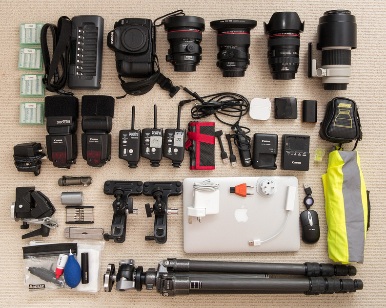
Firstly, an aperture series: if you don't have the time or bandwidth to look at these shots in detail, I can summarise by saying that the lens has fabulous sharpness and resolution on centre wide open, peaking (but only by a tiny margin) at F5.6 but that if you want your edges and corners in as good as possible a compromise with the centre, you'll need F8 or even F11 at a push. If you value low light fall-off, F8 is the first aperture at which vignetting becomes hard to discern. And if you want the best 'magic' of contrast, micro-contrast and just sheer visual fireworks, shoot at F5.6 and live with less-than-perfect edges. Anything over F11 and you are throwing away detail in bucketfuls on centre. But later on, I'll suggest a way of 'having it all'... as long as you have a tripod with you.
This is the test scene shot at F2.8
 These are the links to 92% quality, full-sized shots at:
Please note that these shots have lens corrections applied, and sharpening in LR of 60/0.7/70/20
There are very, very few 'technical' review of this lens on a D800 or E so it's worth noting here that the excellent LensRentals list of recommended lenses for the D800 has it at 1180/940 (MTF 50, centre and edge) on a D800 but notes that that the Zeiss 100m Makro Planar is very notably better on the D800E than on the D800 so, in the light of no data for the 21mm on the 800, I can say that my guess based on experience is that the same is true of it. But I would add that the Nikkor 21mm F1.8G, on a D800, scores 1140/1000 and costs (and weighs) a great deal less. You might counter that it's a lot less wide and that it is known to be a 'tricky' lens, with field curvature and some mid-field weakness. Well, the same is true of the Zeiss, just somewhat less so. The Nikkor is a better deal by far (if you know how to shoot it) but it lacks the magical micro-contrast of the Zeiss.
Let's take a quick look at some other considerations:
Distortion: the lens has a mild-ish but noticeable moustache substyle which cleans up nicely in Lightroom. Don't bother for landscapes, do bother for architecture.
Before correction in LR:
After correction in LR: 
Flare and CA: the lens performs pretty well but you will find some coronal circles, ghosts and veiling flare to some degree and they will spoil shots unless you use them 'creatively'. So avoid very strong point light sources and don't let the sun brush across the front element, even when out of frame. That hood's there for a good reason. Talking of the hood, if you're stupid (I am) it is easy to put it on at a 90 degrees wrong angle and the results will hurt. As for CA: don't sweat it. It is so well controlled that I rarely even correct it.
Bokeh
Given that the lens is designed to give great sharpness centrally wide open, and given that even at this focal length, focussing on close-up subjects at wide apertures will give considerable OOF areas, bokeh is a significant part of the appeal of the Zeiss: I post an example below and observe that in addition to a really nice bokeh behaviour, the manner of transition from in- to out-of-focus areas is great and contributes very significantly to the 3D pop of the lens. Viewed on a Retina display, many images really do look so convincingly 3D that I find myself moving my head about unconsciously, as if to 'see behind' the edges of foreground objects.
Tips 'n' Tricks For Perfect Snaps
There are some things to be aware of if you want to get the best results. These findings refer to my particular lens/body combination and I should comment up front that, like Lloyd Chambers (who reviewed the lens mostly on a D3X) I have found some mildly confusing and inconsistent results. These are not unusual in very wide angled lenses, especially with high resolution full frame sensors and can be caused by a combination of 'natural' (inherent to the design) and 'aberrant' (particular to a lens or body and caused by mechanical errors) factors such as:
- Field curvature
- Sub-field weaknesses
- Sensor misalignment
- Mount misalignment
- Lens element misalignment
I know from MTF charts that this lens has some sub-field weakness at mid-apertures and generally more sagital than tangential. I don't believe that my body has notable misalignments of mount or sensor (I have my reasons and I have about an 85% certainty of this) but I do suspect a very minor misalignment of an element or group in my copy of the lens. Not enough to fuss over, certainly not firmly diagnosed, but I have my suspicions... however, odd effects, when inconsistent, tend to be multi-factorial and can take a long time to track down.
I do know from my own field testing that this lens has more field curvature than people normally associate with it. The image below was focussed on the red sign using the centre of the lens and then recomposed. Shot at F5.6, I then painted in a semi-opaque focus mask at 50% zoom on screen:
This appears to show a combination of corner weakness and field curvature. Key to this is that the chosen plane of focus is sharp from edge to edge and, focussed correctly, this is generally the case at F5.6 and tighter as long as you focus correctly. But you need to be aware of what else in the FOV will be in and out of focus and the above should help visualise 'the zone'.
Another notable aspect of my copy of the lens is that the infinity stop on the lens is way past infinity. I never shoot it turned to infinity: rather, I push it to that point and then back off a millimetre or so.
These two f5.6 100% centre crops show the difference this 'backing off infinity' has on a far landscape (about half a mile): first is hard-stopped at infinity, second is twisted a touch nearer. Both looked fine in the viewfinder and had 'green dot' confirmation. The effect at the edges is also significant.
This brings me to another point: the lens seems easy to manually focus either by eye or using the focus confirm dot but in truth, the dot is too easy to please and the eye needs to be very keenly used. Mostly it works fine but I have had some spectacular mis-fires that looked good through the finder. You may think DOF on such a wide lens will save your bacon. It won't. If the shot really matters, bracket focus or focus in Live View.
On the subject of focus bracketing, I found myself exploring 'focus stacking' with the lens. The reason for this is that I sometimes really do want a frame which is entirely and laceratingly sharp all over, corner to corner, edge to edge and this lens, good though it is, is not quite up to the task. If you focus very cunningly you can almost get a shot at F5.6 which, if taken at eye level, will get the grass at your feet and the far mountains sharp. Almost isn't good enough. Normally I'd just swap the lens out for a Samyang 14mm F2.8 and get what I needed but sometimes I need to use filters too... so what I suggest is that you take two shots, one at F5.6 and one at F11, without re-focussing between frames, and combine them in Helicon Focus.
The 'normal' use of focus stacking is to get 'impossible' (some might say 'improbable') DOF. Shots like this one, made by stacking 14 images, all focussed at different distances, and allowing Helicon to combine them.
 Clever-ish but also a bit of a novelty. Much more subtle is (using a tripod) to leave focus unchanged and just change aperture, giving you the fabulous centre-field micro-contrast of F5.6 with the greatly improved edges and corners of F11 or, as in this case, F16:
 This technique will really help get the most from a D800 and Zeiss 21mm and I do suggest you try it.
A note on metering: in most scenes, the sky takes a slightly smaller proportion of the scene and on the D800 I often find that this leads to brighter areas blowing out as the camera meters for what seems in effect to be an average meter reading - I have never believed the modern camera marketing hype about comparing the contents of the viewfinder to a database of thousands of scenes. Shooting wider, where the sky often takes a more prominent place, means that that lenses like the 21mm Zeiss give the impression of 'better' exposures in that there are fewer instances of 'blinkies' in the sky and fewer 'hard right' histograms. For a JPEG shooter, this is probably useful and certainly easier than constantly dialling in negative compensation but for an experienced RAW shooter, it will lead the camera to underexpose quite often, especially for ETTR fans. It's useful to be aware of that with this lens on the D800 and I suggest trying a general setting of +1/3rd to +2/3rds as a starting point.
My final analysis is that I wouldn't be without this lens in my 'wider kit bag' but won't take it everywhere. I greatly value its micro contrast and magical way with colour and contrast but it is a bit finicky, a bit fussy and frankly, a bit unpredictable even when you know it well. A better design will be in the works somewhere but we might have to wait a while. If you are happy to wait rather than dropping $$$ right now, try the Samyang. It does much of the same stuff, some of it rather better, at a much lower price, if you can live without using filters...
This month I am supporting the charity Photovoice. I wrote about it in depth last week and that article is here. If you have found this blog useful and are feeling generous, I would hugely appreciate a donation to the charity, even just a pound or a dollar: every little helps. You can donate here and the Virgin Giving site is secure and takes cards and PayPal. The Gods of Great Photography will smile on you if you donate. I promise.
]]>Learning to print digitally has led to a both a revelation and a reavaluation. Sure, sometimes I crave the sheer punch of Cibachrome but it's not available anymore and in any event my tastes have changed towards the subtle. A few years back I bought myself a 24" roll printer (HP Z3100) and when that eventually pissed me off too much, I changed to a Canon iPF3600. Both printers let you switch from matt to gloss printing without changing inks, an absolute prerequisite for me, but otherwise the results are pretty similar. And then I set about learning the new craft. Absolutely indispensable for this task was the Luminous Landscape video series, From Camera to Print.
Like it says on the tin, that series teaches you how to calibrate the entire process from capture to final output, including calibration of every piece of hardware and software en route. It teaches you how to soft-proof and, most importantly, how to either make or find the correct ICC profiles for the paper and printer you intend to use.
Having learned all that gave me much greater confidence in the 'expensive-if-you-get-it-wrong' process of making large prints with the colour I want. Since I often make limited edition prints in series of between 10 and 25, consistency is vital too: I need to be able to get the same result from the same file over a period that might span several years.
That confidence has also encouraged me to experiment with a wide variety of different papers but pretty early on, I realised that one paper in particular got a very strong reaction from viewers. The most common reaction, with the right sort of image, is "that's not a photo is it? it can't be!". What is more, those are the images that sell at the best prices, most quickly. Sure there's a synergy between the paper and my style of image making, but the paper is quite certainly making a vital contribution to whatever I have achieved.
I want to add here that I am absolutely NOT a 'novelty printer'. I don't print on canvas, because a photo is not an oil painting and even if I wanted it to look like one, printing on canvas would just make it look like a photo printed on canvas. I have no desire to hide or disguise the photographic intent of the images I make. So my reason for liking this paper is not because it tricks viewers into imagining the image to be drawn or painted. No: I like it because it makes the right sort of image look astonishingly but subtly lyrical.
This paper is Hahnemuehle German Etching.
It suits landscapes more than anything, but not the sort of landscape where you want every last pixel of resolution to be leaping from the print. The paper doesn't throw information away, but it manages to be both accurate and ever so slightly impressionistic at the same time. Also, as a very matt paper, it doesn't make colour sing like Sondheim: rather, it's Strauss's Four Last Songs. Quiet, capable of swelling to loud, pregnant with richness rather than rich with bling. I find it especially great with images that have a limited colour palette or a muted tonality with some areas of rich colour, combined with fairly simple, graphical composition. For this reason it is also good for some sorts of studio still lives, of simple subjects simply shot and where complexity and depth are required rather than explosive impact. Here are four examples of images which look rather ho-hum on a computer screen but get a very positive reaction when printed on German Etching:
 On the other hand, scenes with a lot of colour contrast are bad, as are any portraits other than very high key, soft contrast. Neither of the following would work well:
With the single exception of the strong distortion (and 'easily fixed' is not always the same as 'perfectly fixable') this lens is brilliant. It is the only lens under 50mm I have yet used on the D800E that can easily give edge to edge, corner to corner sharpness that doesn't leave me feeling that something is missing. It has great colour, wonderful contrast and micro-contrast, resolution that knocks most lenses out of the park, is well made, very nice to use, small, light, and boy is it cheap at £306 or $429. And, though it is manual focus, it is fully chipped for metering, automatic aperture control and EXIF when used on most current Nikon cameras.
Personally, if I were you I wouldn't even read the rest of this review: I'd just go and buy one. There are so few tricks to learn, it is so mild mannered, that you just take it out of the box and use it as the Good Lord intended. It is insanely great with almost no effort, and will make a lot of photographers look more technically accomplished than they are. And thought there are reports of bad copies (as there are with so much gear from other manufacturers too, it must be said) I can safely say that there is no rigorous testing regime. Use it for an hour and if it doesn't amaze, it's a bad copy.
Right. Let me now write the 'other 90%' of this article, in which I will attempt to justify and prove the above, for those of a doubting nature. I will start with a little party trick.
I took two lenses. One is the Samyang and one is the Zeiss 21mm F2.8 Distagon, a truly venerable lens. On a D800E, hand held, manually focussed through the viewfinder, at F5.6 in good light, I shot the same subject. For the Samyang I stood closer, so as make the subject the same size in the finder in both shots. I took great care to level the subject 'back to front' so that the camera was not tilted up or downwards. I then processed the files in LR4 and included a lens correction in that software for the Zeiss, though I round-tripped the Samyang file through PTLens for the best correction currently available.
The full scene looked like this uncropped:
Here are 100% crops from those files. I can't really hide which is which, because the wider lens is bound to have a slightly different perspective, but try not to think about that. Just look at the shots: clicking on them will load full-sized versions.
Please note: these days I check resolution on a Macbook Retina display, which in Retina-enabled applications such as the latest versions of Aperture and Capture One, and Lightroom 4 latest Release Candidate, give an image very similar to print resolution when viewed at 100%. However even Retina-enabled browsers such as Safari won't do this with images you load from here, since my blog host doesn't serve the right 'version': so you will need to load the files into a suitable application if you are on a Retina display. Users of conventional 100ppi displays should view images at 50% zoom to get a similar view.


Now this comparison backs up what I find in the real life usage again and again: both lenses are great but the Zeiss, like so many other wides on the D800E, has certain parts of the frame where resolution seems to drop off a little, even in uncorrected files. Whereas the Samyang is just sharp everywhere, pretty much all the time. This may not be what you are looking for of course - but if you are, it is a godsend.
This is not a comparative review of the Zeiss versus the Samyang: the Zeiss has its own skills (it can take a filter; it is pretty much as sharp wide open as it is stopped down and in any event the two lenses serve slightly different purposes) and I will review it at a later date. But I will say that you can also get it sharp edge to edge and corner to corner but you have to know it really well before that is guaranteed - whereas the Samyang almost requires special skills to get anything other than great results.
But surely a lens of this price must be crap wide open, right?
Let's take a look. Here's a scene shot on a tripod and focussed in Live View then shot with 3 second delay. The general scene first, then side by side crops from centre, far right edge and far right bottom corner. In each side by side, you are looking at F5.6 on the left and f2.8 on the right. No corrections were applied for either distortion or vignetting. Clicking on the crops will load full sized versions for you to look at in your preferred viewer.


 What you will see, if you peep in detail, is that the lens has a slight glow wide open, especially on bright parts of the subject. But it still has great resolution and it amazingly manages to keep very good resolution even into the corners. If you want a planar subject critically sharp and with great micro contrast, use F5.6 and if you have a very deep subject field, use F8 or F11 in which case you will give up a little bit of ultimate resolution, dull the very good micro-contrast slightly, but get enough DOF for you nose hairs and the moon to both be in focus.
A word about chromatic aberrations: at my usual working aperture with this lens of F5.6, even strongly contre jour, they are fairly infrequent an issue and when they do pop up, the LR4 one-click method works well. I think the lens is very civilised in this respect. Follows two crops from the worst case I have yet seen, shooting with exposure for a forest floor but with some blown sky visible through the tree canopy, at F5.6 and from the top edge close to the corner, without and with LR4 one-click treatment:
Flare is similarly well-controlled: here's a quick series showing me swinging the sun into the frame over three shots. Note the very low veiling and the generally good flare control. In fact, for a 14mm lens with a bulbous front element, I think this is a good performance at any price...
Now for a quick look at two shots that show both pre-correction vignetting and bokeh. First at F2.8, then at F5.6, click for full sized images but if you want an easy summary, there's a lot of vignetting at F2.8, some slight amount remains even by F5.6, I quite like it and if you expose properly, you can generally eradicate it where necessary. Bokeh, I don't like: it's nervy. But this is not a bokeh lens, it is the exact opposite and in any event, no lens of this focal length that I have ever used or seen examples from is significantly better.


Readers will have noted in the bookcase example above that this lens has more barrel than a brewery: the distortion is measured by Photozone at over 5%. And because there is is also a moustache sub-style, you can't deal with it in Capture One or Lightroom: in fact I checked the downloadable community-created profiles available for Lightroom and there isn't one for this lens. But for $25 the excellent PTLens will do the job, and will work as a standalone or as a round-tripper external editor for Lightroom. Look at this 'before and after' example:
 Just look at how well that moustache is tamed! But I give one caveat: if you want to shoot high level architectural work, fully corrected, this lens might just satisfy but only if you shoot 'fully levelled'. the following example shows a worst case of before and after correction for a shot that was taken by hand and purposefully NOT lined up very well. You might be able to fix this fully, but life is too short. In general, I regard this as a landscape lens and for most landscapes I wouldn't bother applying corrections. Most sorts of architectural or mixed-subjects scene can be made to work very well with corrections and maybe someone will home-brew one that suits them even better than PTLens but if I wanted perfect rectilinearity with this FOV and resolution, I'd probably be shooting medium format or exploring the limited range of other options available at very much higher prices.
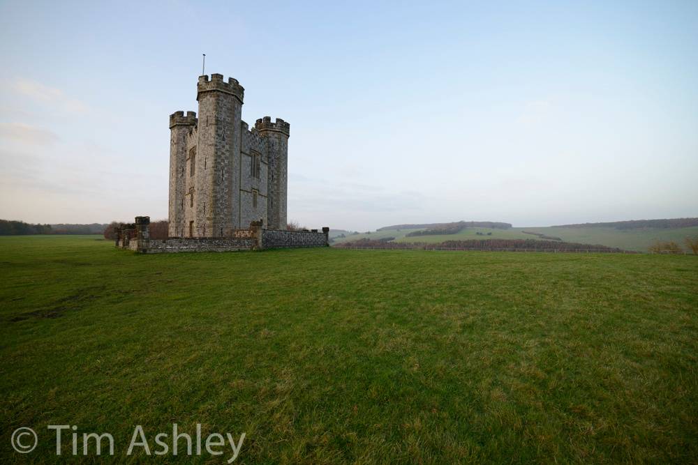
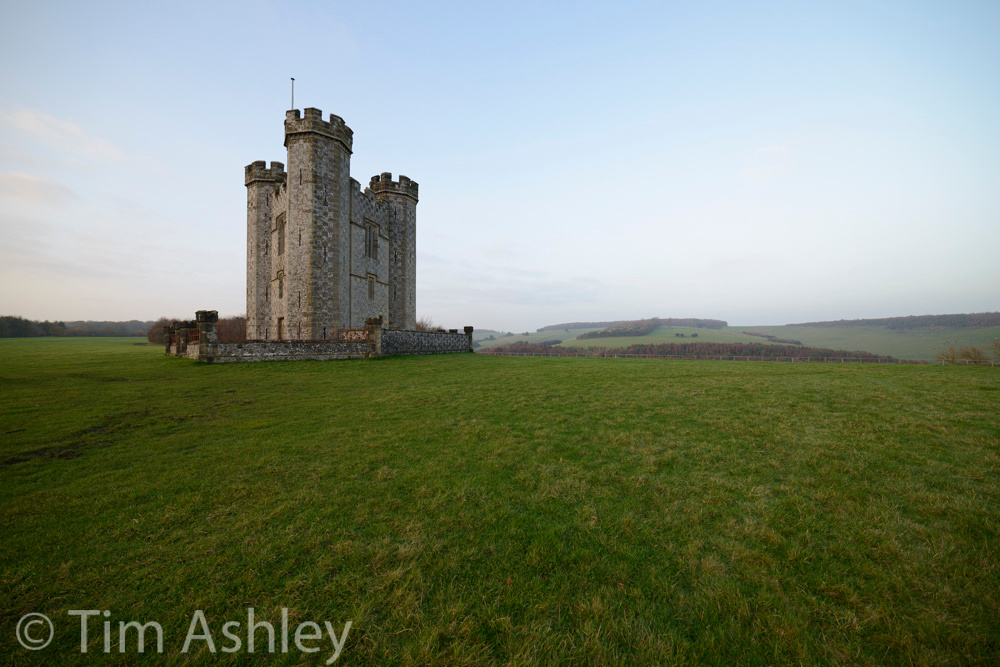
I want to say a little now about field curvature and focussing this lens. I pointed out above that it's hard not to get great results out of the box, but knowing a little more about the lens will help you get even better images.
Like many wide angled lenses, there is some field curvature with this Samyang. Imagine, if you know it, the British Millennium Dome. Now imagine that you are lying on your back in the middle of it, with a camera pointed towards the roof. The roof is roughly the same shape as the field of focus of this lens though as you stop it down, DOF increases so much that you can stop worrying about that shape. But between F2.8 and F5.6 it does matter, at least to the obsessive. Here's an example: you will need to click for a full-sized version and load it into your preferred image viewer then read the commentary and walk through the file. Remember to view it at 50% in your preferred application, or, if on a Retina display, at 100% in latest versions of applications as detailed above.

For this shot at F5.6 I focussed and recomposed on the trunk of the nearest right-hand tree. It is in perfect focus, and you will see that the ground running towards the camera is pretty impressive. Even the corners are quite good though F8 would have tightened them up. You will also see that the central distant fir tree is in good focus, as are the near branches running into the top left and right. But look behind those branches: the further peripheral trees are OOF because they lie 'outside the roof of the Millennium Dome'.
What this means in practice is simple: if the camera is at eye height and you want to get everything from near corners to far edges in focus, regardless of the 'shape of the subject' you will need F8 or sometimes even F11. The good news is that resolution is still very respectable at those apertures, and micro-contrast, though a little duller, is also still good. There is a wrinkle, too: on my copy (and this is not the same on all iterations I have seen pictures of) the 'infinity' position is marked not only by an infinity sign, but by a 1cm 'zone' that goes unexplained in the manual. I find that tugging focus to about half-way along that line and using f8 will nearly always get everything in focus in pretty much any shaped scene. But in scenes like, for example, an alley for trees stretching away from me, the best trick is to focus on about the three metre mark and set F5.6 and then you get the whole curve or alley in front of you sharp to infinity and you get the very best micro-contrast. But don't let me make you paranoid: this is for those seeking extreme perfectionism and, having read the review of this lens at 3D Kraft, where the Samyang is compared to the mightily expensive Zeiss 15mm F2.8 and the Nikkor 14-24 Trinity lens at 14mm, I think I could match the best performance in each of the tests shown there by using the Samyang focussed as suggested here. As ever, copies vary so it is important to establish the exact parameters that work for your combination of lens and body.
Some further general comments:
-
The lens won't suit video shooters very well since there's no good way to correct the heavy distortions in video, though they will sometimes be creatively useful.
-
The build quality is great, and the lens is light, compact and feels very strong and smooth: the cap feels a little plasticky but clips into place more confidently than Zeiss caps ever do. Overall the lens feels a lot more classy than, say, the 28mm or 85mm F1.8g Nikkors.
-
The lens focusses very close at 28cm but it takes an entire 2/4 turn from there to infinity. I don't mind that but some people have complained that this focussing 'throw' is too long. But focussing action is lovely.
-
The true light transmission (and possibly the actual apertures) are around 1/3rd stop less than advertised. In other words, the 'T-Stop' number diverges from what you might expect if you looked at the F stop alone. This is not uncommon.
-
The bulbous front element means you can't fit filters. This is a biggie for me, and means that I also need the Zeiss 21mm F2.8 Distagon in my kit. Otherwise I would make do with just the Samyang. Really.
-
The petal lens hood is quite small but is fixed and gets in the way of the on-camera flash beam. You can't have it all.
-
So many lenses that review well on 'last gen' cameras take a radical turn for the worse on the D800E. Not this one.
Conclusion
I have trie damned hard, over the past week, to find a problem with this lens. Like most people I assumed that an astonishingly cheap piece of kit from a little-known manufacturer could not possibly be very good, let alone excellent. But this thing is simply brilliant. It answers a real need in my life: a wide angled lens for landscape use that gives me sharp images from near to far across the frame. Sure it has distortions, but they are very nearly always fixable and frankly I rarely bother: for most landscape shots, the distortion just does not matter. Flare, aberrations and field curvature are all pretty benign, especially for a lens this wide. Resolution and micro-contrast are way, way above its pay grade. Knowing what I do about it having shot it fairly widely this past week, I can confidently say that I would be willing to pay two, possibly even three times this price for it. Don't tell Samyang.
This month I am supporting the charity Photovoice. I wrote about it in depth last week and that article is here. If you have found this article on the Samyang 14mm f2.8 useful and are feeling generous, I would hugely appreciate a donation to the charity, even just a pound or a dollar: every little helps. You can donate here and the Virgin Giving site is secure and takes cards and PayPal. The Gods of Great Photography will smile on you if you donate. I promise.
]]>
For those of us with a passion for photography, there are remarkably few charities that are specifically suited to our interests: sure, we can give our photographic time and skill to pretty much anyone but, a dedicated photo charity? They are few and far between.
Photovoice's own website does a better job of explaining what they do but in short, they turn documentary photography on its head: instead of using professional photographers to document the plight of disadvantaged groups, they use those photographers to train their 'subjects' in the craft and art of photography so that they can document their situation from the inside out, becoming their own advocates. Consumer-level cameras are provided, training courses are established and the shooting begins. At the end of the course, those participants with the best 'eye', the greatest passion and the most well-developed skills go on to a bursary program where their entry-level camera is replaced with an SLR and they receive individual mentoring. Some of them even end up as photographers.
Like all charities, Photovoice gets the bulk of its donations in a way which limits their use to a particular project. These are the journeys, if you like: but someone has to pay for the vehicle to be maintained. The annual auction does this: the funds from it pay for all costs which are not project-specific. Without these, the charity would not exist.
This year's print donor list reads like a Who's Who of contemporary photography, with some classic names thrown in too: Herb Ritts, Simon Roberts, Tim Flach, Nick Danziger, Chrystel Lebas, John Swannell, Nadav Kander... the catalogue is here. Guide prices are from £150 upwards and there are, though it pains me to say this in the light of a charity, always bargains.
Below is a very small selection of what is on offer, just to show the range of names and types of imagery. They are alphabetical, so, errr, mine comes first. And following the sample of auction prints is a further small selection of images taken by project participants.
If nothing takes your fancy but you feel like helping, even a tiny bit, there is a webpage where you can make a donation, which would be hugely appreciated: this blog is toll-free, I make no money from subscriptions or click-thru or in any way whatsoever but if you enjoy it and feel inclined, please give a little. You are utterly welcome here whether you give or not, but it would be very, very much appreciated. Thank you.
If you do follow the links to the donation page, please enter in the comment box that you came from this site so that we have an idea of where donors originate.

No Other Blue, November 2011 © Tim Ashley

Drawstring, 2012 © Thomas Allen / Foley Gallery
Juke Box Johannesburg, 1961 © Ian Berry / Magnum
Approach to the Castle, Lisbon, 1963 © Dorothy Bohm Archive
Oscar Pistorius, 17 July 2011 © Harry Borden
Diana Dors, 19 May 1956 © John Chillingworth / Picture Post / Hulton Archive / Getty Images
 Trabants I–XII, 2012 © Marcus Lyon
Greenhouse Structure, Study no.2, Biei, Kokkaido, Japan, 2004 © Michael Kenna
Sandown Pier, Isle of Wight, 2012 © Simon Roberts
Pink Floyd Contact Sheet, 1976 © Carinthia West

Now we've seen some great work by professional photographers, let's see some more Photovoice workshop participants strutting their stuff. You will note that the images have Edition Numbers on them: they are available for purchase from the Photovoice website as a further means of fundraising.


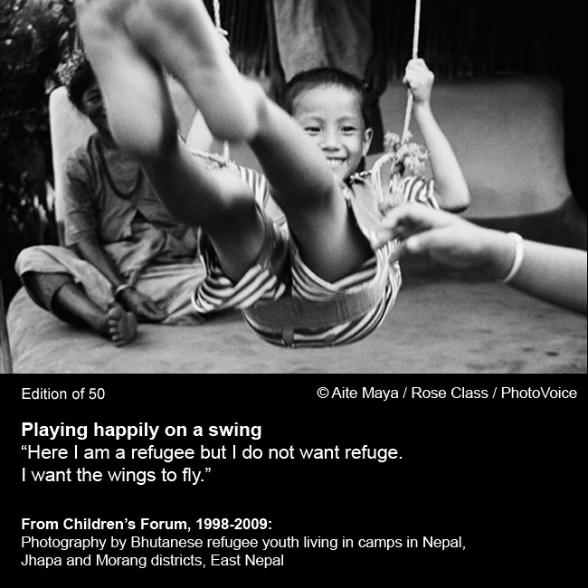
Thanks for looking... and shamelessly, here's another invitation to...
]]>
And with the rate of technological change, the power of camera manufacturers' marketing and the shininess of the toys, it is all too easy to get trapped in the 'gearhead' phase of the process and not to place enough emphasis on one's philosophical approach and on the development of a critical infrastructure that informs the development of one's own aesthetic and in turn of one's practice. Add to this the prevalance of some really quite constraining norms in the genre and it can be hard to plough an individual furrow rather than get stuck in a generic creative rut.
Some of these issues were covered in my piece What is Fine Art Photography and, despite a limited angry reaction, 90% of the feedback to that somewhat controversial piece was very positive and a number of people asked for suggestions as to what reading material might help broaden their creative perspectives. So here goes.
Firstly, I want to say that there is nothing wrong, limited or second-rate about wanting to be a straight photographer: it is a complex, and honourable practice and it can be extremely satisfying to the photographer and his/her audience. But many photographers crave the additional kudos (and the attendant sales) of the Fine Art label. This piece is for those people.
It is my contention that to be creatively original, you need either egregious levels of natural talent or you need to work at it, and hard. The following process might help.
- Learn to enjoy and 'read' art in general - be an educated aesthetic consumer, one who can tell the difference between 'pretty and attractive' and 'artistically accomplished and significant'. Unless you want to be a punk artist, philosophically opposed to the processes of art itself, this necessarily involves accruing some working knowledge of the history of art, and not just Western art.
- Read about what happened when photography was invented (starting with the Rennaisance use of the Camera Obscura and how it impacted depictions of reality via accurate perspective) and how artists and non-artists perceived its potential, its threat and its meaning.
- Learn your equipment and your technique inside out: the more you can do, the fewer boundaries there are to the imagination. But don't let technique and equipment swamp the development of your creative vision.
- Look at the work of others in the genre. Think about what they were trying to achieve on both aesthetic and intellectual levels and on where that fits in with the culture in which they worked. It's almost a definition of art that it is something that should not be taken at face value: you have to deconstruct.
- Think about what you want to say with your own work. In addition to how it looks, think about its cultural, ethical and intellectual roots and ambitions.
The books I have chosen below will, if taken together, cover most of the above bases efficiently, effectively and enjoyably. This is not a commercial site, I neither earn nor seek any revenues from it, but since my readers come from (at the last count) over 140 countries, I have provided links to these books on Amazon as the most global supplier.
On Photography by Susan Sontag
An incredibly ambitious and influential book, with no photographs in it at all. You know you're in for an intellectual workout from the first line:
"Humankind lingers unregeneratedly in Plato's cave, still revelling, its age-old habit, in images of the truth,"
and then, remarking that the sheer volume and range of photographic imagery available changes the 'terms of confinement' in the cave, she goes on to the simple but apparently profound "To collect photographs is to collect the world." I say 'apparently' because there's a lot in this book that might be considered profound or trite, depending on one's sympathies.
Regardless, there are a lot of interesting and original thoughts. "Movies and television programs light up walls, flicker and go out; but with still photographs, the image is also an object,' she says, though, having been written before the digital revolution, that is no longer true - and this highlights one problem with the book: for an analysis that squares itself up to the task of generating eternal truths, it sometimes feels rather dated - and Sontag's slightly haughty approach to the detailed understanding of technology sometimes lets her down.
What follows is a rollicking if demanding read in which she draws freely on the history not just of art and photography but also of the world, embedding her analysis in fact, myth, culture, politics, fashion and style. Neither is she always serious: famously critical of Arbus, she at one point dismissively summarises her oeuvre as an "extremely private obsession... a thing (she) had for the Halloween crowd."
Now that made me laugh. As did the phrase "much of modern art is devoted to lowering the threshold of what is terrible."
She is so smart, contentious, densely argued, learned, reverent and irreverent that any attempt at summarising this series of essays falls straight into the reductionist pit. Sontag takes photography by the balls, swings it round until it is giddy, then leaves it stumbling off into the history of the world somewhat unsure of its place but knowing at least that it has one. You may not agree with her thinking but as an example of how to think about photography, this book is pretty much without parallel; and it does not shy from the question of beauty, and whether it has any value beyond its own surface appeal. But a warning: if the approach of a pundit on record as having said "the white race is the cancer of human history," with the later addition that the statement had "slandered cancer patients" offends you, do not read this book. It is very East Coast Intellectual, but it takes no prisoners.
One last word: I would love her to have lived long enough to get her teeth thoroughly into Crewdson. Here's a hint of the direction she might have taken...
"Since photography cut lose from the Whitmanesque affirmation - since it ceased to understand how photographs could aim to be literate, authoritative, transcendent - (it) has given itself over the the consolations of Surrealism.... Surrealism is a bourgeois disaffection; that its militants thought it universal is only one of the signs that it is typically bourgeois."
The Genius of Photography by Gerry Badger
Gerry's name may not be familiar to you (it wasn't to me) but having seen the BBC TV series (available on DVD) that accompanies this book, I wanted to refer back to some of the images and ideas that I had seen on screen. The book has become my first recommendation to students who want to see their work in its proper historical and aesthetic context. Its stated aim, a "quest to understand what makes a truly great photograph," is ambitious and while the book lacks the depth of philosophical ambition to take on a definition of terms in the way Sontag does, it is far less authoritarian, far more readable and, yes, it has a lot of great pictures.
For someone who wants a real tour d'horizon but without giving up an analytical infrastructure, this is the best I have seen. It is intellectually strongly grounded but with great narrative pace and ease of use. It covers pretty much every important photographer, showing where they came from and where they led others, a very useful exercise. Take, for example, the way Badger ties Stephen Shore's Merced River, Yosemite National Park, 1979 to the work of Ansel Adams:
"Whereas Adams tried to make believe that Yosemite remained an unsullied wilderness, Shore photographs a family picnicking by the Merced river. He has accepted that where nature is, man is also, but that does not prevent him from making his own version of the American Sublime..."
Then back to Adams:
"His Western Landscapes... (present) the land as we want it to be rather than as it is."
So there's little surplus of high-falutin' critical vocabulary here, no criticism of Adams for mis-representing the truth in search of the merely pictorial. The book doesn't allow itself to get bogged down in all that. It notes that Adams' work was a meditation on a timeless Eden but does not criticise him for failing to meditate on the fact that this Eden was already lost: it just moves on. But in its desire to move on, it doesn't miss out anything of significance either and in this, it might be preferred to the Sontag book, which strays too far into semiotics for the tastes of some.
By the end of the book, anyone who wants to take the meaning of their photography more seriously will have the tools to start the journey. You can't say better than that.
Another book in the same vein is Art and Photography by David Campany. In a way it combines many of the best features of both the above mentioned books and might be characterised as a more comprehensive but less accessible version of the Genius of Photography. It is, however, let down by the very worst kind of 'form over function' typography which, in my opinion, makes it close to unreadable. If you can bear that, it's great.
Magnum Contact Sheets edited by Kristen Lubben
This 'coffee table' book is almost the size of a coffee table, and almost the same weight. But it is a marvel. If you want to see the political and social ambition of documentary photography executed with the aesthetic of the Fine Art practitioner, this is the place.
The USP of the book is the way in which it shows you the contact sheets from which some of the world's most famous and enduring images were selected. It shows all images on the roll, with red pencil rings around the candidate frames and then the final select, which is shown full-sized and with a commentary, often by the photographer.
Ansel Adams said that "A photograph is not an accident - it is a concept. The 'machine-gun' approach to photography - by which many negatives are made with the hope that one will be good - is fatal to serious results." Sontag, who rather more pragmatically observes that there is an element of luck in most great pictures, is closer to the truth on this one: documentary, in particular, often makes its shift from the sublunary to the sublime by getting the famed 'decisive moment' right and for many great photographers this takes more than one frame. There is no better example of this than the series of images surrounding the final select for Werner Bischof's Courtyard of the Meiji Temple, in which the compositional elements move into place such that many of the frames would have been very good but only one, which could not necessarily have been predicted, is great. So this book shows how multi-frame shooting isn't just another way of saying 'don't let the best be the enemy of the good.' Rather, it's a way of ensuring that the photographer achieves both.
Naturally drawn, as I am, to the fine art end of the photographic spectrum I tended to gravitate towards those sorts of images when exploring the book, such as Mark Power's Dalmation and Chris Steele-Perkins' Mount Fuji, either of which would look very comfortable hanging in a fine art show.
Whether its pictorialism you're after, or documentary, from Mother Theresa through the KKK to the Vietnam War and Bloody Sunday, from the Beatles to Muhammad Ali and Margaret Thatcher, the very best of photographically recorded history is here, rich and deep and very well edited and presented. Take a look at Thomas Hoepker's 9/11, for example. It quite simply defines one of the most significant events in the history of the world, and it looks great too. There's nothing else like this book and every serious photographer will enjoy it.
Photo Wisdom edited by Lewis Blackwell
This is a good old-fashioned book with lots of nice pictures by lots of top-ranked photographers. I add it because, unlike the above three books, it features purely contemporary work so, rather than delving yet again into the classics, it is a fair shot at a "who's who" in current practice. There are any number of similar books but I like this one for its clean style, good reproduction, simple formula and great choice of images. I discovered some photographers of whom I had not previously heard, such as Fulvio Bonavia (half-Sugimoto, half-Gursky, all good) and Loretta Lux, whose highly stylised portraits of children (more Grant Wood than Sally Mann) are very original. But there are some more established favourites too, such as Massimo Vitali, Nadav Kander and Elliott Erwitt.
Each photographer is given space to write interestingly about his or her practice, and this is often done in a way of very specific interest to other photographers. It is, for me, a great balance of words and pictures, of personal insights shared, and of discovery and re-discovery. A treat.
]]>
D800E with 70-200VRII at F2.8, ISO1800
Let's rewind a little to the past from which I was trying to escape. It was full of cameras that were not quite right:
- The Leica M9: poor-ish high ISO performance, tendency for lenses to 'drift' out of calibration with the body's rangefinder.
- The Canon 5DII: a benign but unexciting beast, plodding AF and bandy shadows. Same as all the 1Ds models I had before.
- The Phase One P45+ then P65+ then IQ180, shot on both SLR-style and technical-style bodies, each with their own profound usability issues.
So my pump was primed: I was ready for a radical shift, combining the convenience and flexibility of a DSLR with much of the resolution of Medium Format.
D800E with Nikkor 28mm F1.8 at F2, ISO1600
I was hoping for a Canon, I must say: back in February I had a bag of Canon glass and my only flirtation with a Nikon, the D7000, had been so profoundly irritating that I'd made a very rapid exit. Nikons don't focus well was my gut reaction after that experiment. But, as is so often the case, my eyes were to prove hungrier than my stomach when suddenly, bang, out of nowhere appeared the announcement of the D800. And better still, the D800E without AA filtering. I hate AA filtering. And surely Nikon would have gotten the focussing right on such a massively high-profile camera? To some extent I was willing to bet that they had - I would buy into the system as an experiment but I would hold on to my other gear for a while, just in case.
On the horizon we finally had a camera that would be small, light and with some weather sealing, offering almost the same resolution as a P45+, with access to a vast range of glass, promising super fast and accurate AF, great ISO performance... in short, all the skills and conveniences of a modern DSLR with most of the image quality of a medium format system. I could eventually sell all the Phase One gear, all the Canon gear, the M9 (but keep the Leica glass: you never lose money by keeping Leica glass) and frolic off into a sunlit meadow of photographic loveliness.
 D800E with PC-E 24mm F3.5 at F3.5, ISO100
I placed an order and waited, accumulating a basic set of lenses in the meantime and sagely sharing opinions with other Medium Format refugees. "The glass will be the problem," we all agreed. Of course, coming from MF-land, we had all the techniques and tripods we needed to deal with this number of pixels. But would we be able to find good enough glass?
D800E with 70-200VRII at F6.3, ISO100
Before my "E" arrived, I got a whisper of a standard D800 and nabbed it. It would be a handy second body, I thought, and if moiré turned out to be a big problem with the E, I had another option. Then the E turned up, a few days later.
Neither of them could focus as advertised. I won't bore you with the details but after months of effing about, failed repairs, blah blah blah, Nikon refunded the D800 and finally got the E to focus such that, at a stretch, I can convince myself that it is 'within standards'. It certainly isn't within my standards but hey ho...

D800E with 85mm F1.8G at F2.2, ISO 320
The next most pressing problem has to be the extraordinary approach to lens manufacturing that Nikon has. They seem to bang them out of the factory without reliably effective testing, I suppose in the hope that most punters will be too daft to notice. And when you send one back for repair, in my experience, it does not get repaired. I now test every lens I buy immediately, knowing that there's a pretty good chance that it'll be a sub-standard copy and that the best thing to do is return not repair. I have to rotate retailers it's so embarrassing. And I have never had this sort of thing with any other manufacturer. Sure there have been one-off problems but not like this. Nikon need to be aware that selling bodies with incorrectly calibrated AF alongside poorly QC'd lenses is a recipe for really pissing of its customers. Nuff said.
D800E with 70-200VRII at F4, ISO1800
On to the good stuff, and there is plenty.
The D800/E is no more demanding than, say, a D700 or 5DII, as long as you don't want to enlarge or crop more than you did with either of those cameras. On the other hand, if you want to shoot it like Medium Format (i.e. with either a tripod or a fast shutter speed and with great glass) then in my opinion you will get results in the same ballpark as Medium Format. Actually, the colour is not quite as good, the ISO performance is waaay better and the Dynamic Range is better overall even than an IQ180, though most of the advantage is in those deeply miraculous shadows: for my money, the Phase camera still handles the rolloff into blown whites with more skill.
 D800E with Zeiss 100mm Makro Planar F2 at F11, ISO100
Largely, the promise of MF quality with DSLR convenience and flexibility is, focus issues aside, delivered. The camera is no machine gun, but it is fast, responsive, fully-featured, light, comfortable, practical and very highly capable. It can cover 85% of what I was previously doing with the Phase One and Canon gear combined (including studio work at which I think it excels) as long as you use the right lenses. And there's the rub: there are very few lenses that can match the abilities of the sensor across the entire frame. Even some of the exotic manual focus lenses, especially the wides, have design compromises that make it very hard to deliver what the sensor is capable of. Here's a list, with a 'would I buy it again now I know it' rating of Yes/No..
- 70-200VRII - reliable, sharp, wonderful - Yes
- 85mm F1.8G - fabulous - Yes
- Zeiss 100mm F2 MP - frankly, so compromised by colour aberrations that it hardly gets used - No
- Leitax-adapted Leica 50R Cron - an absolute star - Yes Yes Yes.
- 24-120 VRII - test your copy carefully. Nothing else is this convenient so even though it doesn't realise the sensor's potential - Yes
- 24mm PC-E - IMHO out of its depth on a D800 but I have to have a wide with movements so grudgingly, on my second copy - Yes
- 28mm f1.8G is 'tricky' but fun and very, very sharp when used to the full - Yes
- TC20E-III - a very useful extra, plays pretty well with the 70-200VRII - Yes
- 20mm F2.8D - a Lensbaby without movements. Blurry, close to useless, de-centred too. I returned it hence - No
- Tamron 24-70 F2.8 VC - I returned this because neither the aperture setting nor the VC worked properly but it showed promise - No

D800E with 70-200VRII at F9, ISO 100
Things I would really like the camera to do:
- Give me access to the Slower - Faster setting in Auto ISO at the top level or in My Menu.
- Allow individual AF Fine Tune settings for each sensel.
- Allow designated Non-CPU lenses to have their own AFFT value, so the 'green dot' is influenced by it.
- Have proper Matrix Metering: if I want Spot, I'll choose Spot. When I choose Matrix, I want Matrix.
- Have an 'Expose to the Right' metering mode (actually in Live View it almost does).
- Have a mode that effectively gives UniWB based 'blinkies' but with a correctly coloured preview image.
- Have better zoomed Live View implementation, possibly with a form of focus peaking.
D800E with 70-200VRII at F4, ISO 200
I have included a selection of images here to show the variety of bases I want the camera to cover. And from macro and still life through studio work, tilt/shift and landscape right through to moderate action, in black and white and colour, it really can cover all those bases. Its weaknesses are in the areas of very fast action, (either in terms of frame-rate or accuracy of focus tracking for those with poor left-side sensel calibration) and in the lack of a good, wide T/S lens. Otherwise it is pretty damned good and quite certainly the best all-round camera I have ever owned. And a good, properly fine-tuned lens using the cross-type sensels can focus very accurately. 
D800E with 70-200VRII at F5.6, ISO 140
And yet... I don't love it. It's amazing, visionary, widely capable and I am very grateful that it exists: but I don't love it.
Maybe that is because of the series of returns and repairs I have had to endure and which I know from the online community are far from being a rarity. Maybe it's because it lacks what Michael Reichmann calls 'thingness', the tactile pleasure of the thing itself: as a more-or-less pro tool, that isn't a design priority. Maybe it is because, though the files are truly excellent, with the best combination of resolution, noise and DR I have ever experienced, they lack the character of (for example) the way a Nex-7 handles blues and greens or the indefinable but wonderful rendition of a Leica M9. I also have failed, as yet, to find a low-distortion flat-field wide angle lens that is sharp to the edges and corners on far landscape at an aperture wider than where diffraction sets in.
D800E with 24-120VR F4, at F5.6, ISO 100
I shoot with my D800E more than any other camera I own and yet here we are, six months in and I still have all the Canon glass and I still (just) have the IQ180 and technical camera - and the thing that stops me finally 'pushing the button' on selling them is that I have yet to take a single shot with the D800 that enters my personal 'hall of favourites'. Not a single shot I really love, in six months. My fault, I know: I've found the perfect second wife and yet, here's me, still seeing 'the ex' - and looking for a mistress too.
]]>
click any of this series for half original sized versions

I have such a lens for my D800E. A Leica 50mm F2 Summicron, ROM edition, adapted with a Leitax mount. And even though my copy is very slightly soft on the left hand side, it is by far, far, far my favourite lens on this camera. With the possible exception of the Zeiss 100mm Makro Planar it is sharper than anything else I own (when stopped down a bit) but it is also poetic: obviously poetic when used wide open so as to create its characteristic 'glow' and less obviously but perhaps more profoundly poetic in the subtlety with which, when stopped down, it renders colour, micro-contrast and tonal transition. And it has only one sin: LoCas are clearly visible when shot wide open - but unlike with the Zeiss, they disappear quickly on stopping down and are in any event easy to get rid of in Lightroom without spoiling the rest of the shot. And, very satisfyingly, this fantastic lens cost me less than $500 to buy and to adapt.

I'm not going to go into the full details of the Leitax conversion other than to say that it is quick and easy to do at home, the mount is well made, and it works. I only have one tip: when you order it, ensure that you include their own screwdriver in your purchase. I wish I had: it costs almost nothing and it has to be better than the watchmaker's screwdriver I used rather fumblingly. Because what you are doing here is not mounting a traditional adaptor - you are unscrewing the Leica lens mount and replacing it with a Nikon mount that fits the Leica lens.
So, to the lens. Bad stuff first:
- it won't meter well on a D800 (and I'm not sure if the Leitax optional 'Dandelion' chip* would help that, I didn't fit it) but I tend to shoot a lot in manual anyway, checking my histo as I go - and this is the best way to shoot this lens.
- you won't get aperture information in EXIF, which makes learning how to use the lens slower, but the aperture series I provide here will help a lot with that
- for some reason, it plays havoc with White Balance, so you'd better have either a good eye or a WhiBal card.
- it only has half-stop aperture clicks
- it is a six blade design, so bokeh, though generally very nice, is not perfect.
- there is no way to set an AF fine tune for it, not even using the 'default' feature. Nikon could allow this in firmware as part of the Non CPU lens setup menu. On mine, the green focus confirmation dot is useful but not definitive and I think this is because my body requires most of my glass to have between +5 and +10 dialled in for AFFT. However, it is somewhat easy to focus by using your (well corrected or naturally brilliant) eyesight, with the right dioptre setting on the camera.
Tip: ensure that Auto ISO is off, otherwise your manual shutter speed changes keep changing the ISO rather than allowing you to under- or over- expose at will. Also make sure that you set the lens up as a non-cpu lens in the camera menu system.
Good stuff is plentiful:
- wide open, it has a gorgeous glow, reminiscent of a Notilux but less extreme and at a fraction of the price.
- micro-contrast is exceptional, tonal transitions superb. Stop down to f5.6 for best micro-contrast. F8 gets you the best edges, but costs you a tiny bit of the magic on centre
- when you get WB right, colour is rich and clear
- there is some slight forward field curvature but slight is almost an exaggeration. Ignore it.
- There is a tiny amount of focus shift as you stop down but it always keeps the POF easily within the DOF.
- it feels lovely and the focus ring is beautifully smooth and precise
- it is just utterly wonderful for shooting at dusk. It does something that makes me shiver with pleasure.
- Vignetting wide open is, I think, quite lovely: at F2.8 it is subtle, at F4 almost impossible to discern and at F5.6, gone.
So: it is a great general purpose lens because it has a fairly flat field and is pretty darned sharp when stopped down a bit. But it is magical wide open, and it is magical with evening light and colour:
Click for half-original sized versions


It handles sharply delineated scenes in bright sunlight very well:

It is great close up...

...but not always easy to get perfect focus... (click for full-size, shot at F2.8)

Aperture Series
I like this lens most for architecture or scenes with some man-made material: it likes to get its teeth into concrete and stone and glass and steel. But it is also very nice for landscape work. I have included one architectural and three different kinds of landscape in the aperture series:
Clicking on the F5.6 versions below will take you to a gallery with F2 thru 5.6 and sometimes 8 and 11 and full-sized files for each aperture can be downloaded there. These scenes are chosen to show:
Far detail with a more or less flat field: (focus on the small group of trees in the middle of the high field, centre)
Far detail with a more or less curved field: (focus on the sign, centre)
Near detail with far backdrop: (focus on trunk of central tree)
Mid distance flat field architecture (F2 thru F16, scene shot from a slightly different point than usual due to access restrictions: I apologise for this since it does affect the continuity of subject planarity on the left hand side. I have also included diagonal shots on this series to show corner performance.
 My conclusion on aperture is that F2 is for use when you want a soft, glowing, romantic look, that F2.8 is 'sharp enough', that F4 thru F8 are all great on centre but that the edges are best at F8 and micro-contrast is best at F5.6... and finally, that F11 is still perfectly useable despite the effects of diffraction being quite clearly seen.
Bokeh
The first two show focus on foreground and then background for the same scene at F2.8 - this scene also shows the degree of fringing you might expect wide open. The next shows the lens wide open, focussed on the central bough of leaves. The last one shows OOF highlights.
click for full-sized originals


Flare Resistance...
...is perfectly reasonable with the sun just out of the frame and the in-built hood deployed, but not so great with the sun in the frame: note, these last two shots do not link to full-size originals
So there we have it: the Leica R Cron, adapted via Leitax to a Nikon mount, can be a poetic 'look' lens or a subtle, scientific instrument. It is cheap, easy to use, small and light. But beware: with the new Leica M coming in January, complete with R lens adaptors and Live View option, used R glass has started to creep (of late, rush) up in value. Grab one while you can. If I didn't have one, having seen what it can do, I personally would be willing to pay well over £1,000 for a good late ROM version.
There are people who are expert on every tiny version and variation change of Leica glass. Despite owning or having owned about twenty Leica lenses over the years, I am not one of those experts. The 50 R Cron, for example, has been made since 1964. Since then, it has had one, two and three cam versions, a ROM version, and has been made in both Germany and Canada. Bottoming out exactly what changes to the optical formulae and the coatings have happened and when is simply not my special subject: the version tested here is the ROM (most recent) version. If you are looking on eBay or similar for a lens to buy and want to check where it fits into the pantheon, check here for further guidance, or ask a reputable dealer. Additionally, if you visit the Leica website here, you can download Erwin Puts' classic, definitive analysis of the lens from the '50-60mm Leica R lenses' link. This has a very detailed optical analysis.
* The Dandelion chip offers the following if mounted on the ROM version of Leica lenses:
- Metering (Matrix if available in your camera) with consumer-class Nikon cameras ( D50, D60, D5000, D80, D90, D3000, etc)
- Fine calibration of focus confirmation dot.
- Correct focal length and max. aperture in Exif data.
]]>
Frieze, a part of the London art calendar for many years now, is a sort of tented mall of galleries, bringing together 'the most exciting contemporary art and living artists.' But now, in a concerted attempt at extending this formula to 'historical art', we have Frieze Masters, 101 gallery stands squeezed into a vast marquee and filled with good things. You can tell the price bracket by looking at the other guests at the preview: some very expensive looking ladies, well tailored German gentlemen, and a strong smatter of American accents. Look, there's Michael Bloomberg, spotted with his entourage of security, curly wires emerging from their ears.
Now unlike a one-artist show at a commercial gallery or a public gallery show based on some theme or other, this is a show curated by one thing: money. The artists here have floated to the top buoyed by their sales alone. The world of commercial galleries is not a sentimental one, and though high-browed critical language is applied as needed, it is not the point of the exercise.
So this show, agnostic as to whether the medium of expression is oil, watercolour, stone, silk or chemical dye, is a great place to take another shot at that vexed question: what is Fine Art Photography? And today's answer is, it's what sells in places like this.
So who do we have, and what does the list tell us about How to be a Big Name in Fine Art Photography? (or skip to the bottom of this page for the Executive Summary)
Dead White Male Photographers:
- Edward Steichen
- Cartier-Bresson
- Irving Penn
- Richard Avedon
- Bernd Becher (Hilla lives on)
- Helmut Newton
- Robert Mapplethorpe
- Jeanloup Sieff
- Edward Weston
Dead White Female Photographers:
- Zofia Rydet
- Diane Arbus
Live White Male Photographers:
- William Eggleston
- Richard Avedon
- Lee Friedlander
- Andreas Gursky
- Josef Koudelka
Live White Female Photographers
- Hilla Becher
- Annie Leibovitz
Dead White Male Artists Who Took Some Photos Too
- Richard Hamilton
- Brancusi
Live White Male Artists Who Take Some Photos Too
- Thomas Schütte
- Gerhard Richter
- Richard Wentworth
- Dan Graham
- Gilbert
- George
- Jürgen Klauke
Dead White Female Artists Who Took Some Photos Too
- Birgit Jürgenssen
Live White Female Artists Who Take Some Photos Too
n/a
Totals
- Dead/Alive: 14/14
- Primarily photographer/Primarily Artist: 18/10
- Male/Female: 23/5
- White: all
Executive Summary
The advice is clear to those wanting to be numbered amongst the creme de la creme of top-selling, big name fine art photographers: don't worry about whether you're basically an artist or basically a photographer, don't even worry about whether you're dead or alive, but try to be male and make damned sure you're white.
Frieze Masters runs from the 11th-14th October 2012 in London
]]>
So a series of photographs that started as a loose idea has ended not only as a great work of art, but as a documentary and a force for political and environmental change.
As a man who has experienced dislocation himself (born in Israel, raised in South Africa, works mainly out of England) and who has a recent family history of geographical shift (Russia, Germany) he finds himself drawn to the vulnerability of those displaced by the forces of history. It was this spark of empathy that first took him to China, and then drew him back a further four times, 'scouring and looking for pictures that made me tick,' as he puts it.
Changxing Island I (Island of Oranges), Shanghai
Travelling with an assistant and a 4x5 film camera, he traced the course of the Yangtze river from mouth to source and in so doing, created a body of work that follows the history of China itself - from the glossy, technologically cutting-edge city of Shanghai through the smoggy, industrialising interior to the pristine source, which looks as it must have done for millennia before the industrial age.
Pudong I, Shanghai
Along the way he passed a population greater than that of the entire United States of America for, on the banks of this one river, lives an astonishing eighteen percent of the entire human race. And as a major source of transport, power, irrigation and water supply in the world's most populous and most rapidly developing nation, a huge number of those people are in transition.
Nanjing II (Metal Palm), Jiangsu Province
These transitions are economic, social, political, cultural and most dramatically geographical. Many of the villages in which people were born and raised can no longer be visited; they have been razed, replaced by new cities or huge highways, by factories and facilities and bridges and dams. Entire valleys are gone, the landscape itself gouged and roughly re-shaped so as not to stand in the way of progress. The fate of this river is, then, a powerful metaphor for the nation and its people, their past, present and future re-shaped, straightened, tapped, made more efficient, more useful, less beautiful and less natural.
Fengjie III (Monument to Progress and Prosperity), Chongqing Municipality
The river itself, now running with the toxic overflows of agriculture and industry, has an almost spiritual role in China's consciousness. As an inspiration for poets over many generations it has shaped the sense that people have of what it is to be Chinese and, in its latest iteration, it remains true to this role. As Kander's images show, the poetry has not gone though it has adopted a less romantic, darker and sadder tone. What started as a love song has become a lament.
Old Fengdu II, (Looking At New Fengdu), Chongqing Municipality
Signature motifs of the series are many and are worth observing, because this is how a master at the top of his game draws together the disparate strands of so many images taken over so much time and distance into something which is both aesthetically and narratively whole.
The colour palette, majoring on exhausted, sear browns and smoggy greys (but very often with a splash of blue) is reminiscent of traditional Chinese 'wash' painting, known as Shui-mo, but the compositions and content contain elements of Gong-bi, the more calligraphic style, which manages to be both highly detailed and minimalist at the same time.
Chongqing II, Chongqing Municipality
Kander also uses the nature of the light very knowingly: the displaced people are often shown in sharper, foreground relief against the hazy, smog-stained technology rising around them. But in many scenes, the people are absent altogether, having dissolved into nothingness under the onslaught of the technology that is meant to serve them.
Chongqing I, Chongqing Municipality
The use of scale is as important as that of light and perspective: I am reminded, in some of these images, of those stunning Spielberg juxtapositions of scale between humanity and monolithic spacecraft, used to indicate absolute dominance over absolute fragility.
Chongqing XI, Chongqing Municipality
I own a very large, framed print of the image above and I want to say clearly that, beautiful though it might look on a web page or in a book, its true nature is revealed only at the scale of a more-than-one-metre-wide print. The detail is meticulous but not dominant, the tonality and transitions displaying the subtlety that come naturally to 4x5 film, carefully stitched from more than one shot. It is jaw-droppingly lovely, and I fell in love with it the first moment I saw it when this series was shown at Flowers East gallery in London.
Kander does not, however, shoehorn the images into too tight a narrative: there are other scenes where the monoliths accommodate the people, being turned to unintended human uses. Below is one of the most iconic images of the series, and it makes the point that this story is not about extinction but rather, enforced adaptation - about human strength as much as about human vulnerability. The flyover and bridge may be newly built, the people apparently sidelined in the expressway rush to make and to ship product; but the sampan still finds space on the waters and the family picnic indicates that life will go on, using the monster that towers over them for protection rather than transportation.
Chongqing IV (Sunday Picnic), Chongqing Municipality
Similarly here, the bathers are not about to give up their pursuit of leisure in the face of the glowering hulk or steaming stacks opposite.
Yibin I (Bathers), Sichuan Province
As the series moves further up river, the colour palette and the light begin to shift towards the more naturalistic. The scale of the landscape starts to dominate that of the built environment, showing that it has the longer game in mind, and the power to overwhelm the incursions of man. The following shot is wonderfully metaphoric: the river may be bleeding from its injuries, but it has delivered a fatal blow to the bridge.
Qinghai Province II
Finally, there is a return to the source, to the pristine, and to some sense of the abiding nature of a land so vast in scope that at its deep heart it remains unchanged.
Qinghai Province III
About Intention
Kander himself told me, when I was asking about his inspiration for and purpose in making this series, that he 'never does pictorial landscapes and had no intention to do documentary.' Rather, he went to China because it was troubled (as noted above, he is attracted to the vulnerability of the displaced) and returned four times as he worked through what he saw of that trouble. And what that 'working through' has led to is most certainly a document, and a series of pictorial landscapes, and a great deal more besides.
Any undergraduate student of post-structuralist critical theory can tell you that all narrative has more than one meaning and that, to an extent, the intent of the author is secondary to that which arises in the mind of the reader or viewer*. Nonetheless, that authorial intention is clearly of significant interest. What Kander shows us with this series is that intention does not have to precede creation: you can start a project guided by nothing but intuition, by following your nose. As the project grows and progresses, narrative possibilities and meanings will suggest themselves, whether consciously or not. The subject matter itself begins to resolve into a story, and any intent with which the artist started can be dammed, diverted and tapped in ways different from those originally envisaged.
This process reaches its logical conclusion in the final edit, and the ordering of sequence in which a serial work is shown. When I asked Kander about this he said that his intention in the editing phase was the same as it had been up-front: a general desire to investigate the fragility, weaknesses and strengths of humanity itself. In other words, there was no conscious 'emerging documentary intent'. But he is nonetheless delighted that people read it that way because, like our student of post-structuralist theory above, he believes that meaning lies primarily with the viewer. For him, the edit and ordering was about representing a geographical progress from the mouth of the river to its source: but he is clearly very happy indeed with the post-hoc documentary interpretation of the series. 'I find it lovely that people read it that way,' he says.
About Method
Kander shot the entire series on 4x5 film. He also shoots medium format digital (Phase One p65+) but he says that for certain kinds of project he 'finds digital colour too accurate'. And who is to argue? It's all about which roots and powders and pigments you mix to get the palette you want. He also said that 'film keeps you feeling uncertain for longer' and it is clear that the tension evinced by such uncertainty is part of his creative process.
At one point in the project he experimented briefly with compositing. My understanding is that this grew out of the occasional need to stitch frames in order to get the right field of view and perspective and led to some images in which people had been 'lifted' from one location and pasted into another, their journey in post-production software serving as a metaphor for the geographical dislocations they had experienced. But eventually he decided to expunge these scenes: 'No falsification was needed,' he says simply.
My great thanks to both Nadav and his assistant, Felicity McCabe, for their great help and cooperation in the writing of this piece.
* to me, for example, this series is effectively a 'road movie': it follows the traditional narrative of following a physical pathway towards something pure, liberating, and more true to the human essence than whatever is encountered en route. Whether it's about destiny or history, it's about getting to nirvana, which is peace and understanding, in one way or another.
]]>
The Context
To visit the Fresh Faced + Wild Eyed exhibition at the newly refurbished Photographers' Gallery is to enter the cool white spaces of Britain's creative revolution. As anyone who watched the 2012 Olympics opening ceremony will be aware, in this post-industrial nation these kids are our future. Stella McCartney, for example, has rapidly gone from being someone else's daughter to representing serious GDP in her own right. And so I take a show like this very seriously: as a nation, this is what we do these days and even if these particular individuals don't end up being a significant export, they are part of the creative field fertilisation and crop rotation system that helps fill the nation's stomach.
Given the quality of the schools involved, this show should be cutting edge. The schools are worth listing, because they represent the current 'top of the game' and include in their number institutions whose histories give a good clue as to where photography is 'at' in Britain at the moment.
-
The London College of Communication which used to be the London College of Printing and has its roots in the late 19th Century as a cultural and educational institution for printers and allied trades.
-
The Royal College of Art which was founded during the industrial revolution in order specifically to encourage the application of art and design skills to the industrial sphere.
-
Central Saint Martins, which had in some ways similar roots to the RCA.
-
The University For the Creative Arts, Farnham, which had as its precursor institutions a number of regional schools the foundations of which were largely Victorian and concerned, again, not merely with a philanthropic desire to promote cultural education but also with the application of art, craft and design to industrial processes.
-
Glasgow School of Art, similar in foundation to the above and tellingly, renamed from its original School of Design roots.
-
The University of Gloucestershire, which started life in the 1830's as the Mechanics Institute.
-
The University of Westminster, the fist 'Polytechnic' to open in the UK and therefore with its feet firmly in the technical clay.
-
The University of Brighton, which has 'previous' as both a technical college and as an art school, though the art school DNA is more of the applied than the fine art strand.
-
The Slade, which historically had more of a Fine Arts gestalt.
So: out of nine schools represented, only one has deep Fine Art roots. One cannot of course clinically distinguish between applied art, fine art, design and craft (their Venn Diagrams overlap too much and too confusingly) but the trend above is clear: the great majority of the historic impetus of this group of schools was applied arts, rather than fine arts in orientation.
From this I conclude that...
We, as a nation, are not quite as 'over' the industrial revolution as it might seem. We realised during the days of steam and coal that every object made had first to be designed and these days, having thrown out the industrial bathwater we are at least left holding the baby. As a corollary of this, it's worth observing that those other nations which, in their first blush of industrial activity resort to 'borrowing' or buying design from abroad, won't do so forever: it is time to consolidate and protect our lead.
This is not necessarily a Fine Art show - not that it claims to be, but that is very much the ambience, though the gallery's admirable remit is to 'show photography in all its forms'. But I would hazard a guess that of the students showing here, those who go on to get commercial representation will be mainly sold in future through the Fine Art galleries (such as Flowers) rather than through photography-specific galleries such as Diemar/Noble, which has recently (sadly) closed. Those who buy photography to hang on their walls regard it these days as a seamless extension of the fine arts and they want both the visual impact and the investment upside commensurate with that form of collecting.
So to summarise the context: these are largely students coming from an educational infrastructure still firmly rooted in the industrial and productive application of the arts, but who will likely be selling into a Fine Art market. Which is not to say that photography in the UK is schizophrenic, merely that it is in transition, or maybe trying to juggle two balls.
The Show
I'm going to treat this as a degree show, rightly or wrongly.
In art school degree shows one used to expect to see a sort of 'finished body of work in progress': the work was finished, the artist in progress. Talent-spotting was conducted through a slight fog of immaturity, transitional expressions of style and the working out of creative tasks set by others. But at some point in the past ten years the gallery owners started to turn up with beadier eyes and readier cheque books and the degree show became a de facto first commercial show. Pressures which might constructively have been delayed were applied ever earlier. I cannot say that the work has suffered, but I do think that, like a pre-pubescent girl in lipstick and a short skirt, it has sometimes been brought on too soon for its own good. With the aforementioned gallerists hunting in packs and with the creative media always hungry to acquire fresh material the creative pubescence and teen-ages of the students are compressed together and the students are encouraged to produce very early. Indeed, at least two (that I can remember, possibly more) of these students have already appeared in the hallowed pages of the BJP. Luckily, pretty much everyone in this show is up to the task and the count of recycled tropes is low; at least as low as it is in the marketplace for mature work.
I personally find that looking at a show, taking no notes, going away and then trying to remember the next day what I liked and what made an impression, is a good way of letting the content percolate. Here are some I enjoyed:
Alison Bettles, whose subtly lit and well exposed scenes of domestic upset show vases, plates, teacups and glassware in various stages towards the ends of their precarious existence as delicate objects. They teeter, jostle, fall and break, victims of their ambiguous roles as items of creative design but practical purpose. To me, that serves as a fitting metaphor for the context of the entire show (see above) and that is the reason I list the work first. These are images of beauty as well as intent, and would hang well on a wall for a long time, continuing to give pleasure.
Alison Bettles, Teacup, 2011, Digital C-Type Print, © Alison Bettles, Courtesy The Photographers’ Gallery, London
Jonny Briggs. I am going to have to try very hard here to avoid the 'curatique' vocabulary of those for whom everything is an 'exploration', an 'interrogation', an 'examination' or a 'questioning'. They are all good enough words but please, enough already... Jonny Briggs has unearthed the photographic shoebox of memory, finding, framing, and sawing apart the images and then partially re-assembling them. Sometimes this is achieved physically, with an actual snapshot, in which the father's legs are repositioned under the child's body. Sometimes it is achieved in a dressing-up box recreation of scenes, like a children's home theatrical performance, stage set to be photographed. The work seems to be about the dislocations and reconstructions of memory, the attempt to understand what was 'really happening' and who was 'really' who and what their relationships actually were, all compounded by the haziness of memory itself. The use of faded photographs as a metaphor for this sort of thing is not in itself original but Jonny has gone deeper and wider, adding new and made-rather-than-found material and the results are intriguing, amusing, and a bit disturbing too. Having a photographic memory can be as much about time, decay and the imagination as it is about accurate recall.
Jonny Briggs, Un-seeing I, 2012, Lamda C-Type Print, © Jonny Briggs, Courtesy The Photographers’ Gallery, London
Helen Thompson has photographed the last meals of death row prisoners, turning them into beautiful visual still lives at the end of turbulent human ones. This was my favourite work of the show, and the image below will stay with me for a long time.
Helen Thompson, Angel Nieves Diaz's Last Meal, Digital Print, © Helen Thompson, Courtesy The Photographers’ Gallery, London
Paula Gortázar, whose images of the interiors of the European Parliament at Brussels and Strasbourg, largely devoid of people, remind me of those sci-fi movies about technical and inhuman futures where we are all fed soma or farmed for our organs. The effect is very creepy, very indicative of the faceless monolith that rules without explicit consent. It is also wonderfully well shot, with the eye of someone who has the talent to be a surrealist, an architectural or a documentary photographer, or all three.
Paula Gortázar, EU Parliament, Brussels, Jozsef Antall Building, Room Jan 6Q2, Lamda C-type Print, © Paula Gortázar, Courtesy The Photographers’ Gallery, London
David Birkin, who has had the original and intriguing idea of taking the name of someone associated with the subject of the image, inserting it as text into the digital image file and then printing the result as both 'corrupted' image and as text. In the case of the image below, it is the name of two people recorded in the Yad Vesham Holocuast database, inserted into an image by an unknown German military photographer. The cleverly named 'Embedded' ends up ticking both the aesthetic and intellectual boxes and is interesting to look at as it is to think about.
David Birkin, Untitled I, 'Embedded', 2011, Digital Pigment Print, © David Birkin, Courtesy The Photographers’ Gallery, London
Minna Pöllänen, whose creative documentation of the physical characteristics of a piece of her family's land is quietly lovely to look at and is very evocative of the great historical uncertainties involved in being Finnish (which she is) when your nearest neighbour has a history of bad manners when it comes to matters territorial.
Minna Pöllänen, Air, from the series Attempts, 2011, C-type print, 70 x 90 cm, © Minna Pöllänen, Courtesy The Photographers’ Gallery, London
There was nothing else in the show that was less than very good. I admired the occasional pictorialism of Maria Gruzdeva, and the sheer balls of Hallgerur Hallgrimsdottir in taking such a resolutely anti-romantic (though not anti-pictorial) approach to her native Iceland. I also enjoyed Gemma Marmalade's video of pigeons looking at lesbians with evaluative eyes (you have to see it to make any sense of that) but I do have one gripe: the catalogue. Whoever put it together has decided, from admirably egalitarian motives, to list the photographers in alphabetical order of Christian name. But the work itself, hung in three spaces over two floors, is presented in no such manner. Which means that as you make your progress, you are constantly required to flick backwards and forwards through the entire booklet searching for the rubric that attends each set of images. This is (sorry) a typically 'imaginative' triumph of concept over function and it detracts from the energy and attention that should be given to the work itself.
One last word. Earlier this year, an art school of which I am trustee was looking for a local photographer to take some interior images of their studios for use in a brochure. Budgets were tight and quotes were high so I asked a photography student from another school to do the job. He was eager, and willing to do it for free. However, when we came to the brief I needed to cover some mildly technical matters such as depth of field, focal length and aperture and I was utterly and completely astonished to discover that the student, then at the end of his second term, had only the vaguest idea of what I was talking about and no idea practically as to how it could be achieved. 'I get really pissed off,' he said, ' because they don't teach us that. It's all about the creative stuff, which is great but I want to learn how to actually DO it. and I think the teachers don't really know enough to teach it properly.'
The people who taught the fifteen students in this show clearly do know enough, and are able and willing to share their knowledge. Technical standards are very high without having in any way crowded out the achievement of creative expression. Those technical colleges know a thing or two about what they are doing.
Fresh Faced + Wild Eyed runs from 15-30 September 2012 at the Photographers' Gallery, 16-18 Ramillies Street, London W1F 7LW
Thereafter the exhibition can be seen online at: www.ffwe.thephotographersgallery.org.uk
]]>One could argue the toss forever about just how much privacy a famous person deserves, whether the extent to which they court the press in order to sell music, movies or whatever has any bearing on the matter, whether the degree of effort they have made to avoid being seen or photographed is relevant. But it seems to me that the Duchess of Cambridge is a thoroughly good person of admirable charitable endeavour who, other than the monarchy itself, has little to sell. And that when she took to the sun sans bikini top, she was with intimate friends and family a very long way from any public right of way. So in the pantheon of those who might be considered fair game, she ranks low.
Unless, of course, you are a 'pap' - an abbreviation also used to describe genital warts. In which case, for at least some of them, interaction with the rest of the human race is a morality free zone.
During the recent uproar over the publication of the above-mentioned photographs I heard a particularly unedifying interview with a British paparazzo who, when asked whether he thought there was anything unethical about the behaviour of the photographer involved, replied with words to the effect that there wasn't because 'every pap would have done it,' which seems to me to be the excuse of everyone who shelves moral responsibility as soon as the $$ signs come on in their eyes. Whether or not these people would feel the same were a third party to behave with similar disregard toward themselves and their families is a question I can answer easily: if someone mowed their spouse down on the sidewalk, abducted their child or stole their money, they wouldn't like it at all. They might glory in such nicknames as 'The Sewer Rat' in their professional lives but you can bet that if they found rats in their own kitchens, they'd be calling the exterminator.
As a photographer myself I'm less interested in the moral positions of the editors and media owners (my expectations of people like the Berlusconi family are not sky high: if the paparazzi are the rats, these people own and run the sewers) than I am in those of the paparazzi themselves. Because it seems to me that these questions apply not just to these camera-wielding spree-killers but also to the rest of us.
Let me give an example: a familiar sight on the photography forums is the keen novice who has suddenly become greatly excited about 'Street Photography' and who utterly misunderstands what that genre involves, with the upshot that they go out and prey on the homeless as photographic subjects.
Now, it is in my opinion absolutely possible to treat the homeless as legitimate photographic targets IF your intention is in some way to highlight their plight and help improve on their situation. It is absolutely NOT legitimate if you are choosing them because they are in a sad way picturesque, and are also too weak or drunk or old or ill to object to your intrusion. They are not there as objects of curiosity for a cheap shot: they are generally there because something has gone wrong with their lives so, if you can't (or don't want to) help, then please, walk on by.
There are a lot of less clear-cut instances of when it is and when it is not ok to photograph people in public places and many of these are not only morally but also legally ambiguous and these ambiguities vary from country to country and culture to culture. There are those who think you might be stealing their souls, perhaps, and there are those who simply value their privacy. There was a famous legal case in the USA involving photographer Philip-Lorca diCorcia who had photographed an Orthodox Jew in a public street and then offered the resulting image for sale as a limited edition print. The subject complained that his privacy and his religious rights had been violated by both the taking and the publication of the image, and took his case to law. diCorcia won the case on the basis of the First Ammendment. So he was judged legally entitled to act as he did, regardless of what one might think of the morality of it. In my opinion, he is a photographer of the highest possible quality whose work treats its subjects with great respect and empathy and so I am inclined not only to trust his judgement but also to feel pretty certain that he will have considered the ethical dimension of what he was doing in some considerable depth. And in the final analysis, to me, that is what matters: not whether or not I agree with the moral judgement of another photographer but that I know s/he at least considered it seriously.
Which is not what most 'paps' do, as far as I can see.
]]>In this, his genes stretch directly back to the work of Ed Ruscha, an artist whose work heralded the idea of seriality in popular modern photography and went on to influence a variety of practitioners from the Bechers to Gursky and Burtynsky.
 Exodus I - Damascus Syria 2009
Of course the documentary intent is easy to map onto any serial work (possibly a mild confusion between serial and seriality in the critical lexicon?) but in truth it is not always there in significant portion. In Lyon's work, however, it is central. These are conceptual series which start with a perception of some particular aspect of the world and then engage with the pursuit of images which provide the narrative to illustrate that point.
Oh, and I should mention that they are beautiful. Gobsmackingly, gorgeously, richly beautiful. And huge, as is the fashion for work in this genre; underneath the abstraction that Lyon uses to draw the viewer in from a distance is a stunning quantity of tiny, perfect detail. The distant image that looks like a constructivist composition is, in fact, an arial view of a shipping container facility. Those pointillist arrays of coloured specks are automobiles, captured whilst hanging from a helicopter. He moves both from the general to the specific conceptually and from the impression to the specific visually and this is the key: the abstractions and the specifics are both vital parts of the narrative. In particular, in Exodus, the series shown here, the narrative is about the relationship between individuals and their increasingly globalised swarms. It is a documentary* about the ways in which individuals relate to their larger and more corporate manifestations, their domestic, social and economic selves represented at a level beyond the tribal and into the scale of the mega-hive, in which their individuality is subsumed and against the flows of which they are powerless. So the macro and the micro representations of human existence are two sides of the same narrative coin, matched by Lyon's visual technique.

This matching of visual method to narrative intent is subtle, sophisticated, and rare. Another rare thing about his work is that he has absolutely no interest in equipment per se. Though clearly technically highly competent (and I know that he wields a 4x5 film camera with the same skill as he handles a digital SLR), if you ask him what camera he uses, he will say 'Canon.' And if you ask which model, he will simply look confused. And yet these images, stitched from multiple frames (even when captured from aircraft) look as if they have been shot on Medium Format Digital rather than 35mm and this is true even when you cross the room and get your nose right up against them.

One last word from me before you hear from the artist himself: Marcus is a man who has travelled the world both widely and deeply, and more often than not with the aim of helping others. Whether with Amnesty International, Photovoice or the Consortium for Street Children, his roots are fundamentally empathic. He may well have photographed the Queen (and more prime ministers than you can shake a stick at) and it is certainly true that he has been nominated for the Pictet, won a sackful of awards and prizes and exhibited everywhere: but at its roots his work is about empathy, not photographic stardom.
Exodus IV - Hong Kong China 2010
Biography
I'm British, born in 1965 and raised in rural England, before studying both at home and abroad (Leadership at Harvard Business School and Performance Measurement at the Kennedy School of Government). My working life started with Amnesty International in Latin America and there lie the roots of my interest in development and urbanisation. I have been lucky enough to travel to over 90 countries and have used this opportunity to create art that explores the issues surrounding the under classes in the developing world, with a particular focus on street children and manual labour.
 Exodus V - Pudong Shanghai China 2010
In the early 21st Century I moved from exploring the micro to the macro with the large-scale BRIC and Exodus series, exploring themes of urban expansion and migration. If I had to sum up these interests, I would say they explore the edges and inflection points of critical change that encapsulate the relationship between man-made and natural worlds. I am also interested in advocacy for and documentary of disability sport, with which my latest project (shot on 4x5 film at the London 2012 Paralympics) is concerned.
 Exodus VI - West Lamma Channel South China Sea 2011
 Exodus VII - Tin Flats City Cape Flats South Africa 2011

My early photography was dominated by the painstaking rigours of large format plate camera work but though I love 'gear' for what it lets me do I am not a 'gear head': for me, the idea is the first domino in a collapsing line that ends with the falling of the last domino, the presentation of the finished work. All the dominos in-between are just means to an end, the right tools for the right job. For the Exodus series, this meant shooting with the light weight and adaptability of 35mm digital, in this case pro-level Canon equipment. The images are shot from helicopters and other high vantage points and then montages made from individual frames to make the final composite images. Each one takes eight weeks or more to research, shoot and build.
The Exodus series has been exhibited extensively and has been represented by the Photographers Gallery in London and the Inception Gallery in Paris. The full body of work and Lyon's acclaimed BRIC series will be the subject of a month long exhibition in Paris during November to coincide with Paris Photo. (www.inceptiongallery.com 3.11.12 - 28.11.12 - 37, rue de Poitou,75003 Paris, France)
Lyon has won numerous awards for his work including the B&H Gold Award, Agfa Photograph of the Year, a Prix Pictet nomination, a D&AD Silver nomination and 5 AOP awards
In 1990 Lyon founded the Glassworks, an award-winning multi-disciplinary art studio that acts as a gallery, exhibition venue and centre of excellence for commissioned and original artworks.
* It is a documentary of a sort: given that many of the images are composites, the work is a creative rather than factual documentary. It shows what is but at a meta-level rather than a strictly factual one.
The next featured photographer in this series will be Nadav Kander
for the critical framework surrounding this series of guest photographer features, please see my earlier essay 'What is Fine Art Photography?'
]]>
A few months back, after several years of love/hate (mostly love) I sold my M9 but, not being a total fool, I kept my lovely lenses. In my experience you never lose money on M glass, and often make nearly enough to subsidise your camera body habit. So, having shot with digital M since the first day of availability of the M8 I found myself with no body on which to use my finest (but by no means only, trust me) collection of glass. Unless of course you count the various NEX and MFT bodies, on which M glass sits like ermine on a pauper, with results about as convincing.
My main reason for 'getting out' was simple. I could live with many of the things that drove other people bonkers (the terrible screen, the slow, buggy performance, the poor performance at high ISO) but I absolutely could NOT live with the constant 'drift' that affected the relationship between the bodies and the lenses. Nor, when this eventual mis-calibration set in, could I deal with the round-tripping to Solms. No: I was selling the M9 and all my Phase One gear and consolidating into the marvellous Nikon D800.
Which has spent a great deal of time being round-tripped to Nikon service. Only, unlike Solms, when it gets back from Richmond it rarely feels fixed.
Also, having done two foreign trips with the Nikon gear I am starting to re-realise something I've known for a long time: zooms are in general more convenient than effective and I find myself gravitating back to primes. In which case... on a Nikon that often means Zeiss. And if you're paying for Zeiss you might as well have Leica.
Another thing: if I look back over any of the series I shot with the Leica gear, there is a certain je ne sais quoi to the images and I miss it. There's a glimmer of it when I mount a Noctilux or 50 Lux on a NEX 7 (at least in the central portion of the image!) but it really isn't much more than a glimmer. Of course, there's a risk that the switch from CCD to CMOS might break the spell, but I don't think Leica would do that. I don't trust them to get the video right but I do trust them to get the feel of the files right. Famous last words? Let's give them the benefit of the doubt: they have chosen 'minority report' sensors before and managed to retain 'the look'.
So. The Nikon (if I can ever get one that focusses as advertised) will end up as a studio camera, an action camera and a landscape camera for when I really need ultimate extra resolution or perspective control lenses. And given that there still isn't a MFT camera that really does great image quality (I had high hopes for the GH3 but it turns out to be a video camera) that leaves NEX and Leica. NEX can't use Leica glass convincingly and with very few exceptions, most of the E mount glass is miserable. Which brings us back to...
The M. On which subject, why are Leica 'doing an Apple'? I mean really, all this dropping of model designations á la iPad, and great dramatic launch events. It's not your style, drop it.

I said last week that I'd only be interested in the new M if it had an EVF (to obviate the need for accurate RF focus) and that I'd want that EVF to be built in, not clipped on. But I have thought it through and I have changed my mind. I will use the RF only, most of the time. I will make a one-off effort to get the new body correctly calibrated to my existing lenses and then save the EVF for when they drift apart or for when I need extremely accurate focus or framing. In the meantime, I'll love going back to the speed and general accuracy of RF focus, I'll use hyperfocal when it suits, and I'll feel that glorious connection with the subject that M photography does like nothing else.
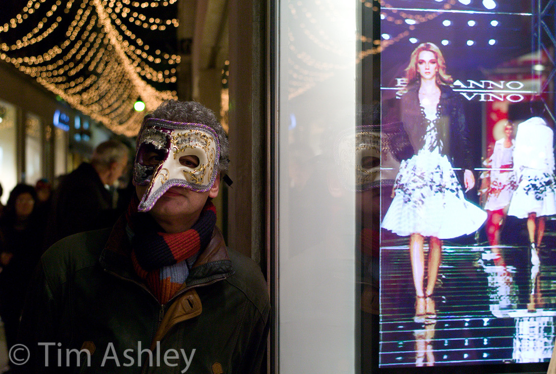
But I would add that the higher the resolution of the sensor, the more demanding it is of accurate focussing, and that an EVF, in future, will be absolutely vital for those wanting to exploit the potential of escalating pixel counts for larger prints or deeper crops. Especially with longer lenses or very wide apertures. For those that don't want these options, the choice not to buy the add-on EVF is simple and the cost saving in not paying for it 'in-camera' is obvious. In fact, the price of the new model is, by Leica standards, perfectly reasonable and probably round about what you would have expected from a model without the EVF feature. So everybody wins.
* aside from the Hasselblad Lunar, henceforth known as the Lunacy, which clearly shows how much distress the Medium Format Digital sector is in. Tarting up a NEX-7 in a camera with a bit of wood on it and charging several thousands Euros more for a product with very very limited access to native mount glass of any quality just... smells...desperate. More desperate even than Phase One's 'new' 645 system body, which looks about as new as... well, I am too much of a gentleman to say.
]]>
To be honest I hadn't given this too much thought - it hadn't bothered me on any of the files I have shot, possibly because I am so used to slight shifts with Leica M9 files and wider lenses and partly because many systems do this 'a bit' but it gets lost in the mix of perception.
Where it really does matter is in shooting wide angled technical lenses on technical or field cameras with medium format digital cameras. In both this case, and the case of the M9 with wides, the phenomenon is caused by the fact that the rear element of the lens is close to the sensor and therefore, rays reaching the peripheries of the sensor are doing so at a sharper angle. Even with specially designed micro lens arrays, this causes both luminance vignetting and colour cast problems. Those of us familiar with medium format digital are accustomed to shooting an 'LCC shot' through a thick sheet of optically correct plastic, for every (if we are diligent) 'regular' shot we make. Later, in post production, we feed the LCC reference shot to Capture One and it subtracts what it finds from the 'real' shot in order to neutralise it.
This is tedious. It is also very necessary with certain lens/sensor combinations to exactly match the focal length, aperture and movements (tilt and shift) of the LCC shot with the 'real' shot, which means that if you want to do it properly, you have to always, always make an LCC file. And when Phase One introduced the IQ180 back, it turned out that many people's favourite tech camera lens, the wonderful Schneider 35XL, was no longer fully correctable and when used with anything other than small movements, fell apart altogether. It became unusable.
In Leica world, the rather wonderful Sandy McGuffog invented Cornerfix to help. The problem was that though Leica tried to build corrections into their DNG half-baking algorithms, their efforts were doomed to partial success because the camera has no way of knowing the true and exact aperture the lens is set to. So it can access generic lookup tables only whereas what is needed is specific shooting data.
Cornerfix works by taking what is in effect an LCC (Lens Cast Calibration) shot as per Medium Format practice, and doing with it what Capture One does for Phase One files. So you have to shoot a white card (some people use a perspex sheet, like I do, it's more accurate) at the same shooting parameters as the file you wish to correct, and then Cornerfix will in effect subtract the luminance and chroma shifts of that file from your treasured snapshot and voila, your shot is clean.
You do this by shooting your real and LCC files in RAW, opening them in a converter, exporting them as DNG and then using Cornerfix to introduce them to each other in a constructive way. In other words, it's a PITA (not Sandy's fault at all, it's the nature of the beast) and something you'll only want to do when you have to.
Trouble is, you never know you need to until you see colour shifts spoiling your shot - by which time it's often too late to shoot an LCC with exactly the same parameters, if you are a Leica user.
Back to the RX-100.
Luckily, since the zoom lever tends to stop at discreet and repeatable intervals and since it records aperture to EXIF, you CAN make an LCC later.
Trouble is, it doesn't seem to do anything and I can't work out why.
This shot was taken on a cruise a coupla weeks ago and I thought I might be able to see slight chroma shifts so I decided to have a bash at fixing it:
 So I recreated the focal length as close as I could (very close) and set the same aperture, then shot through an optical grade LCC sheet with +1 exposure compensation (to get the histo about right). This resulted in the following shot:
 Now: this shot has very clear shifts towards the edges. So I applied it to my Chefs in Cornerfix and got this:

But if I look at the original chefs, versus the 'fixed' chefs, in Lightroom's Develop Module, I can position the magnifying glass over the exact same pixel on both files, flick between them and see no difference in RGB values. Furthermore If I use the LCC shot to 'fix a version of itself', the two are identical.
(clicking on any of the above files will give you a 100% size version at 91% quality JPEG but note that the files look rather flat since I have not applied any tonal corrections, in order not to skew the comparison)
Now, this was not what I expected to find. Possible explanations:
1) I am doing something wrong. Possible but I have been careful to rinse and repeat and to read the instructions
2) There's a bug with the software.
3) The colour shifts are so slight as to fall outside what Cornerfix considers possible to fix (or worth fixing?)
I vote for 3) above. I'd love to hear from anyone who has also tried this experiment but I must say that life suddenly seems too short to dig any deeper: I have yet to see a real-world RX-100 file that is notably compromised by colour shift and so, to all those who have emailed me raising the concern and asking me for opinions and cures I say, go shoot! But if you have a file that really is badly affected, try the method I have suggested above: colour shifts vary with aperture and focal length and some combinations might give enough trouble to be worth CornerFixing... for the rest, I suspect that either Lightroom, or Sony in-camera, is already doing most of the lifting...
]]>
- I know we'll probably see an M10 with Live View but I want it to be 'through the viewfinder' (not through a carbuncular mansard) and with peaking. Otherwise all my Leica M glass is going and I'm out for good unless we get the next item...
- I want someone to make a really fine camera for Leica M lenses that has microlens technology that allows the use of lenses wider than 50mm without weak edges and colour shifts.
- I want a 36mp plus Canon that doesn't do banding, and has their superior AF technology.
- I want a Sony RX100 variant with an EVF.
- I want some good glass for NEX or the NEX system is going.
- I want a Panny GH2 replacement that has weather sealing and better higher ISO performance than the Oly OMD.
- I want more glass from all comers that can handle high resolution FF sensors to the edges and corners. Zeiss is heading that way.
- I want a Nikon 24-70 f2.8VRII that weighs no more than 800g.
- Most of all... I want the D800 sensor in a mirrorless body with a high res EVF and focus peaking along with great quality live view on the LCD, so that we are no longer reliant on a small number of tightly packed focus points, some of which in my experience don't work.
And I want my own dressing room with a star on the door.
]]>
They say that a picture paints a thousand words so with no more ado (and given that I am blogging from a ship with rather dodgy internet abilities!)...
Odessa: This is where the beach will be...
Odessa: Now Shipping

Odessa: Dog in Skip

Odessa: Back in the USSR
Yalta: Early Arrival
Yalta: Lenin eyeing up McDonalds
Yalta: Massandra Winery, 100 year old wine.
Yalta: Livadia Palace, scene of the Yalta conference. Roosevelt and Lenin wait by the phone.
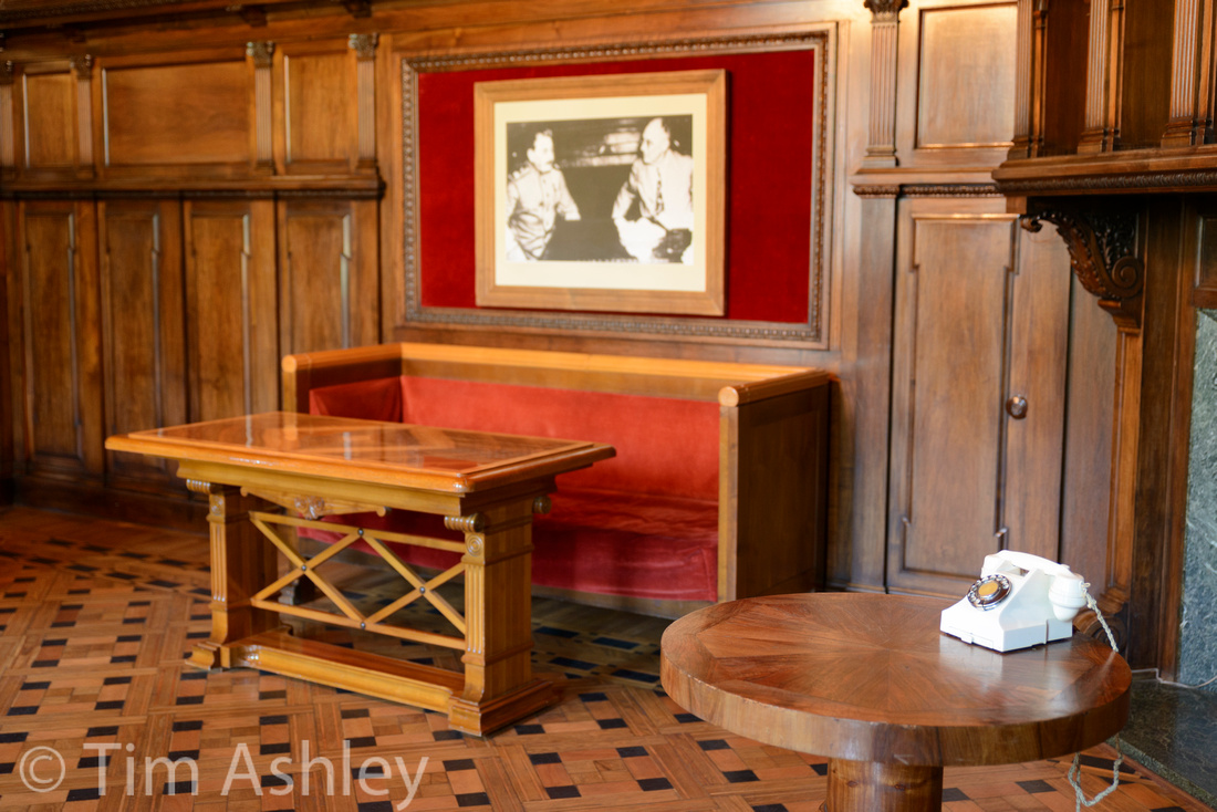
Yalta: Livadia Palace. Flags of Convenience.
Leaving Yalta: a very corny sunset...
With apologies to those who like to see the technical details, uploading from a ship is like pulling teeth without anaesthetic so I will add the relevant details and opinions when I return home. For now, all these were taken with a D800E and either a Tamron 24-70 F2.8 VC or a Nikkor 70-200 VRII.
I am also shooting with a Sony RX100 and will post some shots and thoughts from that camera later.
]]>
Tree of Remembrance, Nessabar, Bulgaria. Tammy @ F5.6
Cafe, Nessabar, Bulgaria. Tammy @ f2.8

The Docks at dawn, Constanta, Romania. Tammy @ F8
The Casino, Constanta, Romania. Tammy @ F8

The Romanian Navy. Nikkor 70-200VRII @ F8
]]>
In the following few days I will be posting from a variety of places around the Black Sea...
I decided to travel with the D800e and a Tamron 24-70mm f2.8 VC, a Nikkor 28mm f1.8 and 70-200 f2.8 VRII plus a Sony RX100.
So far the D800/Tamron combo is getting 90% of the action. I have discovered that turning off VC below 1/40th second means I get a very high rate of keepers. This lens in quirky but wonderful, sharp wide open on center and at f5.6 to the edges at all focal lengths other than 24mm where it's a little soft at the edges only. The VC system is only useful at slow shutter speeds but has a very high hit rate when used in that way. I used it yesterday in dark rooms at the Topkapi Palace and Harem, often at 1/20th, and it never faltered. Wonderful! But it can cause images above 1/40th to blur, even with quite high shutter speeds: so default mode is to leave it turned off.
Larger (and more) images with EXIF can be found at:
http://tashley1.zenfolio.com/p369781604

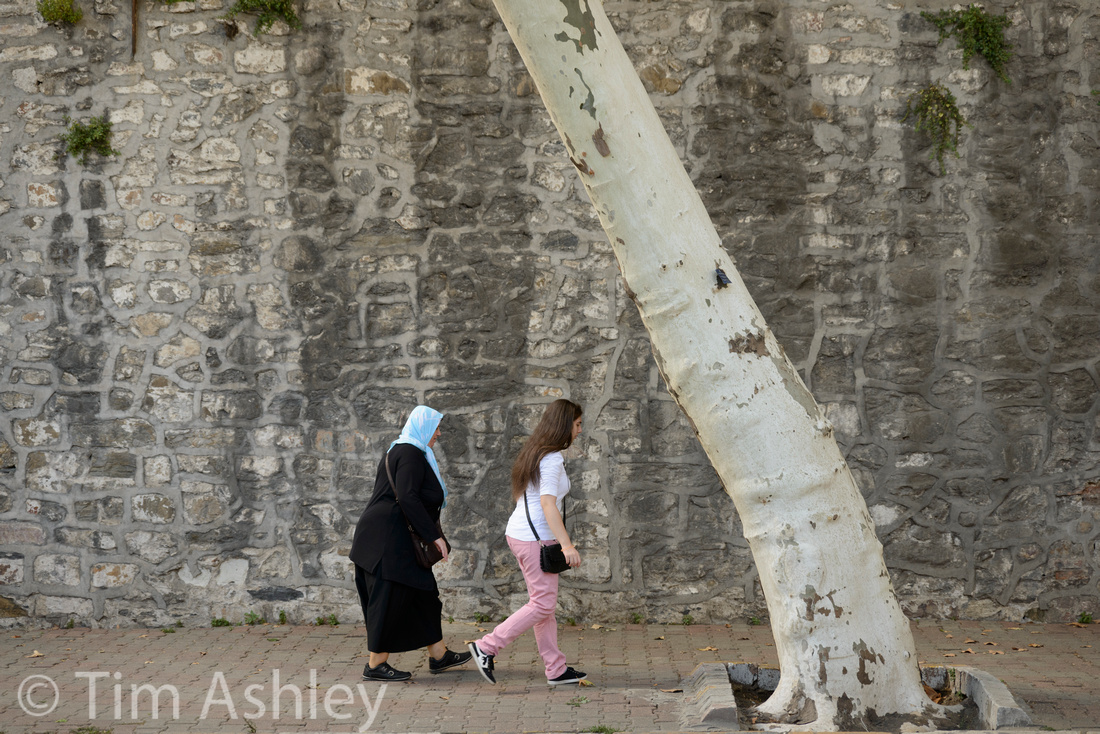
In the introduction to this series I said, as part of my attempt to define Fine Art Photography, that it largely excludes images of loved-ones, pets, homes, holidays etc., but there are of course shots of these subjects that have something to say which is larger and more universal in visual impact than the photographer's personal relationship to a particular family member. The work of Sally Mann and Elliott Erwitt comes to mind.
As I typed those words, I immediately thought of Jono Slack.
Jono is widely known in the online photo community. He has a voracious appetite for all things photographic, a great knowledge of the subject, and a great willingness to share that knowledge. He is also unusual in that for all his connoisseurship of camera equipment, he has never gone down the extremely technical route. He has never purchased a Medium Format Digital system, has eschewed the Nikon D800 (the DSLR equivalent of MFD) and has no interest in shooting with tripods, remote releases, or any of the other obsessera of the high-end shooter. Instead he concentrates on cameras that feel wonderful to use, fronted by lenses with beautiful renderings. So for Jono, photography is a tactile, sensual pursuit rather than a primarily technical one. And this shows in his work.
I first came across him in the world of Leica photography, where he and I were very early adopters of the M8 camera. And while I have rather left Leica behind (I still have all the lenses but am waiting for what I think is a truly viable camera body on which to use them) he has gone on to be an acknowledged expert, beta tester, and exponent of the Leica style.
Returning to the question of family, pets, homes etc., Jono has been sharing his work online for so long that many of his wide audience have come to know his family members, home and menagerie of animals over the years even though most of use have never met them. It is not so much in the particular image that the work excels (though it nearly always does) but in the narrative: the children who arrive, grow, leave and return; the wife, whose portrait of intelligence, gentleness and humour is so deftly drawn. We don't need to know these people personally in order for their lives, as portrayed, to make sense to us.
Jono's gorgeous selection of lenses is put to use on a daily basis, as it has been for a very long time, in the task of documenting the daily business of living in a wider context than that of family alone. He doesn't go to Arizona, Iceland or Namibia in pursuit of Photographic Big Game to stuff and hang on his wall: instead, he captures his farmhouse kitchen on a spring morning, fresh wildflowers in a rustic vase. Or natural-looking knobbly fruit in chipped, beautiful bowls. The family dogs cavorting madly in the fenlands surrounding his home, the lone trees in bleak fields under vast skies, changing with the shifting seasons.
His work is, therefore, domestic documentary made not through any cohesive scheme to organise, order or present (try using his website!) but captured in all its messy glory. And it is marvellous. He works with the enthusiasm of an avid snap shooter but with the aesthetic and skill of a very expert image maker, all filtered through those wonderful lenses. He has created a record of time, place and people which I consider fascinating and possibly unique and which I think will historically hold up as having greater interest than the specifics of the individuals involved.

Then there is his use of light: I am not sure that he owns even a flash gun: that farmhouse and the garden that surrounds it are full of shafts of light, used to isolate and give dimension, and dappled shade to emphasise texture and mood.
As we move further from the house and out (with the dogs of course) into the surrounding countryside, we start to get a sense of the landscape that has shaped this inter-generational narrative, and the intimacy of these landscapes appeals greatly to me. They are not walked through but lived in and there is a great sense of a two-way relationship between the land and its inhabitants, a sense of how they have shaped each other over time.
It's the irony of a data-intensive age that so few people make packets of prints any more, to store in shoe-boxes and be discovered by their grandchildren. Hard drives speak only through their software interpreters and who knows, in fifty or one hundred years time, how their storage will have held up and how widely the language of their file formats will be spoken. So domestic documentary material like Jono's may not last. And this would be a crying shame. Someone somewhere should be building a future-proof archive of material like this to ensure that the charm of the ephemeral present does not get dissolved in the future.
Jono Slack Biography
I grew up in St. Ives, Cornwall where my father Roger Slack was a local doctor and my mother, Janet Slack, a jeweller. They were part of the vibrant local art scene, my father as an archivist (recording local people's recollections of Alfred Wallis in the 1950s and 1960s, and the International Music Seminar concerts), as a photographer and as a sculptor.
Barbara Hepworth, Patrick Heron, Tony O'Mally and Brian Wynter were family friends and dinner guests. Both of my parents were very much involved with the setting up of the Tate Gallery in St. Ives: Art was part of my childhood.
I started painting when studying science (and learned to draw in Botany classes) but with the advent of a real job and a real family, time was limited and so I turned to Photography as a more immediate art form. How little I understood!
We settled deep in the countryside on the Norfolk/Suffolk borders in the 1980s, but still with a close connection to Cornwall and its beautiful landscape.
We have a family-run software business and consequently I made a decision not to become a full-time photographer. I have done some PR work and I do weddings occasionally (these days the proceeds go to charity) and this means that I can concentrate on taking the photographs I want rather than having to concentrate on clients
In the early days of digital I got involved with firmware testing for Kodak with respect to the SLR/n and this lead first of all to firmware, and then hardware field testing for Leica. It's fun to do and hopefully it's useful. I've spent time with prototype versions of the M9, the X1 and X2 and more recently the M Monochrom.
From an equipment point of view, I usually use two Leica M9 bodies with a selection of lenses ranging from 16-90mm. I love the way the cameras get out of your way and the way that one's subjects don't seem intimidated or phased. For telephoto and macro work I've settled on Micro Four Thirds with a couple of Olympus OMD bodies. I never use a tripod because I've lost the will to live by the time I've got everything set up. I like small cameras, not so much because of the weight or the handling but because of the effect that they don't have on your subjects, whether that be a horse or a person.
For post-processing I use Apple Aperture, because I like the cataloguing and the printing and I find the controls more to my liking than Lightroom. I also use Silver Effex Pro for B&W conversions. I only use Photoshop these days for correcting lens distortion.
I studiously calibrated my monitors every week for several years (and they seemed to need it). However, I stopped doing it completely around 2 years ago. Now I understand absolutely the relationship between the screen on my 17" MPB, my iMac, my Cinema Display and my Epson 3880 printer. Similarly when shooting outside I use daylight White Balance on all my cameras - it gives me a fixed frame of reference which I really understand and shooting RAW means that it can be corrected later.
I've avoided Medium Format equipment (and the splendid new Nikon D800) because although I'd like the detail, I can't see it contributing much to my spontaneity. I seldom print larger than 18x24" (A2+) and for these purposes and my photography, 16mp is quite adequate.
My photography is fundamentally primitive (Alfred Wallis rather than Patrick Heron). I shoot what I see and very rarely plan a photograph. I might move a vase of flowers or a bowl of fruit into the light but that's about it. When I see something I'll take several images but it's nearly always the first one that works best: engaging my conscious brain only seems to spoil things. I like to think that I sometimes provide an alternative view of a simple scene, or catch a nuance in an expression, raise a smile with an unexpected juxtaposition or create a visual link between a skyscape and the land below it. I have no profound intent, but I feel that my photographic instinct is much more subtle than my photographic intellect, and thus would rather rely on it.
 I always carry a camera. Always. And I take photographs every day, even if the light's awful and the prospect of anything useful is quite remote. Whereas thinking about images seems to be counter-productive, practicing is absolutely useful, practicing focussing with the Leica rangefinder, practicing framing with the OMD, practicing looking, all of this is positive and useful.

Photographs are the punctuation marks of my existence, making images is a kind of obsession. Sharing them makes it all worthwhile.
]]>
A brief recap: I have a Nikon D800E with the infamous Left Side Focus Issue. It is still capable of astonishing results but with shorter focal lengths it is strongly advisable to avoid using the left-most focus point. I haven't tried to get it fixed because there is much anecdotal evidence that Nikon are still trying to bottom out the problem and because the D800 I had went back twice, without success, for the same problem, to Nikon UK at Richmond.
Now to be fair, Nikon repair was swift and courteous and they paid for P&P and when they failed to effect a repair, they at least agreed a refund.
Readers of this blog may recall my recent series of field reviews of the 24-120 F4 VRII zoom. I tested this extensively on both D800 and E bodies and find it to be a very useful and capable lens. BUT my copy had a blurry right-hand side at all but the 24 and 28mm focal lengths, and at 50MM and longer this was strong enough to compromise even moderate sized prints.
Richmond received it for repair on the 1st of August having promised to get it back to me before my vacation at the end of August. The receipt email stated that it would be completed by 15th August.
By 20th August, still sans lens, I called to chase it and on 23rd August I received it back.
And I really, really wonder what goes on in that workshop.
Follows, crops at 85mm f5.6 from far left
before:
 and after:
I wasn't complaining about the left side: it's not great but this is a zoom. It seems unchanged to possibly very slightly better after the repair.
The right hand side before:
 and after:
Again, possibly a tiny touch better but not in any way acceptable in a lens of this price - especially given that it is recommended by Nikon for use on the D800.
The repair docket says: "Check focus to Nikon Standard. Check lens resolution to Nikon standard. Check, test and clean equipment."
I can only assume that
- Nikon's 'standard' is piss poor or
- Richmond are not up to the job of repairing to meet it or
- My eyesight is a lot worse than my optician thinks or
- I have egregiously unreasonable expectations
Based on the evidence above, what do you think?
I would add this: a lot of photographers have switched to the D800 from either Medium Format or from Canon. Me for example - I have switched from both. That's a lot of new customers to impress. When you switch systems, you have to acquire a lot of new stuff at once, and test it properly. My verdict of this experience so far is, it sucks - and then it blows meaty chunks. Out of two bodies, two have been faulty out of the box and out of six lenses, three have needed repair or return though to be fair the dealer felt that one of those was OK though to me it clearly wasn't.
I am posting this not merely to vent but to warn. I am now going to take a Panny GH2 and a Sony RX100 on vacation and not bother with the Nikon gear. A left focus point that doesn't work, combined with a fuzzy right hand side on the general purpose zoom I was planning to carry, make this expensive system less viable than far more modest equipment from other manufacturers.
For those in doubt, look at these two files. One is a D800E file with 24-120, after repair, at 100mm F5.6 ISO125 and I have downsized it to the same size as a file taken on a Sony RX100, also processed from RAW. The Sony file is also F5.6 and ISO125 and at 100mm equivalent focal length from the rather good 28-100mm equivalent lens. That lens might have a shorter zoom range but it also has a much faster maximum aperture of F1.8...
Both files are 5472 pixels wide, which translates to a 27" print at 200ppi. Look at them at 50% on screen to emulate that print size.
I ask you this: if you were carrying a camera on vacation, thought you might capture some scenes worthy of exhibiting at that sort of print size and could be confident of shooting at low ISO, which would you rather take? And please ignore the fact that the Sony camera costs and weighs less than the Nikon lens alone. Just choose on IQ.
Click for full sized images
Sony

Nikon

Now, one might observe that the centre resolution is better on the Nikon frame - and that would be true. But in a print the differences would reveal themselves only to the closest observer. Whereas the blurred right hand side would be clearly visible. And if one were to decide to take the Nikon, frame wider and then crop so as to lose the blur on the right, one would end up with a frame of roughly the same pixel dimensions as the Sony...
Food for thought.
]]>
Focal Length Series
clicking on any image will download a half-resolution JPEG.
All files processed first in Image Data Converter from RAW, then imported into LR for sharpening at 90/0.7/70/20. This is quite a high sharpening level and is intended to make the sharpest possible print at 200dpi from a base ISO 125 file. View the half-resolution download on screen and, given that it's a 50% sized file, it will look like a 200dpi print on most monitors. So you'll see about the best possible representation of how the lens can do. Every frame was shot at f5.6
10.4mm (equivalent to 28mm)

11.18mm (equivalent to 30mm)

15.82mm (equivalent to 43mm)

21.29mm (equivalent to 57mm)

27.54mm (equivalent to 74mm)

36.95mm (equivalent to 99mm)

Brief commentary: were this a kit lens on an entry level DSLR, I would be very surprised to see it perform this well. It is capable of making great prints at 200dpi from edge to edge at every focal length in its range though there may be a tiny touch of weakness at the right hand edge of the 74mm equivalent. I have not used any kit lens on any system this good. It thrashes the Nex-7 18-55 kit at the long end, generally matches its best performance, and beats it everywhere else. As we shall see later. In fact at many focal lengths I would prefer an RX100 file to a Nex-7+kit lens. Which means I now carry the RX100 rather than the Nex, because it's better, not because it's lighter, though this assumes good shooting conditions and lower ISO. Talking of which...
ISO Performance Series
I shot the same scene, from which central crops will be shown, at f5.6 on a tripod with 10 second delay, at every ISO, in JPEG (camera standard) and in RAW. The RAWs were given a totally neutral processing in the Image Data Converter then exported as 16bit TIFF to Lightroom for sharpening and NR. The exact amount of these varies at different ISO as I try to find the best balance of noise control and detail retention.
I'm not going to post all 18 crops here: the issue of who will see what on what size and resolution screen is too complex. But I will post the ISO 6400 examples and a link thereafter to all the shots. But please note, the sharpening/NR I have applied to each RAW file is intended to be seen at 50% on screen. At 100% the higher ISO ones look horrible. However, having pored over all the images and tried different sharpening and NR combinations, I would say that I personally will try hard to keep to no more than ISO800 in RAW but that processing from RAW can give between one and two stops subjective improvement on JPEG. I will also add that even ISO 1600 is pretty damned good from RAW and that I am surprised by the quality of 3200 and 6400 but won't be using them if there's any other choice available.
TIP: when looking at the downloaded files, try examining the legibility of the small text on the pear's label.
ISO 6400, RAW first then JPEG.

Entire series ISO here.
Compared to Nex-7 with 18-55 Kit Lens
I shouldn't have been surprised (the kit lens is widely acknowledged not to be up to the job on the NEX 7) but nonetheless...
At the long end... (and don't forget two things: firstly the mantra is that All Kit Lenses Are Crap At Full Zoom and secondly, the RX100 zooms quite a bit further than the NEX kit lens).... at the long end, the Nex Kit lens is dreadful. This is my second copy and it is a whole lot better through its entire range than the de-centred first copy I had. In fact it is perfectly adequate, even quite good at times, at wide and mid range and its performance at full zoom improves noticeably if you pull the zoom even a a little bit close. But the RX100 smashes it into oblivion at full zoom and it zooms further. The Nex lens wastes those larger and more plentiful pixels so badly that the RX is REX here.
At the wide and mid-ends, the contest is more evenly matched. In general the RX lens is better but there are some bits of some frames where you can see the resolution advantage of the NEX trying to get out. However, the Zeiss lens on the RX has more pop, more of a 3D look. It is a better lens in terms of consistent quality, maximum aperture and zoom range. No contest.
The link to all the full-res comparative files is here and if you look at the captions they will tell you where the images were focussed if it is relevant. They were all processed identically, first in IDC from RAW to TIFF and then to Lightroom for sharpening and NR.
The RX100 Zeiss lens wide open
It's a fact that no compact zoom on a 20mp camera that dares to offer a maximum aperture of F1.8 can be much use. An absolute fact.
No it isn't.
This lens doesn't quite rock at f1.8 but it's close. A distant landscape is slightly soft, more so at the edges, and there's no real pop. A highly textured stone wall at a few feet away (a much more likely distance for using this lens) is acceptable to the edges at the same viewing resolution as a 200dpi print. Not acceptable for an F1.8 zoom. Acceptable full stop. The corners are a little soft but hey, there are some laws of physics at work, even if you are Zeiss. Contrast is a little lower than at the smaller apertures but that was always going to happen.
I am very seriously impressed and will have no hesitation in using this lens wide open.
Click on either of these ISO 80 images to see a full res file, then look at 50% as usual.


So that's it. Enough testing. This camera is fit for a wide range of purposes, is an amazingly portable way of giving yourself a fighting chance of exhibition quality prints, and is a lot more useful than it's big brother (when paired with kit lens). In short it is way better than I thought it would be, and though I have a deep dislike of cameras with no viewfinder, in this case I will make a serious exception.
Kudos to Sony. REX wears the crown.
Footnote: Quality control issues are a serious problem facing camera purchasers these days and there are reports of asymmetrical sharpness with some RX100 lenses so I strongly suggest that if you buy one, and live in a country where returns are your legal right, you test it at F5.6 on frame-filling planar subjects at a distance of ten feet, fifty feet and far distance and check, when viewed at 50% on screen, that the left and right sides of the frame are equally sharp.
]]>Russ's photos (and many of his captions too) are lyrical. They are pretty much all beautiful. He is not afraid of beauty because he knows how to make it work without resorting to cliché and he has an inner sense of beauty which is both individual and communicable. And it is consistent without being repetitive. This set of characteristics is, IMHO, quite rare and it comes from him looking, really looking, at the landscape with his own eyes only. He connects with the landscape personally and emotionally, and then is able to turn that connection into something for other people to understand and enjoy on a level well beyond 'pretty'.
His work could be broken down and subcategorised in many ways so I suggest that people look at his website for the entire oeuvre. Here, I am going to reproduce three short subsets of stuff I particularly like. I will give a brief comment and Russ will do the same. At the end, there's a bio of Russ by Russ, and a section on how he likes to look at and work with the landscape.
Abstract Colour
One of the things that demonstrates a photographer's depth of intent is how well they have considered the relationship between colour and form. This distinction, much beloved of the European Impressionists and the American Abstract expressionists and taught in every serious art school, is something that a good artist in any medium will eventually work out for themselves even if they haven't had formal instruction. My favourite writer on the subject is Patrick Heron, whose work consistently chipped away at the question of what each of colour and form are and how they are related. The 'journey towards abstraction', a series of explorations undertaken on paper, canvas, stone and steel by so many artists, can inform the work that pops off the inkjet printer to equally good measure.
Russ's abstract colour works remind me of plenty of stuff - some of it powerfully of Ed Steichen - but it's all his own. Here are some examples, along with Russ's own words on the subject (in red).
please note: in order to format the images and text correctly across desktops/laptops/tablets the images are displayed on most systems in a way that is physically smaller than the resolution of the loaded image allows: pinch-or-tap to zoom gestures will allow you to see them at a larger size without sacrificing quality.
"22 Carat"
I struggle a lot with colour. At least I feel like I struggle a lot with colour. I'm not even entirely sure what I put this down to but perhaps it is the fact the real world is often very subdued in its earthy tones, the greens and browns that are found all around us in the landscape are not often colours which set us alight, it's probably why so many photographers seek out the overdone orange sunset to make things look more interesting than they are. That's not really my approach though and instead I focus my attention these days on form, on movement, on the surreal and almost exclusively on mono.
"Renewal"
When it comes to landscape colour I definitely prefer something akin to reality and actually I find it increasingly difficult to produce anything but an authentic landscape image where colour is concerned because I find it difficult to enjoy the over-saturated HDR sunset that millions of others seem to pursue.
"Dune"
Abstract is different though. It's escapism from the real world and in this respect gave me an excuse to use some imagination and produce something other-worldly for a while. It didn't really last for me though, we all need some escapism but as it turned out this was merely a fore-runner to my darker world of monochromatic vision where shape, light and texture became everything.
"Elysian Fields"
Colour is secondary in a lot of images to me - in many ways once you strip away the distraction of colour you are left with the real image, the one which takes a photographer's skill and eye to create. That's why I love mono and that's why I have left abstract and colour almost completely behind. It has its place of course but the use of out of focus elements and Tilt Shift generated blur have really replaced anything akin to a dream state for me.
The Deadpan Surreal
Hot on the heels of 'traditional' art's exploration of abstraction came its dalliance with the surreal. Whether you like Magritte, Dali, Duchamp et al, their work has resonated powerfully in the photographic world, originally through Man Ray and currently most popularly through Gregory Crewdson.
The nature of that work is most often 'constructed': even Duchamp's 'Fountain' (a urinal) became surreal not in its own usual context, but by the surreal construction of the re-contextualisation created by putting it in a gallery.
For me, there is something mildly arch, slightly too knowing, in such constructions - which is maybe why I'm not quite sure about Crewdson's work. And Man Ray's re-invention of solarization as an escape from 'banality' (as he put it) has lead, ironically, to a huge amount of banality: the surreal effects he pioneered in photography have been aped by generations of the Fun with Filters crowd, as effectively as a Bonobo Chimp jabbing at a calculator: they are emulating very well what they see others do, but with no understanding of what the intention of the exercise is.
Russ's surreal work is a lot more subtle. It is at its best when implied rather than shoved in your face, 'found' and reproduced in its own context, without comment. He sees the surreal as slight warps in the veil of reality and then captures it so it can speak for itself. The nature of some of what he perceives as surreal is relevant to me in a lot of my own work: it has to do with what you might call 'negative human spaces', traces of human life left on the landscape, signs of their occupation or endeavour which imply narratives, real and surreal, to the viewer.
"The Deer Hunter"
I don't feel I really have one style as such and I often make a lens selection based on the scene, the weather or if I'm feeling in a particularly dark mood. My Nikon Tilt Shift lenses are absolutely exceptional in helping to create that surreal look but they create a very different output say to a straight long exposure. I've even started to combine that Tilt Shift look with Long Exposures (not easy given the extensive filtering required) and it holds some promise for the future. I guess I'm still searching for that particular style that defines me in some way, but in the meantime I'm happy to shoot a combination of Tilt Shift, Long Exposure with largely mono in order to create something that is hopefully seen as artistic (some even refer to this look as artography) rather than something that is directly representative of the real world.
"Confinement"
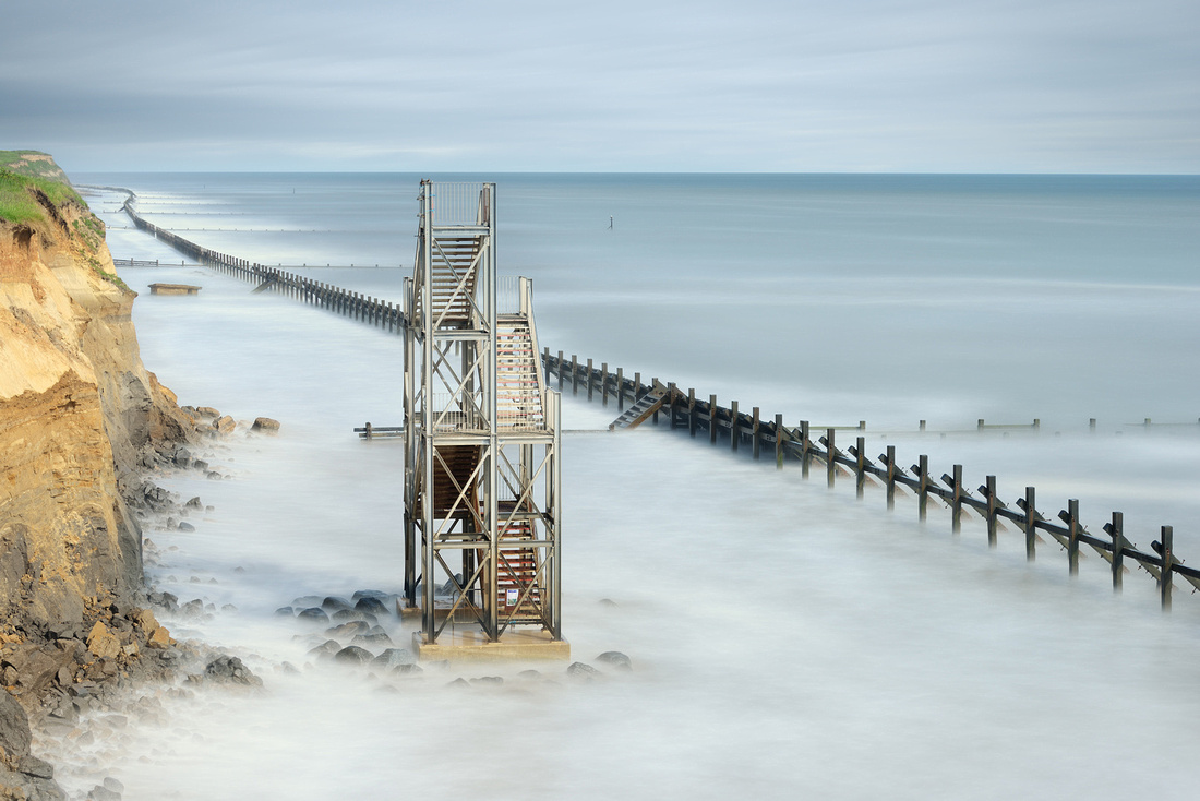
As I've stated on my website, my vision is to aim for a level of artistic interpretation within a scene. In this respect, my approach to photography is not usually about recording what the eye can physically see in a given moment, but perhaps what my mind's eye wants you to see. That's the key - vision beyond the lens for me, seeing a finished piece in mono, looking for that dynamic contrast or the juxtaposition of texture in front of me. It's not that easy to find - sometimes I go for weeks in a depressed state not finding what I'm looking for and it's a quest that grinds but is ultimately worthwhile.
"Caged"
B&W When Colour Might Be More Obvious
If there's one thing more counter-productive in the work of the enthusiastic photographer who mistakenly confuses dramatic effects with creative progress, it is the decision that saturation and HDR are no longer enough and that 'really arty' means Black and White, preferably with Nik Silver Effects in overdrive. The subject doesn't matter. Slap on the slider and gear up the grain in post processing and next door's garage becomes art.
Not for Russ. He's thought about it. And yes, he does use some of the above-excoriated methods, but unlike the Bonobo Chimp with the calculator, he knows what he is doing and why.
I shot a series of mono landscape images recently using a couple of large lavender fields as the subject. 1x.com put one of these images in their gallery and I got a comment from someone who said that I had been "brave" to use mono instead of colour for such a scene. This amused me somewhat and made me really reassess my approach for these images - to me the lavender rows were an ideal monochromatic subject, they have great form, repetitive lines, a unique texture, even and under the right light create quite dramatic shapes; but did my image need to be purple because that's what convention says? Did I blatantly 'waste' this valuable colour, forfeit something which others look on with some fondness in their own minds - did I even somehow desecrate that memory we hold?
When I thought about it more that one comment made me feel very uneasy about those images as if what I had done was dirty in some way. To be fair I understand his comment - many visualise a lavender field in rows of purple and blue, perhaps with a sunset but that's been done hasn't it? Over and over and over.
"Lavender Blues"
"Hive Mind"
I don't deliberately try and be controversial in my approach but there are people out there who have created spectacular lavender images which I will never come close to matching. Put "Antony Spencer Lavender" into Google and you will see exactly what I'm talking about - I can't 'compete' on his colour stage, he's certainly one of the best out there for an image like that and unless I can create something equally compelling I'm not interested. Instead someone will now look at my interpretation 'Hive Mind' and hopefully they will see something equally compelling, but very, very different. Isn't that the point? Isn't that what many of us try to be - individualistic in some way. Photography doesn't need any more copycats, I'm trying hard to plough my own furrow instead.
Russ Barnes Bio
Who I am isn't important - I came from decent artistic stock; my father was a highly accomplished landscape water colour painter and my uncle owned his own photographic business when I was small so I had a lot of artistic influence around me for a lot of my impressionable younger years. However it was only once my age was chiming near that magic forty marker that I became seriously interested in photography - I had reassessed the importance of certain things in my life and I needed a meaningful pursuit....
I had become too materialistic and I needed to reconnect with the world. I sold a BMW 5 series that was costing me a fortune and bought my first DSLR and lenses with some of the cash from the sale. I haven't looked back since and landscape photography has certainly changed who I am and how I feel about my planet. The journey, or is it an obsession, goes on.
"Rise and Fall"
Working Methods
These days I shoot with what I consider to be the best DSLR available for landscape photography - the Nikon D800. Partnered up with it I have two different types of kit made for 'near' and 'far' landscapes and seascapes. It's a lens discipline bought about by limited bag space which although I keep telling myself I need a bigger bag, it totally helps keep the weight down and pressure on those finite vertebrae...
For nearer landscape, woodland photography and coastal work at close quarters I pack the spectacular Zeiss 21mm f/2.8 ZF.2 and Nikon 45mm f/2.8 PC-e (Tilt Shift). If I'm going to the coast I will ALWAYS bag the Nikon 70-200mm f/2.8 VRII too because there is usually something offshore that you don't have a hope of coming near to. The 70-200 is the only zoom I keep - I've tried many of them and simply prefer better quality prime lenses, all zooms are a compromise on image quality as stunning as the 70-200 is. If that landscape is likely to include a lot of verticals I might swap the Zeiss for the Nikon 24mm f/3.5 PC-e (Tilt Shift) so that I can work the Shift function in maintaining those verticals. It really does depend on the scene. For far landscape but still accessible at closer quarters I might exchange that 70-200 for the Nikon 85mm f/1.4G - some of my lavender images were bagged with this lens. Regardless, I wish they were all a bit lighter!
Despite the wonderful dynamic range of the D800 I also own and use a full set of Lee Filters. In my eyes these are essential kit to any landscape photographer - getting as much right as possible in a single frame is critical. I do a fair amount of post-processing work, especially where a mono conversion is concerned but the base of the image still has to be exactly what I'm looking for initially. Creativity must be with the camera and not with software, I do nothing to elicit blur or those sweeping skies in long exposures - all of that is achieved in camera. I admit however that there is nothing I like more than mixing different types of colour filter in monochromatic conversions so that I get the look I really want, but that's about a finish for me, I'm not actually changing the image.
As for how I shoot, I'm not going to give any of that away but I do deploy what I consider to be best practice - I use a remote release, I use Mirror Lock Up and I close the shutter over the viewfinder on every shot. Everything else is second nature. What lens I pick for a scene I really don't even need to think about. From your point of view half the fun of photography is creativity and working out for yourself what you need or want to do for any given scene. My only advice is to try and do it different to the next guy and in the end someone will notice your contribution...
footnotes
* as a caveat, I do think that looking online at images designed to be seen as prints is a mildly dangerous occupation. There is a lot that can change when the quality of printing, type of paper and eventual reproduction scale are taken into account and I haven't yet seen any of Russ's work printed, though I hope that will change. He uses very high-level equipment and technique so I have little reason to doubt that the prints will at least live up to the expectations set by these online images.
]]>
I am about to launch an ongoing series of Guest Photographers here on the blog and before I showcase the first, I want to set out a sort of manifesto that puts some structure around what gets shown and why I think it's good. To do that, I need to spend a few paragraphs holding forth about what makes my eye and brain happy in photographic imagery and why I think that a lot of contemporary photography is uninspired, unoriginal and uninteresting to anyone but the photographer. Which is fine. Most people who pick up a camera don't intend to challenge Steichen, the Bechers, or Arbus. But there's also a lot of stuff around calling itself art when it isn't and holding itself up for a critique that in reality it is not prepared to hear.
My rough yardstick for wanting to own a photo made by someone else, or to make one of my own available for sale as a Fine Art print, is that I have to believe that if it hangs on a wall for a long time, it will continue to have something to offer. Clearly this largely excludes images of loved-ones, pets, homes, holidays etc. but there are of course shots of these subjects that have something to say which is larger and more universal in visual impact than the photographer's personal relationship to a particular family member. The work of Sally Mann and Elliott Erwitt comes to mind.
What is Fine Art Photography?
I think that quite a lot of what is offered as 'Fine Art Photography' is at best merely pretty, and at worst garish*. Of course there's also a lot of wonderful work out there - stuff that has a profundity of perception, intent and effect far beyond the pictorial - but it is in the minority and it is too often lumped into the Fine Art category alongside material which should really be placed elsewhere on the spectrum that runs from unoriginal cliché to artistic genius.
For the sake of concision I am going to concentrate mainly on landscape photography from hereon in: but the ideas are the same, whatever the specific genre.
In the largest producing and consuming nation of FAP, the USA, the norm seems to me to be overly dominated by the twin shadows of Ansel Adams and by the output of those who lead workshops to Slot Canyons and similar. I saw a photo recently, taken by a workshop participant, which zoomed back from the scene itself (a desert, viewed from a high ridge at about sunrise) to show an ant-like cluster of around thirty participants, tripods a-ready, perky zooms pointing into the landscape. All taking approximately the same photo. Which will probably look very similar to the one on the front of the website or brochure used to advertise the workshop.
There are key places in the USA for those shots: parts of the midwestern desert; those bloody slot canyons; El Capitan in Yosemite, etc. etc. etc. and I am 100% honest when I say that I frequently recognise shots of the exact same individual rocks (not rock formations or dolmens, just small rocks) taken by different people on different days or even in different years.
In the UK we have the Northumberland coast as the pre-eminent amongst a variety of other tripod littered wildernesses.
Having found the 'right scene' (i.e. one in which other people have Taken Lots of Nice Shots) it becomes necessary to emulate 'the look'. This involves
- Perfectly Focussed Foreground Interest with...
- ...an Almost Impossible Depth Of Field, through which run....
- ...Lead-in-Lines towards...
- ...Perfectly Focussed Mid- and Far-Grounds, themselves topped by...
- ... skies stained by graduated filters in unlikely colours (in theory to 'Protect the Highlights': in fact, to add some artificial colouring to bland food)
- All of the above marshalled into place by the Rule of Thirds grid in Lightroom
Add some Sci-Fi HDR effects, round-trip through Nik filters, make sure that any water in the frame is made dreamy by using a slow shutter speed and you have the finished product: a 'Fine Art Photography Landscape'.
Now this is, of course, satire. But only to a degree. And I would be the first to add that there are some very accomplished photographers who can use one or even all of the above techniques and still make work that is inspired and original. The key is subtlety (even when seeking a dramatic effect), moderation, and not throwing the kitchen sink into the bath with the baby.
Photographerds
The problem is that there are so many magazine covers with lurid images in this vein, so many books and workshops that promote variants on it, that it becomes hard to see the world differently. So while I find little visual stimulation in work which merely 'photocopies the world', I am downright disheartened by work which photocopies the work of others and then bumps up the saturation slider. Copying is fine as part of the learning process but in the end, good photographerds must move on and become good photographers, if they want their work to be, and to be recognised as, truly original and genuinely creative.
There's a distinction that struck home with me in a book called ‘The Philosophy of Art’ by Theodore Gracyk: that between Popular and Fine Art. My personal feeling is that an awful lot of what is generally referred to as Fine Art photography would better be termed Popular Art photography. It is often pretty (though generally in a sugary way), always conventional, and very rarely original.
There was a thread on roughly this subject recently on the excellent OnLandscape website (subscription but very worth paying for). It started with a very good article by David Ward entitled Giving Beauty a Bad Name, in which he discussed an image of the above mentioned El Capitan by Thomas Struth. But this one wasn't an Ansel-a-like, it wasn't pretty and it had attitude. This article formed the nucleus of a very mature and long-running discussion about the elitism of the artistic establishment versus the aesthetic tastes of the masses, roughly characterised as 'clever-versus-pretty', a false opposition which was recognised as such in the debate but which proved useful. Other ways of putting it might be 'conceptual-versus-pictorial' or 'aesthetic-versus-antiaesthetic'.
My contribution to the thread included the following paragraph, which came after a few comments similar to those I have made above.
"On the other hand, the an- (or anti-) aesthetic school, with its lack of ability to unpack beauty from the bourgeois, running scared of making the former for fear of being accused of the latter, misses a number of possible tricks. Those who follow in the photographic footsteps of the Bechers... run the risk of being slavish to a different convention than that which ensnares the ‘foreground interest’ crowd. But it is still a convention. Much traditional Japanese art made hay in this territory, forcing enormous tension of perception into the simple, haiku-like conventions of their form; but unlike the photographic in-crowd they did not fear beauty."
The thread went on for weeks, and was very civilised, thoughtful and respectful, and in the end, the majority of the participants saw both sides of the aesthetic argument and quite a few felt as I do. So I know I'm not alone in being bored with the Practical Photography Magazine Cover Look but also wary of stuff which is so clever that it has little visual appeal. When it comes to 'conceptual lens-based art', I suspect the emporer isn't always wearing knickers, however clearly visible his trousers are.
So I do like to look at work, especially landscape work, which is primarily photographic in addition to stuff which is more 'Tate and Moma' in its ambition. I love Steichen and Kander, and Burtynsky but I'm quite partial to Gursky too, and to the Bechers. On the other hand I have never been totally convinced that Gregory Crewdson isn't quietly 'going commando' - or wearing the artistic equivalent of a thong.
To summarise an answer to my own question, therefore, I see 'Fine Art Photography' as having the following characteristics:
- It has to have extended 'wall hang appeal'
- It has to be more ambitious in conception and effective in execution than the merely pictorial
- It needs to be visually or intellectually original
- It should avoid Novelty Techniques unless it really understands why it is using them
- If it uses the tropes of the genre it should do so quietly, or ironically
There are a lot of photographs, and I would include the current work of Gursky in this, which are in my opinion primarily art, not photography. They just happen to have been made with a camera. The work of Tacita Dean is another example of this. It is a tough distinction to make between this sort of work and work which fits my Fine Art Photography definition and there are clearly areas of shade and grey where the two meet but I hope my attempt at a distinction is clear nonetheless.
In traditional art media, I love Rothko, Heron, de Stael, William Gear, Adrian Heath, a host of others, very often abstract or on the exploratory edge of abstraction. I dislike, vehemently Fragonard. Torture for me would be having The Swing suspended on my wall for eternity. Which is a pity because it hangs in the Wallace Collection, the nearest museum to where I live.
So over the coming months, when you see a photographer featured here, it's usually going to be because their work is the kind of thing I'd like to hang on my own wall, or work I wish I had made myself. Stuff, maybe, that wonderfully evokes how a scene feels, rather than how it looks, or worse, how the photographer thinks other people think it should look.
* For an extreme example (and I thought long and hard about whether to include this link but even the photographer himself agreed with a comment made by someone else saying, "You are correct, there's no accounting for taste,") take a look at this.
]]>But in general I tend to use larger sensor cameras with between 18 and 80 megapixels at their disposal, base-lining at Leica M9 and going up to Phase One IQ180. The bigger the better, clearly. And even at my standard size of 54x36cm the differences can usually be seen though this does depend what I print on. I am currently using a Nikon D800E but even that can't make the two metre tall prints that I sometimes like to exhibit. Not to the quality I want.
But on the basis that a small print of a great shot is better than a large print of nothing in particular, I always carry a compact with me just in case. And it is amazing how just how often that case happens. So I tend to keep up with the latest in small cameras. Consequently I have a cabinet littered with triumphs of hope over experience: various MFT cameras, a Fuji X100. Some Ricoh stuff. You know the drill.
So what I want is:
Something that has a large-ish sensor, can take pretty good shots up to ISO800, has a zoom lens that covers 28-100mm equivalent without going soft at the corners, has a fast maximum aperture, fits in a normal sized pocket.... and can make exhibition quality prints up to the above-mentioned standard size. Again, you know the drill.
'Exhibition Quality' is a weasel phrase so let me clarify: I am quite happy to print and sell images with noise, grain, blown areas, soft edges, whatever works for the subject. But for a camera to qualify, it has to be able to make prints that have good dynamic range, no specifically visible noise and are sharp across the frame. And it has to be able to 'do' some bokeh. Simple.
Enter the Sony RX100, the latest 'wonder camera'. Can it cut the mustard?
Time for some snaps, and that's all they are, but they show the camera in use in a variety of situations and at various focal lengths and apertures.
F4 28mm equiv ISO125 1/100th
F4 28mm equiv ISO125 1/250th
100% crop from TIFF of the above... looks a little crunchy due to the sharpening used (see below) but this is appropriate for normal, non-100% viewing.

F3.5 54mm equiv ISO800 1/60th
F5.6 39mm equiv ISO 125 1/40th F5.6 100mm equiv ISO160 1/125th
Some difficult lighting conditions in some of the above: and the RX100 does have enough DR to cope, as long as you expose it properly, which generally means a little negative compensation for anything with sky in it. The rolloff into clipped highlights is abrupt and of course irrevocable so care is needed.
On that note, like many cameras, the overexposure 'blinkies' cut in too early. In fact even a JPEG from the camera will often have a third of a stop of heardroom above what is suggested on the review screen, and a RAW sometimes a third more again. Not reliably, but it happens. It partly depends on whether you have Standard, Vivid, Landscape or whatever selected in camera - I shoot Standard, it makes image review in camera a more accurate indication of what's in the RAW file.
Accurate focus is an issue: the focus points are nice and flexible, focus is very fast and generally accurate. But for my money, the points are too big and in low light (actually it doesn't have to be that low) they default to Enormous Mode and are no use to me. Manual Focus is quite good but the peaking sometimes misleads because it is contrast-based in quite a basic way. Also, the ring around the lens is so hard to turn that the forces exerted in doing so when focussing manually make it hard to keep the camera still enough to perform that operation using any degree of zoomed view.
I won't repeat all the useful things that Michael Reichmann, Ming Thein and Lloyd Chambers have said about the camera about useability etc. other than to say that largely it is pretty good. It fits even a jeans pocket (unless you're a Teddy Boy) or a shirt pocket. Its internal charger is stupid and irritating. The flash is surprisingly useful. The menu system is one of Sony's better efforts. Colour seems good. There should be a printed or PDF manual but isn't. I only trust the stabilisation by a stop. You can't set minimum shutter speed in auto ISO and it sometimes chooses speeds too low for the abilities of its stabilisation. I want an EVF version the same size... with full weather sealing. You know the drill.
Two little annoyances:
- It seems that when powered on, it is always pre-focussing, even when in non-tracking single shot mode. That uses too much battery, though it does help explain the speed of focus acquisition.
- Minimum ISO when in Auto ISO is 125 and I would rather it was 100.
I do have a minority report on the RAW converter that you have to download because no one else supports the (stupidly proprietary) RAW files yet: it isn't as bad as some I can think of. But it crashes my un-crashable Mac Pro every time I try to batch process any files in the background. You have been warned.
On this subject. My suggested workflow:
- Shoot RAW+JPEG (until Lightroom et al support the files) and import the jpegs into Lightroom/Aperture/whatever.
- Copy all the RAWS to a folder on your computer for later use.
- Browse the JPEGS and choose the ones you like, then venture into Sony's Image Data Converter.
- In that software, create and save an Image Process Setting that has all sharpening and NR turned off and contrast notched down a tad. Make sure that Creative Style is set to Standard.
- Batch-apply that Process setting to all the images you value, then batch-export them to 16bit TIFF in Adobe RGB.
- Import the TIFFs into Lightroom or whatever
- Season to taste.
If you do all the above, you'll get the best DR, sharpening and NR. My LR sharpening is 60-80/0.7/70/20 and NR is all off, for files shot in good light at base ISO. It works when viewed at 50% zoom as an indication of a 200dpi print.
When the mainstream RAW converters support the files, they will also have import profiles that should do a good job with the colours. Until then, you're on your own if you don't like what comes out of the tin.
So, back to my original question: can the RX100 make an exhibition quality print by my definition?
Amazingly, yes, just about, at lower ISOs if you shoot it right. The lens has about the bottom end of what it takes and the sensor is up to it too. I reserve judgement on images above ISO 200, though they look promising up to about 800. Other reviewers have liked them to higher but so far I don't. Well not enough.
Here's an image, processed as above and titivated in LR. Not a very exciting shot but it contains wide DR, needs good DOF and edge to edge sharpness. Click it for a full sized 91% quality JPEG then load it into Lightroom/Aperture etc and look at it at 50% zoom, which on most screens would be equal to a 200DPI print.
If it were a more interesting shot, I would have little hesitation in printing it for exhibition, with a bit more work. It's not perfect, but perfect weighs, and costs, a very very great deal more.
Job done, thank you Sony.
F4.5 28mm equiv ISO 125 1/320th
 Coming up: within a day or two I will publish full sized shots of a test scene taken at each of a variety of focal lengths at F5.6 so that you can see how the lens is when at its best. I will also do some wide open at F1.8 including at higher ISO and I will do a comparative landscape against the Nex-7 (the girl I was dating until last week) with the kit lens.
Pip pip.
]]>I think it's great. It does some tricks. It's sharp. It's very light and quite cheap. But it has a dark side: those people were right in spotting some odd behaviour. It has not only focus shift* as it stops down, but pretty extreme curvature of its field of focus. If you imagine an aerial view of a nose, that is the shape of the field of focus of this lens: it has a sharp distant centre, sharp nearby sides, and risks other stuff being OOF when you might expect it to be in.
This also changes depending on aperture and subject distance. So you need to know its ways before using it on a job or it WILL bite you in the arse. I've used it a fair amount but I still have tooth marks from time to time.
So I call it the 'Marmite' lens. You love it or you hate it.
(Marmite is a yeast extract much beloved of many British adults for spreading on hot, buttered toast but an equal number of people absolutely hate it!)
But one thing worth bearing in mind: on the Lenstrentals page of D800 Recommended lenses it has a better balance of centre and edge sharpness than almost any other lens, zoom or prime, Nikon or Zeiss. though it is worth noting that the test methodology is not consistent across lenses per aperture
First, some photos at a variety of apertures:
A couple wide open so you can see the bokeh, which is very pleasant:
 100% crop of the above to show that this is also reasonably if not extremely sharp wide open:
 And another to show how the bokeh is both fore and aft the POF:
Now one at at F8:
 And an F2:
Now to the meat.
Focus Shift*
Some might need a slight tweak: I tested it using a Spyder Lenscal and it was well calibrated wide open. Then as I stopped down, the plane of focus shifted backwards but on my copy, the POF always remains in focus. Some people have found otherwise with their copies and the solution should be a simple adjustment: dial in some negative AF fine tune and you can probably find a point whereby the lens focusses properly wide open BUT keeps the POF in focus even at smaller apertures as the focus shifts backwards. It might take a few minutes but it'll probably be worth it.
Field Curvature
There are going to be a few examples here, but a few is never enough: this lens behaves differently at different subject distances and apertures and there are too many permutations to cover but I'll do what are, for me, the most important ones. Clicking on any image will load a full-sized, 91% quality JPEG for you to explore. Look carefully: this is one tricky minx.
 Click on this image to get a full sized version. This is at f5.6 and focus was using focus and recompose on the centre of the second step up. Notice how the entire curved wall and the steps are in very good focus. Notice how the tower in the distance is in very good focus. But notice also how the mid-distance at the sides is OOF. Notice also how there are two 'wings' of sharp focus coming in down the left and right foreground to almost the photographer's (very fresh and fragrant) armpits.
This is a clue to why people have issues with the lens. It has what appears to be almost random areas of in-and out-of focus which, depending on the aperture and the focus distance, can be confusing in their placement and extent. But I have to say that in relaxed, forget-about-it-and-shoot usage, I have probably only been surprised and disappointed about five times out of well over a thousand shots. The reason for this is that the lens nearly always seems to have a fairly good flat plane ability. For example (and again click for a full sized image) this next shot is very typical. Again at F5.6, a more or less totally planar subject, and apart from a touch of weakness at the extreme corners, everything is in focus:

So (aside from happily shooting any plane parallel to the sensor) one useful trick with the lens is that you can shoot down rooms, halls, alleys of trees, many of life's challenges requiring apparently enormous DOF, without having to use focus stacking, tiny apertures, perspective control lenses, whatever.
If you know the lens.
And if you turn it on its side, something rather marvellous happens. Same scene as above, same POF:

In this shot, everything is in focus until literally just under the photographer's toes. The bulging field of focus, much more prevalent on the long side because of the geometry involved, has sucked almost everything in. Of course if you were able to look a little more to the left or right, just beyond the confines of the frame, the drop off would begin. But in portrait orientation this ability is very, very useful.
If you know the lens.
So let's take a look in slightly more detail at what happens and where, in the field of focus. This will help avoid future teeth marks on the rump.
Take a look at this:

This shot, made at F8 on a D800E, was focussed using the right point on somewhere around the easel and then recomposed. You can see therefore that focus was effectively set in the centre of the frame at about the same distance from the camera as the easel. Elsewhere I have noted that F&R is suboptimal for this lens on this camera compared to using the peripheral focus points but that was wide open and it was suboptimal not terrible. You can pretty much ignore that in this example.
It is really worth clicking and downloading the full-sized version because it is very instructive but here's my commentary, FWIW:
Everything in the foreground, from the extreme corners to the centre, is in focus. Everything in the same plane as the POF is in focus. Everything, even to the very far far distance, in the centre is in focus: just look at the distant hillside. But the trees in the mid ground, right, and the tower, are OOF. And if you look at the grass (and the slightly rising ground is why I chose this scene for this little experiment) you can see where the curve of the field of focus lies. And it is very complex indeed. It is almost a forward wedge, shaped like a runway seen from one end. But towards the far mid-ground it widens out a touch. Note how the extreme right hand side of the tower is just about in focus. The horses are in focus. And if you read leftwards from the left-most horse, you will see just how abruptly the zone of focus falls off. Extraordinary.
BTW the best, best way of finding out where focus fields are is to shoot scenes like this with grass in: it gives you a million points of reference and is by far your best shot at a complex and frustrating task. You will pretty much never find this sort of information in a bench test of a lens and yet it is vital, with complex lenses like this, to know what is going on, however methodologically open to dispute such field tests may be.
Here is a screenshot from this image loaded into Capture One, which has an elementary kind of Focus Mask ability built in. It only gives a rough idea but for those who can't be bothered with downloading the full image above and walking around in it, it should be useful though it rather misses the fact that the far central hillside is crisp:
Ignore the weird White Balance: I was shooting using UniBW (Universal White Balance) and if you don't know what that is, best not to ask!
OK so now we know where at F5.6 and F8, with certain points of focus, the field of focus lies. An experienced photographer can extrapolate from that, various likely scenarios. But if you want a good general rule it is this:
If you stop down to about f3.2 and shoot at distances of about ten feet or more, you have a very high chance of everything at the planar distance of the POF being in focus and you will get a bonus runway running from your shoulders to somewhere in the central distance, the size, width and position of which are determined by POF and aperture.
Usually.
Because sometimes, it will bite you. Take a look at this shot, made whilst doing comparative tests for my recent series on the 24-120 F4 VRII:
Now I didn't use this shot in that comparison because it is an aberration. It doesn't show what the lens pretty much always does, which is to give you clean sharp edges at the planar focus distance. Instead, the centre of the line of houses is sharp and the edges are gone and from this, and the rest of the field of focus, I deduce that the Live View AF missed its target, which it rarely but sometimes does:

note: this shot was made using Live View AF on a tripod. All other shots were made using viewfinder (phase detect) AF handheld, because that is how in practice it is most likely to be used and so those were the lessons I wanted to draw
Moving on now...
The problem with lenses that have characteristics like this is that there are some situations where working out how to use them is a mindfuck. For example, I know a few guys who sent it back because they couldn't get shots where the subject was at a 45 degree angle to the sensor to focus as they wanted. Now I totally get this problem. But I would say that if you pre-visualise the 'runway' when you shoot and choose your POF accordingly, given the angle you are to your subject, it gets a whole lot easier. Take this one for example:

Now here, I honestly can't say exactly where I focussed and the NX2 method of displaying the focus point used wouldn't be useful because I probably F&R'd a little. But I can say that it shows that at F5.6 or tighter, and by focussing further forwards into the scene (probably about the boat) and angling the camera appropriately relative to the scene you can get that runaway of focus zone in a shape and place that suits you. Hell, focus bracket a bit til you get the hang of it. I did! And soon enough you will be doing it, and getting it right, automatically and intuitively.
Last of all, I want to post an aperture series. This will, incidentally, let you see something of how the field of focus shifts as the lens is stopped down BUT the main purpose of it is to allow you to assess the sharpness of the lens at reasonable distance at different apertures, and to allow you to see how much and when it is affected by diffraction at smaller apertures and softness at larger ones. All are clickable for full sized versions. All are focussed in the centre of the buildings opposite.
To save the sweat of those who like their food fast, here's my commentary.
At F1.8 the lens is already pretty good, even to the edges, until you compare it to F4 and 5.6 where it is best. By F8 a tiny, tiny diffraction has started to kick in, quite hard to distinguish at all F8 or indeed at F11 but at F11 just enough to take the edge off the moire visible in the brickwork on the buildings at far left. So that's another good tip: if you're shooting an E, use F11 when that suits your DOF needs and you want the benefit of a virtual AA filter.
F1.8

F2

F4

------------
F5.6

F8

F11

Last photo: people keep asking if, with all this focus zone stuff and with all this focus shift stuff, it can shoot landscapes where everything is sharp.
At F5.6 at least, it can ;-)
click for full-size

For stuff on CA, vignetting, LOCAs, distortion and so on, see the bench test websites - but I can say that I haven't had anything I couldn't quickly and easily remove. I caution against using Lens Corrections unless you have to: for really large prints, they tend to stretch the mid zones and that reduces effective resolution there a touch.
One minor carp: this lens is a p.i.g. PIG to focus manually, it has huge and asymmetrical slop in the focus ring. Otherwise its construction suits me fine. I don't mind that it feels a bit 'placky' because it is good, light, solid placky.
So, it's a wrap. Great lens, great value, great weight.
*note on focus shift. Mine has it, but the POF always remains in good focus as you stop down. Lloyd Chambers' first copy had it bad, and it went OOF as he stopped down. He later tested another copy and basically decided that its shift made it untrustworthy (my word, to paraphrase his conclusion). You need to subscribe to his site but it is well worth it. I cannot replicate his results or conclusions so I have to assume that he never got to test a great copy, or mine was hand-rolled by virgins. Photozone tested it too and found no focus shift at all, though Lloyd and I both used D800 cameras and Photozone used a D3x. I conclude from all of the above that if you buy a copy, which I hope you do, you should test it on your camera. AF fine tune it first, then with focus on a centrally placed ruler, set it to LVMF and focus on the central part of the ruler, at f1.8. Then set the lens and the body to MF and shoot one shot at each aperture as you stop down. If, at any aperture, your chosen mark on the ruler slips OOF then try to AF Fine Tune it again putting the mark towards the back of the DOF when wide open. Rinse and repeat. If you can't get it to keep your mark in focus at all apertures, take it back and get another one! But please be sure you have understood and executed the procedure correctly so as to save your dealer an unnecessary return.
]]>
Many photographers will be familiar with this sense of recognition when looking through the viewfinder or when scrolling through the tens of thousands of images in their photo library. For me, even a thumbnail can spark a sudden sense of familiarity and then a hunt for the other photograph of which I am reminded.
A while back, I started to put such images into pairs with their 'brothers' and mount them side by side. The 'match' can be between images separate by tens of years of thousands of miles but in some way, when I see one of a pair, I know it and I have to hunt out its other part.
This pairing can be as simple as colour:
 or a little more complex, such as a mixture of colour and form, or in this case the inversion of colour but with similar form:
 Sometimes it is as simple as the way a surface looks, such as in this example where the colours are very similar, the forms are echoes in some respects, but the surfaces 'feel' the same in their slickness:
At other times there just seems some looser, less clearly define match though this is helped when backed up by matching subject matter:
 Or we could look for similar 'verb-based' ideas such as 'subject walking through a tunnel', though a similar composition helps draw the pair together:
Then there are pairs whose union is in an idea, in this case the slightly surreal sense that some Big Brother project is underway: The sign left says 'CCTV in Operation.'
 Finally, my favourite subject for street photography: wry humour. Mine happens to be so wry that viewers might struggle to see where I'm coming from but the double irony of this pair appealed to me:
 Whereas this last one is a little more obvious but I think quite funny: (these images are designed to be seen larger than my blog page can render them, but the sign on the right-hand image says 'Health Promotion Centre').
 So, on a rainy day, this can be quite fun, matching and pairing. I crop them so as to enhance their union, mount them in double-cut-out frames and they seem to engage their viewers. I'd be very interested to see any that others people have found, or whether anyone else has ever gone down this same road?
]]>
Dial in some negative. Review. Cripes. Still blinking. How much is this thing really overexposing by? I thought it had a-maz-ing matrix metering with 91,000 pixels of super intelligence at work analysing the scene and guaranteeing that not even I can screw this up. But half the scenes I shoot seem to have vast black blinkies on them. Help.
Load files into Lightroom. Err, where have them blinks gone? A lot of the files that looked badly blown in Review mode are just fine.
Here's an example: (excuse the bad photo of the back of the D800 screen)
That's on the screen. But in Lightroom, there isn't a single blown pixel...
 In fact the shot is so well exposed that just adding 0.05 to exposure in LR brings in the red highlight warning. All it needs is some slider tweaking from what you see above and it's good to go.
Turns out that after a bit of fiddling I discover that Lightroom seems to flash red when any of the RGB channels hits 99.8% or thereabouts (it's a bit more complicated than this but this is close enough to true...) whereas the camera's screen starts to warn you at more like 96.5%
But wait. In fact, even if you are shooting purely RAW, the image on the review screen is affected by the Picture Control you have set. Put it to Vivid or Landscape and the blinks kick in earlier than if you set it to neutral. Also, Lightroom will render the file according to the import profile you have set. Camera Neutral gives less highlight warning than Vivid, for example. And changing WB can affect where the image blows, too.
TIP: create your own Picture Control with sharpness, contrast and brightness all at minimum. Set the camera to use it, even though you are just shooting RAW: it calms the blinks just a little bit, without putting you at risk.
For fun (sad or what?) I made a little chart to shoot. It has bars of pure white, 18% grey, 100% black, grads from 100% to 0% RGBCM&Y and then a little added grain so as to give a bit of detail to see if what seems blown is indeed blown. Then I added text in 5% and 95% black. It looks like this and if you click on it, a full-sized version is yours to use as you will. Note that it displays gamut issues, too complicated to go into here.

Then I printed it, shot it with fairly even studio flash at various intensities and tried to find a frame that was *JUST* into blown whites. You can see that the lighting is not perfectly even (I'm not a copy stand dude) but
The frame I got, screenshot from Lightroom with the red warnings turned on looks like this:
 From this I learn that the yellow blows first. I have noticed this with flowers. Worth knowing. I will use this in future, with refinements, to learn some more stuff that might be useful, such as whether when more evenly lit the red blows before or after the yellow: in my experience, reds tend to blow readily too. But it's worth noting that I shot these in 0.2 stop increments and in the shots either side of this one, the whites were blown all over and not blown at all, so this is more evenly lit than it looks.
Of course, a lot of images are just fine with some blow: it suits them artistically and it is unavoidable technically without biasing the capture wrongly:
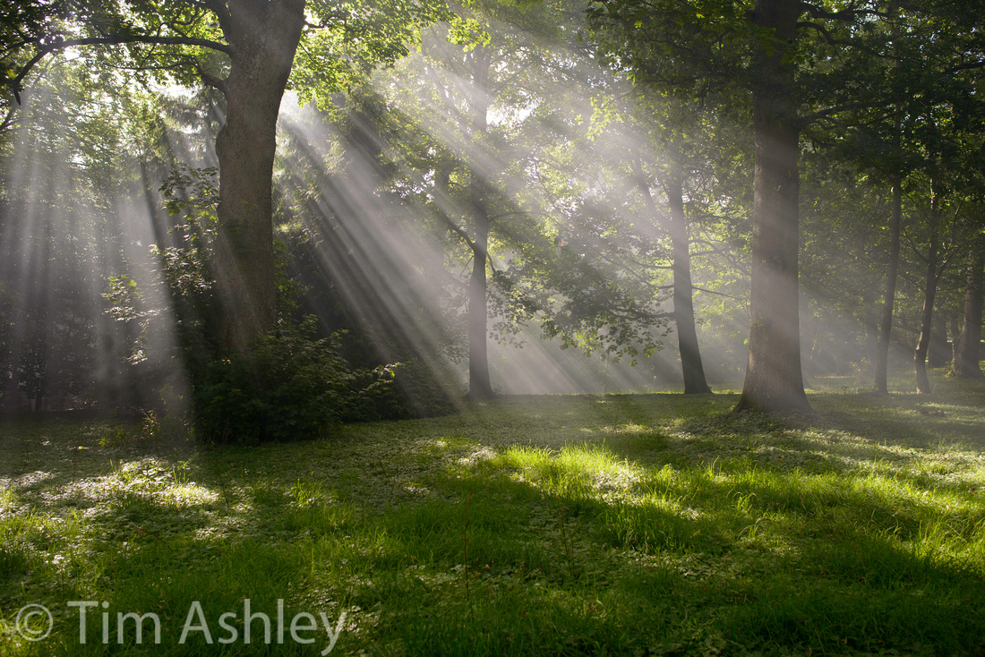
Then again, even if you get it slightly wrong it's not the end of the world.
TIP: if you have any blown areas at the edge of the image, don't show the bleed onto the paper edge: cut it with a fine black stroke line, or mount the image in a traditional cutout mount in a colour other than pure white.
But having said all that, it's right to ask if the over-enthusiastic blinkies on the D800 are helpful or not? I, for example, would prefer that they cut in like LR does: when any channel comes within around 0.5% of blowing. But that's personal and I totally understand that when a lot of consumers are going to be buying the same model as a lot of very experienced users, some attention needs to be given to protecting them. Also, JPEG shooters need to be a little more conservative with their highlights.
The next question, of course, is to ask whether the D800 Matrix Metering is as good as one might expect. For a while I thought not: I thought it tended to overexpose a little for my taste and I was slightly surprised that it couldn't, with all its 91,000 eyes and vast brain, recognise a bright sky and expose so as to stop it blowing. Especially given that the shadows are so malleable that underexposure is preferable to overexposure. But then I dialled in a -1/3rd stop fine tune, got used to the system, and think it's pretty good. I still do a lot of review, compensate, reshoot but that gets less frequent the more I get used to the system. And no AE system is psychic: it cannot know what YOU want - and what YOU want is central to the act of taking a photo.
We all want different things from a AE system. Some want never to see a blown highlight. Others want to protect the shadows. And like rescue dogs, we all carry the scars of our past: I spent quite a bit of time with a 5DII and learned to finesse 'expose to the right' because of the Dreaded Shadow Banding. Then I spent a lot of time with a variety of Phase One backs on Cambo field cameras (no metering built in) and very quickly realised that the Sunny Sixteen Rule and a bit of common sense were at least as useful and much quicker than a light meter. That, and image and histogram review. On that system, I also wanted to expose as much to the right as possible without blowing anything important but the needs was less urgent because the shadows were much better and because the shape of the rolloff shoulder into overexposure seemed a little gentler.
Then along comes the D800 with its amazing shadows and suddenly, I don't want to Expose To The Right (ETTR) any more. Not at the lower ISOs. I want to protect my highlights in white flowers against dark backgrounds. I want a sky I can pull back in post and see some detail in the clouds. And I can have it, as long as I back off that whole ETTR thing a little.
Take a look at these two files shot today (I turned my -1/3rd global fine tune off for today's shooting as I thought about this piece).
The first shot was taken with no Exposure Compensation whatsoever. It is shown as Camera Neutral, rather bland, but it has the potential to look any number of ways more exciting because there are only tiny, tiny specular blows in the ground and none in the sky. There are also some very fine lines of blocked black where there is no detail
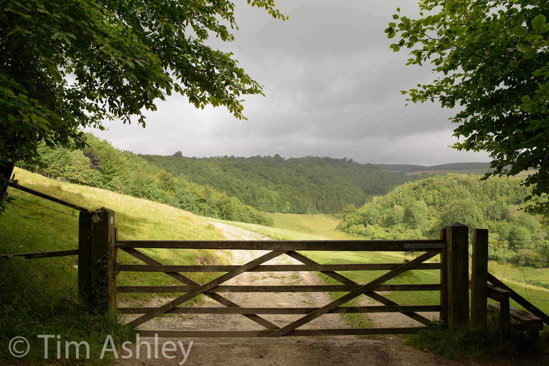
Later in the day, exactly the same scene, but this time -2/3rds was needed to get the best balance of 'no blow, no block' because the lighting was very different.
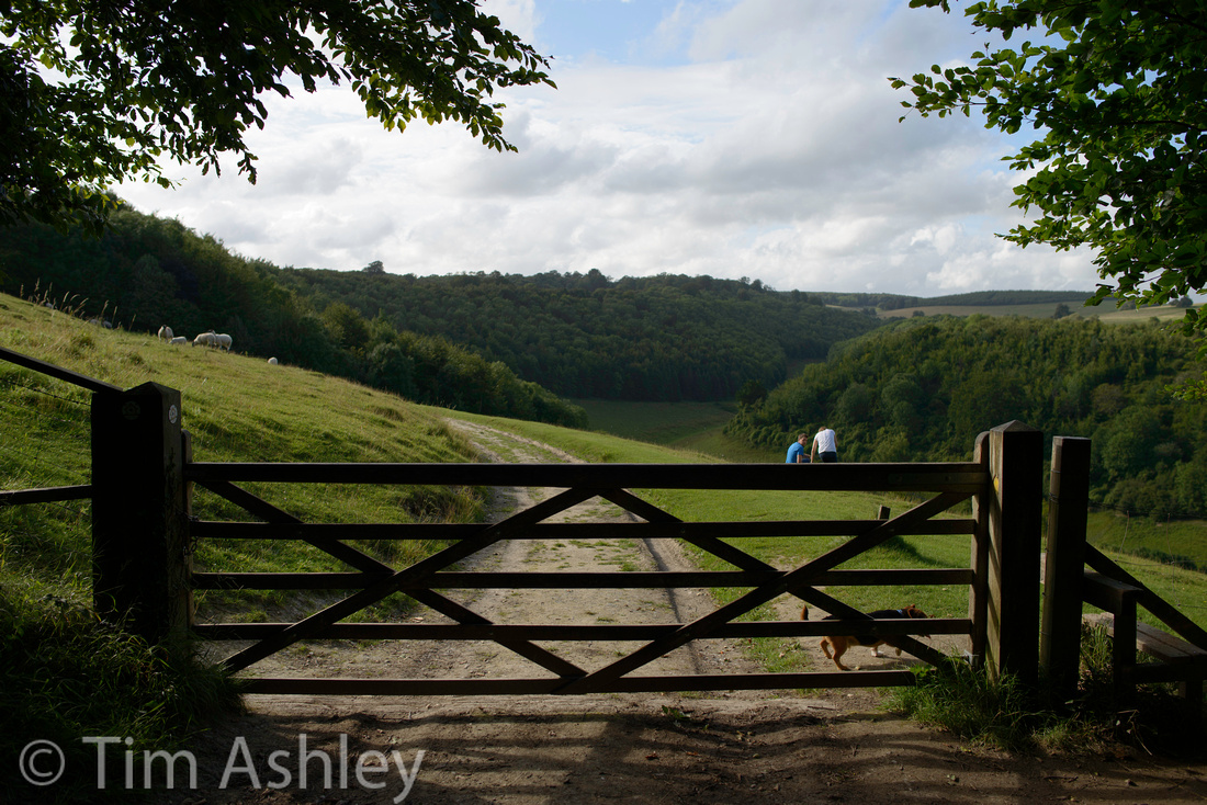 The sky here is literally a gnat's chuff from being blown but blown it is not, and there is very, very little blocking. So, load into Lightroom and treat it like a slave:
I personally HATE. Hate hate HATE anything that looks like HDR photography. I associate it with the covers of the worst sort of Creative Photography Magazines (How to make Planet Earth look like the cover of a Sci-Fi Novel. For Beginners.) But this nasty treatment above does show that if you start by not blowing the sky, you will have quite a lot of choice about what you do later... trouble is, the original of that shot above had a sky load of blinkies on the LCD. So if Nikon offered a firmware update to change the warning level, like Capture One offers, I'd use it.
But what about the histogram? I hear you ask. Well. For me at least, the histogram is about the balance of the exposure. It shows you the weight of your decision, not its outside limits. Of course, a line of pixels scrunched up against either side will indicate over- or under-exposure but too often, a perfectly weighted histogram can hide a hard-to-see but vital spike at the right which might not be immediately obvious but which might indicate, on a larger graph, a blown region. So the blinkies, when you know how to read them, remain the the best and fastest indicator of your not having placed the DR of the exposure where you want it. They are just quite hard to interpret.
So there is no substitute for knowing the system intimately if you want to get it right.
The great complication here, of course, is that the Matrix System will weight the exposure it chooses according to the operative focus point. Now, that opens a can of wriggling worms. Do you ever focus and recompose? I do, with certain lenses and apertures, quite a lot. If so, do you lock exposure before you recompose? If not, then the matrix meter is not biasing exposure to where you focussed but to where that AF point is pointing after you recompose. You have to know all this. You have to be very aware of how you have your various buttons set up and what each of the modes do but in the end, experience is the only route to success.
And in a perverse way I like that. Because one day soon enough, there will be sensors that record 200mp with 25 stops of DR in each of forty different Lytro focus planes and then my friends, anyone who makes a living out of all this will be at least half screwed. In fact, it's just their creative vision that will set them apart because there will be few technical challenges left, just the quality of the shooting eye and the aesthetic of the post processing brain.
And I don't know if I relish that day or not.
Footnote: the brilliant Michael Reichmann at LuLa has suggested that metering systems should be programmable to never blow a highlight. He proposes that you could dial in a percentage to allow for specular highlights, but that otherwise the camera should automatically E as far TTR as possible without blowing. Clearly that requires pretty much as many metering sensels as the camera has pixels and is currently therefore possible only with cameras that meter directly off the sensor. So the D800 could theoretically do it in Live View mode. And clearly it gets less necessary as sensor DR improves. But it sounds liked a good idea to me.
]]>
Or maybe my copy's a bit crook? For one thing, I have intermittent blur on the right hand side of the lens at all focal lengths from 50mm outwards. It is usually there, but not always, and though it can be mitigated but stopping down to F11 it is still discernible. A clever man I know pointed out to me that this could be a symptom of poor VR 'parking'. That means that whichever elements in the lens that are moved by the gyro to compensate for camera shake are not returned fully to their 'normal' position when the VR has done its thing. And this can affect shots taken both with and without VR, which might explain the results I see even on a tripod with VR off.
I was advised that cycling VR a few times before turning it off might help but I can't tell if it does because of the intermittence of the problem. And maybe it's just a mis-aligned lens element to blame.
But in any event, the VR performance itself, claimed at up to four stops, is simply not as good as it is on the 70-200 F2.8 VRII that I also have. That is a rock steady lens and I can reliably shoot it with VR on and get three (sometimes 4) stops of improvement which that means I can set Auto ISO Minimum Shutter to Normal or even one step towards Slower. With the 24-120 I have to set it at one stop Faster than Normal, to be reliable at all subject distances.
Now we are all used to the extra demands of shooting a D800 and so, were this lens a non-VR version, I'd happily accept a shutter speed of twice the 'old formula' of 1/focal length. That's an extra stop, and some people recommend two stops to be sure with a non-VR lens. But hang on, if the VR is helping by 4 stops, that should mean I get clean images at least sometimes at 1/60th (only three stops improvement) when the focal length is set to 120mm.
Well, sometimes I can - just not as often as with the 70-200VRII and to be honest, not a lot more often than I can without VR. As an example, at a two meter subject distance with the lens set to 120mm and VR off, I can get an average of 40% satisfactory shots at 1/60th compared to 60% with VR on, judged from many repeated series of shots. At 1/120th without VR I get 80% satisfactory and with VR on it's close to 100%.
VR performance is a bitch to test for. Bad VR performance is really easy to spot and really hard to prove. How do you standardise a certain amount of camera shake? And synchronise that shake to the shutter actuation?
The only thing you can do is take a lot of shots and look at your average results. So that's what I have done with the 24-120. Lots and lots of shots and then look at the percentage that look steady.
I buggered about for ages, testing a zillion different variables and this is what I decided, for my personal use of my copy of the lens. YMMV.
(all these suggestions refer to using the lens at 120mm)
For shots over 1/500th, don't use VR at all. A lot of pros will tell you that this is true for any VR system in this focal length range. It seems to be true.
For closer range shots (3-5 metres) you can reliably get two stops and often get three stops.
At longer subject distances, to be anywhere close to sure, you can't rely on more than one stop. Better than nothing for sure, and with some shots I'd get more like two or rarely three stops. But it doesn't seem consistent and it isn't as good as the 70-200. It seems generally between one and sometimes two stops less effective, in fact.
Onto AF: this is a little slower to lock than the 70-200VRII in AF-S mode, and that is to be expected in a less high-end lens. It seems to me to be pretty much as accurate. But the big surprise is how good focus tracking is. In a variety of AF-C modes, tracking birds in flight hand-held, I got really quite a high proportion of keepers. Statistically (and given the number of variables in this setup, involving movement of both camera and bird and rapidly changing exposure parameters etc this is a hard judgement) I can't say it is significantly worse than the 70-200VRII, which is pretty amazing.
One warning though: if your camera has the Left Side AF issue, and my twice-fixed D800 still does, then the fact that this lens is not a 'fast wide' won't save you. Use the left point at wider angles at your peril. That is not the fault of the lens.
Finally, bokeh. I have received a number of comments from people who have read the earlier parts of this series to the effect that they find the bokeh of the 24-120 to be less pleasant than that of various other lenses and whilst the nature of bokeh itself is somewhat a question of taste, I think we're all agreed that this isn't a lens you'd reach for if bokeh was your first priority. I have posted some samples already and don't have a great deal more to say other than this: "trying to make a zoom that covers the hallowed 24-120 territory is going to be complicated and expensive if done well, and is going to involve optical, cost and manufacturing compromises. Everyone will have a different view of how those compromises should be balanced."
IMHO the series of compromises made in this lens are nearly but not quite right. I would rather they charged me more and made it better. I don't care about the bokeh, it's pleasant enough. And my very expensive Zeiss 100MM F2 has far more destructive aberrations. I can live with F4, too. But for another 30% on the price and better edges and corners at the long end, they'd have my cash in a moment provided the weight of the lens didn't jump.
One last word: QC.
My 24-120 has gone back because of the right-hand blur issues discussed in this series. WIthout wanting to bang on, I have a D800E with no accurate left hand point focus abilities. My D800 has just gone back to Nikon for the third time for the same problem. I had a 20mm F2.8D that was asymmetrical right out of the box. I had to send a battery back under the exchange scheme. Last year I idly purchased a D7000 just to see what all the chat was about and I loved it but none of the three lenses I bought for it were reliable focusers and I rapidly gave up and sold it.
(EDIT: to be fair I did have a 70-200VRII with it which was perfect and which I foolishly sold at a loss when I dumped the camera, breaking my own rule: never sell good glass. I had to buy another one when I got the D800s...)
This is not too unusual in the modern world: I have had to return Leica glass, and Phase One. But as an owner of a bagful of Canon L glass I can honestly say that I have never had a problem.
I cannot generalise from my experience: that would be illogical. But my personal current experience of Nikon is a kind of 'ship now check later' feeling and that, I'm afraid, is quite irritating.
]]>
The key benefits of the 24-120 over the 'Trinity' mid-range zoom is its longer reach, covering the 70-120 range and therefore becoming a possible 'one lens' solution for certain purposes. Leave that humungous 70-200VRII at home? Yes please, if possible. But mid-range zooms that stretch into tele territory are traditionally at their weakest here. Let's see.
Firstly a few shots at various focal lengths and apertures.
105mm @ f8
120mm @ f5.6
120mm @ f7.1

120mm @ f5.6
 What I want to say about these shots is: they are all in very good focus, with great resolution, where I want them to be. The lens may not be sharp corner to corner and edge to edge at the telephoto end, but over most of its field it is very good. Even with my 'blurry RHS version' by framing appropriately, I can get the shot with a bit of cropping. Of course I will get the lens fixed so I don't need to crop but the point remains: this lens has enough of a sharp zone (pretty big really) to use for normal subjects. Normal subjects, unlike my test scene, are rarely planar - especially in telephoto shots where one is so often after some separation of subject from background.
Now to the test shots. For my reference lens I have chosen the 70-200VRII rather than the best prime I have in this range (the Zeiss Makro-Planar 100mm F2) because it covers both my 100mm and 120mm focal lengths and because it is a direct competitor for this role. It is also IMHO an extraordinarily good lens.
The scene was shot on a D800E using LV, LVAF (but checked at 100% on screen), 3 Second Delay, Gitzo 3 series CF tripod and Arca Cube.
Rather than post crops that you might not think are representative, click on the image itself to get a 100% sized file at 91% JPEG quality in Adobe RGB. It was processed in LR4 with sharpening at 90/0.7/70/20 and with lens corrections ON but no corrections for vignetting or for CA or fringing. Import Profile was Adobe Standard. I advise that you try to look at it on screen at a resolution equivalent to around a 200 DPI print. On most existing monitors that means 50% zoom but on a Retina Macbook display it is 100% though you may want to avoid that for now, unless in Aperture or iPhoto, since other photo applications are not yet Retina optimised.
24-120mm at 98mm F5.6 (it's really hard to get exactly 100mm!)

70-200 at 102mm F5.6

On examining the full sized shots it is clear that the 24-120 zoom is within close spitting distance of the hallowed 70-200 over most of the frame. But at the edges (and the corners too, I've tested it) it falls notably behind. In truth, for a planar subject like this, I would always rather have the 70-200, by a long shot. To me the peripheral areas of the shorter zoom are not up to standard for serious use - by which I mean a 36 inch print. Even when my copy gets fixed and has a reliable right hand side (i.e. the same as the left hand side!) I would only use this lens happily for 'traditional' tele shots: those where the subject is somewhere in the middle and the edges are blurred on purpose by use of DOF.
On to the long end of the zoom:
24-120 at 120mm f5.6

70-200 at 125mm f5.6 (missed the exact focal length again, sorry.. the barrel markings are really only a guide)

This is where the men get sorted from the boys: the 70-200 is clearly superior across the frame and though the 24-120 is pretty acceptable on centre, with the differences not very strong at all when viewed at 50% on screen, the sides and edges of the cheaper, shorter (lighter!) lens are pretty useless for anything planar. Again, I don't hesitate to use it for central subjects where blurred edges are appropriate but if I had a full-time assistant with muscles, I'd rather have the 70-200 any day: it is amazingly good across the entire frame AND it has better VR - a factor I will consider in a future post
]]>24-120mm at 52mm F8
24-120mm at 85mm F4 showing pleasant bokeh wide open

100% Crop from above, focus on brim of hat
For the sake of brevity: there's nothing in terms of vignetting, CA or fringing that can't be dealt with pretty well in post production in this range of the lens's operation. And though pincushion distortion is clear at 50mm and worse at 85mm, I don't see anything that doesn't correct. Not ideal of course, but this lens is a series of compromises with a purpose. Does it meet that purpose?
I tested against two absolutely stellar reference lenses: the Leica 50MM F2 R Cron and the Nikkor 85mm F1.8G in order that you can see what you are 'losing' when you exchange prime quality for zoom convenience.
The scene, as shot on a D800E using LV, LVAF (but checked at 100% on screen), 3 Second Delay, Gitzo 3 series CF tripod and Arca Cube.
This is the same test scene as before: and rather than post crops that you might not think are representative, click on the image itself to get a 100% sized file at 91% JPEG quality in Adobe RGB. It was processed in LR4 with sharpening at 90/0.7/70/20 and with lens corrections ON but no corrections for vignetting or for CA or fringing. Import Profile was Adobe Standard. I advise that you try to look at it on screen at a resolution equivalent to around a 200 DPI print. On most existing monitors that means 50% zoom but on a Retina Macbook display it is 100% though you may want to avoid that for now, unless in Aperture or iPhoto, since other photo applications are not yet Retina optimised.
First, at 50mm
24-120mm at 50mm f5.6

Leica 50mm f2 R Cron at f5.6
 What I see in this comparison is that the Nikkor zoom gives my reference lens a very good run for its money on centre. It is not quite as articulate and has less micro contrast. Also, from many many shots' worth of experience, the Leica lens has an ability with colour and somehow just with understanding light that very few other lenses have. But this comparison is very flattering to the Nikkor. At the left hand edge, the Leica is clearly superior but the Nikkor is somewhere between very acceptable and pretty good. Would I use shots taken with this lens at this aperture? Sure I would. I can add that even in the corners I'd use it, though the Leica is clearly superior here. The rub, however, is that my copy of the lens has a very weak Right Hand Side from before 50mm and upwards and this is very clear in these shots.
This is odd, because it is nearly always but not quite always weak on the right. That implies either a slightly loose element, or some problem with VR 'parking'. I will cover that second possibility in a later post on the use of VR with this lens but I should mention here that these shots were taken without VR but that the weak RHS is usually evident whether VR is used or not.
Moving on to the portrait range, at 85MM. Here I chose the Nikkor 85 f1.8G as my reference. Let's see how they compare.
24-105 at 85mm F5.6

85mm F1.8G at F5.6
 I won't comment on the weak RHS again here. Clearly there's a problem and I'll have to get it sorted.
On centre, there's not a great deal in it: the prime lens has slightly better micro contrast. Otherwise you are getting no real compromise here by using the zoom. Pretty good. The same is not quite as true on the left hand edge. The zoom is a touch softer but is still pretty impressive. And even more amazing is that when I look into corner crops of other comparison shots, the zoom is far closer to the prime than I would expect. And this is a very, very good prime.
My conclusion is that, assuming I can get mine fixed so that the RHS is as good as the left (or assuming that you can buy a good copy) then this lens succeeds in delivering great quality compared to very good primes at F5.6 in this focal length range - and offering more convenience albeit at a less attractive maximum aperture.
As a p.s... people often assume that these workman-like zooms are rather prosaic in character and that you have to go elsewhere for a 'look' lens, but I quite often find with this zoom that it has nice '3D pop' on the D800. Here's an example at f9 and 40mm. The very gentle rolloff into OOF given by the small aperture helps, as does the nice lighting, but this slightly boring shots doesn't look like it was taken with a boring lens...
Coming up: the Telephoto Range.
]]>So I decided to see if 'focus and recompose' would work on the 28mm F1.8 lens, using a real-world target. It certainly doesn't work particularly well with test targets at close distances. So I set up a tripod and used a ship, floating about 1/4 mile away. It has horizontal and vertical detail and it fits entirely within the focus rectangle, water line included.
First shot is with the ship under the centre point, viewfinder AF at f5.6 and is pretty acceptably sharp given that this is 100% crop.
my usual settings for these tests: no lens corrections - they can distort the mid field - and LR4 sharpening of 90/0.7/70/20
Second shot is then made with no change in focus, but the camera swivelled on the tripod until the ship is under the left-most point. This exactly replicates the 'focus and recompose' method:
Third shot is with the camera still swivelled so that the ship is under the left-most point, but using Viewfinder (Phase Detect) AF with that left-most point:
Final shot is with the camera position unchanged, so the ship is still under the left-most point, but using zoomed Live View Manual Focus to show that this part of the lens is perfectly capable, at least at this distance and aperture, of sharp rendition of the subject: it is at least as sharp as the centre point AF shot.
These results are from a 'twice-baked' D800 (i.e. one that has been in to be 'fixed' for the Left Point AF problem twice).
They clearly show that focus and recompose, even with a lens with field curvature, is better than using an inaccurate left-point - but that it is still not as good as the lens can do. Therefore I conclude that focus and recompose is a temporary solution only for users of such lenses, failing to offer the accuracy of which the lens is capable.
I have run similar series at different apertures, subjects, and subject distances and got similar results.
Moral: if your left AF is 'off' then don't believe that focus and recompose will save your ass. It won't.
EDIT:
I chose a distant subject here so as not to muddy the waters with the complicated issue of 'cosine error' but the issue has come up a lot in discussion since the post so here, for those unfamiliar with it, is a link to a brief primer:
http://www.bobatkins.com/photography/technical/focus_recompose.html
And here is a link to the Hasselblad system that corrects for it: and Hasselblad introduced this solution because studio photographers felt there was a problem!
http://press.hasselblad.com/media-library/background-articles/true-focus.aspx
Some further comments: the issue is complicated by the fact that given the physical displacement of the centre from the peripheral points, the distances from any of them to the subject will vary by up to several millimetres. That can affect the accuracy of focus of a fast wide, shot wide open, on an eye.
Some photographers claim to be able to minutely 'rock' their bodies forwards or backwards so as to compensate for this. I am not so well calibrated. Some lenses may have field curvature, which generally in fast wides causes the peripheries of a lens to focus close than the centre. Clearly when executing an F&R manouvre, this can be a factor too, depending on the angles involved and the degree of arc involved, but may help compensate.
In practice, however, greater than any of these issues is likely to be the fact that both model and photographer are likely to to be moving by small amounts in the two other planes as the manouvre is carried out. The model is moving however you choose to focus, but F&R does increase the risk of the photographer's motion impacting the accuracy of focus.
None of these errors is significant at distance because the percentage of the error to the distance involved is smaller, and the DOF greater.
]]>
Then there are the places with much drier, clearer air. New Mexico, and Antibes. Deep blues and penetrating shafts of light that create strong forms from surface and shadow and let you compose as effectively with shape or colour as you can with more conventional matter.
Like many photographers, I am constantly attracted to these places and constantly met with the desire to come up with work that transcends any particular subject and speaks directly to the quality of light itself. Mere figurative representation of the scene risks a rapid descent into 'pretty' at best, through cliché, to banal. But the risk is worth taking from time to time, because an everyday subject can sometimes be transformed by lovely light into something far more interesting.
No wonder these places have encouraged so many traditional media artists to explore the abstract: it's the light itself which is interesting, rather than any particular thing on which it falls. Failing, as I constantly do, to catch it, is one of life's most frustrating and compelling challenges.
St. Ives, Cornwall
St. Ives, Cornwall
St. Ives, Cornwall
Vik, Iceland
Antibes, France
Antibes, France
Santa Fe, New Mexico
And then sometimes you get home and find that the most dramatic light is right on your doorstep:
The South Downs, England
24mm @ F8
24mm @ f8
24mm@f8
I also added in the introduction that it has CA throughout its zoom and aperture ranges and that it has vignetting throughout its range but that at the wider end this does not diminish fully on stopping down. Nothing more to add here. Both of these are correctable in post and both go with the territory of multi-purpose (or "Swiss Army Knife") wide and mid-range zooms. I personally often like a bit of vignetting and the benefit of the D800s high DR is that when you want to correct vignetting, the extremely tolerant shadows can take a lot of pushing in post (especially when shot at lower ISOs). So there is little cost to correcting this when required. CA is a fact of life on so many lenses that my acid test is, firstly, "is it easy to correct in post?" and secondly "does correcting it compromise the file quality significantly?"
IMHO this lens passes both tests. No need to post examples because I have never had an issue with it.
Testing is rather dull and can get obsessive so I will keep it short: in this review, at all focal lengths, I will use the most appropriate reference lens I have in my bag as a comparison for the performance of this zoom.
at 24mm I only have the PC-E 24mm and that has too many 'issues' of its own to use as reference, so I will just post from the zoom at 24mm:
The scene, as shot on a D800E using LV, LVAF (but checked at 100% on screen), 3 Second Delay, Gitzo 3 series CF tripod and Arca Cube. That should be good enough for most people - it's certainly good enough for me!
This is the test scene: and rather than post crops that you might not think are representative, click on the image itself to get a 100% sized file at 91% JPEG quality in Adobe RGB. It was processed in LR4 with sharpening at 90/0.7/70/20 and with lens corrections ON but no corrections for vignetting or for CA or fringing. Import Profile was Adobe Standard. I advise that you try to look at it on screen at a resolution equivalent to around a 200 DPI print. On most existing monitors that means 50% zoom but on a Retina Macbook display it is 100% though you may want to avoid that for now, unless in Aperture or iPhoto, since other photo applications are not yet Retina optimised.
24-120 zoom at 24mm f5.6

What I see is that this lens, here at f5.6, has no observable curved field of focus effects and that it is very acceptably sharp from edge to edge and very good on centre. I happen to know that corner performance is totally acceptable too. That's all I need to know about it.
Moving on to 28mm, where I can show the results against one of my favourite lenses, the 28mm F1.8G
Again click on the files to get full-sized JPEGS.
24-120 zoom at 28mm f5.6

28mm F1.8G @f5.6
What I see here is that the zoom image is again sharp everywhere I need it to be and compares very favourably with the prime, especially when both are viewed at 50% so as to emulate a large print. This is a very good result and I would happily use it for a gallery print with a bit of work.
(Please note that the 28mm F1.8g shot is from the series I shot for an upcoming piece on that lens and is from a slightly different angle but you can use it just as well to judge edge and centre sharpness. I will post the 28mm F1.8 G shot that I did take as part of this series in the piece I publish about it later. It shows field curvature absent from this shot and that's a whole 'nother topic I'd rather get into when I am writing purely about that lens. I wanted to show it here at about its best edge sharpness so as to set the bar for the zoom.)
So the 24-120 zoom at 28mm does what it says 'on the tin'. No messing about. It takes a sharp photo of everything in the frame at the distance you focussed on. Trustworthy. We like that.
I don't have a reference lens at 35mm. It's not a focal length I use a huge amount so I didn't shot a frame in this series, but I did parse my LR library and found a frame shot of the same scene but on a D800 and on a different day, handheld, using VR and viewfinder centre point AF. It is fine throughout, though possibly very slightly soft at the edges at 100% on screen, though at 50%, equivalent to a roughly 35" print, it looks good.
Here it is for reference:

So there we have it. For me at least, (and there are a lot of other frames I have shot to reach this conclusion) I would not hesitate to use this lens at any focal length between 24 and 35mm for even serious work. Very, very useful.
Coming up: mid-range to short portrait, 50-85mm
]]>
62mm @ f4.5 1/250th ISO 500
There were a few surprised faces when Nikon's Technical Guide to the D800/E included the 24-120 as one of the lenses suggested for use for 'enhanced sharpness'. After all, this was a lens that had disappointed and irritated many with its performance on other 'serious' Nikon FF cameras, and which had something of a reputation for QC issues.
Yet here, in a nervous little booklet apparently intended as a pre-emptive strike against complaints from people not used to working with a sensor this good and this fussy, was a suggestion to use a lens that a lot of people regarded as barely more than a consumer zoom with a gold collar on it.
No: 'serious' users would stick to 'The Trinity' of 14-24, 24-70 and 70-200 plus a few well-chosen primes, thank you very much.
75mm f4.5 1/320th ISO 640
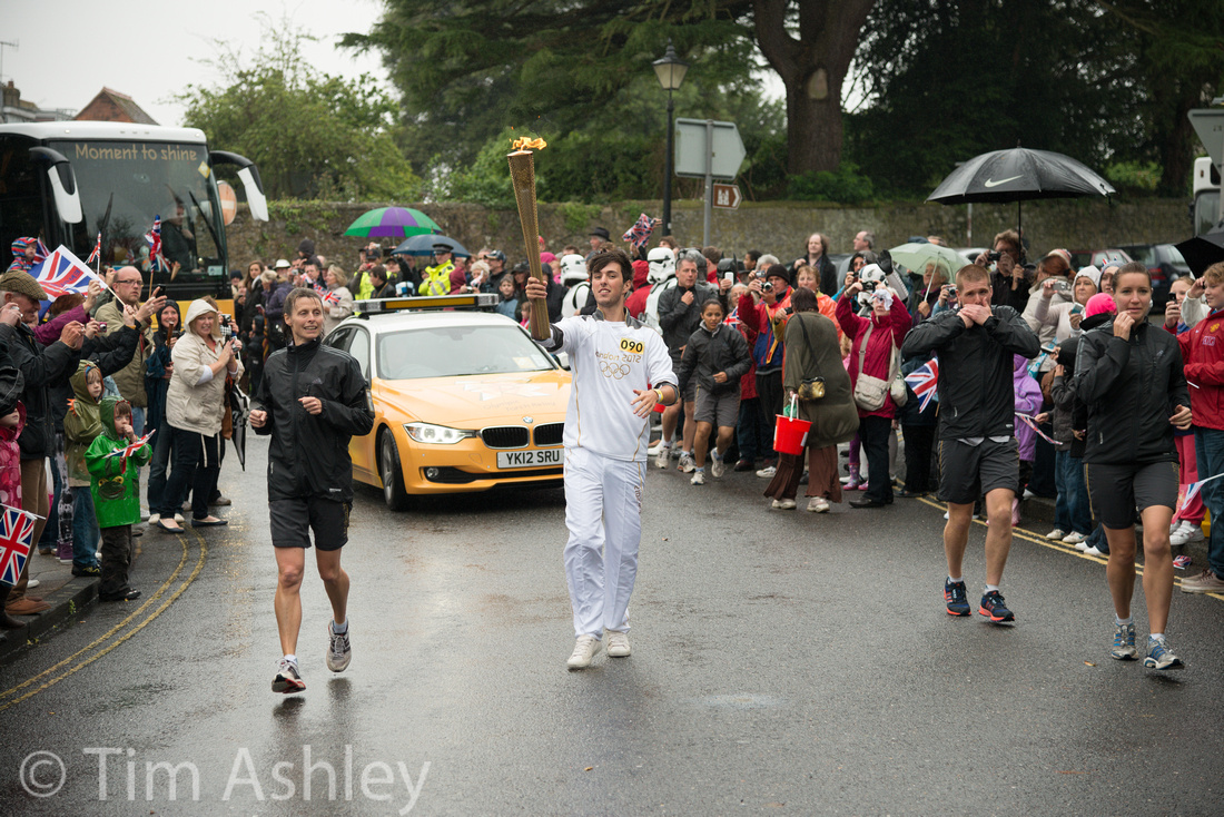
Then reports started to filter through from the those lucky enough to get early copies of either camera: the first two members of The Trinity were not pleasing everyone as much as they'd hoped... and the 24-120 was surprising some people who hadn't much rated it before.
This seemed too good to be true, especially to Canon switchers who were used to the venerable 24-105, a lens which was by no means perfect but overcame its imperfections by being just so damned useful.
24mm F4.5 1/160th ISO 200
So I bought one. And I love it, but it does have 'issues' and over a few posts (one related to each of Wide, Mid and Long focal length ranges and one on When to use VR) I'll go into what it does and when.
But today a simple overview, a 'what it's so good for' and a 'fly in the ointment'.
120mm f4 1/500th ISO 280
Overview
- It's lighter than the 24-70 AND it has the VRII missing from the Trinity mid-zoom
- It can show CA at all focal lengths and apertures if provoked but never too bothersome and always PP-able
- It vignettes quite a bit at all apertures, and at the wide end that vignetting stays even as you stop down
- Distortion goes from barrel to pincushion as you zoom in. Nothing new there, and all correctable
- It has really surprisingly great sharpness on centre at all focal lengths at F5.6 (and even wide open at the wider end)
- Edges and corners are more variable but actually, given that this is a Swiss Army Knife lens, not too bad at all and, stopped down to f8, really pretty impressive up to mid portrait range
120mm f4 1/500th ISO 1250
What it's Good For
A good copy (see below) combines really well with one light, fast lens such as the 28mm F1.8G to make a perfect light travel kit which is still capable of serious work. Bang in one 'super lens' of you choice (mine is the 50mm Leica R Cron with Leitax adaptor) and you can cover a LOT of bases.
If you need one lens for an event, then for me at least, this is the one. I joined friends the other day to watch the Olympic Torch on part of its progress through the UK prior to the opening ceremony. It was pissing down with rain and I had to walk a long way due to parking restrictions so, one lens was required to cover all bases - and it had to be one that was sealed against the weather. The shots in this post are nothing special but they range from 24mm to 120mm and they are all sharp where it matters. This is a very, very useful trait in a lens.
120mm f4 1/500th ISO 2200
Fly in the Ointment
Mine has a blurry right hand side. Not at every focal length, not always even at the focal lengths afflicted, but too often to be right and too often for me to trust it for serious use. This may be a decentred element, it may be poor VR 'parking' (I will cover that in the VR post) but it has to go back to the great Nikon Hospital. At current count, around half the Nikon lenses and bodies I have bought have needed return or repair. They make lovely stuff but IMHO QC needs bumping up a notch or two.
But like I say, a good copy of this lens is a must-have and a few very serious photographers I know use it as their 'body cap'.
112mm F4 1/500th ISO 900
 100% crop from the above:
]]>
But did it work?
Hmmm.
Brief recap: before the 'first fix' at Nikon UK HQ, the left point was back focussing by a lot. The centre point was great, and the right point was pretty damned good. After the first fix, the centre point was still great but though the left point was better, it was still nowhere near as good as it should be and the right point had got worse. A balancing act had been performed that was not at all to my liking: making the right point worse screws up your ability to focus on an eye in the studio in portrait orientation.
Today I took the camera for a quick test shoot of various targets and it was notably better, with the right point now looking fairly good and the left point looking promising but ambiguous. So I went 'real world' shooting at a variety of apertures for a while and got a bit of a sinking feeling: something still felt 'off'. At best, some of the Left Point shots, when viewed at 50% on screen, looked goodish but not great. Generally they were too soft to be acceptable for anything but small to possibly medium prints. The Right point was more consistent, if less good than the Centre Point. See below for more on this.
A note on testing for this: I use a fast wide, the 28mm F1.8G, for the tests. This, like many fast wides, has focus shift as it stops down. This means that all shots taken at any aperture smaller than F1.8 should be considered irrelevant. The camera is not programmed to compensate, when using viewfinder Phase Detect AF, for focus shift. It might be a nice idea but to my knowledge no camera has this feature. Focus shift also combines in a complex way with the field curvature of lenses that exhibit this characteristic, which this lens does.
That makes for a multifactorial situation, and the point of testing is to reduce the factors at play to one, if you can.
Which means you can only shoot wide open if you want to assess accuracy.
Then you need to be aware that fast wides, shot wide open, tend to be a somewhat soft - especially away from the centre.
That means that you have to accept two things:
- The areas of the field of view covered by the Left and Right points will never be as sharp as the centre, however focussed.
- This fact also makes it harder for the camera to focus, because the lower resolution of the lens here gives it less to 'get its teeth into'
The ONLY relevant comparison is to make some shots using Live View focus over each of the Centre, Left and Right focus points, using an appropriate target, and thereby discover the 'best' that the lens can deliver AT EACH OF THOSE POINTS.
Those shots can then be used as reference shots for the Viewfinder Phase Detect AF accuracy.
There isn't even much point comparing the performance of VFAF by comparing shots taken using the Left and Right points: any problems with the lens itself may not be symmetrical.
So: onto my test results. The target is A4 sized and shot from approximately 8 feet away on a very, very solid tripod rig.
Method was:
- Centre point: shoot with Live View Auto Focus, Live View Manual Focus, Viewfinder Auto Focus
- Left point: shoot with Live View Auto Focus, Live View Manual Focus, then five shots Viewfinder Auto Focus with lens manually defocussed between shots
- Right point: shoot with Live View Auto Focus, Live View Manual Focus, then five shots Viewfinder Auto Focus with lens manually defocussed between shots
The results are posted below but please note that I have run several sets of similar shots with differing real-world and printed targets in varying lighting conditions. Some targets with horizontal stripes, some with vertical, and so on. The results are consistent across all sets of tests.
KEY:
- CP= Centre Point
- LP= Left Point
- RP= Right Point
- LVAF= Live View Auto Focus
- LVMF= Live View Manual Focus
- VFAF= Viewfinder Auto Focus
Click on each image for a 100% sized file, at 91% JPEG quality


Note on Right Point results: you will note that the Live View Autofocus shot is OOF. Lloyd Chambers has questioned the accuracy of LVAF, and I tend to agree that it is not always reliable, though generally pretty good. I have included this data point to show the importance of making test images using LVMF too, if you want to show what the lens, rather than the camera, can achieve, when looking for a reference shot.

You'll be best loading these into Lightroom or Capture One and having a close peep but what I see is that the Left Side is a tad less sharp and a tad less consistent than the Right. But I also see that the 'best' Live View shot on the Right is better than the best on the left. This could just be because this is a pig to focus and there is a slightly less optimal result on the left, or it could be that the lens is slightly and asymmetrically weaker on the left. If that's the case, all bets are off on making a clear judgement because not only does it mean that the Left will never be as sharp, it also means that the focus mechanism will never have as much to work with, and will therefore be less consistent. I have driven myself crazy trying to work out which and after quite a lot of shots, I think the lens is more or less symmetrical and I think therefore that the Left Point is slightly less accurate and consistent.
Some Further Data Points
I mulled this over night and then ran two more tests:
Firstly I used my 24-120 F4 VR, which I know to be reliable at the wide end. I shot the same sequences as above and, though the lens is less sharp at the area under the left point, as you would expect, it is pretty good: and there is NO notable difference, wide open at F4, between the Live View and the Viewfinder AF points: the AF system's left point is immaculate with this lens. This is almost certainly partly because of DOF effects on the result but also, more subtly, because the increased DOF makes the image inherently easier for the lens to focus. Also, this lens has no notable focus shift and no serious field curvature.
Next I shot the 'twice fixed' D800 against the 'screwed and not fixed' D800E. Now: this D800E was similar to the pre-fix D800 in performance with this lens - so it makes a good proxy for seeing how much of an improvement there has been. Both these are identical, Left Point shots: same lens, same rig, different bodies. I shot five of each and the results were consistent so these shots are representative.
 It's not even worth labelling these. The extent of the fix is clear.
So, to the $64,000 question (actually, $2,999.9 at B&H at the moment): is it fixed?
I don't know but it is possible.
- It is not as good as the Centre Point in terms of resolution but it wouldn't be: the lens is weaker at the Left Point
- It is not as good as the Centre Point in terms of consistency: it wouldn't be. The peripheral points are not claimed to be and the fact that the lens is by its nature weaker at the Left Point gives a less able focus point more work to do.
- It is not as good as the Right Hand point in terms of either resolution or consistency. There are possible reasons (to do with lens sample asymmetry, see above) why this might reasonably be the case.
It is certainly notably better.
It isn't IMHO quite 'good enough'. But that has to do with my expectations rather than any test results I can produce: the only way to 'know' would be to set up an identical rig with a 'known good' D800 and see what happened. Anyone offering? Anyone offering a really good sample of a 24mm F1.4 for me to try?
Bottom Line
When I use this lens on this 'fixed' body with this wide angle, fast lens, whether it be wide open or stopped down, I have the constant sense that I can't trust it. It is so often close to good enough but it feels like a plump lady in a too-tight dress: it is always straining to escape. It feels like it has been adjusted to the furthest extent possible and is still not quite there and it is clear from my shooting that it is still trying to back focus and usually succeeding, just by far less than before.
So I don't know if this is the best the design can do, or even if it's the best that this particular body could do without a hardware fix, which I don't believe this has had. But like I say I don't trust it with this lens... and for the reasons outlined above, this lens is a tough gig and may have its own slight asymmetry.
It may be that fast wides, with their tendency to focus shift and their need for tiny movements of the focus mechanism and their weak mid field and edge performance wide open are just too much of a pig for any current 'peripheral' type AF sensor to deal with reliably. It may be that my expectations are too high or unrealistic at this price point. I cannot say. I need to shoot it more, with more lenses, under more lighting conditions, to form a more rounded view. But I have a small feeling it might end up going back again. I have a feeling that it could do better. In the meantime I am going to go out and shoot the camera and enjoy it because, whilst it might not (yet) be as good as it could be, it is still pretty amazing.
What do you think?
EDIT: a week or so later, after using the twice-repaired camera on a great variety of subjects and further evaluating it, I find that in the field, at pretty much all subject distances and on pretty much all subjects, it is back-focussing using the left point, to the extent that that point simply is of no practical use. I have also, after more exhaustive testing, found that at distance the 28mm F1.8G when focussed using Live View Manual, can come very, very close to the sharpness of the centre when focussed on subjects under the area covered by the left point. I therefore refine my conclusions above to indicate that at least at distance, the lens is sharp enough to give the sensor a very good chance of achieving focus but that it still fails to do so. For an example of this see my Focus and Recompose post.
I therefore have to conclude, sadly, that despite Nikon UK's very fast and friendly service, this camera is still not performing satisfactorily. Either, given appropriate targets, the outer focus points are useful or they are not. Mine is not. Which means I have paid for something that IMHO doesn't work properly. Further, it is not as good as the right hand point, which probably means that this is a calibration or manufacturing issue rather than a 'that's as good as it can do given the constraints' issue.
]]>
The on-line reaction to the D800 Left Point AF Problem has been a fascinating lesson in human nature. People seem to fall into one of the following groups.
-
I have it, it's the end of the world, Nikon are shit, how dare they?
-
I have it, it's no biggie, I'll get it fixed whenever
-
I fear I might have it but I'm not really sure how to test for it and I'm getting all anxious
-
Everyone has it and those who don't know they have it are fools
-
No one has it and those who think they do are amateurs, cry-babies or fools
-
Almost no-one has it, it's hugely exaggerated, most people are panicking and that makes them fools
-
I haven't got it so you can't, and if you think you have, you're a fool
-
It won't exist until Nikon says it does, at which point I will go oddly quiet
-
If you went to page blah blah blah of the manual you'd see that almost nothing is an 'appropriate focus target'
With both my D800 and D800E I have tested the left, middle and right point on both and nothing more: life is too short. I have ascertained to my complete satisfaction that the left points on both focus quite a way behind where they should and that is that.
The D800 first went to Nikon UK a few weeks ago and came back with the left side a bit better but the right side no longer accurate. That's bad: the right point is important because it is used in the studio for getting eyes in focus. I can live, short term with a bad left point but a bad right point is a no-no. And I have read of other people who have had similar experiences.
So, having read of Ming Thein's luck in getting the 'New Fix" I called Nikon on Monday. They sent a courier Tuesday to collect (and I'm not even NPS). Wednesday I got an email saying it had been received. Thursday I got an email saying it was fixed and giving a tracking number for its return. Wow. And the camera is already on its way back, according to the tracking.
Boy that was fast. A lot faster than the first time, and there was me hearing through the 'vine that they were all backed up with repairs.
The docket says.
"Check/adjust body focus to Nikon standard
Check, test and clean equipment "
No mention of any hardware replacement like some people have had. We'll see and I will report back. Fingers crossed!
]]>
For casual travel with smaller cameras, like a Panny GH2, I load every card onto an iPad and then lock the cards and keep them in separate luggage from my iPad until I get home. Oh, and I send 'really can't lose' images to the cloud whilst on the road, at the highest resolution that local bandwidth allows.
But for serious photo travel or assignment, especially with today's increasingly large files... I have a new solution and I really like it.
The Macbook Pro Retina has no Firewire, thereby obsoleting a whole drawer full of portable drives. But the Seagate GoFlex FreeAgent (what a stupid, long name) has a great feature: it comes with USB2 and FW800 adaptors and for a few extra quid you can buy a tiny, light, 'docking station' jobbie that turns it into a Thunderbolt drive.
That means you can backup on the road, but transfer that backup to your legacy non-thunderbolt desktop system (Mac Pro in my case, with two lovely huge monitors and stuffed full of RAM).
Now this is never gonna be as fast as an external SSD: the 500 and 750GB versions are 7200 RPM and the 1TB version is 5400RPM (unconfirmed: Seagate's site is not very helpful but I am sure I chose the smaller drive because in store, the package of the larger drive said 5400).
I bought the 500gig version and over both Thunderbolt and FW 800 it is really fast, especially when out on the road where speed matters more.
How fast?
I took a 41.4GB LR folder containing a catalogue, all photos and all other associated files and sub-folders and transferred it from the 2.7ghz Macbook Pro Retina to the drive over thunderbolt. This took 7 min 3sec. Then from the drive over FW800 to my Mac Pro 2.8ghz quad core. This took 11 min 3 sec.
This thing weighs around 255 grammes with the Thunderbolt adaptor. It measures 4 x 2 x 1 inches. It costs a LOT less than an SSD.
Love it.
]]>
We can't all be Joel Meyerowitz but if you're going to take a picture of a stranger, it needs to say something bigger or more interesting than 'here's a picture of a stranger'.
But I do have a weakness for the sub-genre of humour and irony. Laugh or smile, provoking a giggle or a thought, this sort of thing tickles my trigger finger.
Whatever camera you have with you is the right camera. Below are shots from everything from P&S to Medium Format. Quality isn't the point, it's about seeing and smiling.
Dogs are so often good, as Elliot Erwitt well knows. I'm not in his league by a long shot but this one of mine made me grin. Ricoh GR2.
And their expressions sometimes chime so well with the circumstances: Panny FZ8
People can be just as funny, especially the wonderful Italian race... Rome, Leica M9. I like the way the peacocks in the foreground are unaware of the dialogue they are having with the fashion dummies in the shop window. Just look at the echoed postures.
Talking of Italians, I quite like the implied joke, which might or might not be obvious: Leica M8, Venice,
Then there's the stuff that's more observational and ironic, maybe even a little sad or wistful: Barcelona, M8
This one is from Santa Fe, and you really need to see a large print to get it. It's verging on 'clever' rather than funny but I like it. Leica M9. The version posted is easier to 'get' but clicking on it gives a visually much more satisfying shot, harder to see the point of at small size. Not everyone 'sees' the joke in this one...

Similarly, this one isn't really 'funny' as such, but it makes me smile. Leica M8, Barcelona.
Sometimes it's even worth setting one up: this was my Christmas Card in 2008 and was taken with a Phase One p45+. It's called "Credit Crunch Christmas" and Santa's Down and Out Grotto is under Brighton Pier, which had just the right seasonal colours.

Of course the vulgar is always tempting if tasteless...

Talking of vulgar: Rule #1 is that Other People Always Get The Best Shot and, to end, this one proves the point. Someone emailed it to me having found it online and I have no idea who took it but it's really quite funny. You couldn't make it up...

You can't tether a D800 in Lightroom and I don't fancy the sound of Nikon Capture (NX2 is enough of an interface PITA for me). Besides, I've been shooting C1 tethered with Medium Format in the studio and the field for ages. It is easy, stable, and has a great party trick, which I'll come back to.
If you're a C1 'virgin' read on. All will be revealed.
First download your trial copy of C1 6.4.3 here. Install it. Open it. Oh-oh...
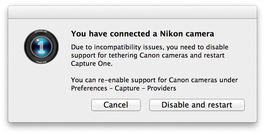 So if you're shooting both, there's gonna be some fiddling to do on switching systems but hey...
Next, say 'NO' to the following offer or it will drive you bonkers in future:
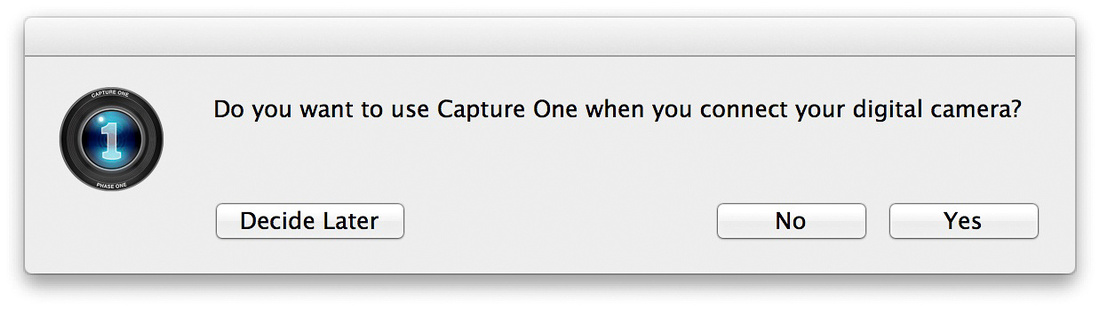 Now you get to the meat.
You'll have a screen that looks like this but without the images, yet:
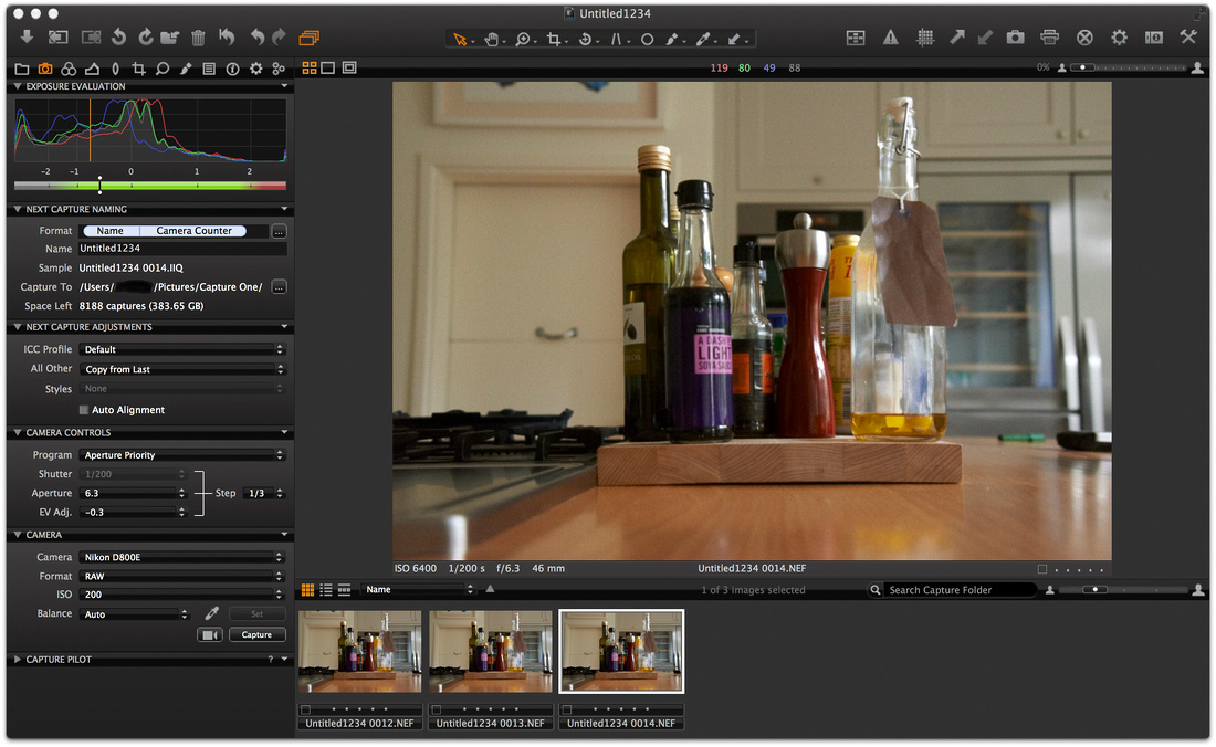
Now I have found that doing things in the following order works best for me, in terms of getting the camera and the software to 'see' each other quickly and reliably. YMM unfortunately V.
Turn the camera off. Use the USB cable that came with it to connect it to your computer. Turn the camera on.
Go to the File menu>New Session and in the pop up give it a name, choose a path where you want it to save files and, most importantly, select "Tethered" from the Type dropdown. Click OK.
A new Session Window (like the one above) will open and after a second or two your camera will show up in the Camera tab in the left-hand column (click it to expand it if it is not open as in the screenshot above). You will also see under the Camera Controls tab above it, sections for selecting the Program (or Mode as we call it in Nikon Land) you want the camera to use. This will then context-sensitively allow you to set aperture, shutter speed etc. whereas the Camera Tab below it allows you to set File Format, ISO and White Balance. You can also use your first (or any other) shot to set a custom WB using the eyedropper and this will apply to all further shots in the session until you advise otherwise.
Now, in the Camera Tab click on Capture and, bingo, the AF focusses (if it's on) and the shutter fires and on my Macbook Retina, inside of two seconds the image appears on the computer screen and you can start to edit it.
Magic. And even more magic given that despite being over a year old, and having been sold as having USB connectivity built in and soon to be enabled, my Phase IQ180 back STILL can't use that bloody USB port because the firmware update hasn't arrived! (as far as I know: it has been at my dealer, for sale, for three weeks now so I can't try it, yet again, to see if this works yet).
Now this is very relevant: the new generation of MacBooks don't have Firewire and the new generation of Phase IQ backs don't yet (AFAIK) have functioning USB. The D800 does. If you had a new macbook, which one would you choose to tether with?
Now for the party trick. Open your iPad or even iPhone and go to the App store. Download Capture Pilot (free) and then upgrade it (about £10.50) so that it can use Camera Controls.
Open the app on your iPad. Now, in Capture One, Expand the Capture Pilot tab and select Start Image Server. The name of your current Session will appear in the iPad screen. select it on the iPad and all the thumbnails of the session you are currently shooting will appear on the screen like this:
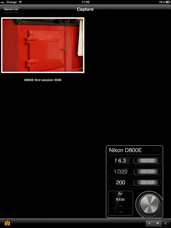
(NOTE: the little camera icon, bottom left, might be white, in which case you won't see the Camera Controls panel on the right. Click the white icon, it turns orange, the Camera controls appear and you're good to go.)
See that sexy silver button? You got it. Press it and the camera will take a shot. Change the Aperture/Shutter speed/ISO (depending on which Mode you are in on the camera) as you like and shoot again. Gosh.
The image appears on my laptop within two seconds. In under 4 seconds, it is on my iPad as a thumbnail and if I tap on that thumbnail, within about a second it appears full screen and fully zoomable. Which means you can check that your model's eye is in perfect focus, or that the movements you have set on your PC-E lens are correct, or that your lens isn't decentered or otherwise screwed.
This, in my view, is a major contribution to life with the D800 and (apart from the lack of a really really good wide PC-E lens) the last great missing link for me as a 'coming from Medium Format' guy.
Awesome. BUT...
You'll notice in the Camera tab a little icon that looks like a speed camera. Click it and... The Selected Camera Does Not Support Live View.
Bummer. Not that Live View with my Phase backs was much clearer than a blurry TV program from another planet but it was useful for lining stuff up and even for fine focus if you were very patient.
Having said that, Nikon Camera Control Pro 2 DOES do live view with the D800 - not according to their website though! I downloaded V2.80 and then had to download the 2.11 updater and tried the whole shebang and - it works, looks promising, but lacks the potential 'all in one' feel of C1 because you need to have a viewer launched at the same time as you are capturing. And it lacks the magical iPad app. But you can fine-tune focus in the preview window, at full or 200% zoom on-screen, which looks.... not brilliant, but useable, like Live View on the camera itself!
FINAL THOUGHT:
This is a marvel. But Capture One as a RAW processing program is not to everyone's taste and, unlike Lightroom or Aperture, it has no built-in cataloguing program - though that is under development as Media Pro gets more and more well integrated.
I like C1 and it gives great results BUT it has a bit of a learning curve. In the end, I prefer LR because of the catalogue functions and print module. Many people think C1 gives superior RAW processing results, however.
If you have time to learn it, do: you might love it. If not, just capture into it using tethering and with all processing set to defaults, then export TIFFS to Lightroom. Easy.
]]>

Nominally a macro lens, and very good at that task under certain circumstances, it trades off having a stop faster than most similar focal length macros for having only a 1:2 magnification ratio and a relatively 'far' close a focus range of around 17.5" or 44cm. It has very low distortion.
 Whilst extremely sharp, that's not the main reason to buy the lens: my 70-200VRII is damn nearly as good at its best (though without quite such good micro contrast) so you'd have to really really want the best available resolution at any cost to use this lens for that purpose alone. Nope. This lens (aside from its Macro abilities) is all about bokeh. Buttery, creamy, smooth, lovely bokeh:

The rub (and it's not like at this price anyone is expecting a free lunch anyway) is that it suffers from fringing, bad, bad fringing, on the D800. And I find it quite hard to know exactly what kind of fringing it is. According to the few reviews I can find, it has very low chromatic aberrations - but quite notable Longitudinal Chromatic Aberrations (LoCas or 'Bokeh Fringing'). However, none of these reviews were conducted on the D800. Now, I am no Human DXO but as far as I understand it, LoCas happen in OOF areas whereas the fringing I see happens around any highlit edge at any aperture until past f5.6 and even then they can crop up until f11 by which time you are into diffraction limitations of the lens' resolution and therefore kinda missing the point of having it. You can treat it but it is fiddly and in some images so fiddly as not to be worth it.
Take a look at this one shot at f2.8...
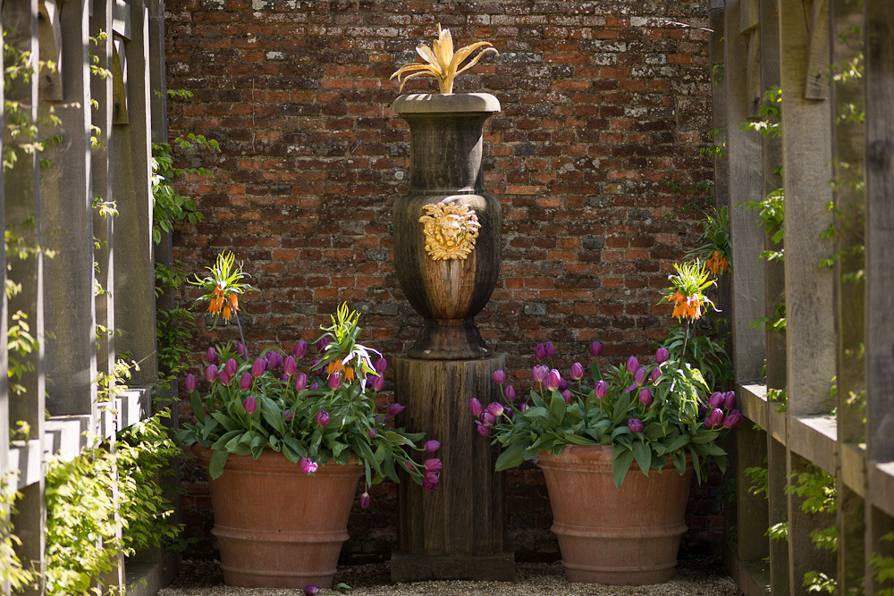 It certainly has some specular highlights, and these situations are a no-brainer to avoid with this camera. An untreated 100% crop:
 But the problem can crop up even in non-specular but brightly exposed but NOT blown (in any channel) areas of the same image even when they are in focus:
 LR4 has a great new feature for removing fringing, based on an eye dropper, but it isn't psychic and it can't replace the true colours that were never captured:
 Look how some of the real colours in the tulips have been bleached to grey.
Now, you can treat this selectively with local area adjustment brushes but it is royally annoying and therefore best avoided: for a badly affected file it can take a long time and not be fully effective.
Some files are much easier to treat, though: one click with the de-fringe eyedropper and it's gone:
 This image is full of subtle fringing, most noticeably in the purple spectrum.
Gone, and without doing too much damage elsewhere.
And again, one click and it's gone:
Let's take a look at OOF areas:
 Crop:
Crop:
 Treated with one-click:
 But look what that does to the colour of the bluebells:
 So this is another file where you'd have to go with local adjustments and get too fiddly for my tastes.
It's a great lens. If it weren't for the fringing I'd happily use it for townscapes, landscapes, portraits, still-life, portraits. It focusses well and easily (the MF ring is beautifully weighted and geared) and it has great resolution that is almost as good at f4 as it is at "the optimal but potentially diffracted on the D800 f5.6". But the fringing is there, so I don't use it that much. Ironically for a 'tuxedo' lens, I wouldn't use it for shooting someone wearing a tuxedo...
Luckily, though, having more or less bottomed out when it will give problems, I use it only when it will shine and for those purposes, I love it. Very, very few lenses have a 'look' as beautiful as this is capable of.
Temperamental but gorgeous. Sigh.
NOTE: Many reviews of this lens on the 20mp range of cameras have had far, far fewer problems with this lens and fringing. Lloyd Chambers review (mostly subscription but worth every cent/penny) first turned me on to the lens and his review of it on the D3X is very, very glowing.
EDIT: I've had a few requests to see the whole of the still life that fronts this post on the main page of the blog. Coincidentally I've also been asked to show some smaller aperture shots. So here's one that should suffice for both purposes. It was just playing, nothing for serious use and I'm no stylist (as is obvious from the ugly angle of the pear!) but it does show that even at f11 this is still a sharp and lovely lens, and that the 'purples' are tamed by then too. It's not as sharp as it would have been at F4 or 5.6 but it probably gives the perception of greater overall sharpness because of the extra DOF. Clicking on it will load a full sized, 91% quality JPEG that you can wander around in if you choose...
]]>
The D800 has a very light AA filter and the D800E has, in effect, none. Either of them, but especially the E, is therefore theoretically more at risk of moire than a 'normal' SLR.
I've taken quite a lot of frames on both cameras since April and I have seen moire rarely on either body but I did find one marvellous example that I wanted to share - so people can see what it looks like when things go horribly wrong, and see what the three major RAW processing engines do about it (I'll ignore Aperture here, though I have a copy, because I am not sufficiently experienced in using it).
Here's the shot, taken on an E with the adapted Leica 50mm R Cron, probably at f5.6 or thereabouts. Now I should mention that this is a fantastically sharp lens, and sharpness is not always your friend...
Rather boring, sorry, but it is a good example as you'll see.
Here's a 100% crop of the shutters as rendered by Lightroom at defaults:
 OUCH! Note that the moire is clearly visible in both colour and pattern (the 'maze' like effect). You can even see it on the camera display after shooting if you zoom in, which is useful.
Clearly this is not good, and it would (in fact does) show quite clearly in a print. And the news on post processing it away is not fantastic...
Here's the same shot with LR moire removal brush applied to the all but the left-hand set of shutters:
 As you can see, the false colour is gone but the pattern remains..
Now in Capture One with default sharpening and full moire correction:
 As you can see, most of the colour is gone but all of the pattern remains and is rather exacerbated by C1's quite aggressive default sharpening.
How about Nikon Capture NX2?
 This is with NX2 medium Moire removal and default sharpening. It looks like the best of the bunch and indeed, when you add sharpening in the program, it still looks like the best bet: (crop is slightly wider on this one but still 100% view)
Now there's a lot here to argue about: the three programs offer different possible combinations of degree of colour moire removal and degree and type of sharpening. Depending on your workflow and access to software, you might hop around between programs and see where you can get to, possibly with combinations of more or less sharpening and moire reduction in local adjustments too. You might also go into Photoshop and do something smart with channels and blur. But none of them is going to take away all the pattern and colour moire without compromising sharpness, and none of them is going to fully restore those slats to being slats, ever. That detail is gone.
Usually (not always) this is easier to get rid of in fabrics, because as you can see the colour is easier to deal with than the pattern, and in fabrics the pattern is usually so tight and fine that blurring it selectively is less noticeable than with these shutter slats...
Morals of the story:
1) When you came across subjects that might cause this in a grief-giving way, check the LCD after shooting and if you see it, shoot again at a slightly different distance. This generally gets rid of the problem but still check and check again. It happens rarely but after years of shooting Digital Leica M cameras, I can safely say that I've had a handful of shots that mattered to me, that I could not easily re-shoot, and that I have never been able to 'treat' fully
2) If you end up with moire in a frame that you really want to use, NX2 is probably the best place to start. If it were me, I'd convert and de-moire in NX2 and then export to TIFF for selective sharpening elsewhere. YMMV.
ps I'm aware that there is a lot of 'secret sauce' out there and if anyone would like to share it, please do! We'd all love to know how best to deal with this...
]]>
 These bugs also love a lake -and so do I. Very late light reflected in still water is so nice to work with.
One thing I particularly welcome after the move from Medium Format is that the D800 is quite happy on a lighter tripod with a less 'serious' head and with no cable/remote release. At least, in these still shooting conditions. Anywhere windy or slippery would be different.
These shots were all made at shutter speeds of between 0.4 seconds and 1/20th (have you noticed how promiscuous cameras and EXIF are with mixing decimals and fractions?) and with the 70-200VRII with VR off. All this perched on a Giottos Vitruvian Carbon Fibre tripod (which is a bit fiddly but weighs almost nothing) with its own built-in ballhead.
I can tell you that:
a) the 70-200VRII is a long, heavy lens and
b) if I had tried this with a Phase One DF body and a similar sized lens, I would have needed a Sherman tank as a shooting base and about an hour of mirror lockup. OK, not quite; but a Gitzo 3 series CF with Arca Cube would have been about right and MUP with a ten second delay mandatory. With the setup I used for these shots, the built in 3 second delay setting was long enough. And one of these shots was taken from a floating wooden walkway, with me swatting mosquitos away like a man possessed, whilst another had the tripod feet sinking into moss.
c) for travel use, this bit is key: the Vitruvian and ball head together weigh less than half what my Gitzo and Arca combo weigh. And the Vitruvian has a centre column (tut tut: totally verboten in MF land) that can be extracted, strapped to one of the legs, and used on its own as a monopod. Neat.
The huge mirrors and IMHO rather basic design of current Phase One SLRs mean that mirror slap is like the proverbial barn door in a breeze. Combined with massive pixel counts, this is a recipe for mushy shots, hence the Large Tripod/Serious Head/No Centre Column/10 Second MUP ordinance. With the D800 and a Vetruvian, unless you're shooting on a cliff in the wind, that misery is a thing of the past.
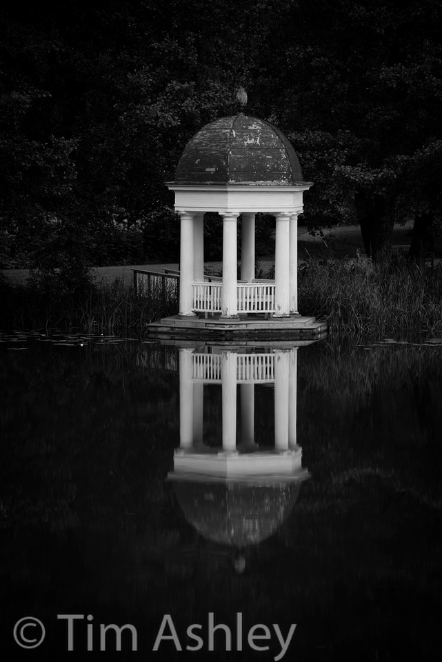 Here's a 100% crop of the above. Remember: this file is a crop of a 36MP frame shot on a 1.25Kilo tripod & head combo with a large zoom set at 155mm attached, shot at 0.4 second, all perched on twigs and moss, with only a 3 second delay and no remote release.
It shouldn't be allowed.
(Note: this crop has my default 'deconvolution' sharpening for the D800E of 90/0.7/70/20 in LR4. That makes it look a bit crunchy at 100% but generally works very smoothly for prints. Travelling with a new Retina Macbook, for which LR is not yet optimised, makes this hard to judge 100% until I get home but I am very confident that the above would make a lovely 36" x 24" print because viewed on screen at 50% zoom it is flawless)
The shots were all taken in and around the gardens of the amazing Mustion Linna manor, which is historic, lovely, great value, comfortable, has great food and is set in the middle of the nicest part of Finland I have yet found. What's not to like?
All the shots are heavily underexposed of course, in order to preserve the mood. I already have the cameras set to -1/3rd as a 'set and forget' fine tune that doesn't even show up when shooting. I'll post on this again but the combination of great dynamic range and quite an aggressive roll-off into white clipping means that the old 'Expose to the Right' mantra no longer holds. Don't do it: blow a bright area that matters and it's lost for ever. Underexpose a bit and you can use the Shadow Slider profligately and get your picture back nicely.
While we're on the subject of exposure, I guess many of you know that the so-called 'Matrix Metering' with built in memory of X thousand scenes etc. in fact appears quite focus spot oriented. Which is one reason that the left point AF issue is a bore - "focus and recompose" in matrix mode means "bugger up the metering", unless you use AE lock as well as AF lock. And the fact that the built in 'blinkies' like to panic way too early means that experience is the only way to go: IMHO there's nothing in the camera that will hold your hand well enough to get the best results. And that's as it should be. We don't want this malarky getting easy enough for anyone to do well, now do we?
On this topic, I tried an experiment today: I set a custom Picture Control to 'minus brightness' and minimum contrast to see if I could calm the blinkies down a bit (the 'play' function displays an image with your currently set Picture Control as if you were shooting JPEG, even when you're not, which sounds illogical but isn't).
It didn't work. Well, maybe a touch, but it was a Scotch and not a Valium and them pesky blinkies need a Valium to sooth their nerves...
EDIT: 13th July 2012
One last photo:
The problem with the PC-E is its inexplicable field of focus. After Lord knows how many experiments I have realised that despite diffraction, the best results are at F11 because the field of focus is not just curved, it's downright twisted. Even with no movements it is a bitch, a real, true, what have I done to deserve this bitch, to focus and get anything vaguely like sharp across the frame. Using tilts and swings is another matter and I'll post about that another time but it can be great fun handheld.
So here's a photo from today and after it, I'll go into what the building is and how I shot it.
This is the Paimio Sanatorium by Alvar Aalto, in South West Finland. Built to treat tuberculosis patients, it is one of the most famous Modernist buildings in the world, nominated to become a UNESCO World Heritage Site. Set in a silent pine forest, it is incredibly beautiful and peaceful. It's also a royal PITA to photograph because it has limited clear space around it and it's quite tall. Which means either vertiginous converging verticals, or a camera with movements.
Bear with me here: I know a lot of Medium Format photographers who have been quietly selling their gear and buying D800s. The DR is arguably slightly better, the noise characteristics at anything over ISO 100 are far superior, and the ergonomics and flexibility are a joy by comparison to shooting MF digital backs attached to studio (i.e. generally monster SLR type) bodies. The rub, however (and this is what stopped a lot of people from switching when the Leica S2 came out - I know this only too well, I had one) is that these photographers often have a technical camera too, onto which the back can also fit, in order to allow tilts, swings, rises and falls in all any any permutations. And a number of these potential switchers have held back until it is clearer whether the Nikon (or limited range of alternatives) PC-E lenses can 'cut the mustard'. The 24mm PC-E is critical here because Canon make a great 17mm AND 24mm and because these MF guys (again, I am one of them) really really badly want a wide perspective control lens. Frankly for many, it's a deal breaker. I'll come back to this.
So, about the shot. Tripod. Preferably not the Giottos Traveller I had with me: I wished I'd had the Gitzo 3 series Carbon Fibre and I badly wanted the Arca Cube I use with it - the best tripod head that (a lot of) money can buy, because it allows perfect, tiny movements in every plane and is rock solid.
Anyhoo... frame the subject in Live View and level the camera as exactly as you humanly can but with the top of the building cut off. Now apply rise (here about 7 millimetres) until the top of the building is visible and leaves whatever amount of sky you want. Now point the camera up a touch and re-frame. This is vital: perfect verticals look weird, so you need to have a slight upward viewpoint in order to allow a light tapering of the building but nowhere near as much as if you weren't using shift.
So far so generic. Now it gets specific to this lens on this camera.
Take some test shots to get exposure right. If you're fussy (I am ) use a Colour Checker Passport to take reference shots for colour and WB. Get the exposure so that it just shows a tiny bit of blinkie in the sky. Ignore specular highlights if there are any: they are built to sparkle!
Set the camera to use a three second delay, or use a remote release: at F11 and trying to keep ISO low, you'll need stability.
Now, and this is the vital bit, in Live View 100% Zoom view, take a series of focus bracketed shots (even though you're at F11) starting with focus on the furthest part of the building away from you and then moving along its length towards you with more shots. Why? Because only God understands where this lens focusses and this is the only way to be reasonably sure of getting the shot. Even so, it's not guaranteed because the field effects are profound and even F11 is not enough to get every subject, however focussed, sharp throughout. But it generally works pretty well, if not quite as well as I'd expect or require. Click here to see a 4000 pixel wide version, equivalent to viewing on-screen at about 50%. But be kind, I processed this in a hurry on a laptop with nothing but Lightroom, in the front seat of my hire car...
Tip: use the Lloyd Chambers technique to focus in LV: Set up a custom Picture Control with sharpening at maximum. Of course, you're shooting RAW so this won't affect your image, but it will make the LV easier to focus.
Tip: if the shot matters, shoot tethered, or immediately review on a laptop to make sure you've got it right.
So, is the lens 'good enough'?
Not really, no. If I were serious about this sort of work I'd keep my technical camera for now (actually I have, but the IQ180 back is for sale. I might get a used P65+ or IQ140 for this sort of work) because this lens is unpredictable and inconsistent and that spells danger for professional use. And don't forget, this trial was only using one of the facilities this lens should be able to offer...
A top-flight technical camera lens that plays nicely with the latest generation of high-end backs can set you back as much as £7,000 so on that basis, I strongly advise Nikon, or one of their competitors, to make a Nikon fit wide angle perspective control lens that knows how to behave. And don't worry what it costs to make - even if it sells for over £5,000 the math will be right for a lot of people. I'd buy it.
EDIT: 12th July 2012
Since posting this yesterday, and after well over five hundred visitors in less than a day, it's clear that a lot of people are interested in this topic. Of those who have direct experience with this lens (and it must be said that most of them are on cameras other than the D800) quite a few have said that they have found similar effects. Conversely, an approximately equally number have defended the lens and said that they haven't seen any odd 'field effects' in its focus behaviour. I've been asked by many of these people to post an example. The following image will, if clicked, load a 4000 pixel wide downres of the slightly cropped original. That's equivalent, roughly, to looking at 50% view on screen or making a 180 DPI print. Look very carefully at what is in focus and what isn't. Focus was using the confirmation dot on the centre of the triangle on the facade, just under the statue's feet. Look at how almost the entire facade is in focus but how the people at the top of the steps are far less sharp than the 'lady in red' bottom left. Imagine the image with a 'thirds' grid applied and look inside the central, lower 9th of the frame. Most everything here is OOF, at whatever distance from the camera, whereas at the sides everything is in focus, whatever the distance from the camera.. I think I know what is happening here and I will run further tests and post again. If I am right in my theory, it could help present a further way to work more happily with this key lens.
]]>
...well, almost without tears: the downside of this lens is its distortion and if you don't get it right when you shoot, no amount of perspective correction in post will make it look quite right.
My advice: don't trust the in-camera horizon. Close but no cigar. Use your eye to first find a vertical and get it perfectly upright using the grid lines as a guide. This vertical is your only friend so get it right.
Then use the in-camera yaw indicator (again close but harder to do by eye). Once that's done, move your camera delicately from side to side (without disturbing your vertical and your yaw - easy huh?) so as to ensure that the horizontal lines are parallel to the frame. This is the best way of getting the sensor parallel to the subject and if you get this wrong you'll weep later. Take the shot. Open in Lightroom if that's your poison (excuse the topical pun) and enable lens corrections BUT choose up to 200% distortion correction and THEN go to the manual tab and add more if required, which it often is. You'll end up with something close to rectilinear if you shot it right!
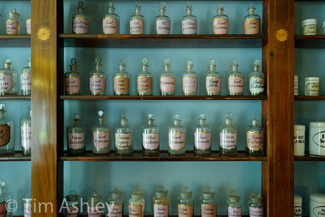
And don't be afraid of the 'blinkies': they are affected by your choice of settings for JPEG even when you are shooting RAW, and in any event they always start to blink an overexposure warning before the area actually blows a channel. Get used to this and you can get the best out of the camera's phenomenal DR. Also, it is entirely appropriate to allow some areas, such as the stripes in these curtains, to blow a little. It looks natural and it allows light into the rest of the scene.
Finally, White Balance. Hmmm. Not everyone can be bothered to grab the WhiBal card and risk looking like a nutter or attracting attention. I personally find the D800 WB not so great, but then most cameras aren't much good at it. So look for a white and balance off it in post BUT... don't be a slave. Some scenes just looked a bit red or blue or sometimes green, just because that's how the light WAS. So allow the feeling to come through and not the theory. It's your photo.
And remember, most whites aren't neutral white. Not like the neutral whites and grays on a proper balance card. Choose something that looks like it'll do and you'll play Russian Roulette, which might be fun and might be not...
]]>
Turku, Finland, on an otherwise photographically uninspiring day.
This is exactly the sort of work I most enjoy making: the remnants of human activity, stains and traces on the landscape, the empty places where people have been and, though departed, remain in discernible in the things they have left behind. My own series Lyonesse and My Space are in similar vein though Koivisto's presentation is more consciously anti-aesthetic: she doesn't generally try to pretty up the composition or the tonality of the pieces, preferring to leave them "as found", which is a perfectly valid approach though one that then depends on seriality to carry it from visually dull to creatively exciting.
The most evocative piece in the show is a video installation of an abandoned swimming pool (I assume from one of these ex-military facilities).
She has shot HD video from both ends of the pool, identically framed. Each video is presented on opposite walls of a gallery room, with the visitor chair positioned centrally on the side wall. After a few moments, gentle ripples spread across the water in both frames, and the camera sits with them until they die, Then the video loops.
The effect is stunning and leaves me profoundly jealous: I was working last year on a similar video series (involving water and grass) with the conceit being that the images would appear on HD screens famed as if they were photos so that when the viewer entered the gallery, they seemed at first to be back-lit still images. Only on close viewing would it become clear that there was very slight motion involved, and motion that was not in effect 'going anywhere' but merely repeating, like the tide, without resolution. I gave up because I couldn't find a convincing and cost-effective way of getting the screen-in-a-frame technology to work for a series of twenty.
I'm glad I gave up when I did. Koivisto's effort is way better than anything I had in mind and I enjoyed watching hers a great deal more than I enjoyed tinkering with mine.
I must meet her though: in another room was a series printed (very large) on fabric and hung slightly off the wall so as to offer a little movement. I have also been experimenting with this for the last 18 months and prefer the results of my printing on silk to hers on thicker canvas, though the canvas holds the colour better.
Aboa Vetus, Ars Nova, Turku, Finland, until 23rd September

Nearly 40 hectares of old wooden buildings surrounded by an unattractive modern town. Quite a contrast.
But people pay some careful attention to their windows here, whatever the age of the property...
This lens has odd field curvature (it doesn't have a plane of focus as such, more a nose-shaped parabolic field that morphs with aperture) but know it well and it can do tricks such as giving an apparently huge DOF when you have foreground on the sides and subject at distance in the centre...
One of the things that people complain about with it (other than those samples that have are calibrated such that the lens's inherent focus shift on stopping down creates problems) is that with these weird field effects they can't make the available DOF work for them with subjects that slant away from the camera. I beg to disagree:
 Finally, there is often something off-kilter about Finland when you look carefully. Here's a good example:
]]>
Still, it behoves each of us to try to make a wedding where we find only a muck cart. Here's my unconvincing attempt.
Note the two differing colour balances in shots taken minutes apart. The first was 'as shot' which is with the D800 A2 (keep it warm) setting and the second was manually done by me. Both could look right but together they look rather odd.
I stayed in what might be the worst hotel in my experience here: the yyterinkylpylahotelli. I won't go into the horrors other than today that they built it out of some super heat collecting metal and then put rooms in the roof with tiny, tiny windows (meshed due to the golfball sized biting bugs) and no air con. After a few hours of near-death sweating I asked for a new room and thankfully got one a couple floors down - still too hot to sleep but not an immediate health risk. And when changing rooms at 3am, it's never good to find security guards in the corridors dealing with other inmates who are so drunk that they're considered a danger.
Oh, and when you check out, they give you a tube of mustard. Go figure.
The only interesting shot I got of the hotel. Taken with the 85mm 1.8G at F1.8 and showing what nice gentle bokeh the lens has wide open.
I love Massimo Vitali's beach images so whilst wandering around the shores of an unpronounceable lake near Tampere, Finland, I couldn't resist whipping out my favourite lens and grabbing this shot. Too deadpan for most people's tastes I'm certain, but it appealed to me. As for the Leica 50 Cron R adapted with Leitax to a Nikon mount and shoved on the D800E, well - it has the nicest look and best behaviour of any lens I have yet used on the camera. It is sharp everywhere, has no weird field curvature, requires minimal geometric corrections in post, and has a very lucid drawing, both dramatic and subtle at the same time. Everybody should have one.
]]>
An inaugural and three day late post from Finland, where I am travelling with a bagful of Nikon gear including:
- D800 & D800E
- Nikkor 24mm PC-E
- Nikkor 28MM F1.8G
- Nikkor 85mm f.18G
- Nikkor 24-120 VRII
- Nikkor 70-200VRII
- Leica 50 Cron R with Leitax adaptor
- Gitzo traveller and Phottix remote shutter (not used either yet!)
It's the first time I've had any concentrated personal shooting time since getting all this stuff. A little background: I've put all my MF gear (Phase IQ180, DF body with plenty of glass, Cambo Wide for field use) up for sale. I've also sold my M9, but kept the glass. All as part of an effort to concentrate on using one 'serious' system (the 800) and one small'n'easy system (yet to be decided between NEX7 and MFT). The reasons for this are many but in short, it's about having less stuff in the cupboard and knowing the stuff I do have in more depth.
This system can be point and shoot - with the right light, the right choice of focus point and the right choice of non-tricksy lens. But it can also be a royal PITA because, like any pro level system, there are a lot of gotchas. The photo above of Helsinki Cathedral is a case in point of this need to learn the gear. It was shot with the 24mm PC-E which seems almost randomly to provide edge to edge sharpness when used with no movements. Shifted, however, it is incredibly difficult (even when stopped down) to focus. The above shot, at F8, was focussed using the focus confirmation dot and the centre point and if you zoom in on most of it, it is lovely and crisp. But there is an oddly shaped zone of OOF covering the bottom, central 1/9th of the frame. Now this is a zone that includes depths form foreground right to the facade of the building and yet within it, nothing is in focus. Meanwhile on the sides everything is sharp from front to back. Moral: only use this shifted on a tripod and with focus on LV and make sure you check every part of the frame. Not an easy lens. Even unshifted, many shots at F5.6 and 8 seem sharp from side to side but others are soft at the edges. I have yet to bottom this out.
On the plus side it has a great party trick: put on full swing and stop to F4 and it creates a marvellous, predictable and easily hand-holdable 'tunnel of focus' (or 'slice' if you rotate the barrel 90 degrees). The trouble is, you can fake this easily in post, with results 95% as good...
ps don't you love it when you look at photos at 100% zoom view and find something weird going on that you never noticed at the time? The following is a crop from another shot of the cathedral. Bizarre and very Finnish... and a testament to the sheer resolution of the D800. It's more a telescope than a camera sometimes.