"You make us all envious with your access to top of the line gear (Phase, Leica, Nikon, Canon), but it seems you still aren't satisfied. Have you thought about going more fascinatingly eccentric or antique in equipment for that unique character you are seeking? ... at least as a vacation from your current gear? If not your thing, what about trying a style of photography that is new to you, where you feel like an amateur, exploring again?"
Hmmm. I think I haven't really explained what I'm doing here, and this note from a reader is a good catalyst for me to make an attempt at doing so.
Eight months and Lord knows how many articles after I started scribbling here, and with many thousand readers, I should probably come clean: my interests in finished photographic images veer towards the semi-abstract and it is an area I frequently explore in my personal work. The comment that most people make on seeing a row of framed prints of mine is 'they don't look like photographs, they look like paintings or watercolours' - and that, I might add, is almost always without my taking recourse to "art filters" in post processing, or, worse, to printing on the dreaded canvas. And yet I am quite discerning about the equipment I use, generally wanting it to be capable to the standards of performance claimed by its makers. And when you buy from expensive makers, they make pretty strong claims.
But I do think my correspondent has a good point: if you read certain of my articles in isolation from the entire series (and who would want to read the entire series?) you might get the impression that the only thing that matters to me is technical perfection. And indeed, the pursuit of that quality in my equipment is a strong strand here. But it is not the only strand and its important to clarify two contextual elements:
-
Seeking very high technical abilities in one's equipment does not mean that one intends always to deploy them in one's images. In other words, if I had a Ferrari, I would expect to be able to drive to the shops in it.
-
Abstraction or creative interpretation of a scene can come as much from framing and the treatment of light as they do from 'effects' such as those created by optical systems or post-processing. Look at the work of Burtynsky (especially his dryland farming series) or Gursky or Kander to see how large format cameras and technical cameras, often used with movements, produce work which is both technically perfect and creatively inspired.
That second point is particularly important to me: the pursuit of technical excellence is absolutely not about making the final image clinical, robbed of all artisinal imperfections. Rather, it is about getting the camera out of the way, so that its presence is not felt in the end result. For certain types of image, grain/noise, distortion, poor dynamic range, differential sharpness across the field, poor colour rendition and flare are merely distractions and reminders that the world is being seen through a device rather than through an eye. All this comes down to the creative intent at the outset.
Two photographs follow. Both were shot on Phase One digital backs. The first required the absolute highest image quality available since it was to be printed very large and its creative intent was to show Mother Nature's artistry, not mine. It was shot in a studio, on a huge light table with incredibly careful lighting, focus bracketing, macro tubes, blah-de-blah. The second one was made by mounting the back on a technical camera and then changing the vertical movement setting, so as to slide the sensor through the image circle, during the exposure: very different creative intents dictating very different deployment of the same equipment.
 Blue
Blue
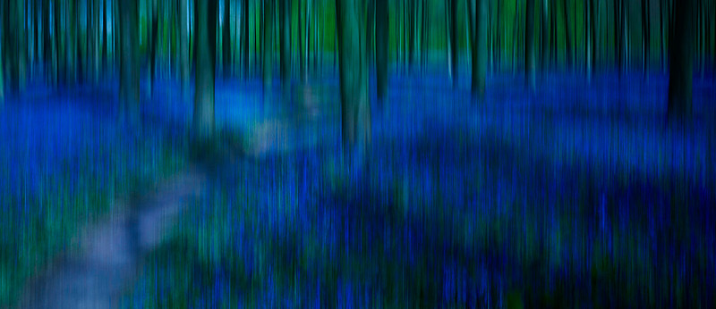 CF002317
In other words I'd like to make it very clear that in my personal work I very, very often eschew the technical perfection that I seek in my reviews. It's just that people generally aren't interested in reading about technical imperfection.
Readership of this site is very telling. If I review a new and expensive camera or lens, I can generally expect many, many thousand visitors. If I write on processing technique (such as my article on how to best deal with moiré in D800e files) then the hits simply flood in. But a Guest Photographer piece will get 'high hundreds to low thousands' of readers and a review of a photographic exhibition, or a discussion of photographic ethics, will guarantee that reader numbers 'go off a cliff'. In other words, people want to read about the gear. It might very well be the case that what I write about non-gear related photographic matters is uninteresting. It might be that what I write in general is uninteresting but that I have 'access to top of the line gear' and it is merely that which attracts readers. Who knows. But it is quite clear to me that the thing that attracts the largest part of my readership is gear. Gear, gear and more gear. And what interests them about that gear is, what do they need to know about it before buying it or when using it?
I'm sure that the great proportion of readers here are also fully aware that technical perfection has its uses but also that it can prove a distraction, a goal that becomes a gaol. Here's another scene, shot twice: the first is a snap from my iPhone. I took it whilst out walking and liked it, then went back next day to 'do the job properly'. So the second shot is a careful HDR combination of several frames shot on a Phase One IQ180 and technical camera, with a mixture of focus bracketing and exposure bracketing so as to get the look I wanted.... at 80mp. I still prefer the iPhone shot and I spent hours buggering about trying to 'improve' on it with equipment that cost more than a Porsche.
 image-1
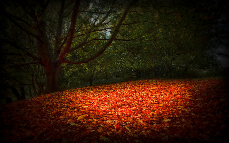 untitled-2
And here's a scene shot this week using a D800E with 70-200 F4 VR but, and this is crucial, it could probably have been shot with an iPhone so as to look very similar indeed at small to moderate print sizes, because it is not 'about' resolution:
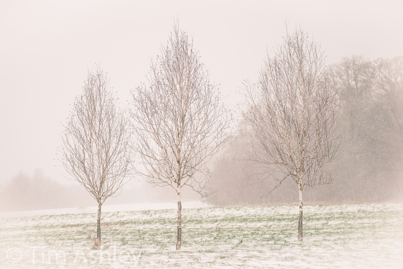 _DSC0890-Edit
In other words, you can often throw detail and information away at a later time, but you can't add it. Which raises the question of whether you should use all the technical guns at your disposal in order to capture the scene 'perfectly' and then reduce quality later in order to get back to your original creative intent. I feel, intangibly, that it is more honest to capture the original scene with the as close to the look of your creative intent as possible. That honesty shines through, and it stops people from becoming addicted to the obvious looks of Hipstamatic and Nik and HDR, to 'fun with filters', to outsourcing their creativity to a programmer.
There are also some 'looks' you can't fake in post processing and in these situations you simply have to capture your imperfections at the outset. The following image, shot on a Leica M8 and a wide open Noctilux, is all about the visual signature of this particular lens when shot wide open and this sort of look can only be properly produced in this manner. There's not a piece of software on earth that can trick it up for you later.
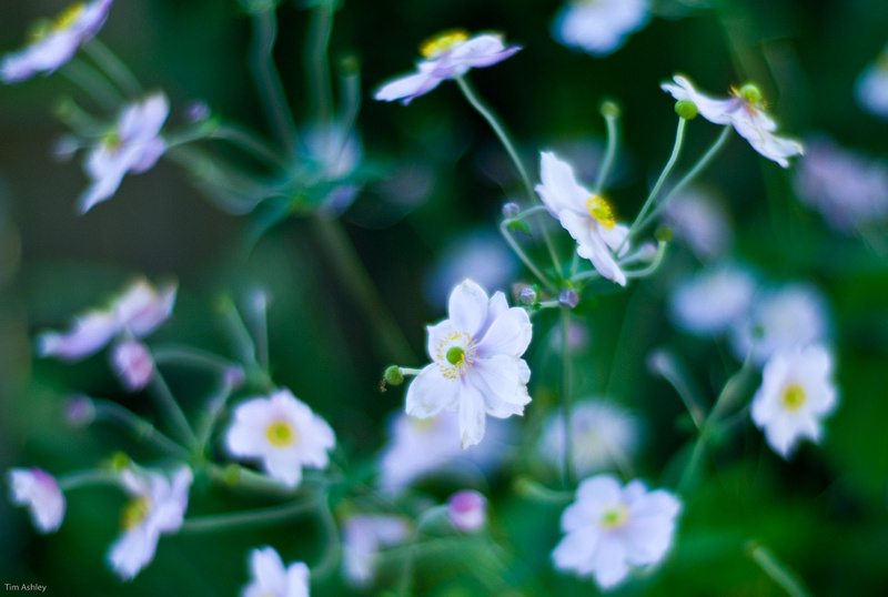 Japanese Anenome
Bokeh in particular, the quality of defocus, is a signature characteristic of certain lenses that is highly valued. But other aspects of the intangible look can include the way that field curvature affects the image, the impact of aberrations and of astigmatism, all of which can manifest as different types and degrees of blur. Then there's the apochromatic nature of the lens: the ability it has to focus all wavelengths to the same plane.
Most serious photographers have a mixture of lenses that they value for their technical perfection and lenses that they value for their 'look'. Some rare lenses, such as the Leica 50mm F1.4 Summilux, have both qualities. That lens, for example, has an almost unique ability to separate subject matter into 'planes' of clearly defined focus. It's not just about the bokeh, it's about the way that the image 'pops' because of this separation of planes. Here's an example:
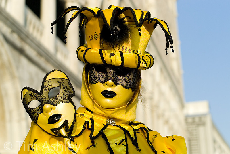 Mask 13
Many people will agree about the qualities of lenses that have these 'look' abilities. You often hear people using words such as 'creamy' or 'dreamy' and so on. But other 'looks' are rather more open to debate. The bokeh characteristics of, for example, the Leica M 35mm Summilux FLE and the new Sigma 35mm F1.4 ART lens are somewhat controversial: many people like them but others regard them as 'nervous' or 'hectic'.
For these reasons, many reviewers, including me, refer to the quality of bokeh as being personal and subjective. Smooth roundness of out-of-focus highlights is one aspect of bokeh which can be quantified, but for the most part it's just a matter of taste.
But there are absolutes in lens quality and there is a risk that over-use of a 'look' lens becomes lazy, that the 'eccentric or antique' lenses that my correspondent refers to become a hardware equivalent to Fun with Filters. Most of us have 'look' lenses but the best photographers use them sparingly.
So in general I mostly want a lens that can get sharp edges by F5.6 and, crucially, which does not have asymmetrical sharpness when comparing left to right on a planar subject. This is not just because of the irritation of having a soft right hand edge compared to the left, though that can spoil certain kinds of shot. More importantly, it is because it screws up the placement of the entire field of focus in a shot. Here's an example. Imagine you are employed to shoot a portrait for a magazine. The subject is a famous one-eyed artist, who wears a patch over his bad, left eye. You decide to use a tilt/shift lens and you use it with a little swing applied: this creates a diagonal zone of focus across the image, running from near on the right to far on the left. Your subject is placed on the right of the frame and on the wall behind him, left of frame, is hung his most famous painting. The slice of focus catches his face so that his good eye is in perfect focus, as is the painting behind him. Everything else is, to one degree or another, out-of-focus (including his bad eye).
Bloody marvellous. Creative, original, meets the brief for the job. And how often are you going to need that trick? Probably once, unless you're an architectural photographer who does facades from an angle. But if you have a decentred lens, every single frame you shoot will have that slanted zone of focus and even if you don't notice it immediately, it makes the images subliminally annoying, there is something indefinably 'wrong' about them, and that makes a viewer quietly uneasy with the work. You might want to do exactly that sometimes, to make the viewer uneasy without their knowing how - but do you really want a 'one trick pony' lens? Because if you take delivery of a poorly built lens with a de-centered element or group, that's what you have: a tilt shift lens without movements.
Similarly, lenses with strong field curvature can be useful but are generally irritating. For example, the Nikon 28mm F1,8G lens, is really sharp - but its sharpness at mid-apertures is very very not planar: it is shaped like a runway, as shown below: (excuse the strange colour balance, it was shot using UniWB, a subject I won't go into here).
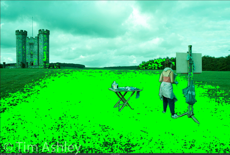 focus mask
The yellow mask shows roughly what is in focus at F5.6. I focussed the lens on the same plane as the easel. As you can see, its field of focus is not so much curved as cone-shaped. Like a runway. Great for shooting a receding avenue of trees but not so great for getting everything in focus in one plane, though it can be done as long as you know where to 'place' the cone and provided your copy doesn't suffer focus shift, which apparently some do.
Applying a similar way of thinking to cameras, rather than lenses, one can draw similar conclusions: there are cameras whose imaging chains have certain characteristics that produce certain specific looks. The Leica M8 and 9 have no AA filters and somewhat limited dynamic range. These characteristics, combined with very capable lenses, give images from them great 'pop' - but a large part of that 'pop' really is just a result of low DR leading to tonal compression. D800E and Phase IQ180 files often look 'flat' when first opened in a RAW converter, precisely because they have a very wide dynamic range and therefore a very wide tonal distribution until some decisions are made in post processing. Cameras with small sensors have a very characteristic look, slightly course and grainy and contrasty, that can be wonderful or annoying depending on you intentions. But a camera with files that show banding, or which has a misaligned sensor or lens mount, or which simply cannot focus properly, is not an 'creative opportunity' (or not very often!) - rather, it is a mess. It's sub-optimal performance is not creatively intriguing, it is a fault. So sure, the best camera is the one you have with you - but I personally think it is always worth having a good one with you.
To wrap up by returning to the note I received from a reader: I do, constantly, experiment with areas of photography which are unfamiliar to me - hence the recent review of the GoPro Hero camera and my large and often strange collection of lenses and cameras. In fact I greatly value technical imperfection as a creative avenue to be explored and enjoyed, but sparingly.
There's 'beautifully imperfect' and there's plain old badly made. I have just returned my third copy of the Sigma 35mm F1.4 Art lens because it was, like the first two, de-centred. In fact this time I took a refund rather than a fourth copy, because I need another inadequately QC'd lens like a need a hole in the head, however promising that lens looks in some ways. Similarly I have given up all hope of getting a good copy of the Nikon 24-120 zoom. So in that sense, yes, a certain proportion of my equipment has left me unsatisfied. Because, unless I am purchasing an oddity for a very specific look or function, I really do expect certain minimum standards of build and quality control and I think most people feel the same when they are spending time and money on this stuff.
Something interesting happened yesterday: a while back I used the below image as an example in a review I wrote of the Nikon 24mm PC-E lens. It was one of many that led me to put this lens back in a cupboard and not use it very often at all because it required much more time and care to produce than it should, and had to be shot at too small an aperture in order to overcome its odd field effects. So I considered the lens just shy of being good enough for commercial use, though it does have some creative fun potential. But out of the blue I received an email from a German publisher who wants to use it in a nice glossy coffee table architectural book. So there's a final mea culpa for you: sometimes the art of the possible is more fruitful than the pursuit of perfection. Sometimes. But I still wish this shot was properly sharp all over, because that was the intent I had for it.
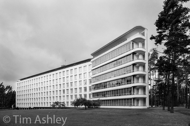 _DSC3292-2