The most beautiful paper to print on
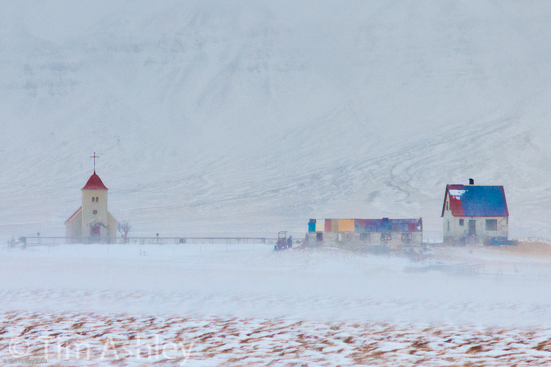
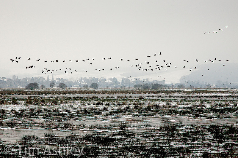
As a kid, I had unusually advanced ambitions: B&W printing was for pussies, I decided. I wanted to make colour prints. And not just prints from colour negatives, oh no. I was a Kodachrome fanatic and if you were a real Kodachrome fanatic, it lead, as do all serious drugs, to mainlining something yet more serious: Cibachrome. Hard, metallic, glossy, contrasty, saturated, bang. Trouble is, doing that at home was pretty difficult and I rarely got the results I envisaged. But when the wind was in the right direction, wow... Kodachrome and Cibachrome together really, really rocked. Learning to print digitally has led to a both a revelation and a reavaluation. Sure, sometimes I crave the sheer punch of Cibachrome but it's not available anymore and in any event my tastes have changed towards the subtle. A few years back I bought myself a 24" roll printer (HP Z3100) and when that eventually pissed me off too much, I changed to a Canon iPF3600. Both printers let you switch from matt to gloss printing without changing inks, an absolute prerequisite for me, but otherwise the results are pretty similar. And then I set about learning the new craft. Absolutely indispensable for this task was the Luminous Landscape video series, From Camera to Print. Like it says on the tin, that series teaches you how to calibrate the entire process from capture to final output, including calibration of every piece of hardware and software en route. It teaches you how to soft-proof and, most importantly, how to either make or find the correct ICC profiles for the paper and printer you intend to use. Having learned all that gave me much greater confidence in the 'expensive-if-you-get-it-wrong' process of making large prints with the colour I want. Since I often make limited edition prints in series of between 10 and 25, consistency is vital too: I need to be able to get the same result from the same file over a period that might span several years. That confidence has also encouraged me to experiment with a wide variety of different papers but pretty early on, I realised that one paper in particular got a very strong reaction from viewers. The most common reaction, with the right sort of image, is "that's not a photo is it? it can't be!". What is more, those are the images that sell at the best prices, most quickly. Sure there's a synergy between the paper and my style of image making, but the paper is quite certainly making a vital contribution to whatever I have achieved. I want to add here that I am absolutely NOT a 'novelty printer'. I don't print on canvas, because a photo is not an oil painting and even if I wanted it to look like one, printing on canvas would just make it look like a photo printed on canvas. I have no desire to hide or disguise the photographic intent of the images I make. So my reason for liking this paper is not because it tricks viewers into imagining the image to be drawn or painted. No: I like it because it makes the right sort of image look astonishingly but subtly lyrical. This paper is Hahnemuehle German Etching. It suits landscapes more than anything, but not the sort of landscape where you want every last pixel of resolution to be leaping from the print. The paper doesn't throw information away, but it manages to be both accurate and ever so slightly impressionistic at the same time. Also, as a very matt paper, it doesn't make colour sing like Sondheim: rather, it's Strauss's Four Last Songs. Quiet, capable of swelling to loud, pregnant with richness rather than rich with bling. I find it especially great with images that have a limited colour palette or a muted tonality with some areas of rich colour, combined with fairly simple, graphical composition. For this reason it is also good for some sorts of studio still lives, of simple subjects simply shot and where complexity and depth are required rather than explosive impact. Here are four examples of images which look rather ho-hum on a computer screen but get a very positive reaction when printed on German Etching:
In truth, I wouldn't use this paper for any shot where the image looks immediately and obviously photographic. For that, I'd use either Canson Platine, or one of the Baryta papers. I also like Hahnemuehle Bamboo for some images. But German Etching is top of the pile for most of my work.
There's always a fly of some size in the ointment, though: this paper will block your blacks if you are not very careful, and is liable to blow your highlights before your raw converter histogram says they are blown. But it will also print very 'flat' unless you boost the contrast. For this reason it is vital to get the right profile from Hahnemuehle's website and to soft-proof the image carefully first. Even then, you'll be well served to make some small test prints first before committing to a full 24 incher. My technique with it is to boost mid-range contrast, increase clarity a touch, but make sure that the highlights and blacks are well protected. You'll need a file with great DR to pull this off to best advantage if you shoot contrasty scenes: ideally a Medium Format file or one from a D800. But scenes with a compressed tonal range also work very well, such as, for example, images shot in fog, mist, rain or snow. It's mainly a mood paper.
I print from Lightroom with Print Sharpening set to Matt Standard, and rendering intent to Perceptual. But I find the most accurate colours if you are printing an image rich in cyans and blues come from printing from the iPF Print Plugin for Photoshop. However, your printer and your desired outcome might require a different treatment.
Also, though the the paper is thick at 310 g/m it is also delicate. It buckles easily and that leaves a crease. It takes a while to lose its 'curl' if it has been tubed for delivery. And its surface is delicate, so don't ever touch it (before or after printing) and make sure that it is carefully covered with acid free tissue paper during transit.
The hassle really is worth the result. If you want to put some poetry into your images, give it a try. And there's no better paper for seasonal images such as moody snowscapes...
This month I am supporting the charity Photovoice. I wrote about it in depth last week and that article is here. If you have found this blog useful and are feeling generous, I would hugely appreciate a donation to the charity, even just a pound or a dollar: every little helps. You can donate here and the Virgin Giving site is secure and takes cards and PayPal. The Gods of Great Photography will smile on you if you donate. I promise.
|