Guest Photographer: Russ Barnes
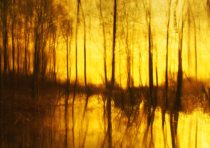
In a genre of photography which is, in my opinion, far too dominated by an official 'look', Russ Barnes' images come almost as a jolt: they are so subtly different from the accepted Fine Art Landscape norm, so varied and yet so much 'of the same eye', that when I first discovered his work I went through every image on his site and still wanted more. * Russ's photos (and many of his captions too) are lyrical. They are pretty much all beautiful. He is not afraid of beauty because he knows how to make it work without resorting to cliché and he has an inner sense of beauty which is both individual and communicable. And it is consistent without being repetitive. This set of characteristics is, IMHO, quite rare and it comes from him looking, really looking, at the landscape with his own eyes only. He connects with the landscape personally and emotionally, and then is able to turn that connection into something for other people to understand and enjoy on a level well beyond 'pretty'. His work could be broken down and subcategorised in many ways so I suggest that people look at his website for the entire oeuvre. Here, I am going to reproduce three short subsets of stuff I particularly like. I will give a brief comment and Russ will do the same. At the end, there's a bio of Russ by Russ, and a section on how he likes to look at and work with the landscape. Abstract Colour One of the things that demonstrates a photographer's depth of intent is how well they have considered the relationship between colour and form. This distinction, much beloved of the European Impressionists and the American Abstract expressionists and taught in every serious art school, is something that a good artist in any medium will eventually work out for themselves even if they haven't had formal instruction. My favourite writer on the subject is Patrick Heron, whose work consistently chipped away at the question of what each of colour and form are and how they are related. The 'journey towards abstraction', a series of explorations undertaken on paper, canvas, stone and steel by so many artists, can inform the work that pops off the inkjet printer to equally good measure. Russ's abstract colour works remind me of plenty of stuff - some of it powerfully of Ed Steichen - but it's all his own. Here are some examples, along with Russ's own words on the subject (in red). please note: in order to format the images and text correctly across desktops/laptops/tablets the images are displayed on most systems in a way that is physically smaller than the resolution of the loaded image allows: pinch-or-tap to zoom gestures will allow you to see them at a larger size without sacrificing quality. "22 Carat"
I struggle a lot with colour. At least I feel like I struggle a lot with colour. I'm not even entirely sure what I put this down to but perhaps it is the fact the real world is often very subdued in its earthy tones, the greens and browns that are found all around us in the landscape are not often colours which set us alight, it's probably why so many photographers seek out the overdone orange sunset to make things look more interesting than they are. That's not really my approach though and instead I focus my attention these days on form, on movement, on the surreal and almost exclusively on mono.
"Renewal"
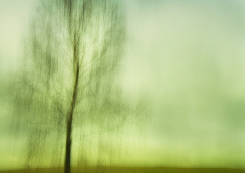
When it comes to landscape colour I definitely prefer something akin to reality and actually I find it increasingly difficult to produce anything but an authentic landscape image where colour is concerned because I find it difficult to enjoy the over-saturated HDR sunset that millions of others seem to pursue.
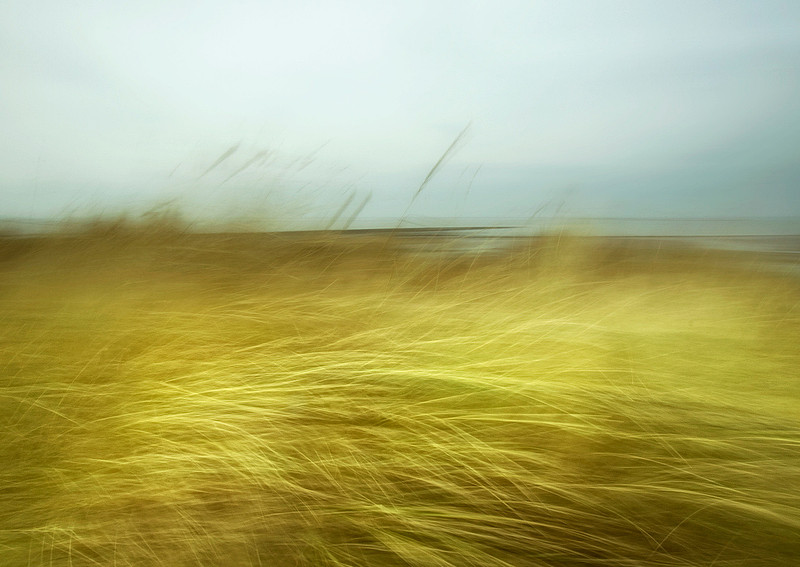
"Dune"
Abstract is different though. It's escapism from the real world and in this respect gave me an excuse to use some imagination and produce something other-worldly for a while. It didn't really last for me though, we all need some escapism but as it turned out this was merely a fore-runner to my darker world of monochromatic vision where shape, light and texture became everything.
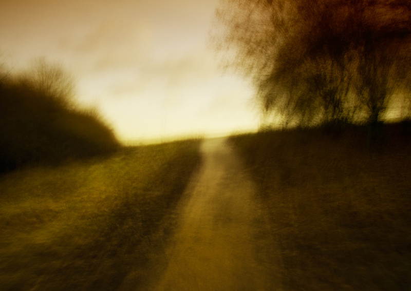
"Elysian Fields"
Colour is secondary in a lot of images to me - in many ways once you strip away the distraction of colour you are left with the real image, the one which takes a photographer's skill and eye to create. That's why I love mono and that's why I have left abstract and colour almost completely behind. It has its place of course but the use of out of focus elements and Tilt Shift generated blur have really replaced anything akin to a dream state for me.
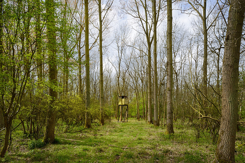
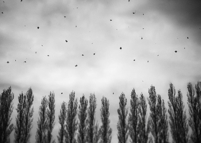
The Deadpan Surreal Hot on the heels of 'traditional' art's exploration of abstraction came its dalliance with the surreal. Whether you like Magritte, Dali, Duchamp et al, their work has resonated powerfully in the photographic world, originally through Man Ray and currently most popularly through Gregory Crewdson. The nature of that work is most often 'constructed': even Duchamp's 'Fountain' (a urinal) became surreal not in its own usual context, but by the surreal construction of the re-contextualisation created by putting it in a gallery. For me, there is something mildly arch, slightly too knowing, in such constructions - which is maybe why I'm not quite sure about Crewdson's work. And Man Ray's re-invention of solarization as an escape from 'banality' (as he put it) has lead, ironically, to a huge amount of banality: the surreal effects he pioneered in photography have been aped by generations of the Fun with Filters crowd, as effectively as a Bonobo Chimp jabbing at a calculator: they are emulating very well what they see others do, but with no understanding of what the intention of the exercise is. Russ's surreal work is a lot more subtle. It is at its best when implied rather than shoved in your face, 'found' and reproduced in its own context, without comment. He sees the surreal as slight warps in the veil of reality and then captures it so it can speak for itself. The nature of some of what he perceives as surreal is relevant to me in a lot of my own work: it has to do with what you might call 'negative human spaces', traces of human life left on the landscape, signs of their occupation or endeavour which imply narratives, real and surreal, to the viewer.
"The Deer Hunter"
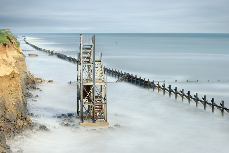
I don't feel I really have one style as such and I often make a lens selection based on the scene, the weather or if I'm feeling in a particularly dark mood. My Nikon Tilt Shift lenses are absolutely exceptional in helping to create that surreal look but they create a very different output say to a straight long exposure. I've even started to combine that Tilt Shift look with Long Exposures (not easy given the extensive filtering required) and it holds some promise for the future. I guess I'm still searching for that particular style that defines me in some way, but in the meantime I'm happy to shoot a combination of Tilt Shift, Long Exposure with largely mono in order to create something that is hopefully seen as artistic (some even refer to this look as artography) rather than something that is directly representative of the real world.
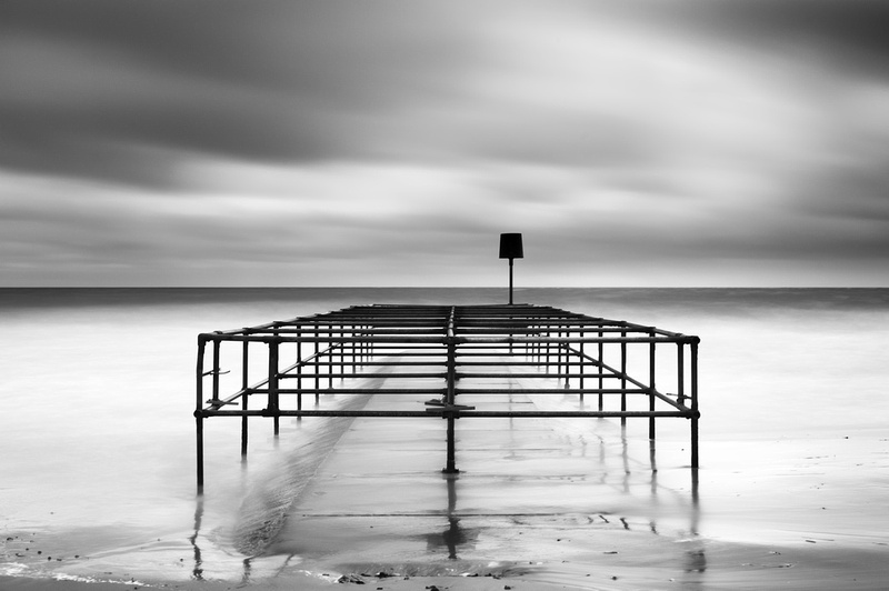
"Confinement"
As I've stated on my website, my vision is to aim for a level of artistic interpretation within a scene. In this respect, my approach to photography is not usually about recording what the eye can physically see in a given moment, but perhaps what my mind's eye wants you to see. That's the key - vision beyond the lens for me, seeing a finished piece in mono, looking for that dynamic contrast or the juxtaposition of texture in front of me. It's not that easy to find - sometimes I go for weeks in a depressed state not finding what I'm looking for and it's a quest that grinds but is ultimately worthwhile.
"Caged"
B&W When Colour Might Be More Obvious If there's one thing more counter-productive in the work of the enthusiastic photographer who mistakenly confuses dramatic effects with creative progress, it is the decision that saturation and HDR are no longer enough and that 'really arty' means Black and White, preferably with Nik Silver Effects in overdrive. The subject doesn't matter. Slap on the slider and gear up the grain in post processing and next door's garage becomes art. Not for Russ. He's thought about it. And yes, he does use some of the above-excoriated methods, but unlike the Bonobo Chimp with the calculator, he knows what he is doing and why.
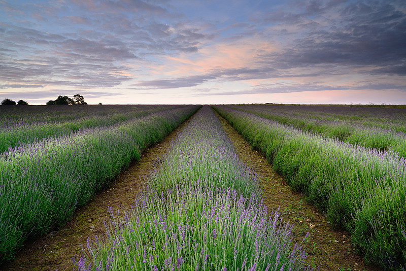
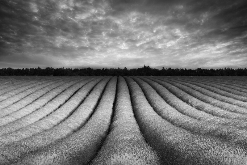
I shot a series of mono landscape images recently using a couple of large lavender fields as the subject. 1x.com put one of these images in their gallery and I got a comment from someone who said that I had been "brave" to use mono instead of colour for such a scene. This amused me somewhat and made me really reassess my approach for these images - to me the lavender rows were an ideal monochromatic subject, they have great form, repetitive lines, a unique texture, even and under the right light create quite dramatic shapes; but did my image need to be purple because that's what convention says? Did I blatantly 'waste' this valuable colour, forfeit something which others look on with some fondness in their own minds - did I even somehow desecrate that memory we hold?
"Lavender Blues"
"Hive Mind"
I don't deliberately try and be controversial in my approach but there are people out there who have created spectacular lavender images which I will never come close to matching. Put "Antony Spencer Lavender" into Google and you will see exactly what I'm talking about - I can't 'compete' on his colour stage, he's certainly one of the best out there for an image like that and unless I can create something equally compelling I'm not interested. Instead someone will now look at my interpretation 'Hive Mind' and hopefully they will see something equally compelling, but very, very different. Isn't that the point? Isn't that what many of us try to be - individualistic in some way. Photography doesn't need any more copycats, I'm trying hard to plough my own furrow instead.
Russ Barnes Bio Who I am isn't important - I came from decent artistic stock; my father was a highly accomplished landscape water colour painter and my uncle owned his own photographic business when I was small so I had a lot of artistic influence around me for a lot of my impressionable younger years. However it was only once my age was chiming near that magic forty marker that I became seriously interested in photography - I had reassessed the importance of certain things in my life and I needed a meaningful pursuit....
"Rise and Fall"
Working Methods These days I shoot with what I consider to be the best DSLR available for landscape photography - the Nikon D800. Partnered up with it I have two different types of kit made for 'near' and 'far' landscapes and seascapes. It's a lens discipline bought about by limited bag space which although I keep telling myself I need a bigger bag, it totally helps keep the weight down and pressure on those finite vertebrae...
Despite the wonderful dynamic range of the D800 I also own and use a full set of Lee Filters. In my eyes these are essential kit to any landscape photographer - getting as much right as possible in a single frame is critical. I do a fair amount of post-processing work, especially where a mono conversion is concerned but the base of the image still has to be exactly what I'm looking for initially. Creativity must be with the camera and not with software, I do nothing to elicit blur or those sweeping skies in long exposures - all of that is achieved in camera. I admit however that there is nothing I like more than mixing different types of colour filter in monochromatic conversions so that I get the look I really want, but that's about a finish for me, I'm not actually changing the image.
footnotes * as a caveat, I do think that looking online at images designed to be seen as prints is a mildly dangerous occupation. There is a lot that can change when the quality of printing, type of paper and eventual reproduction scale are taken into account and I haven't yet seen any of Russ's work printed, though I hope that will change. He uses very high-level equipment and technique so I have little reason to doubt that the prints will at least live up to the expectations set by these online images.
|